Prototyping for Apple’s Vision Pro AR headset
What happened to AR? It shouldn’t be so quiet, right? Maybe with so much hype around AI and chatGPT, it’s hard to focus on anything else. Sure, generative design will be the norm, but that’s easy to adapt to. Designing UI that properly uses 3D Space? Not so much.

Tech journalists are strongly suggesting we will see a new VR device from Apple by the end of 2023. It seemed that Apple’s main focus is VR. So imagine my surprise when they announced they are planning to replace iPhone with AR device, within 10 years…
Considering the current hardware is too limited to replace anything, it appears it will start getting better, fast.
New wave of hardware
UX has taught us that for each problem, there is the right medium. And AR definitely has its strengths:
- It gives us a natural way of interacting with data, via hand tracking and 3D display.
- It limits the cognitive load by showing useful information at the right time, all the time.
- It also reduces the interaction cost. Everything takes less time thanks to its contextual nature.

New hardware brings new challenges. Most of those are still part of UX work, sure. Consider the user, context, problems, limitations. The most unusual challenge, though, comes from utilizing the 3D space. Using it to its full potential.
This is something new. This is different.
But isn’t it too early to start figuring out new interactions patterns? Well, outside the box is where I live!
Coming up with the guidelines
So there are undiscovered uses. There are also very few established patterns. Since we might be designing for AR sooner than we think it seems important to focus on it now. Technically all we need is hardware and some free time. If someone, say, bought AR glasses, they could figure it all out. Huh.

So obviously this is a story about me. I recently picked up TiltFive AR Glasses and jumped right into it. Thanks to Microsoft Maquette I was able to quickly iterate and port my ideas to Unity.
Conclusion? This is much more than placing your design in 3D space. Curious, I started working on a set of rules that could help avoid common mistakes and bad habits we bring from flat screens. The most important one? UI should always be angled towards the user.
1. Face the user
Legibility of text is a challenge here. If text is not facing you it becomes very hard to read, due to antialiasing and perspective distortion. For the same reason it’s harder to interact with UI elements that are facing another direction.
The best thing you can do is organize your design in a way that UI is always tilted towards the user. With simple interfaces it’s easy, just rotate the view 🙃
Bigger challenge is covering the use cases that require a lot of attention. For example, how would an iPad app look like in AR?
Well, we have to bend it.
Curving a screen makes sure everything is at the same distance from the viewer. The bigger the screen the more curved it should be.
Bending view horizontally partially solves the readability issues, but with bigger interfaces elements at the top and near the bottom are distorted and hard to reach. Curving the screen along both axes solves that.
But can we take this even further?
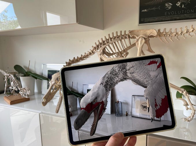
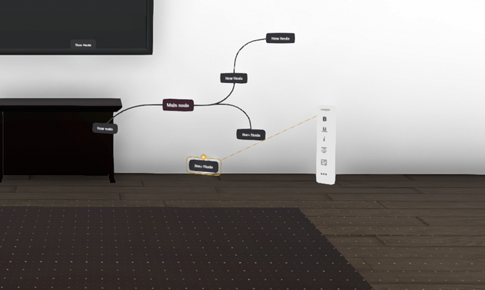
2. Objects, not views
How about ditching skeuomorphism altogether. We don’t need screens here, after all. Why keep pretending we have this limitation.
Scary, right? We’ll power through!
Whew. There’s a lot to break down here.
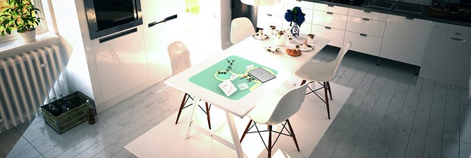
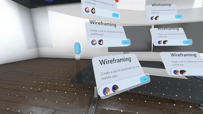
So the obvious question is: does it work? Absolutely. That is definitely the most natural feel in 3D. It’s not pretending to be a regular display. It’s not crowded or stitched together. When you look at it through the headset it feels like an organized desk (Think this metaphor was a one-off? How about a garage bench with a tool rack?).
Everything has its place here. Similar features are grouped together, content can be dragged and pinned at will. It’s a place to work, not a tool you use.
That’s how spatially designed apps should feel.
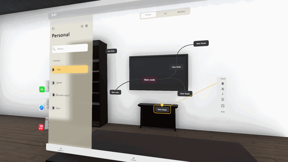
3. Define the surface
Complicated apps need a dedicated surface. This is our work area. It needs to be marked in a way that it’s obvious we have to keep our stuff within it. It also needs to be possible to readjust it.
The magic of AR is in how it integrates with the real world. The magic is gone if half of the menu is inside the coffee table.
4. Improve Information Architecture
Information Architecture in AR is definitely more complicated. Visual connection needs to be clear, yet distributed in 3D space. Showing hierarchy requires using different angles and materials (the way objects reflect light and cast shadows).
5. Add affordances
Sounds familiar, right? Well, AR requires a bit more thought put into it. Especially since hand tracking might not be perfect:
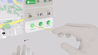
- Showing a ray in front of the finger ensures tracking works properly.
- Highlighting buttons you are pointing at.
- Showing contextual UI when your hand is near an object.
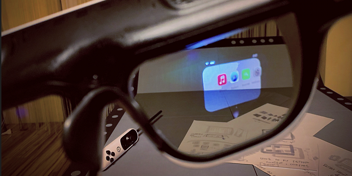
6. Show only what is necessary
Cognitive overload is a serious design challenge. We have to pick carefully what information to show and when to show it. Especially if you are out in the world. Widgets make the most sense here. They are contextual, by design. Created for a simple task and minimal interaction time. Perfect for when you are on the move. Especially when you have a screen stuck to your face.
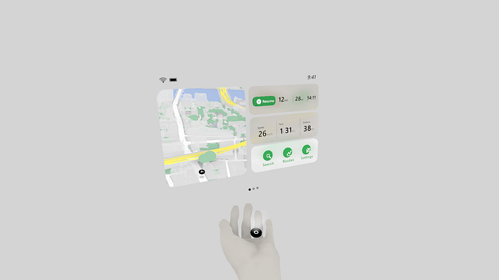
Looking at how the introduction of Apple Watch went, it’s safe to assume the initial AR apps will be close to current iOS widgets. CarPlay took this concept even further, showing multiple widgets at once. It translates well into 3D and is great for providing quick, contextual interactions. While also being easy to implement by developers. It’s all about the adoption rate, after all.
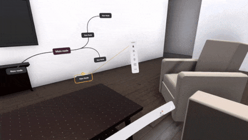
7. Make it intuitive to move
While on the move, obscuring view is very dangerous. Giving user ability to control where the UI is in an intuitive way is important. Embodied interactions are the way to go here — using gestures to make our actions feel natural, like interacting with a real object. So, basically my advice here is: if you touch it, it should react (yeah, I’m sharp like that).

There are couple of options we have here:
- Making it follow your hand
- Dragging
- Snapping it to part of the field of view (billboarding)
- Snapping to a surface (surface magnetism).
For best results we have to give user better control over the UI than we are used to. We can move our phone, rotate the watch with our wrist, we need at least the same level of freedom in AR.
Conclusion
Following these rules definitely helped me come up with interfaces that look less out of place in 3D. It was quite a bit of fun too.
Generally, it’s fun to be at the leading edge, playing with hardware, before it becomes widely popular. Seeing it not for what it is, but for what it could be, someday.
It feels like… well, seeing into the future. Although the picture is still a bit blurry.
Useful AR resources
- Microsoft has a great resource for designers starting out with AR: Mixed Reality Guidelines
- NN group has a great article explaining the benefits of AR: Augmented Reality: What Does It Mean for UX?
- For more advanced stuff check out “UX for XR”, by Cornel Hillmann. I can’t recommend it enough!
Also, check out my portfolio for more AR design experiments!
https://kamilkolodziejczyk.pl