Putting the “Hip” Back in Hipmunk
Improving Hipmunk’s Android Experience

Company and Project Overview
Hipmunk is a popular travel site that helps customers find great deals on flights, hotels, and cars by aggregating listings from a variety of travel partners including Priceline, Expedia, Booking.com, Hotels.com, and more. Basically, it’s like Kayak, but with a way cuter mascot.
In addition to a desktop site, Hipmunk has mobile apps available on Apple’s App Store and Google’s Play Store. Being an Android user (sorry Apple), I decided to take on the challenge of improving their Android app. I’ll walk you through my six-step process below.
Results
After incorporating my changes, I achieved the following results:

Step 1: Guerrilla Usability Testing
Before embarking on my redesign, I needed to first uncover the pain points of Hipmunk’s current design. Alongside my colleague, Terri, I headed off to the Westfield shopping mall in San Francisco to conduct my first usability tests.
During the tests, I asked users to complete 2 tasks:
- Use the app to find a place to stay in San Francisco
- Determine whether they would be able to get a refund should their plans change
My goal was to conduct studies with five random participants and after several hours and countless rejections, I finally succeeded! I rushed back to my laboratory to analyze my findings and uncovered several pain points, which I jotted down on sticky notes. I then used an affinity map to help me prioritize these pain points by level of importance.


Through this exercise, I was able to home in on three pain points to solve for, which I assessed were important to either the user, the business, or both:
- Refund policy was virtually impossible for users to find
- Homepage images and search bar confused users into searching for flights instead of hotels
- Photo gallery was difficult for users to locate

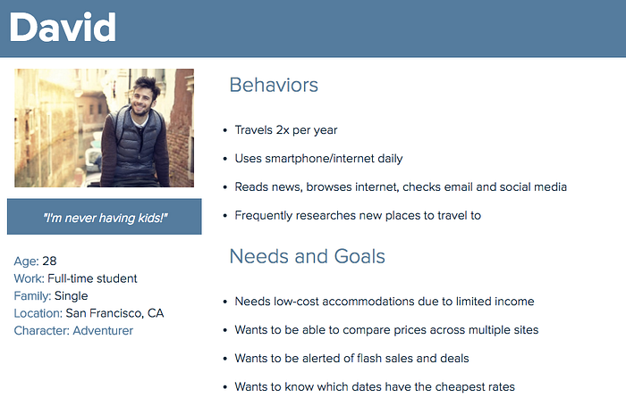
Step 2: Creating Personas
During my studies, I collected background information on my participants, which enabled me to create a user persona.
- 4 of the 5 users that I interviewed were in their late twenties and 1 of the users was retired.
- Of the 4 users in their late twenties, 3 were full-time students with limited incomes.
- All users interviewed owned a smartphone and were comfortable using technology.
- 3 of the 5 users I interviewed traveled to a new city at least 2 times per year and were familiar with the process of booking travel online. Some traveled for work while others traveled for pleasure.
Using this information, I developed the following persona:
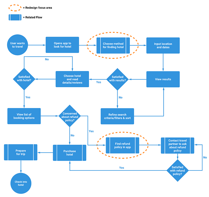
Step 3: Task Flows and UI Sketching
Once I felt I had a good handle on the type of user I was designing for and their needs, I began drawing out task flows and sketching out potential solutions on paper. In the task flow below, I mapped out the current process for booking a hotel using Hipmunk’s Android app.
Before diving into Sketch, my design tool of choice, I drew out a few potential redesign options. This allowed me to quickly get my ideas down without spending too much time worrying about aesthetics.


After getting feedback from fellow designers on my sketches, I proceeded to generate Hi-Fi mockups of my solutions.
Step 4: Hi-Fi Mockups
My first design change involved tweaking the layout of the homepage to make booking hotels more intuitive. During my usability tests, I noticed that several users attempted to use the search bar and homepage images to book a hotel; however, each of these methods defaults to searching for flights.
To resolve the search bar issue, I added radio buttons, which enabled users to choose how the search bar will behave.
To limit the confusion caused by the homepage images, I created a separate tab view for flights, hotels, and cars. If a user wants to browse flights, they’ll click through images on the “Flights” tab. If they’re interested in hotels or cars, they’ll do the same on those tabs.
NOTE: Currently, you can only rent a car on the desktop site. I added the cars section to showcase what the app could look like, should Hipmunk ever decide to build that functionality into their mobile app.

Next, I tackled the photo gallery issue. During my study, users struggled to find additional images of the hotel they were interested in. It wasn’t clear to users that clicking on the main profile picture would take you to the photo gallery. I solved this problem by simply adding a chevron to the right of the screen.

In addition to having problems getting into the gallery, several users had problems getting out of the gallery. This is because there is no visible back button on the screen once in the gallery. A simple left-facing arrow placed in the top left corner solved this problem.
I also added left and right chevrons on top of the images to make it more apparent to users that they can swipe left and right.

The next pain point I addressed was the difficulty involved in locating Hipmunk’s refund policy — and by difficult I mean virtually impossible. None of the users I tested were able to find this policy (I’m assuming this was intentional) so I sought to make it easier to locate.
Originally, the refund policy was buried in Hipmunk’s Terms of Service, which was hidden under a secondary menu. In my redesign, I created a new FAQ page, which could be accessed through the main menu.


My final design tweak involved two changes to the menu. First, I added a new section for the FAQ page that I created. Second, I changed the “Discover” label to “Home” and the compass icon to a standard home icon.
I made this change because during my usability tests, I witnessed several users struggle to find their way back the homepage as it was unclear to them what the term “Discover” actually meant. This replacement eliminated the ambiguity.

Step 5: Interactive Prototype
Once I completed all of my Hi-Fi mockups, I created an interactive prototype using Marvel. I then used this prototype to validate my design solutions.
Step 6: Validation
Now that my prototype was complete, it was time to do a final round of usability testing to see if my changes actually solved the identified pain points. I tested 5 different users and asked them to complete the same tasks as before. The results were as follows:

Although there are still plenty of improvements to be made, based on the results of the latest usability tests, I conclude that my changes significantly improved the usability of Hipmunk’s Android app.
With these changes, users could more quickly and easily book hotels, enter and exit photos galleries, and find answers to their most common questions. If that’s not a win, then I don’t know what is!
Thanks for Reading!
Shout out to Stacey Wang, Mel Smith, Sly Younossi, Peter Petrovics, Terri Shen, Casper Sermsuksan, Zac Halbert, and Jake Fleming! Thank you all for helping me improve this article and for being tremendous friends and mentors.
DISCLAIMER: Before we end, I want to make it clear that this is an unsolicited project and I am in no way affiliated with Hipmunk. However, should new career opportunities arise from this, I would not be opposed.