Quick tips for Auto Layout in Figma
I worked through some of the quirks of Figma’s latest update, so you don’t have to.
I’m one of those folks who made the switch from Sketch to Figma over the summer. About a week after making the commitment and converting components, Sketch stealthily released Smart Layout. I was kicking myself. Here at GatherContent we were part-way through creating our design system and made the switch to Figma to make the most out of the collaborative environment, only for Sketch to come along and have us second-guessing our decision. Still, we pressed on populating our system in Figma, having the occasional glance over our shoulder to see fun times happening in Sketchville.
And then… Figma announced Auto Layout, and a couple of days ago finally released it! Yay! It’s not without its flaws however, but I’ve been spending some time getting to know it over the past couple of days and thought you might find it useful if I went through some of the basics of how to use it.
This should be especially useful for those of you managing a design system, seeing the affect Auto Layout may have on your cascading components. The article also assumes a moderate level of knowledge with Figma and components.
Auto Layout conversion
For the most part, Auto Layout is pretty simple to use, but you can easily get yourself in a complicated mess if you’re not careful.
Container behaviour
If you’re like me, your buttons will be made up of rectangles and text layers. With Auto Layout, that concept goes out the window. Frames themselves form the rectangle base, taking on all the styles and effects from the container shape it’s just swallowed up.

It’s actually a simple but smart implementation from Figma. Let’s take a look at what would happen if you enabled Auto Layout on your rectangle base and text layer component, without that conversion taking place…

The rectangle and text layer would be treated as siblings, and so have the layout rules applied to them. In this instance, the layout settings are set to horizontal. If I change that to vertical, it looks like this…

Once you’ve converted your button to use Auto Layout, you’re no longer able to drag/nudge the contents of the component manually. You adjust the internal padding with the controls over in the right panel.

Buttons with icons
Once you’ve grasped the above, adding more elements to a component with Auto Layout enabled behaves as you’d expect. Let’s take a look at a button with an icon.

As we learnt above, the component frame itself is handling the blue container, so all we have inside are the icon and text layers. Padding is handled via the settings on the right, with 18px padding left and right, and 9px padding top and bottom. The space between the icon and text is set to 8px.
Pretty simple stuff, however the eagle-eyed among you might have noticed the left and right padding doesn’t look equal. Visually, you’d be right, and this is the first quirk I want to highlight.
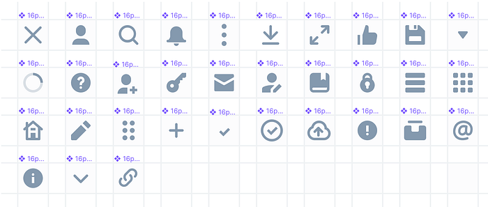
In our design system all our icons are wrapped inside a container. Specifically, 16px icons are inside a 24px container. There are two main reasons for this. First, it allows us to have full control over an icons vertical and horizontal alignment. Ever used a triangular icon and it doesn’t look quite aligned? Second, it forces us to respect the hit area our icon buttons when designing new interfaces.
This of course is creating problems with Auto Layout. Auto Layout doesn’t care about white space, it just cares about about the size of the elements inside the component. Admittedly this behaviour is what you’d expect, but it means it doesn’t play nice for those of you who adopt a similar system.
To resolve this we’d need to be able to set independent values for each padding setting. For now, we’re living with this slight offset in the hope it gets resolved quickly, because we believe our way of managing our icons is the correct way.
Nested components
This is where things can get complicated quickly.
As an aside, I found out just how quickly I can mess things up by assuming Shift+A acts as a toggle. It doesn’t. Repeatedly hitting Shift+A will just send you down an endless pit of Auto Layout hell.
The option menu and “Remove Auto Layout” is your friend here.
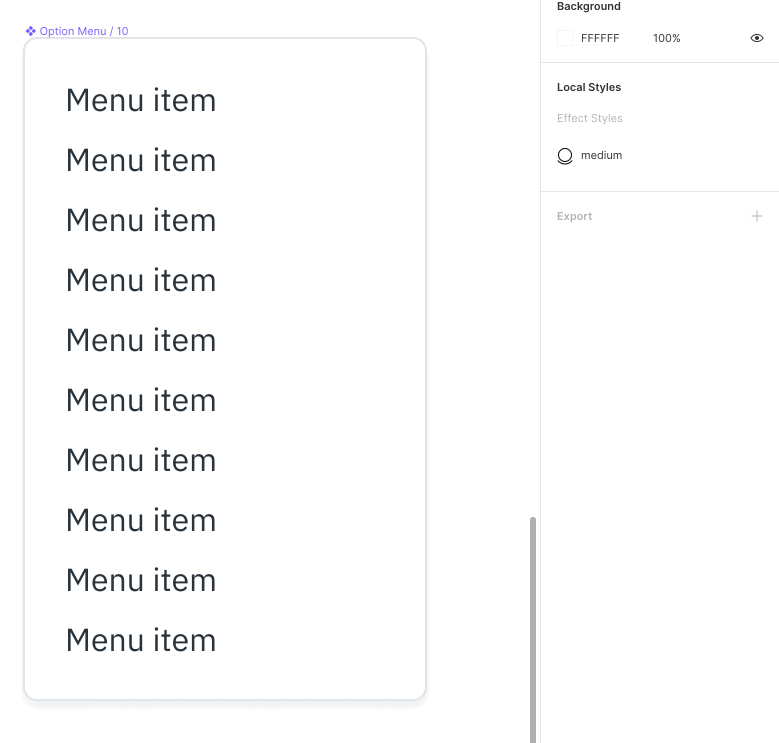
Anyway, nested components are where things start getting rather impressive. Let’s take a look at our dropdown menu component…
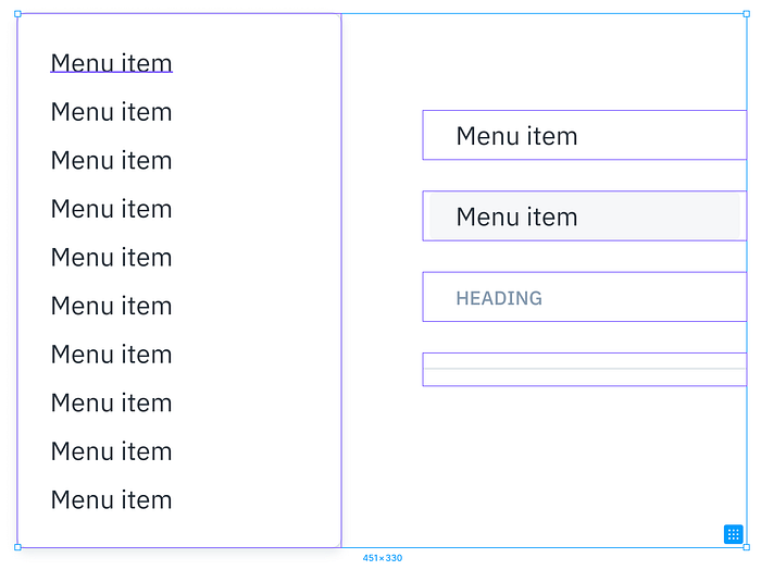
The master component is on the left, and contains [what we call] “modules” on the right. In the example above, the menu is just made up of menu items. The modules are mostly 30px in height, but the divider line is only 20px. In the past, this would have played havoc when swapping menu item instances with dividers, as nothing would resize to compensate.
Alas! No more…
In order for this magic to happen however, there was an important step that had to be done. Because the divider line is 20px as opposed to 30px in height, I had to enable Auto Layout on that component and set its top and bottom padding values. This is so the master component knows the padding values it has to use when the component gets swapped out, otherwise simply swapping a menu item instance with a divider would just force the divider to inherit the 30px height.
And because we have Auto Layout enabled on the master component, the container resizes itself accordingly.
On-the-fly overrides
With nested components and Auto Layout, you’d expect to be able to add elements and have it all organically grow/shrink wouldn’t you? Well, it can, but maybe not as seamlessly as you’re imagining.
Let’s take a look at another one of our components…

Again, the master component on the left is made up of instances of the module components on the right. 2x Completed, 1x Current, 1x Future with instances of the divider Line component in-between.
Let’s see what happens when I insert an instance of the master component, and try to add more modules…

Unfortunately, components and Auto Layout aren’t quite as intelligent as we might like them to be. I know, it’s a big ask for Figma to pull this off, but fingers crossed they do. For now though, the way to make your components super fluid is to detach them from master.
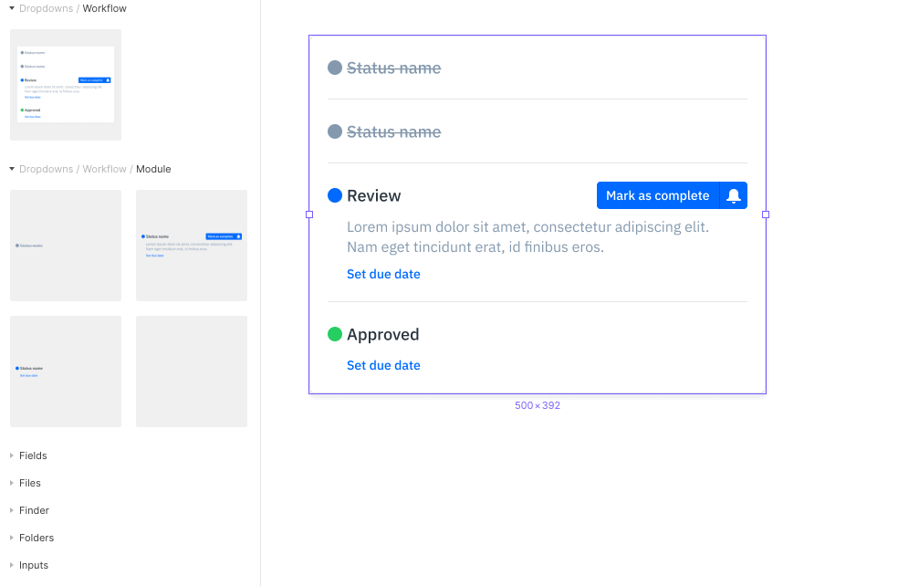
I admit, it does feel wrong.
Landing markers would be nice so I can see where my components will appear, but hey, this is lightyears ahead of where we were just a few days ago. Of course, each of these module components, as well as the master, each have Auto Layout enabled. It’s this nesting that allows for the entire component to resize organically based on its content, even when I change the text of the description layer.
Auto Layout is very much in its infancy, so I’m expecting lots of changes to its behaviour even in the days/weeks after writing this. For now though, this is all the thinking I’ve been able to conjure up since its release.
I know I’m only scratching the surface — I’m sure there are some crazy responsive layouts out there already putting mine to shame.
That said though, I hope at least a few of you found this article useful, and helps put an end to your head scratching. If you have any further insights to share, feel free to do so in the comments!


