5 tips to create a modern app UI

Recently I was given the task to “Modernize” my current companies app UI on Android. The terms modern, young, cool, etc., are all quite vague. What makes a design modern or old?
The meaning changes from person to person. But I couldn’t just say that and leave it 🤪. So I spent an entire day looking at various examples of apps that we commonly perceive as modern, young, and cool. Apps like Airbnb, Coinbase, Robinhood, Uber, Swiggy, Headspace, Cocoon, Eventbrite, Public, Wise, and Google pay. I used Mobbin to look at these apps, in case you all wondering if I downloaded each and every one of them 🤓.
Looking at all these apps, it became evident that not everyone adopted some fancy design style like Cred’s Neumorphism to look modern. The things that made them look modern were quite simple. So simple that I was able to put it into 5 short tips 😎.
1. Space Space Space
Be generous with your spacing. Line height, padding, margins, especially the horizontal margins. I’ve noticed innate fear designers have against adding extra space. Most time’s, the goal is to fit as much content as possible on the user’s viewport
More than 87% of India’s population own a device that is taller than 720px. Check out the data.
This means there is plenty of vertical space to add more space. If you think you need an 8px margin, try 12px. Start larger and reduce it if you feel it is too much.

2. Invisible headers
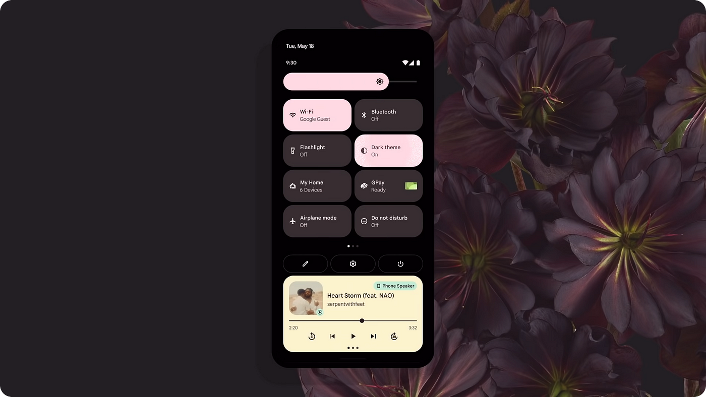
Solid headers are soo 2010’s. The quickest way to make your app look modern is to strip away those solid-colored headers (different from background color). Instead, headers can slide in only to provide context or quick actions once the user scrolls down the page. This automatically adds the much-needed white space into your design, making it feel more breathable and less cluttered.

3. Flaunt them curves
Rarely do we find objects in nature that have sharp corners. The world is made of rounded corners. Sharp corners hurt you. Sharp corners are to be avoided
— Steve Jobs
From an evolutionary standpoint, we have learned to perceive sharp objects as dangerous or aggressive and rounded objects as friendly or safe. This distinction aided our effort to survive. That innate survival instinct is still intact within us, even today.
Avoid sharp corners unless aggressive is what you are going for. A good example for using sharp edges would be action games.

On a side note, maybe our affection for rounded objects turned sharp-looking wolves into rounded goofballs we now know as man’s best friend, Dogs. #SelectiveBreeding
If we love our dogs rounded, why not interfaces too?
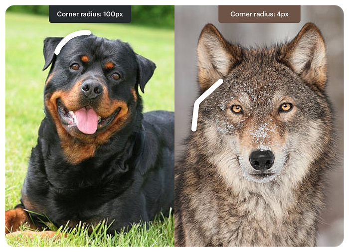
Update 7 Jun 2023: Another reason to avoid sharpe cornered edges is the fact that while using sharper edges our eyes tend to focus on the outside, decreasing eye precision.
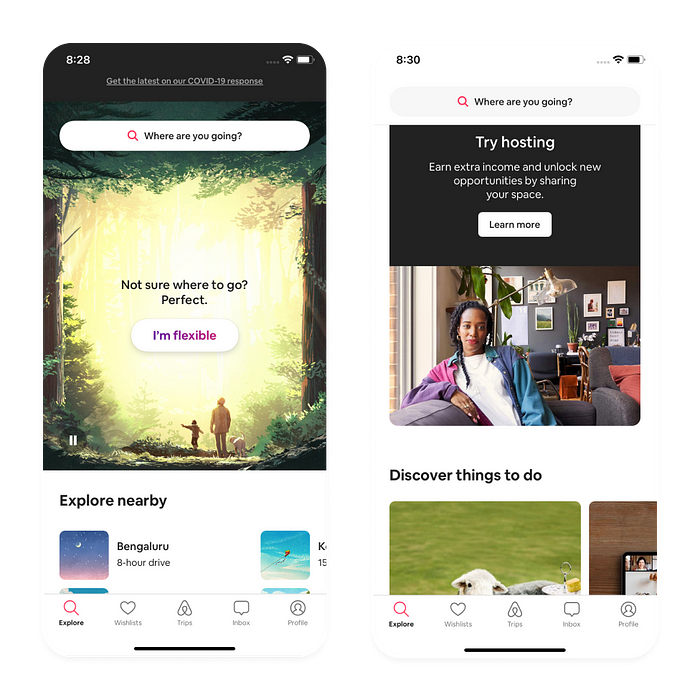
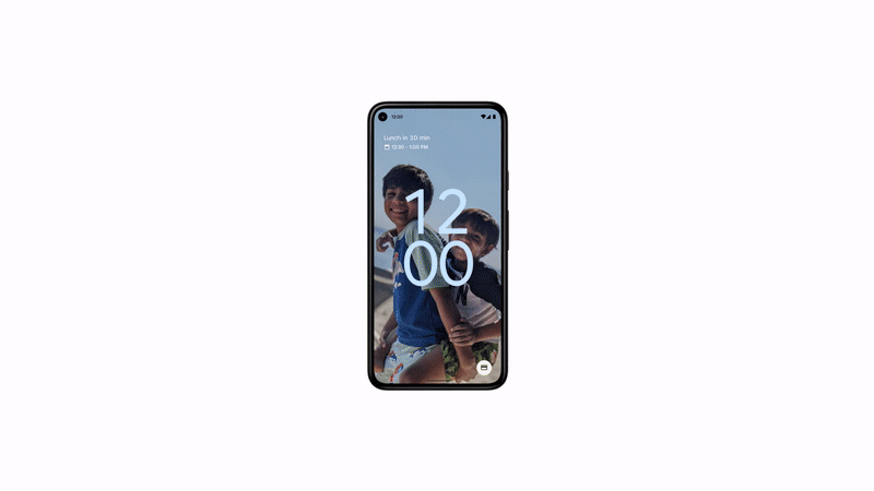
4. Use images
Humans are visual creatures. Images in UX design can be categorized into two, photographs and illustrations. If you think a message can be conveyed through an illustration, go ahead and do that. If you believe an image would help add more context, add it in. Try and break long scrolls of content with intervals of relevant images.
Research at 3M Corporation concluded that we process visuals 60,000 times faster than text.
5. Motion
Motion is something I am personally still learning about. But doesn’t it just feel soo good when using an app that just moves around soo smoothly?
To know more about designing for motions, Check out this article by
Issara Willenskomer.
The points mentioned above would immediately give you a considerably better-looking UI. But there are a lot of other factors like typography, colors, iconography, and shadows, which also play a significant role in how polished your end product looks. The only way to develop them is to develop your taste by looking at and re-creating designs from your favorite app.