QuickShop e-groceries — a UX case study
This was the first project we did at Ironhack. It was a team effort where we were asked to come up with an E-groceries App solution for our “client” ABC (a chain of grocery stores).
So as every UX project, we started with the research. First, we wanted to see what was already out there so we went on to check the competition. We downloaded a few apps to see how they worked and I did a SWOT analysis, where I highlighted the strengths, weaknesses, opportunities and threats of each one of them. It helped to ask questions like: What is working? What is not working? What features do they have that our users would expect? and what features are they missing?.
We ended up interviewing 8 people, some who already grocery shop online, and others who don’t do it yet but they’re interested. We also sent out a survey and got responses from over a 100 people.
Our main findings were that 76% of them want to be able to check their products in person, 70% want to be able to compare products and 50% would like to spend less time grocery shopping.
We sat down to synthesise all of this data. We decided to take 5 minutes to start getting keywords, quotes and ideas from all this information and do an affinity map, where without talking to each other we all started making groups out of the things we wrote down, and then gave names to this “categories”


This helped define our problem statement and gave us an idea of what our user wants and needs, so from this we also worked on our user persona.
Problem Statement:
Busy people who consider grocery shopping a chore, need to find a way to do their groceries faster because they prefer to use their minimal free time on other activities.

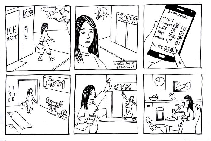
To find and illustrate Margarita’s pain points, and where is it that we want to help her, we created a storyboard and a user journey.

This shows how our user is leaving work late. She wants to work out but remembers she needs some groceries. She know is just a few basic things so she decides to go ahead and try to do a quick shop. She ends up walking around the whole store finding her items that are all spread out in different aisles, takes way longer than expected because she also likes to compare her products so she can choose what is better for her, and on top of that she has to wait in line to pay. After finally getting everything she has to cary all of her bags home, and by the time she arrives, is late and she is exhausted, so working out is not on her mind anymore.
We came up with a second storyboard that illustrates her situation again, but now she has our “hypothetical app” and the outcome is very different.

So these storyboards and user journey led us to pinpoint our user needs, and was our inspiration to start brainstorming. We all started coming up with features that might help Margarita solve her problems, and as this was a short project we did a feature prioritisation, where we chose the features that were most valuable to our user.


With our features clear, we started sketching our own ideas. We then one by one pitched each other our design and had the others critique it. By doing this we agreed on what we wanted to do and how and ended up merging our ideas. Of course this would later be tested and it would evolve.
Our paper prototype was actually an e-groceries store, where we had one feature that worked as a quick shop, where Margarita could have all her usual products saved and she could just directly add them to the cart and checkout. If she wanted to check new products and see more info about them, she could go to the regular store section with all the store’s products.
After testing, we found that is was unusual and not so intuitive for the users to have 2 different “types of store” within the same app. One regular online shop as all the others, and one quick shop that had the option to add to cart directly without having to go into the product’s page. So after testing with some people, we decided that “QuickShop” instead of being a feature, it should actually be the whole app.
This was a super intense and project where we learned a lot. It was the first time that we put into action everything that we learned the week before. We went back and fourth many times, and when something didn’t make sense to us, we weren’t afraid to stop and take a few steps back and even repeat some of the processes we had already done. At the end, we were super happy with our product, and most importantly, it felt useful and usable.


