Rainbow six siege main menu — a UX case study
Introduction
I have been gamer my whole life (and still am!) and I was always fascinated about the process of creation of them. As I grew older and got more experienced in the game industry, I found new fascination… UI and UX. The main reason is that UI plays huge role in games, so please bare with me, I will tell you why I think so.
Without UI and properly designed UX, player will be clueless. They will be lost and eventually frustrated with the product, UI should serve as natural extension of users actions. The main reason I see is that it serves as a gateway between reality and this new world ready for exploration. It pushes atmosphere and if done right, player will never even notice it! Because it is a part of the world that designer is trying to paint, player will never question it. If done wrong player will be frustrated and feel disconnected from the game or even quit your game/product.
You can apply this knowledge to any product outside of the game industry, because rules of engagement for UI are in my opinion same. You don’t want user to dwell too much on UI, you want them to be engaged as much as possible in your product/service in general.
This brings me towards this case study. Recently I was convinced by my friend to try play with him game called Rainbow Six Siege. It was fun, but for some unknown reason I felt disconnected from the game. I couldn’t fully immerse in it. Also during that time, I have been studying about UX, so I have decided to find what caused me this feeling, which led me to main menu structure. So I have decided to apply my new UX knowledge into practice.
Problem
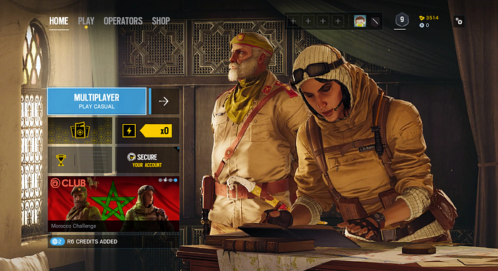
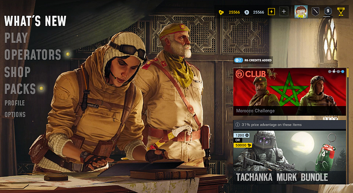
Main menu should be introduction of the atmosphere of the product for the player. For some reason (mentioned later in case study) I haven’t felt that this game has team based tactical shooter feel (from main menu look) as it should, it felt arcadish and random at the times (trying to appeal to everybody, good example would be main menu and play menu). Also navigation should be done with mind of the platform product is being published on. In case of Rainbow Six Siege, this game is published on PC and on Consoles as well. This makes UX and UI Design little bit complicated because designer have to keep in mind how console and PC players navigate. The result in current Rainbow Six Siege main menu design is that it is in between those two platforms, it tries to keep in mind console design but does bad job conveying console player navigation (as a console player since I was 6 years old, I can verify), user uses controller wildly with no sense of logical flow. Also for newcomers a lot of information on screen is confusing and not explained well.
Goal
I would like to achieve clearer look (get rid of useless clutter and duplicate information), change navigation so it has more in mind how console player’s navigation works without compensating PC players and changing atmosphere feeling of the main menu so it supports more the genre of the game. Also keeping human error factor in mind (basically how user will navigate if they select wrong by accident) and try to keep it at the minimum.
Design Process
I have decided to take elements from Lean UX Design, and little bit changing them in process but having still in mind that my design decisions were supported by user research and feedback gathered during tests (and just in general).
In nutshell:

Analysis
Get familiar with the project
To design successful iteration, I had to first understand current state of the product. I have spent several hours playing with mouse and keyboard then switching to Xbox One controller to compare general difference between these two. So I can find problematic areas on each platform and focus on them.
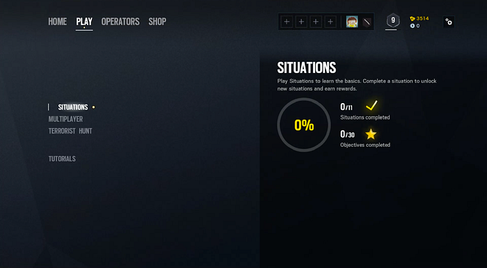
One of the issues I have found, is inconsistency in navigation between different screens, for example main menu and play section.
In play section user uses only Y-Axis navigation which is very comfortable for Console user, due to use of the only two navigation buttons on their D-Pad (which can be applied to the PC as well, by using 2 arrow keys). This navigation proves to be at the moment the best option to adapt for other navigational panels (it has the least human error factor and user uses minimum number of the keys/controls to navigate around).
User research
By playing the game I was able to collect my own experiences and issues with the main menu. Thanks to that, I was able to prepare and ask several questions to the other users throughout different phases of design iteration to be sure that I was designing for other voices other than mine.
So I have interviewed 10 users about their main menu experiences to gain their insight.
I have also divided users in to the two categories Experienced user (3+ hours of the game time) and Newcomer (30 minutes +-) and sub categories according to platform user preference.
Player then had to rate from 1 (worst) to 10 (best), list of the questions:
· Does main menu UI expel feeling of the tactical first person shooter game?
· Do you understand every element of the main menu (what each icon means etc.)?
· Do you find difficult to navigate in main menu?
· Do you feel notified well about new items you receive in game?
Data shows that there is a small difference (more negative) between PC and Console port of user navigation experience. Big surprise was for me the difference between experienced users and newcomers, data shows that there is quite huge learning curve that user has to go through to be satisfied.
Also I have tried to gather needs of each user category which in nutshell can be described here:


Define
With collected data and clear problematic areas, I had to do one more thing before moving to the prototyping phase.
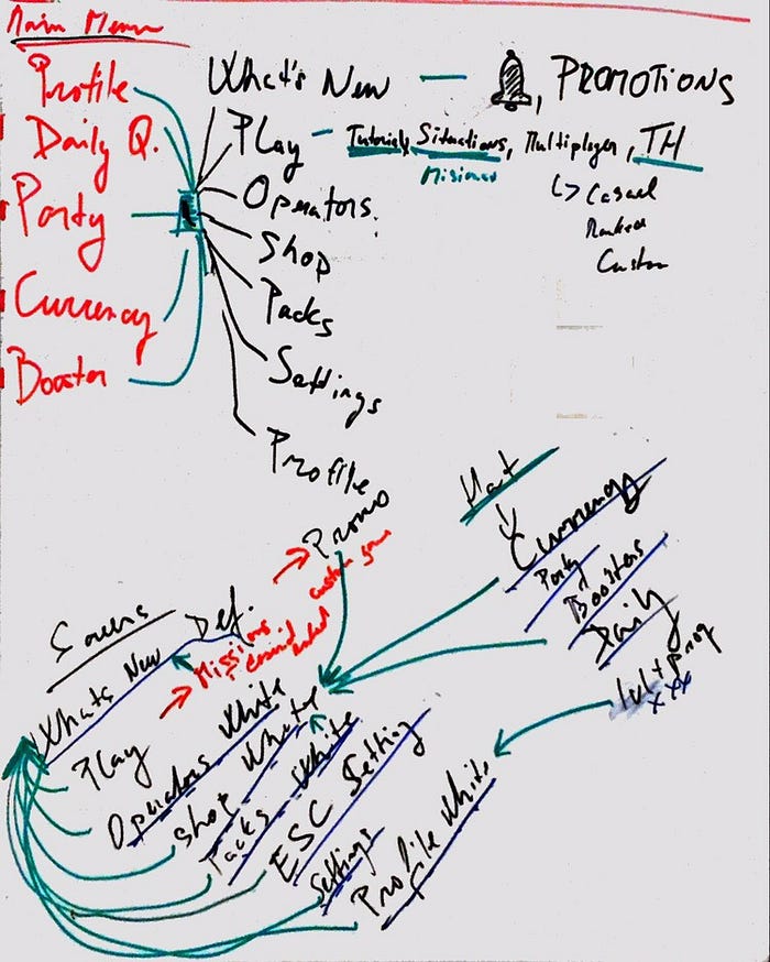
I had to understand fully the layout and placement of each element on the screen.
So I have created wireframe of the original menu which looks like this:

This helped me a lot because after that I could focus on each element of the layout presented above, trying to get rid of the useless information, combine elements that are similar or same into one whole element or group and also trying to prioritize each element/group from player/user importance perspective.
Priority
First I have started with prioritizing each wireframe element in to the groups (prioritization done by my own preference and users feedback that I gathered).
· VERY IMPORTANT FOR PLAYER
— (Red)
· IMPORTANT FOR PLAYER
— (Orange)
· USEFUL FOR PLAYER
— (Yellow highlight)
· IRELEVANT INFORMATION FOR PLAYER
— (Green)
· FORGATABLE (USELESS) FOR PLAYER
— (Blue)

Each category means this:
· Player/group information (Most frequently used)
— (Red)
· Shop, quick game, packs Reward systems (Frequently used)
— (Orange)
· Operators, dailies, boosters (Information places for the player)
— (Yellow highlight)
· Secure your account information, store promotion (Not relevant information for the regular)
— (Green)
· General information/notifications, home button, options (least used)
— (Blue)
This helps me to better understand flow, how user is engaging with each element and how I can clear or combine elements into the relevant groups.
Getting rid of clutter
With prioritization done I can move towards next step, which is trying to remove duplicate information. To do so I had to find duplicate or elements that are similar and combine them into one.

· Player/Profile/Group information
— (Orange)
· Play sections
— (Blue)
· Shop, boosters, packs (all connected with the shop)
— (Dark Blue)
· Operators and dailies (stuff that user is researching when they wait in queue)
— (Yellow Highlight)
· News sections
— (Purple)
· Options
— (Pink)
In ideal world by removing and combining elements the result should look like this:

I know that the result is not going to be like this in the end (due many other factors that are not included by just deleting/combining similar elements) but this is a nice point that I can try to strife for.
Prototype
By using the product for some time period, doing user research and tests, finding needs of the users and problematic areas, also deconstructing original design, I was confident enough to move into the prototyping phase.
Work process
I have started by creating diagram, which helped me to identify key elements, their priority and interaction between other elements. On the bottom part I have drew diagram for me to easily identify how many screen do I have to create and their interaction between other screens (basically pages), so I am able to create interactive Hi-Fi Mockup for the user testing purposes.
Main menu
I have divided designing main menu in to three parts:
· Main menu — navigation layout
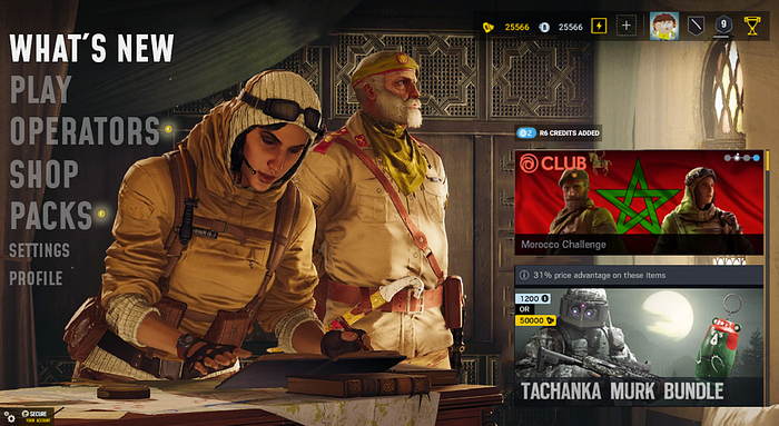
· What’s New- page
· Always present panel (currency, boosters, dailies, profile, group)
My designs went through several iterations but I have tried in each iteration to get rid of the useless elements (or combine more of them together) that are not needed.
This is one of the final interactions, but I haven’t been fully satisfied. I have ended up scaling font little bit down (I have done research on different similar tittles/products and compared fonts in main menus, from that small research I understood that I could save enough visibility and create more space between other elements by adjusting font size, so they can easily pop up), and deleting few elements that are already present in other element groups (for example options button in bottom left corner is present in “settings”-> “profile” section and “secure” pop up is moved towards notification screen).
So I have ended up with this main menu layout.
Main menu navigation layout
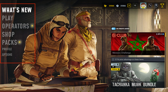
It consists of the main categories of the game that player navigates in. It is set up in prioritized order (by default player is always send in “What’s New” page -> after finishing match, starting game etc.). There is font size difference which creates contrast between two lesser important navigation elements.

Glowing dot symbolize new item in the category, which helps players quickly understand if they received (new feature/item available) any new item and can navigate fast towards it.
To navigate in this layout, player uses only Y-Axis buttons on Console controller or two arrow keys (alternatively keys like “W” and “S”) on PC (also navigation can be done via mouse cursor). This choice also minimizes human error factor (situations when user wrongly selects category). Compare with older setup which uses X & Y Axis, this is simplified navigation which provides similar result with least error human factor.
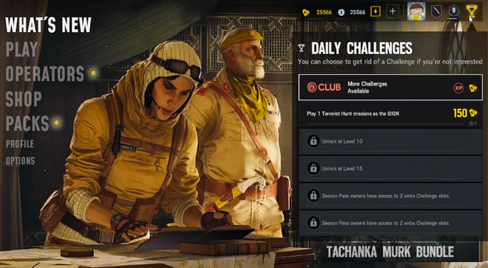
What’s New page
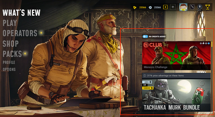
Specific place located for all news and promotions (special offers from the shop or info from devs.). By adding scrolling bar, developers can add X-Amount of the promotions without compensating view/feel of the screen.
It can be also by default dynamic and automatically cycle through different promotions.
Always present panel
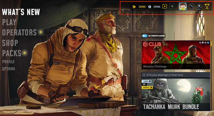
This panel is very important, because it is shown to the player in majority of scenarios. It was also critical for me to put there useful elements that player can use and see all the time.
Elements like…
· Gold currency
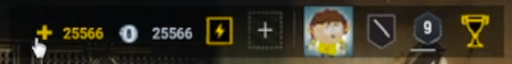
· Silver currency

· Boosters (deactivated/activated, buy new etc.)
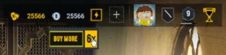

· Group list + info

· Profile info
· Rank/lvl
· Dailies
Flow
With designs done I wanted to set up simple interactive prototype so I can try to test it on myself first and then if I would be satisfied, I will do another user tests with new the Hi-Fi prototype.
I have never worked in any UX tool so I had to do research. I had to try several different tools like InVision and other, but in the end I chose UXPin (because I have very weak PC and UXPin doesn’t require much PC power).
Example of the play flow
Validate
In this section I am trying to get data from new Prototype on the same user groups and compare this data. Eventually, trying to evaluate them.
User test
So I have done same tests as before on same group of the users so I can easily compare data (then vs now). It was little bit tricky to get data from Console users due prototype is on PC but I was successful in changing controls to some extend so Console players could try to test new prototype with Xbox One controller.
Data comparison
This is the result of second user tests done on prototype I have provided.
If we compare new gathered data with previous tests done, we will get this results:

Again, to see more clear results of my research I have counted by how many % my prototype was better or worse then original layout in the game.

In general data shows huge improvements in Newcomers category especially for Console users.
Let’s delve into each question results in detail.
Question #1
Does main menu UI expel feeling of the tactical first person shooter game?
As I said before, biggest group that gained biggest improvements were Newcomers Console group. In general, we can see +30% improvements. The least improvement group which had 18% were Experienced PC users group. My theory is that because they played the game for so long they already know from the gameplay what kind of the atmosphere they can expect from playing the game.
Question #2
Do you understand every element of the main menu (what each icon means etc.)?
Again, like with all other questions and data collected, “Console Newcomers” group showed to have in general biggest improvements overall (up to +50%). Only group that showed negative progress were “PC Experienced” players (down to -13%). In my opinion, main reason for this number is that experienced players (especially users that are on PC) are so used to the current layout (after using product for so long) that any big UI change can at first lead to confusion and frustration, but also this group gets used to changes much more faster then other groups (talking from personal experience) and in the end this is good number to see and further long term tests needed with data comparison for better understanding how big of a positive impact my design had.
Question #3
Do you find difficult to navigate in main menu?
Results are pretty consistent like with all previous questions (spoiler alert, for like with all upcoming questions). First place takes “Console Newcomers” group with up to 40% improvements. What is interesting is that “Console Experienced” group had improvement only up to 5–10% and “PC Experienced” group down to -2,5%. This behavior can be explained with same hypothesis like in previous question data results for all experienced groups. Any change created for very experienced group can lead to frustration but this data from my own experience quickly changes to positive numbers, nonetheless to be 100% sure, additional tests has to be prepared over some extensive time period (for example 2 weeks).
Question #4
Do you feel notified well about new items you receive in game?
Data shows improvement rate up to 16% (average in all groups).
Conclusion
Overall I can say that there has been huge improvement spike. If I would now look at the goals that I set at the start of the project I can say with full confidence that I have completed all of them, nonethenless I would focus more on areas like each elements of the main menu (the least improvement rate area) and do A/B tests over some time period (1–2 weeks would be enough), and then do another round of data evaluation and iterations.
Final thoughts
I have learned a lot during this project. It is important to set clear goals at the start of your project and plan your work process ahead. During prototyping phase, I have learned that it is very easy to go more and more ambitions and do bigger changes and more game changing, which on itself shouldn’t be an issue but with bigger changes you have also bigger risk of failing and as later user tests data shows, any experienced user group doesn’t react to big change positively and you can risk to some extend loosing that group of users.
If I had more time I would also add additional highlight buttons for all elements, so users can easily understand which element is interactive and which not.
I hope this project was somehow interesting for you, if you want to get in touch or discuss my project in more detail please don’t hesitate and contact me via LinkedIn page.
https://www.linkedin.com/in/anatolij-dzjuba/
Thank you for your time.
-Anatolij Dzjuba

