Re-designing a mobile AR experience for athletes — a UX case study
A couple of months ago I was contacted by the Unreal Engine 4 experts over at Code-HQ to redesign Nchworm an augmented reality fitness and drill assistant. What a better opportunity to share the design process behind creating immersive AR experiences that are intuitive and super easy to use.
Before we go into the different design phases lets talk Augmented Reality. AR happens when we place virtual objects in real-world settings that users can interact with this can be done through a variety of types of AR devices in this particular case we will be discussing handheld devices such as smartphones and their best practices.
Background
Nchworm is an augmented reality sports performance app to accurately measure any distance, create drills, courts, fields, anywhere right from your mobile phone. Nchworm helps athletes get better at speed, agility, acceleration, and endurance. It also allows athletes to set up drills with accuracy.
Challange
Create an intuitive immersive experience for users interacting with virtual objects in realtime and exercising in open spaces while maintaining key features important to athletes such as time-tracking, workout tracking, and calorie tracking.
Phase 1: Discover
Athletes, sports teams and their coaches always look for ways to get better results and guarantee victory. New technologies are a great advantage for professional athletes to improve their techniques and estimate the pros and cons of the practice.
AR can become an indispensable tool that all athletes will handle to obtain real-time data on each hit, running distance, thrust, throw, jumps and more. With this information, athletes can correct their actions, change the technique and make the right decision.
AR Users Feedback
In the absence of user surveys, I took the initiative to study the various comments and views on existing users of the various store platforms to download applications from both Google Play and App Store, to identify the main pain points and challenges that users find in AR apps. The pain points that users exposed were:
- Poor use of the user interface design because it caused confusion on how to use certain features
- Poor reliability in measuring distances
- GPS and location issues and failures
- Problems to register for buttons that appear inactive
- Excellent performance for one type of device and for other devices app does not work
The most recurrent pain point in all reviewed apps was confusion when using the user interface. Users felt that more instructions were needed one even had to contact support to figure out how to an app. That being said extensive research was put into user interface legibility and readability in an effort to avoid these challenges AR users have experienced in other apps
The applications which user reviews were taken into consideration for this evaluation were Strava, Jefit, Nike Run Club, Argus, Houzz Home Decor (ar), TapMeasure — AR utility, AR Civilizations, AR Fitness
User Interface Legibility for outdoor or bright lights
According to research on legibility, several factors including contrast polarity have an impact on legibility. They summarize the effect of the color-related factors as ‘Color difference was found to play a minor role in legibility under daylight ambient conditions.’ Edward F. Kelley in a study on Display Daylight Ambient Contrast Measurement Methods and Daylight Readability found
daylight readability assumes negative contrast polarity will degrade readability.
This information lays a crucial role in the development of the user interface hence users will be using the app in varying lighting. This is why UI efforts will focus on contrast. The more contrast the more visible in varying light. Earthy, pastel and desaturated colors are to be avoided. The color palette will focus on bold, saturated, complementary colors to maximize contrast.
Readability and typefaces in AR
Although no conclusive research can prove if san serif or serif fonts are more legible between each other recent studies have proven many sans font are legible but not readable. Much of it has to do with the letter shapes themselves. Monotype and MIT AgeLab conducted a study that found that the style of a sans-serif typeface can affect how long a driver’s eyes fixate on a dashboard screen and off the road while driving. The study tested humanist and grotesque typeface styles against each other and found that humanist typefaces were significantly quicker and easier for drivers to read.
“There was a 12% difference in average glance time, which represents approximately 50 feet in the distance when traveling at U.S. highway speed.”
The research has shown that the glance time difference between the two sans-serif typeface styles is too great to ignore. Hence the preferred font for increased readability in order to enhance the overall user experience within an Augmented Reality app is a humanist sans font.
UX Audit — App testing

Since there is an existing app to test I like to conduct a UX audit. Where I create a document outlining a usability inspection and the recommendations from UX best practices. The existing design was not visually appealing and lacked the fundamentals of user experience design and user interface design for augmented experiences. There were many areas to improve from a visual standpoint as well as a usability point areas such as:
Realism
AR objects should engage with and reflect their environment. Using shadow planes, reflection, lighting, and textures help emphasize the objects in place making use of realism.
Depth
Identifying how far away a cone was difficult even though they included distance markers. In AR experience, it is best to create depth by properly using shadow planes, occlusion, and perspective. It would help to place larger objects closer to the user and smaller objects further away to define depth.
Content Manipulation
Just about all the controls in this app are buttons. Avoid on-screen control under all means in AR experiences. Content selection, scaling and rotation should all be done through gestures. Example multi-touch gestures:
Rotation — support both 1-finger and 2-finger gestures
Scaling — Pinch to scale
Not all was terrible focusing on usability the app did 2 aspects very well.
Movement
Nchworm encouraged movement which is a key element that is often overlooked when designing for AR the app clearly reminded users they can move around through guided steps. It also places objects cleverly encouraging them to move toward it.
Plane discovery
The app effectively shows users how to find a surface using their phones. It used illustrations to show users how to scan properly and gave instant feedback to show the surface was detected.
When designing for AR I like to check back at Google’s augmented reality design guidelines since its a very comprehensive guide for designing AR experiences.
Phase 2: Define
Sketching
I like to do a lot of sketching before I get into the wireframing stage. As you can see in the sketches below I do up to 4 versions of a screen. I also like to map out user journeys and add notes mainly because I always go back to my sketches when I am wireframing. I end up selecting one and at times I mix and match elements from one sketch with another sketch looking for my best ideas to put forth into the screens.


Wireframing
I am a huge fan of high fidelity wireframing, it helps me and stakeholders visualize what the final design will look like. So I try to wireframe as close to the final outcome as possible.

User flow mapping


Visual references
After all the research was done it was time to look for some design inspiration the first step was to create a bucket on Dribbble for Nchworm app where I added anything that inspired me, function-wise and visually after I had enough visual references (for me is about 10 or so shots) I moved on to creating a mood board on Invision using all the steps from this article here on mood boards for cohesive visual design.
Color Scheme

Typography
As mentioned in the research above the best fonts for increased readability in order to enhance the overall user experience within an Augmented Reality app is a humanist sans font. I chose Open Sans from google fonts and used it in different font weights.

Phase 3: develop
In this phase, I jump right into adding colors, and images. During this process, I try different styles and elements to find what works bests as you can see below I end up tweaking my designs in this phase they did not necessarily end up like the wireframes with some minor changes.
Design Variations

Version one felt too simple, version two was way too techy so I tried to bring a vibrant and a sporty feel to the design while also making emphasis on the AR object so it's clear for the user he will transition into AR mode when tapping on the cone.
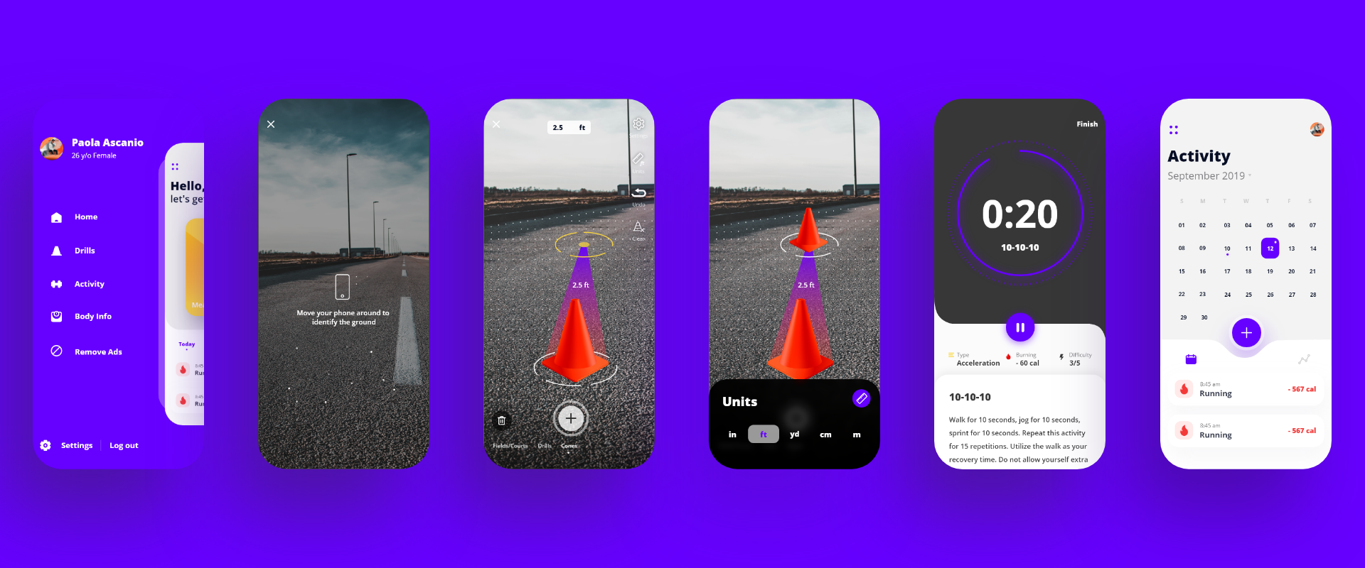
Final Designs


Conclusion
Designing for AR experiences is applying all your user experience knowledge, such as user research, competitive testing, UX audits, sketching, wireframing, and so on but for Augmented reality technologies and there are certain principles that must be met in order to ensure the best experience possible. Here are the official guides for designing AR experience on mobile devices


