Recovering a dormant obsession
A display typeface designed by looking back at a high school infatuation.

 One evening, during my first semester teaching Introduction to Typography, I had a brief side conversation with a student. He was a little older and had a little more experience than most, so he was well at ease asking a teacher question. He said something to the effect of “You Seem To Be Really Into Type” (not a direct quote, as I have no record of this) and then, as a casual tangent, asked me if I had ever designed a typeface myself. I had a “Heck No!” mental reaction, akin to what you might get when asked if you had ever climbed atop a volcano. Sure, it sounds like an amazing feat, but I am certain I lack the skill, training, and stamina. After a pause I chuckled and mumbled something about No, But Maybe Someday and went on about what was due on Monday.
But that comment had some staying power. In subsequent years, I added a type design component to the same class, vicariously assigning that same herculean task to students as an experiment. There is quite a lot to learn about type by attempting to design a display typeface, so this became one of my favorite projects to assign. Over time, though, the hypocrisy laid bare too crisply, and that student’s words kept rumbling back. Well, why not try designing one of these?
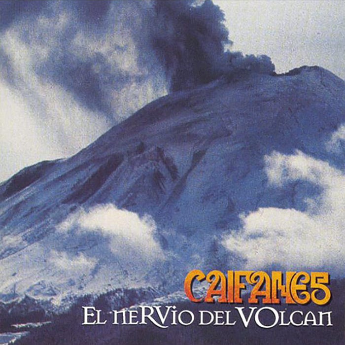
 Deep in some other brain well, I held the peculiar letterforms from Caifanes album covers — a Mexican band I idolized in high school. Sometime between that long-ago side comment and the spring of 2020 (not sure when exactly), I realized that if I were to attempt to design a typeface, it would be based on these characters.

In addition to being obsessed with Caifanes’ music, I spent a lot of time in high school staring at these letters, drawing them repeatedly, decorating my binder with them, doodling on the margins during lectures. Something about that S drew me in, and I found the uppercase A to be so memorable and beautiful. Of course, this was before I knew what typography was, long before I knew you could study letterforms and that their parts had names, long before I noticed that only one of the A’s had a slab serifs and the other didn’t, long before I even had the vocabulary to make that mental note. I doubt that my interest in letters began with these albums, but it was certainly fostered there, incubating in my headphones on my walks to school. It grew as I listened and listened and identified with the songs, subconsciously connecting bass lines with baselines.

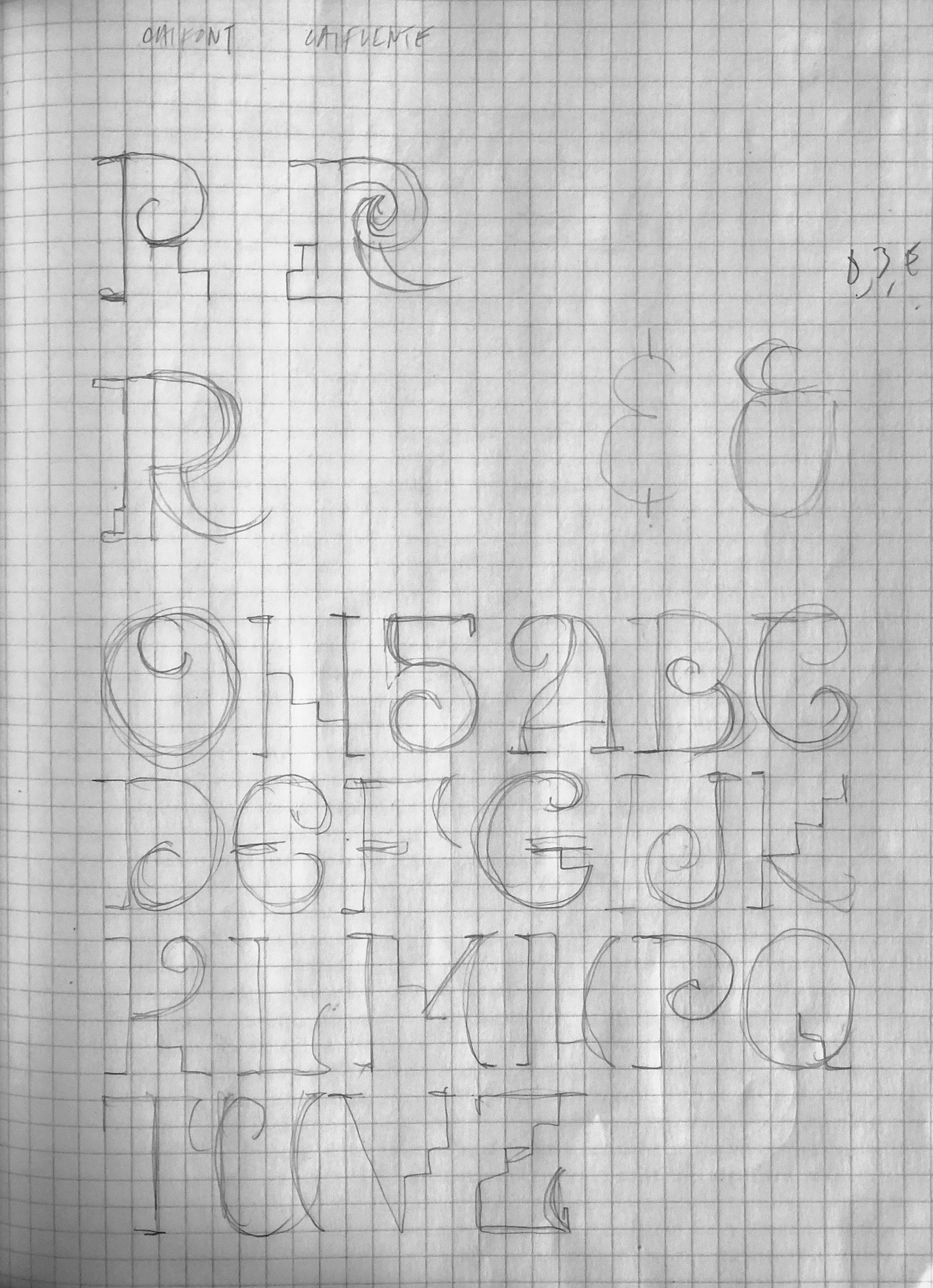


On March 2 of this year, the 36 days of type project started, and I took that as a final nudge to get this going. I began, of course, with that uppercase A. From the outset, I wanted to explore the typeface in a couple of different realms — in one, I stayed close to the original outlines and trimmed the contours; in another, I accentuated the stroke contrast. Lastly, I added a stencil on some studies that took even broader geometric liberties. Would the spirals taper or not? Would I keep the slabs? Would the quirky internal architecture of the original lettering hold up for legibility within an entire alphabet? Those are things I wanted to dig into as the project got off the ground.
Over time, the forms that were closer to the original began to lose their appeal, as it felt like an exercise in cleaning up vernacular type without adding anything else. A specter of pointlessness began to fall over those letters, particularly in the middle of the alphabet, where the task felt more like a production assignment, not a years-long What If project. I loved how the A and the B and the C turned out, and I continued drawing them to see what would happen once the R or the X or the Z came around, but I did so without the same interest.
Drawing tapering spirals also tested my patience a little too much, especially with the daily pace the project required. The high contrast version stayed around a little longer (in fact, it is still an intriguing idea to me and perhaps something I will revisit down the line). Still, by the end of the alphabet, I was most satisfied with stencil / geometric approach. I kept drawing high contrast versions until the end, but as the numerals started to count down, I knew the outcome would be a cleaned-up version of that stencil set.
Little rules emerged here & there. The original wordmark had no diagonals, so I stuck to that as much as possible, which made things like the N and the forward slash and the accents somewhat of a challenge, but I felt there had to be some idiosyncratic remnant to the alphabet to keep the spirit of the original letterforms. I had to sacrifice the original S as it just started to read like a 5 in most cases (I kept is as an alternate), and, though I’ve always loved the NE relationship, I removed the curved stem of the N to make it work better in the entire system.


As I feared on that long-ago sidebar with my student, there was only so much stamina I could bring. When the non-alphabetical glyphs came around, I could only muster the energy for the glyphs hidden behind the keyboard’s numerals. !@#$%^&*(). Someday the other glyphs might make it back, but this particular set felt like it needed to come to a close.
Part of why I love teaching type is that it is so ubiquitous that you fail to see it, but once you unearth the particulars, you realize there are dozens and dozens of decisions that need to be made. Where should the crossbars hit? Should the slab serifs always project horizontally from both sides of the stem? Are all circular segments sections of circles, or ovals, or supercircles? Should this zig-zag component appear only on the R and K, or somewhere else?
In Episode S2:06 of Netflix’s The Art of Design, Jonathan Hoefler walks us through Decimal’s design and alludes to this process, half science, half art, mostly rational decisions with a speck of Just Because.
 As the alphabet took shape, I showed it to a fellow designer, and one of the first things she said was that it looked good and that it felt “Mexican.” I had lost conscious access to this fact, as it had gotten buried in the mix of sounds and shapes playing in my head, but part of why I gravitated to the band in the first place was that the music itself felt “Mexican” to me, which was an important factor back then. My family had moved from Mexico to San Francisco in 1990 when I had just finished grade school. That‘s when their 2nd album, “El Diablito” came out, and this is when I first heard these songs. Admittedly, I did not like them at first — the lead singer’s voice takes a bit to get used to — but some seeds were sown. Their brilliant 2nd album, El Silencio, came out in 1992, which set the foundation of my infatuation. Then it culminated in 1994’s El Nervio del Volcán, a CD that I spun right into the ground from overplaying it.
At this juncture, I was still just four years removed from having finished 6th grade in Mexico and found myself in a new country, with a new language and new sounds blaring out everywhere, with no grounded identity in place. These songs reflected some of what I had been asked to leave behind; they beckoned, rippling through my bloodstream. Green Day and Cypress Hill dominated what my friends were listening to — and I loved that stuff, too — but those riffs felt foreign, distant. There was a particular inflection to Saúl Hernandez’ voice that felt right, as did the building guitar and keyboards of Sombras En Tiempos Perdidos, or the horns at the end of La Celula Que Explota. These sounded and felt very Mexican, like home, like bursting embers that allowed me to experience an adolescence I never actually lived through.
As most awkward high school kids do when obsessed with these things, I went through a pretty heavy “Caifanes T-Shirts Only” phase, finding these at concerts or flea markets and wearing them all the time. In particular, one promoted that 1994 album and pictured an Aztec warrior watching over a sleeping woman in front of a smokey background. A volcano sat far behind. Some of the albums’ lyrics referenced this volcano, so I looked into what it might mean.


The volcano pictured is a famous peak in the Mexican horizon, the mighty Popocatépetl, an active volcano that sits alongside a dormant one known as Iztaccíhuatl. The names come from an Aztec legend that depicts Iztaccíhuatl as a beautiful princess in love with a warrior named Popocatépetl. One day, she dies from grief, after being deliberately deceived and told that Popocatépetl had perished in a battle. When Popocatépetl returns to find his loved one dead, he kneels by her grave and vows to look after her sleep. As the centuries roll by, the gods cover them with snow and change them into mountains. Popocatépetl becomes an active volcano, occasionally bringing his fiery wrath in the form of eruptions into the city, grieving his loss. Iztaccíhuatl remains asleep, her back forever arched upward across the city’s landscape.
I thought about this story a lot back in high school, its epic sadness and beauty, its utter Mexicanness. I’m not sure I would have looked into this tale, or this aspect of the city I was born in if it wasn’t for that cover or that t-shirt I wore feverishly. It was mesmerizing, this notion of a dormant volcano, a Mexican Juliet of sorts, representing a deep feeling, a deep sense of devotion buried forever. What happens with emotions, with sounds, with the love of things, when left behind? Do they erupt violently? Or do they seep into the ground and slowly and interminably impact the lives that follow?
That story came to embed itself in the way I listened to these songs, the way I looked at my faded out T-shirt that had the same smoke bellowing out, the same deep blue cast leaving a trace, like a powerful image seeping through the thick fog of memory. That myth, the songs, the mist, and the letterforms soon became one single thrust and remained so for years. Attempting to create a typeface that felt “Mexican” was not my summer project’s goal, but it makes all the sense in the world in hindsight that this was the outcome. Some things go deep. Some things go right to the very core.
 After the 36days project ended, I walked away for a while, then came back and refined two weights, the regular/medium that was the focus of the posts, and a light version that emerged when doing the numerals. I named the two weights Caifan Lai and Caifan Jevi — deliberate misspellings of Light/Heavy that reference the backstory of the Caifanes name itself. The band’s name came from Pachuco slang for “Me Cae ‘Fine,” a term of endearment which, through the lens of time and its two intertwined tongues, basically translates to “cool dude.” In the future, I would love to add a bolder weight and bring back that stencil version that was a big part of the original study. Maybe later on, with another burst of fire and energy, I can tackle the lowercase characters. Maybe someday.
I know there are many blind spots in these letters. Not only in the glyphs I outright omitted, but there are some ratios and counterforms that an experienced type designer would find appalling and numerous things I am sure I can’t even see. But, as an exploration of a deeply buried notion, it feels like a decent outcome. Some songs are fine without a guitar solo; some are fine ending at 1.56.
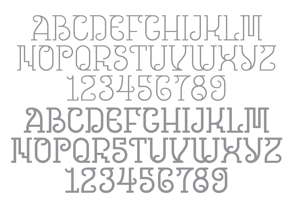
We all have musicians and bands and heroes that get us through high school. These are critically formative years, and the emotional responses built up through this stretch have a long reach; they remain emotionally resonant long afterward. As I wrapped up these letterforms, it became clear that this exercise wasn’t just about going on and on about my favorite band, or nerding out on letters, or reconnecting with a younger self. This was also about reaffirming my own identity, of further fusing these two selves back together — the Mexican and the Designer. These are by no means mutually exclusive, but these two sides have developed at different times and in different cities for me, and they sometimes need more common ground to share.
In 1996, Caifanes became Jaguares (I can’t get into that here, but in short, they’ve had a long history of internal feuds, including some about the name, although they recently returned to Caifanes and started playing again under that moniker). That first Jaguares album, which I got as I headed off to college, opened with a track featuring atmospheric, cave-like sounds while Saúl Hernandez spoke about returning to primal states, about finding balance. The spoken word segment ended with the lines: “No quiero perder el instinto / Que me guiará a recuperar / Nuestro estado original.” This loosely translates to: “I don’t want to lose the instinct / That will guide me to recover / Our original state.”
It is a great fortune to get a chance to reconnect with something that had been long abandoned — an adolescent sketch, a lost identity — only to find it breathing, ready to wake after being thought to be lost deep underground.


