Redesigning a non-profit website — a UX case study
Timeline: 2 Weeks • Materials: Sticky Notes, Pen, Paper, Figma
UX Techniques: Business Analysis, User Interviews, Surveys, Secondary Research, Competitive/Comparative Analysis, Affinity Mapping, User Flows, User Archetypes, Site Map, Sketching, Wireframing, Usability Testing
Background
Food Runners is a San Francisco based non-profit organization whose mission is to alleviate hunger in San Francisco and help prevent food waste. Since 1987, they’ve been collecting excess food from businesses such as restaurants and then delivering it directly to neighborhood programs.
The Problem
While Food Runners has successfully created a “food rescue chain” by connecting local businesses to food programs, our challenge was to explore different ways we could expand the current “food rescue” chain to include contributions on an individual level.
The primary business needs we defined were:
- Improve peoples’ understanding and awareness surrounding the impact of food waste
- Increase contributions on an individual level to Food Runners’ existing food rescue programs
The Solution
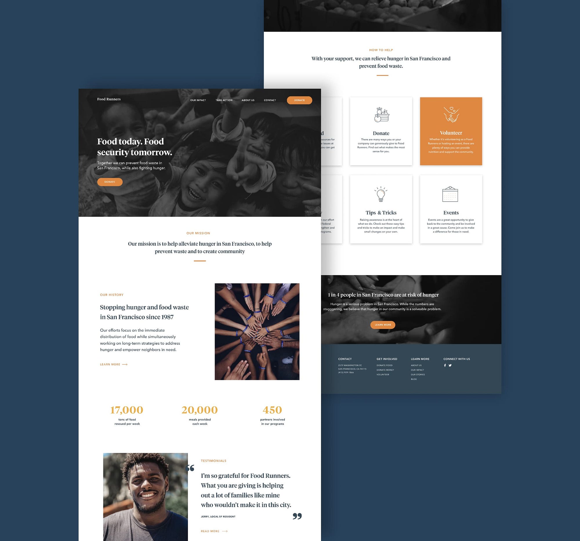
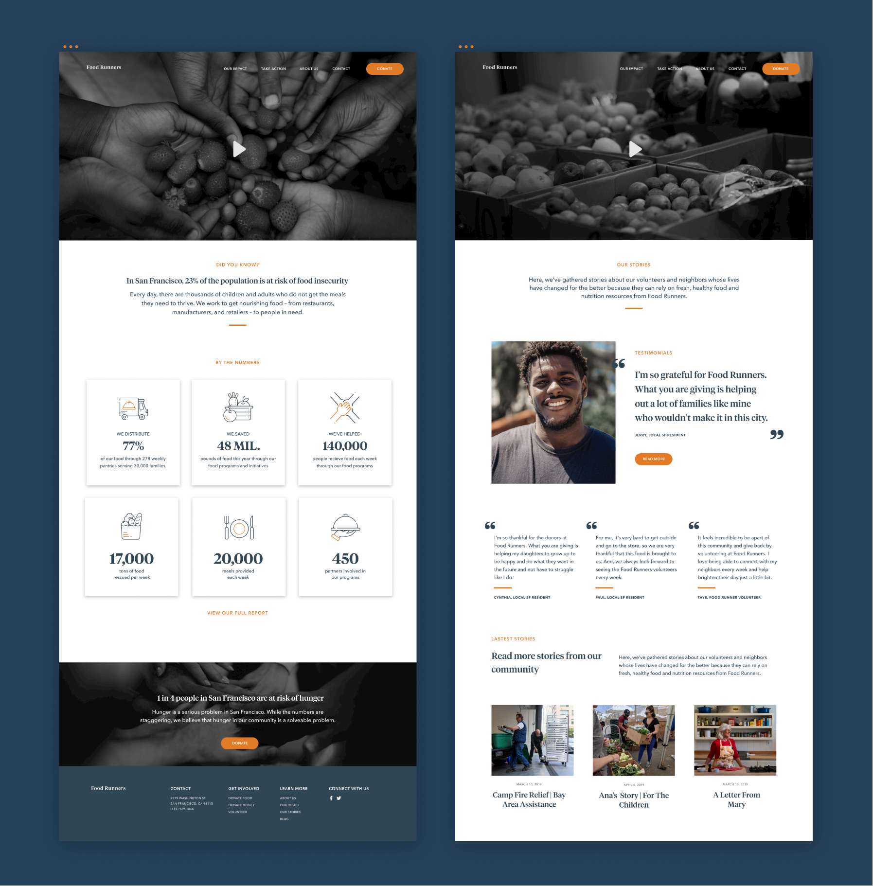
We re-designed the current Food Runners website to provide individuals with more meaningful information about food waste, Food Runners’ mission and programs, and easy ways to get involved. This would help establish trust and confidence in Food Runners, increase awareness, and ultimately empower individuals to get involved.

Research
User Research
To gain a better understanding of how we could more effectively address this problem, we conducted a series of user interviews and surveys. Questions we asked included:
- Tell us more about what social issues you care about and why?
- How do you access information about social issues you want to be involved in?
- What factors influence you the most when deciding which social issues/organizations you want to be involved with?
- What stops you from being more involved with organizations?
Uncovering the barriers to involvement
After surveying 20 participants and conducting 4 user interviews, we used affinity mapping to find common themes in the data we collected. As a result of this activity, we were able to discover several major trends that we needed to address in the next phase of our design process.
Some of the major pain points we identified included:
- People felt they didn’t have enough time, money, and educational resources to contribute
- People wanted to be more involved but were unsure where to start
- People felt like they couldn’t make a difference on an individual level
- People wanted to validate that organizations were trustworthy and aligned with their values

Secondary Research
To validate our findings, we conducted some secondary research focused specifically on why individuals don’t get involved in social issues and organizations. Extensive research on this issue was conducted by the Stanford Center for Longevity, which discussed the three main reasons why people don’t volunteer. While the reasons listed were consistent with our findings that lack of time, money and resources are the most common barriers to involvement, the article also revealed another important insight: most people don’t volunteer because they simply aren’t asked to.
The most common reason for not volunteering is lack of free time (about half of Americans cite this as the main reason)
Research Synthesis
User Archetypes
Based on the patterns identified in our affinity map and secondary research, we came up with a primary user archetypes:
The Outsider: Someone who is curious about preventing food waste, but is unsure where to start or how they can make an impact
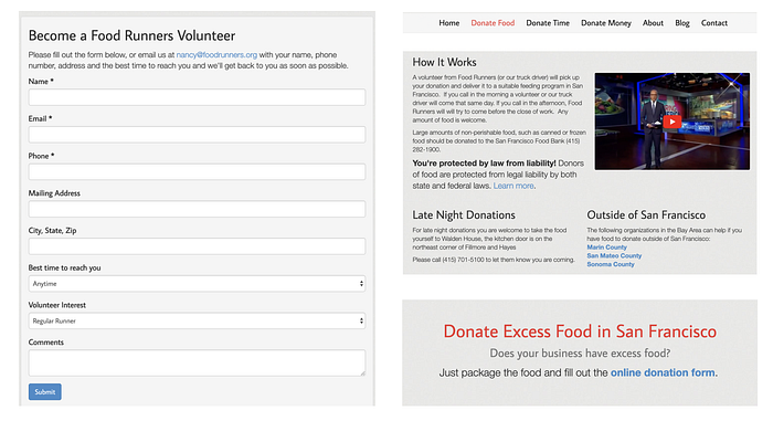
Current Site Analysis
We looked at the current Food Runners’ website to determine their existing areas of focus and what could be improved to address both business and user needs. We found that overall the website was more catered to businesses and organizations, instead of individuals.
So, it’s not surprising that we identified several issues that might discourage an individual from getting involved including:
- A lack of information and resources about the issues Food Runners is trying to tackle
- An inefficient food donation process
- Limited ways to volunteer
- A lack of evidence showing the impact that Food Runners has made and the impact you can have as an individual
User Journey Mapping
In order to visualize the current Food Runners website experience from the user’s perspective, we created a series of user journey maps. We wanted these to journey maps to illustrate potential scenarios where a user might interact with the Food Runners’ website including; The process of donating food and the process of deciding whether to get involved.


Competitor/Comparitive Analysis
To gain inspiration and identify best practices for our website redesign, we conducted a competitor analysis. We began by looking at the websites of several other non-profit organizations including Pencils of Promise, Save the Waves, and Project Open Hand.
One common feature we identified across these websites was the placement of the donate button in order to emphasize it as the main call to action. This was an important design pattern to consider in order to make it easier and more efficient for users to get involved and donate.
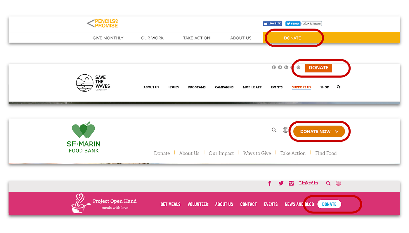
Another common design pattern we observed was that each non-profit prominently displayed their mission statement at the beginning of their homepage. This was an important method to effectively communicate each non-profit’s mission to the user and help them better understand what each organization does.
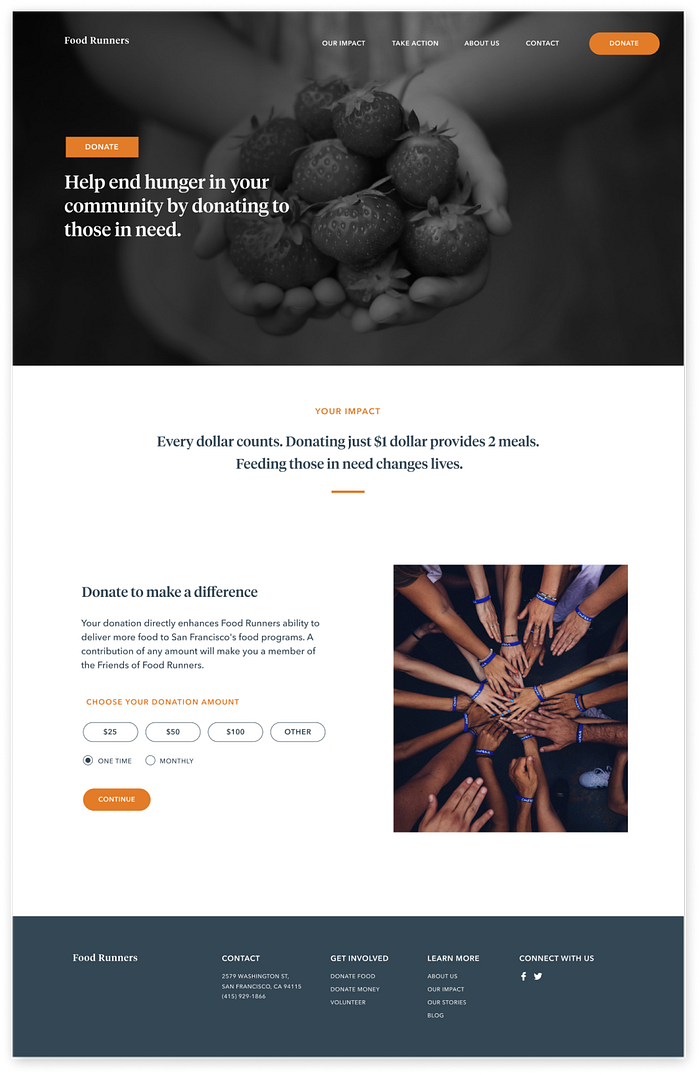
On the donate page, we noticed that many non-profits had pre-determined donation amounts in order to make the donation process easier and more efficient for users.


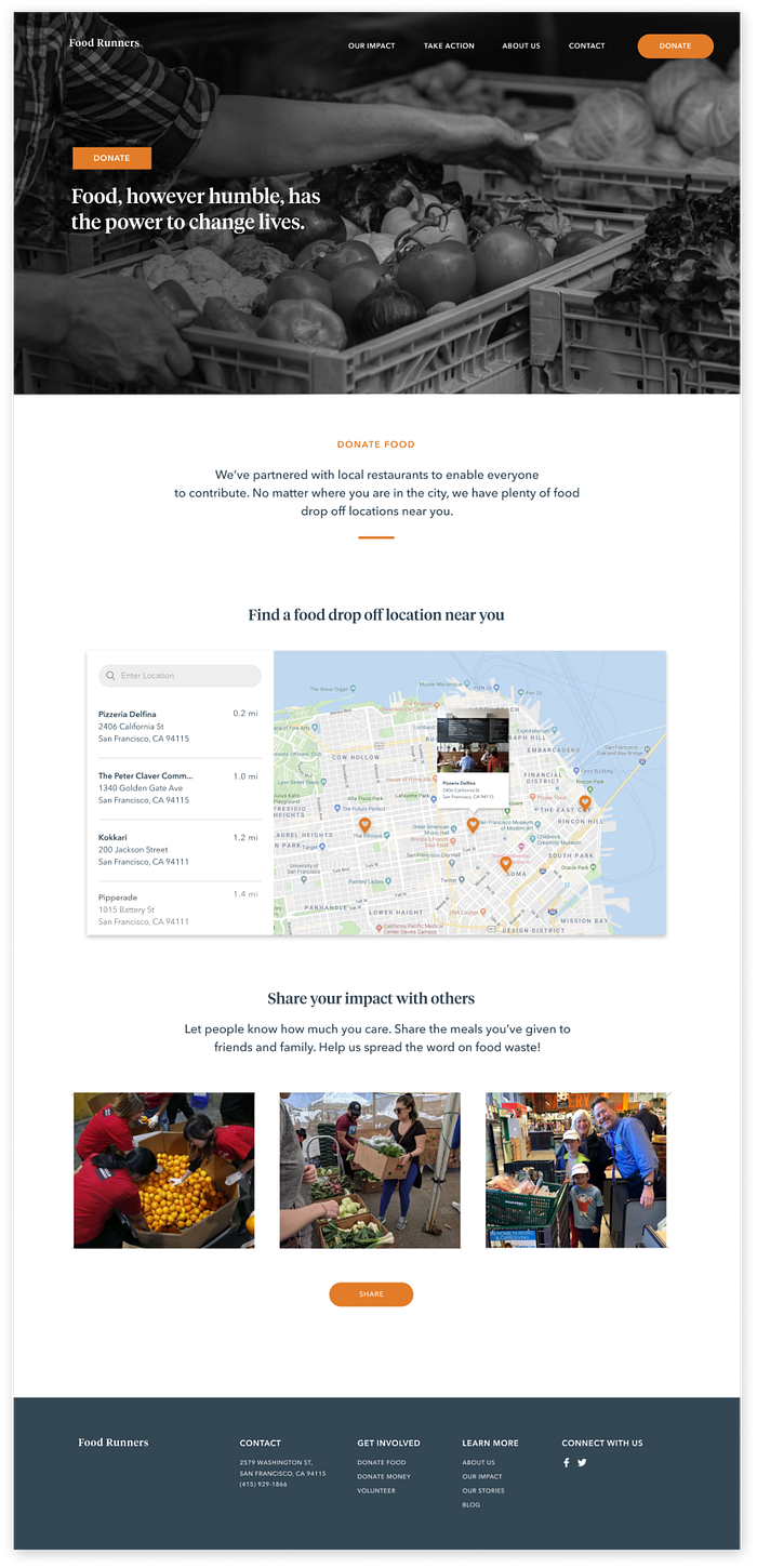
We also analyzed websites such as Air Bnb and Google Maps to observe how they presented information in a way that was easily accessible to users. The map feature with a summary pop up was an effective technique to give users quick and easy information while still being able to orient themselves based on location.

Initial Sketches
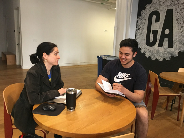
Once we organized all our research and defined our solution, we began to explore potential designs for the website. To start this process, we all took part in a design studio, which is a design practice to help translate our thoughts into tangible ideas and better visualize our problem. This allowed us to quickly explore several concepts for the website layout as illustrated by the quick sketches below. We then tested these with 3 participants to validate whether these solutions addressed both the user and business needs.
Wireframing
After we defined the core functionalities that we needed to include in our solution, we created quick, low-fidelity, wireframes. Using these wireframes, we were able to conduct usability testing with 4 participants. This allowed us to gather some crucial feedback to help us decide what to include in the final experience before jumping into the next iteration of our design.
Overall users had an easy time using the website, we just needed to address a few small issues with the navigation labeling and placement of the page titles. We completed a few rounds of iterations based on testing and feedback to ensure the wireframes included everything we needed. Once the functionality of our design was finalized, we moved on to designing the UI.

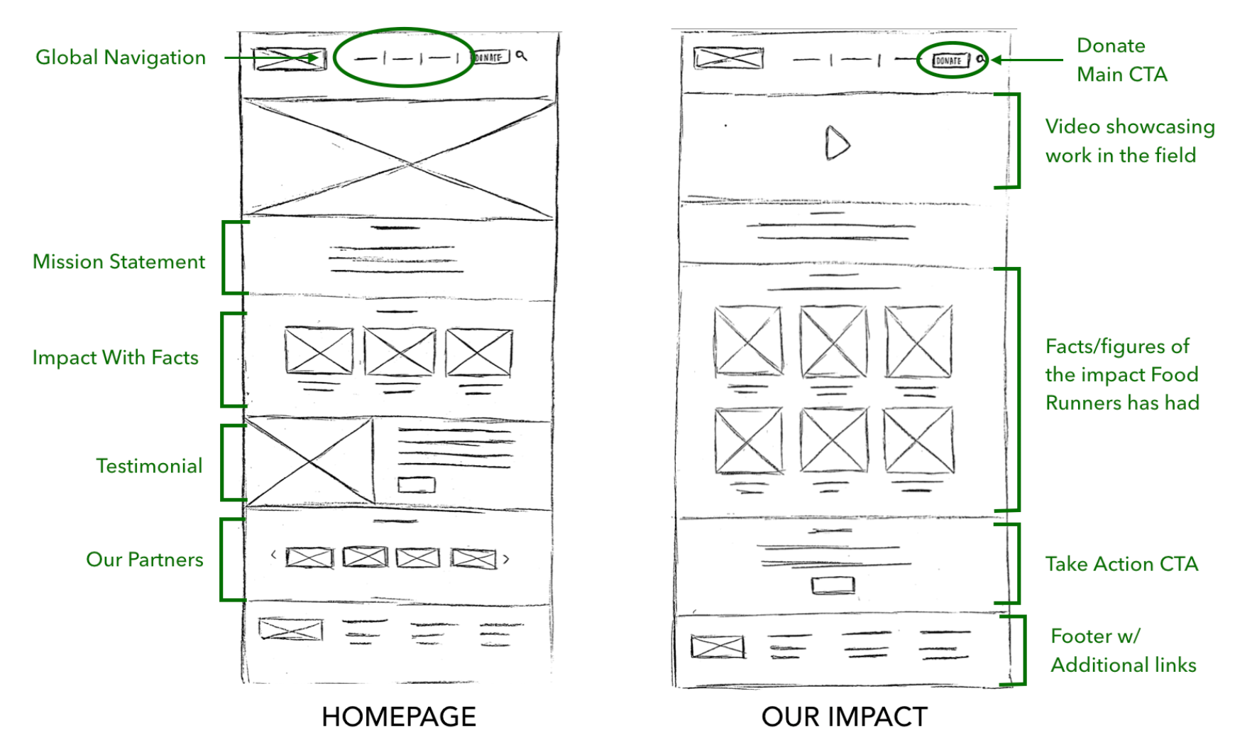
Design
Leading users to ways they can support the cause
In order to immediately catch the attention of our users, we designed a donate button as the main call to action, further highlighted by the orange color. By making the donate button easily visible, it would make it easier and more encouraging for users to contribute — bridging both the organization and user needs.
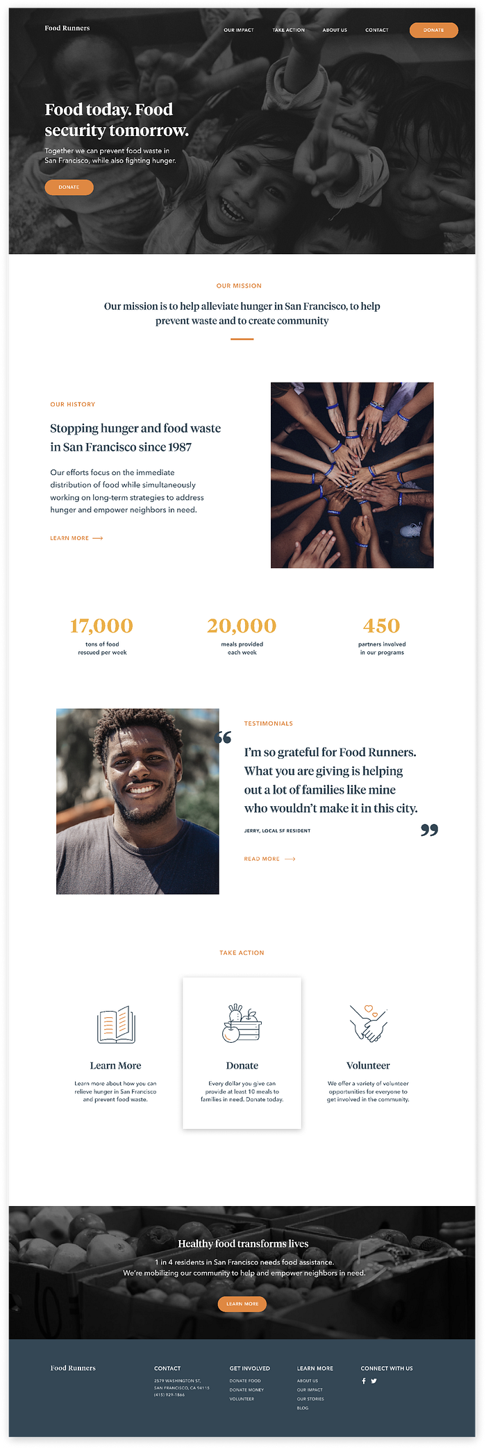
Easily accessible resources to empower and educate
In comparison to the current Food Runners’ website, we wanted to expand the focus beyond businesses and organizations to be more inclusive of individuals. In order to do so, it was important that we provided more meaningful and easily accessible information to users about the issues at hand.
One of the ways we accomplished this was by designing a “Take Action” page. Users could go could visit this page to inform themselves more about the food waste and hunger issues Food Runners is trying to tackle, as well as easy ways they can get involved to make an impact.
We also designed a blog where users could learn more about Food Runner events, stories, and other resources surrounding the issues of alleviating hunger and preventing food waste.

Establishing trust and confidence
We wanted to ensure that the user would feel confident and have trust in Food Runners so we made sure to incorporate this aspect into several different features throughout the website including:
- Prominently displayed mission statement on the homepage
- “About Us” page to give users a deeper understanding of Food Runners
- “Our Impact” page showcasing facts and statistics about the impact Food Runners has made in the community
- Established list of business partners involved in the “food rescue” program
- “Our Stories” page featuring personal testimonials from people impacted by or involved with Food Runners

Bringing new volunteer opportunities to the table
As it stands, there are only two ways individuals can volunteer: become a “regular” food runner or an “on call” food runner. In order to motivate more individuals to contribute their time, we incorporated additional and more clearly defined opportunities to volunteer such as working as an event planner or photographer.
To further expand volunteer opportunities to everyone, we designed a section where users could inquire with their unique skills in case it wasn’t mentioned above.

Delivering a more streamlined food donation process
It was important that we made the food donation process more simple and efficient since our research revealed that many people lack the time to get involved. To address this barrier, we designed a section where users can search for specific food drop off locations near them instead of having to call Food Runners to get this information. These locations would then be clearly displayed as clickable location pins on a map next to the search results.
Including Suggested Donation Amounts
We wanted to make the money donation process more simple for users that might not have a lot of time to get more involved, but still want to contribute. We redesigned the money donation page to include suggested amounts individuals could donate. Additionally, we made sure to provide a compelling and short reason why they should donate and the impact their donation would have.
Next Steps: Looking At The Bigger Picture
Moving forward with this project, I’d like to start looking at the bigger picture of how to get more individuals involved in Food Runners. This includes exploring different offline methods to raise awareness for Food Runners, and ultimately drive traffic to the Food Runners website. Possible ways this could be conducted include giving customers the opportunity to donate a meal when dining at a restaurant partner or providing more convenient food drop off locations for people who have excess food, but have limited time.
What I learned
This project was a monumental learning experience for me in so many ways. I feel like overall our team accomplished an incredible amount of work considering our relatively short timeline of 2 weeks. I personally learned a lot about the process, collaboration, and working with non-profits. I also learned quite a bit about myself.
I’d like to highlight two things I think will have the most impact on my ongoing career and creative process:
1. Collaboration is key
While I do have experience working within interdisciplinary teams and leading creative direction through past jobs, this was my first time working with fellow UX designers, which brought on its own set of challenges. I had to learn to be more aware and open to constructive critique, as well as learn how to adapt to other designers’ habits and methods. I believe this project has allowed me to develop new collaboration skills that will be helpful for other projects in the future.
2. The importance of research
Compared to previous projects, this project was a lot more research heavy. I saw this as an opportunity to strengthen my research skills and get more involved in the process of learning about our users and their needs. Some of the methods and situations which I encountered for the first time were eye-opening and will be helpful to use moving forward in my design career.