Redesigning a product page
What I learned as a designer and front end developer

For e-commerce sites, the product details page is the most crucial part of the website. Customers land here looking for things that make or break your sale, and they should be able to do so as easily and quickly as possible.
Easy Signs is a printing and manufacturing company that produces prints from signages to marketing materials like brochures and business cards. Products are made-to-order, with customizations varying from one item to another. The website is the lifeblood of the company as this is where all the orders come in.
The objectives
A redesign of the product page is one of the key projects from last year. Taking into account the business goals, customer feedback we’re getting from our customer service and sales teams and observing how users actually behave on our site (Smartlook is a nifty tool for this to see what people are doing), we wanted to focus on addressing the following:
A fresh look with improved user experience
- Present content better that is cohesive and in a way the elements are not shouting for attention
- Have our customers get price quotes quickly, and submit an order by themselves by using our online pricing calculator (instead of calling or chatting with us)


Integrate a design tool
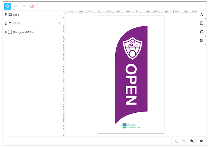
Some customers ask for help in designing what they would like to be printed (even if it’s as simple as a text on a colored background). We put in a design tool for some of our products so they can now design their own prints. This would mean a quicker turnaround time on the production of orders, and we want to assure our customers that it’s an easy process.
Highlight the quality of our products
The company takes pride in producing prints fast and of good quality at an affordable price. We already have verified testimonials (via Trustpilot) on the page, but we wanted to make them a bit more prominent at a glance.
Optimize code for better performance and maintenance
Re-assess on how to refactor the current codebase without breaking the rest of the website. (Eg. take out parts no longer used, and load only the parts necessary for each page.)
The redesign
With our north stars defined, we head on to the fun part — designing! I used the good ‘ol pen and paper, Sketch, and Invision to do this.
- To help reduce our customer service team’s workload (so people don’t have to ask for quotes anymore since they can do it on the website themselves), the online pricing calculator must be easily noticeable. We decided to have it visible at the top-of-fold for those browsing with medium to large screens (tablet, laptop, desktop PC, etc.). Most of our customers are browsing the site with those screen sizes.

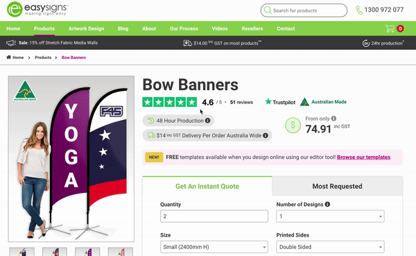
- Boost trust by presenting product highlights and features without overwhelming them. Adding verified product ratings and proof as a genuine product of Australia (for some products) guarantees that what we produce is of high-quality, on top of a quick turnaround and affordable price. This helps customers decide in confidence that they will be receiving an excellent and authentic product.
- Straightforward pricing should also be present on the page. This is even more important especially if you’re running Google Shopping ads for your site, as they require a single prominent price displayed.

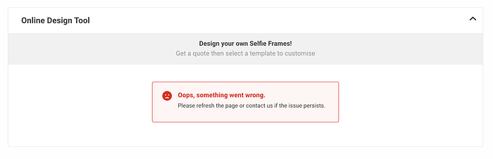
- Go for little UX improvements that make a great impact. Show a loading icon while a process is ongoing. Use subtle transitions for a less rigid user experience. Add personality to error messages with a visual (and hoping to reduce our users’ frustration when they encounter it).
- Some parts need not undergo a drastic redesign; they just need a minor facelift. Returning customers don’t like too much of a change especially if they’ve gotten used to the old layout or functionality.


- Consider the context of displaying content and loading functionality We want to let people know if the design tool is available for that product, but only show the design tool if people are on a device with screens that are large enough to do designing (ie. tablets).

What did I learn from all this?

- Plan with a timeline and estimates. Yes, doing product estimations for a web development project like this is hard. But you can make your estimates more realistic by breaking down the project into smaller tasks.

2. With so many information that varies depending on the product, it can be tempting to make all of them stand out so customers would easily spot them. However, doing this can be counterintuitive and the entire design would look rather disorienting. It was definitely a challenge to strike a balance between simplicity and adding graphical elements without overdoing it.
3. Map out different scenarios for user flow. This was especially challenging to products with the design tool available since there is a separate set of steps to go through when a customer goes this path. We must ensure that 1) the user experience is seamless, and 2) it is technically feasible to implement the design we wanted to achieve. I created a flowchart with Miro and worked closely with our back-end developer to make this a reality.
4. When in doubt, talk to someone — it can be a colleague, your boss, or someone whom you know may have an informed opinion about what you need to know. Better to seek clarification early than making it to almost the end of development only to find out you got the idea wrong. Consult with stakeholders as much as possible to make sure everyone is aligned with the project direction.
5. Consider the resources available when doing the design and turning it into reality. Fortunately, we already have the content for the products. I had to bear in mind how these are structured with the CMS we are using so I know how to fetch and display them.
6. You don’t have to throw away all that code when refactoring. It may be wiser (and faster to complete the project) to keep using an old JS library instead of writing your own component from scratch.
7. Launch it, then iterate! Items on the to-do list may not all be achieved. It helps to identify if a task is essential, or an enhancement that you can work on after the project goes live.
Here’s a demo of how a customer can use a design tool and order a product:
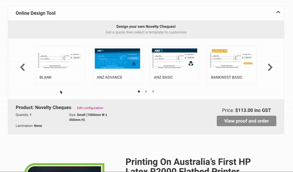
And here’s the new product page, with a product having the design tool:

There are still tons of work I’d like to improve on this (ie. accessibility). Hopefully in another post in the future.
Kudos to my back end partner Kharen and colleagues who supported us in this project 🎉
That’s it! Thank you for reading this far, I hope you learned a thing or two 🙂 If you have tips, experience, or questions on doing something similar, feel free to share!


