Redesigning DoorDash to create an improved digital food ordering experience
Founded in 2013 by a group of Stanford University students, DoorDash is a San Francisco-based technology company that connects people with a variety of participating restaurants in their neighbourhood. The company operates in more than 4,000 cities across the US, Canada, and Australia. Their mobile application offers pick up and delivery options, so you can either collect your order from the restaurant directly, or have it delivered to your home.
The Challenge
Most would agree that the coronavirus pandemic has seen some food delivery companies hike their prices and increase service fees. In April, I heard about DoorDash’s commission relief initiative aimed at cutting its commission fees by 50% to help local restaurants in Australia. I had never used the app before, so I downloaded it to see how it compared to other food delivery service apps.
The DoorDash app is certainly very popular, with more than 10 million downloads from the Google Play Store and close to 800,000 reviews. It was early in the morning when I first opened the app, and the first thing I noticed was that all of the restaurants on the Home screen were closed. I wondered how hungry breakfast-goers would easily find restaurants offering breakfast, since there was no option to filter by open restaurants.
Objectives
My first-time experience is what inspired me to attempt this redesign project. The overall objective of the redesign was to identify other problem areas and propose solutions to improve the overall app usability. I also pursued the project as an opportunity to showcase the problem-solving and creative thinking skills I acquired from Academy Xi’s User Experience Design Online course.
My Role
I managed all aspects of the project, from the initial user research and ideation, through to prototyping and user testing.
Note: I am not affiliated with DoorDash, or any other food delivery company, in any way.
The Approach
In this study, I applied the five stages of Design Thinking, according to Stanford d.school: Empathise, Define, Ideate, Prototype, and Test.
Stage 1 — Empathise
I began this project by learning more about DoorDash’s target market and identifying the company’s closest competitors.
Understanding the Target Audience
DoorDash’s mission statement is to “deliver good by connecting people and possibility”. The technology company strives to bring good to people by giving them time back in their day, and offering them a wide range of choices. In an interview with the Stanford Graduate School of Business, CEO Tony Xu described the company’s primary target audience as young families where both parents work full-time.¹
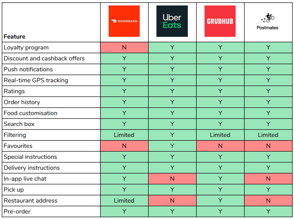
Comparison Matrix
The competitive analysis was carried out in the form of a feature comparison matrix. Here are the key findings:
- Unlike its competitors, DoorDash doesn’t have a rewards program
- DoorDash provides limited filtering options
- Uber Eats is the only food ordering platform with a Favourites feature
- Grubhub is the only service that allows you to see a restaurant’s address before an order is placed
Secondary Research
Following the analysis, and before diving into primary research, I conducted some desktop research to better understand how users feel about the DoorDash app. These are some of the most common pain points I identified:
Restaurant addresses aren’t displayed
Some users are annoyed that you can’t see a restaurant’s location until an order is placed. The address is only shown if the restaurant offers pick up.

Favourites feature is missing
A number of users expressed that they would like to be able to add restaurants to a favourites list so that they can easily revisit them later.

Lack of photos to represent menu items
Users are frustrated that some items on the menu are missing photos. While it is the Merchant's responsibility to upload their own photos, it is often said that people eat with their eyes first.

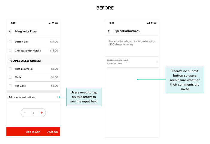
No option to make a special request
Even though the app has a “Special Instructions” field, users said that there was no space for them to include instructions or requests.

Limited filtering options
Users mentioned that they would like to see more filtering options, including the option to filter by distance and fastest delivery time.

Difficulty finding the cart
Some users had trouble finding the cart, as it doesn’t appear on every screen.

Primary Research
After my secondary research was complete, I surveyed 60 respondents about their usage and perception of food ordering platforms.
The majority of respondents were from Australia and the US, and aged between 25 and 34 years. Overall, 30% of respondents reported using food delivery apps once per week in the four weeks before the survey. While 20% said they had been using food delivery apps two to three times per week.
Participants were asked to comment on what they like most about their preferred food delivery apps. I used an affinity map to organise and sort responses into groups with common themes.
Here are some of the key insights:
- Convenience and ease of use are important to users
- Users want to be able to select from a large variety of restaurants
- Discounts and promotions are a key factor in deciding what app to use

By contrast, the top frustrations among delivery app users are the following:
- High service fees and pricing
- Inability to customise an order
- Some restaurants aren’t on certain apps
Respondents were also presented with a Likert scale (1 = not at all important to 5 = extremely important) and asked to rate the importance of certain features.
The survey revealed the following:
- Around 56% of respondents considered the checkout process to be extremely important
- Nearly 52% of respondents rated the search box and filters as extremely important
- The favourites functionality was rated moderately important by nearly 27% of respondents
- Interestingly, majority of respondents rated the in-app live chat as not at all important
Finally, those surveyed were asked the question, “Are there any key functionalities missing for you from food delivery apps?”
Some of their recommendations included:
- Random restaurant generator
- More pre-order options
- Loyalty card
- Save functionality
- Restaurant suggestions based on history
The responses to this question revealed that respondents greatly value personalisation and customisation.
Stage 2 — Define
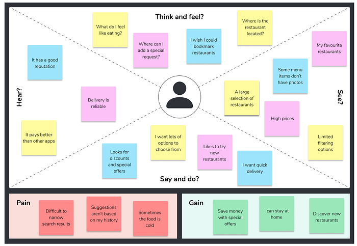
Empathy Mapping
Following my research, I created an empathy map to put myself in the shoes of a food delivery app user, and gain insight into their behaviour and feelings.
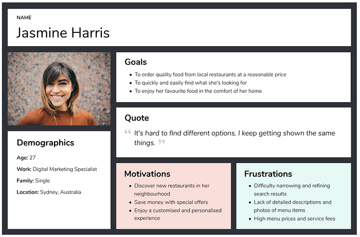
User Persona — Meet ‘Jasmine’
The insights I uncovered from both my primary and secondary research allowed me to create a user persona, ‘Jasmine’, on which to base my redesign decisions.
User Flow
After discovering more about the typical food delivery app user, I put together a user flow to visualise their steps and thought process.

Stage 3 — Ideate
How Might We (HMW)
After crafting my user flow, I devised a number of HMW questions to help with the ideation phase:
- How might we improve search and filtering to make it easier for users to find what they’re looking for?
- How might we allow users to see the precise location of a restaurant?
- How might we create a more personalised experience for users?
- How might we make the checkout experience even more seamless?
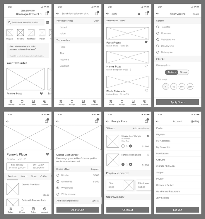
Wireframes
Using the HMW questions I came up with to help me address the redesign challenge, I sketched initial designs on paper and used Figma to create mid-fidelity wireframes.
Phase 4 — Prototype
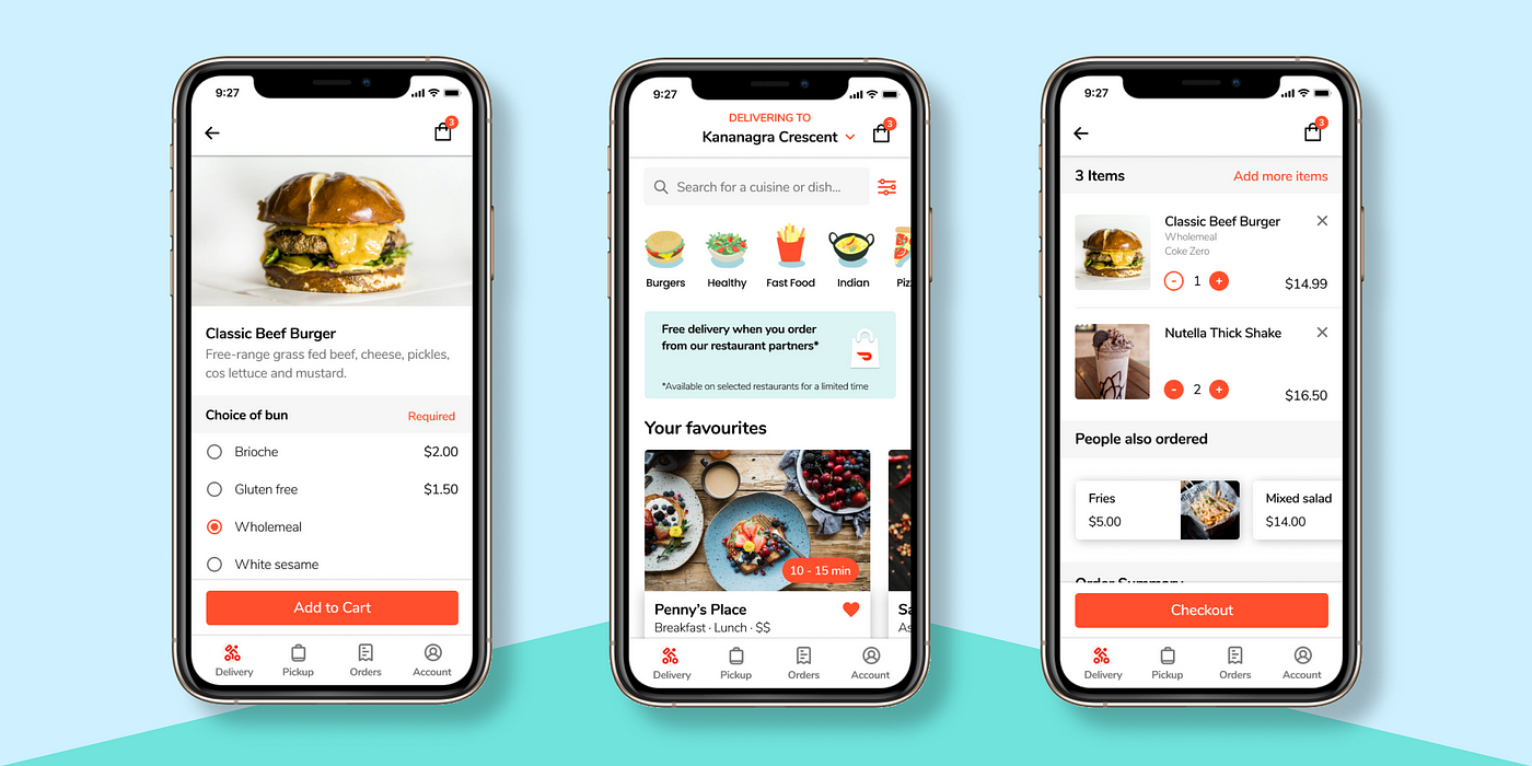
Experience 1 — Search
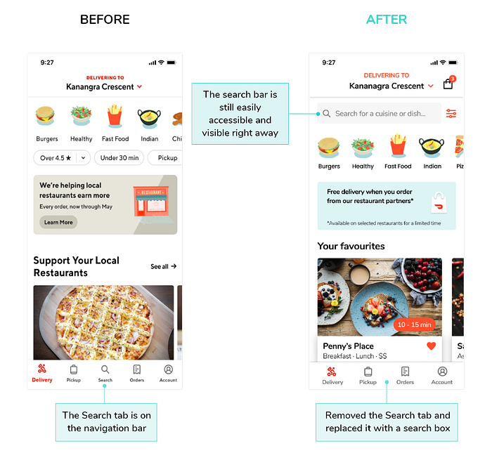
Search Tab
Currently, the Search tab is on the navigation bar. To make it even more discoverable and easily accessible, I decided to remove the tab and place a search box at the top of the Home screen instead. Since the ultimate goal of using a food delivery app is to find something to eat, including a search box on this screen seemed like the right decision.
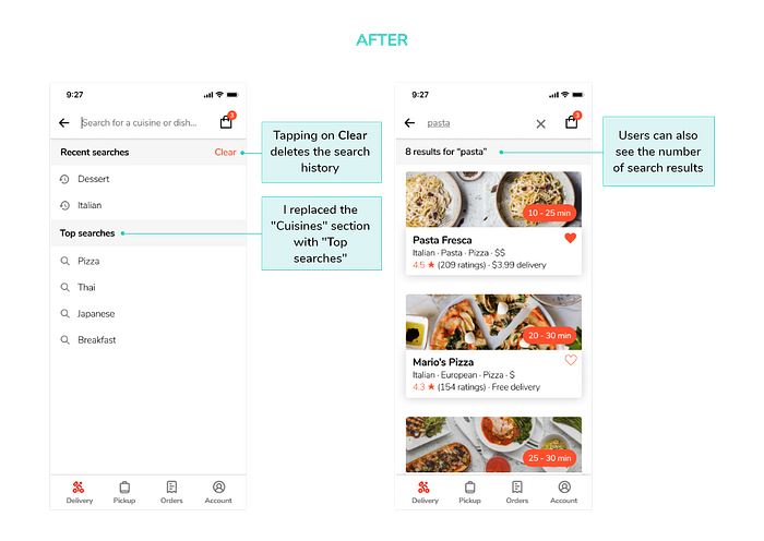
Search Screen
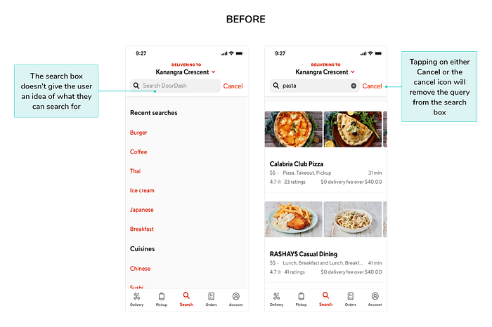
When users tap the Search tab, a new screen opens with a search box, along with recent searches and a list of cuisine types. The search box, however, doesn’t make it clear what users can search for. This led me to include a sample search query in the input field so that users know what type of queries can be used. I also decided to replace the “Cuisines” section with “Top searches” to provide inspiration and ideas.
To cancel a search query, users can either tap “Cancel” or the cancel icon in the search box. Since both features perform the same action, this might cause some confusion. I made the decision to remove it and added a “Clear” button instead, which deletes the user’s entire search history. I also felt it was important to indicate the number of search results returned so that users have an idea of how long it might take to filter through them.
Experience 2 — Filtering
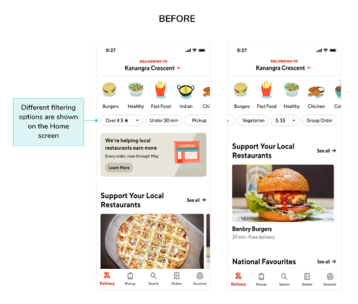
The DoorDash app has six filtering options that are displayed vertically along the top of the Home screen. The options include the following:
- Rating
- Under 30 min
- Pickup
- Vegetarian
- Menu price
- Group order
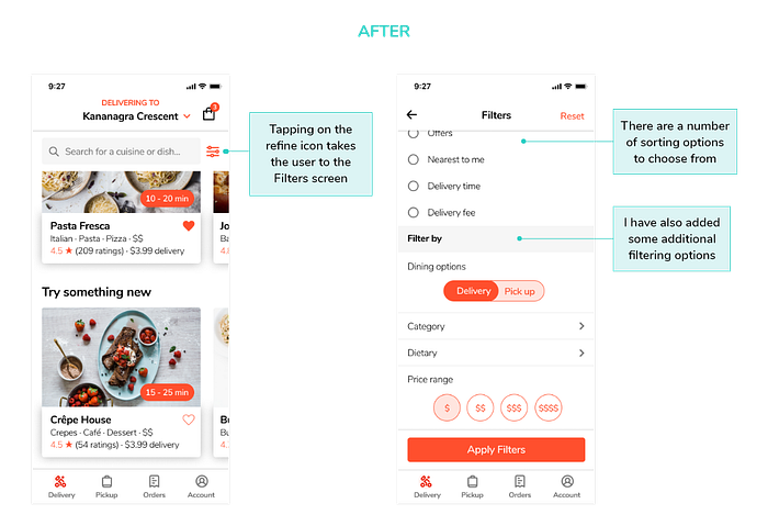
To help users narrow research results and find what they’re looking for as quickly as possible, I placed a refine icon to the right of the search box. Tapping the icon opens a new screen with a range of sort and filter options.
The additional options include:
- Top rated: Top rated restaurants nearby
- Open now: Restaurants that are currently accepting orders
- Offers: Restaurants that have a promotion (e.g. free delivery)
- Nearest to me: Restaurants that are close to the user’s location
- Delivery fee: Ordered by cheapest
On the other hand, new filters include filtering by category or dietary needs.
Experience 3 — Restaurant address
Users mentioned that they would like to be able to see a restaurant’s address before they place an order. While tapping on “Pickup” will reveal the address, for restaurants that don’t offer pick up, there is no address listed. What’s more, users might not know that tapping on the address highlighted in red will open the location in their default map app.
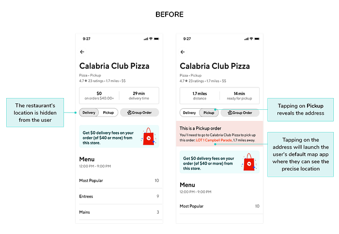
To address this pain point, an “Open Map” functionality has been added. When the user taps on the hyperlink, their default map app will launch where they’ll be able to see the restaurant’s address.

Experience 4 — Personalisation
Order History
According to a study carried out by Accenture in 2016, 65% of consumers are more likely to purchase from a retailer that knows their purchase history.² At present, users need to tap on the Orders tab to view their past orders. To emphasise a user’s order history, I have included a section titled “Recently ordered from” on the Home screen.
Favourites
Giving users the option to add restaurants to a Favourites list helps them spend less time searching, and is a convenient way for them to create a list of restaurants to try as they discover new ones. Users can favourite a restaurant by simply tapping the heart icon. They can view and manage their list by going to the Account screen, and accessing “My Favourites”.

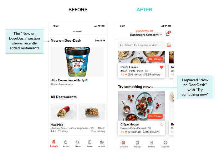
Now on DoorDash
On the Home screen there is a section called “Now on DoorDash” which allows the user to see Merchants that are new on the app. To encourage the user to want to see or discover more, I decided to rename the heading to “Try something new”. The aim is to enhance the user’s experience, by inspiring them to discover restaurants that they may not have known about.
Special Instructions
Users either missed or didn’t know how to specify a special request. In an attempt to resolve this pain point, I made the decision to include the comment field on the same screen to remove the need to switch to another screen.

Experience 5 — Checkout
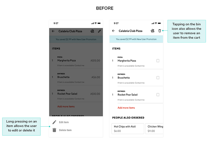
Shopping Cart
There are two ways to edit the cart:
- Tapping the pencil icon on the top right gives the user the option to remove an item.
- Long pressing on an item reveals both an edit and a delete option.
In my opinion, the long press functionality isn’t very user friendly, as the user has to learn that it exists on their own. To make it easy for users to remove an item from their cart, I have added a cancel button next to each item. Users can also easily change the quantity of an item by tapping the minus and plus buttons. This saves them time, as they don’t need to revisit the menu.
Lastly, to increase the discoverability of the cart, I added a shopping bag icon to the top right corner.

Stage 5 — Test
To validate my proposed solutions, I asked three users to perform the following set of tasks using the prototype:
- Add “Crêpe House” to your Favourites list.
- Locate the shopping cart.
- Find the “Special Instructions” box to add a custom request.
- Erase your search history.
- Open “Penny’s Place” in Google Maps.
Surprisingly, all users managed to successfully complete four out of the five tasks. Two users had some difficulty with the final task, as they weren’t quite sure what to tap on to see the address. I took their comments into consideration and changed “Open map” to “See Map”. I decided not to remove the underline, so that the hyperlink is clearly distinguishable.
Check out my fully-interactive prototype here!
Reflections
Overall, I’m really pleased with how my first UX case study turned out. In particular, I learned how important it is to consider the user in every stage of the design process. I think I underestimated the amount of time it would take to finish the project, so next time I’ll need to set realistic deadlines. I also would have liked to have conducted more usability tests to see where additional improvements could be made, however, the pandemic made it challenging.
Thanks for taking the time to read my case study! If you have any feedback or would like to get in touch, please connect with me on LinkedIn. 😊
I’m looking for more projects to add to my portfolio, so please feel free to contact me if you’d like to collaborate!
References
¹E. Ekiel, ‘DoorDash CEO: Solving Problems of Time-Starved People’, Stanford Graduate School of Business, [website], November 30, 2015, https://www.gsb.stanford.edu/insights/doordash-ceo-solving-problems-time-starved-people, (accessed 20 April 2020).
²Accenture, ‘Personalization Pulse Check’, Accenture Interactive, 2016, https://www.accenture.com/_acnmedia/PDF-37/Accenture-Personalization-Pulse-Check-Infographic.pdf, (accessed 7 May 2020).

