EXPERIENCE DESIGN
Redesigning iMessage for better user experience — a UX case study
Introducing usability to the art of communication.

 Communication is a vital part of our everyday lives. We almost don’t even have to think about it. With social media and our devices as prime tools, we’re constantly finding new ways to stay connected. Instant messaging — a quality example. Today; despite the rise of social distancing, we get to share our thoughts, ideas, and information all across the world. Within split seconds.
On this project I improve the user experience of Apple’s official messaging app — iMessage, with the central focus on restoring usability. My design offers potential solutions in the form of minor adjustments to the look, feel, and functionality of the app. With these improvements, I achieved a communication tool that is usable, accessible, and efficient; meeting users needs for rich interaction.
Understanding the Problem
The Challenge
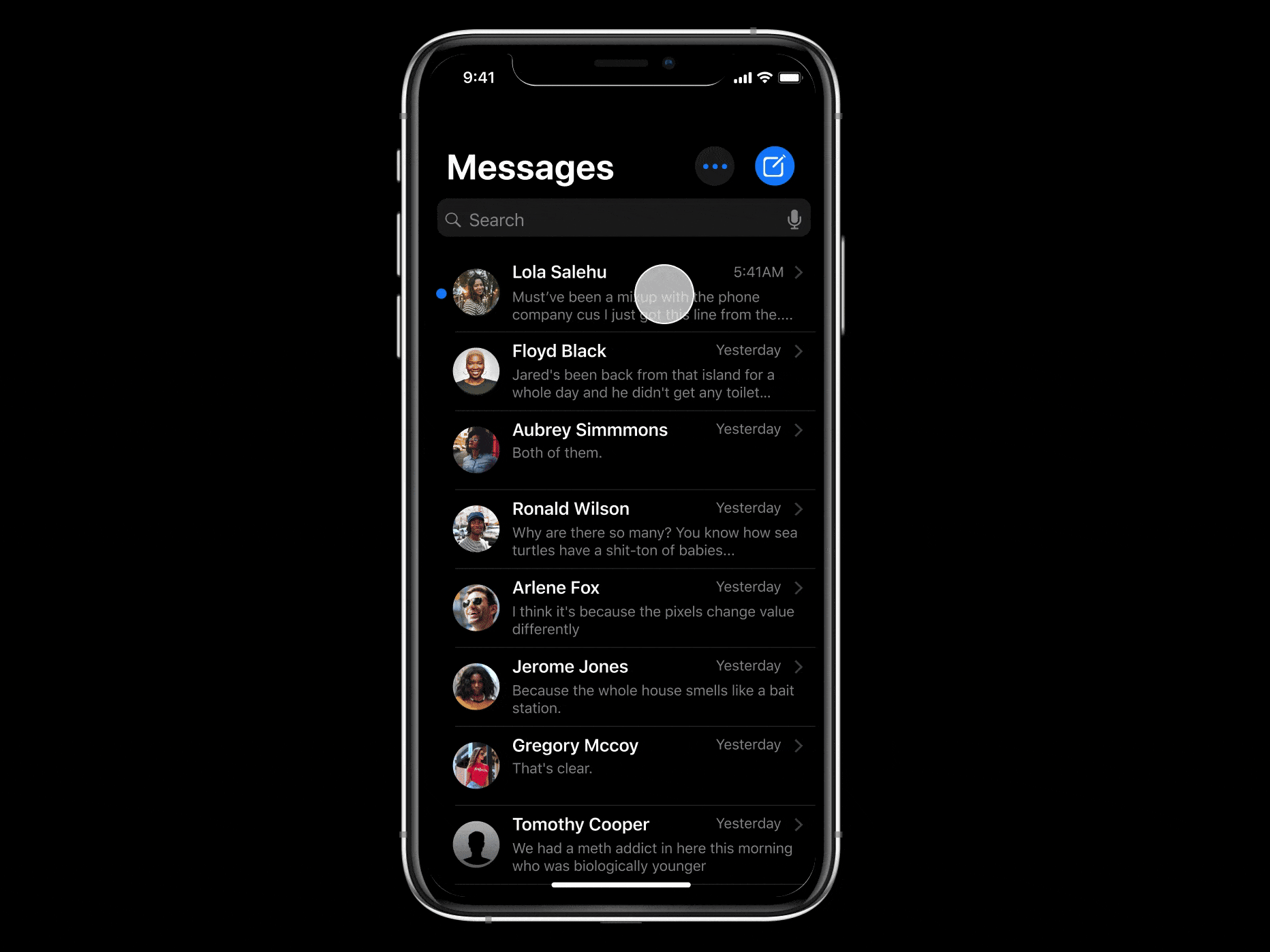
iMessage launched in 2011 and has received several major upgrades since then — most recent being the updates that came along with iOS 13. The application comes pre-installed as the default messaging app on every iOS device. Yet, we find that a lot of users do not adopt it as their primary messaging tool. Why? I found this an interesting challenge to solve.
As an occasional iMessage user, I had a few ideas about why this was. Interactions with the app often revealed clear usability issues and pain points. However, I needed to confirm my observations.

My major goal for the project was to revise usability in iMessage. I wanted to give people a more engaging and seamless experience while communicating and staying connected.
Examining pain points
Meeting the Users

To get some data to work with, I carried out qualitative interviews with frequent iMessage users. Some of the questions asked were focused on:
- their nature of use,
- possible frustrations experienced during use, and
- functionalities they liked in other messaging apps.
At the end of each interview, I asked them to use the application. I wanted to observe their personal interactions with the app and the context in which they used it.
Likewise, I got feedback from a Typeform survey carried out with a group of 88 iMessage users across social media. I was able to gather the following insights:
FREQUENT MISCOMMUNICATION OFTEN OCCURRED
- Users get annoyed when they had to carefully specify which response was to what question; so the reader did not misinterpret the meaning.
- This slowed down the chatting process and allowed for big misunderstandings. Users expected iMessage to be more intuitive

SIMPLE TASKS REQUIRED LONGER PROCESSES
- Users were put off by the fact that they could get tasks done a lot faster on other messaging apps.
- People respond to a lot of their messages while multitasking. As such, they want to be able to process and divulge information as fast as possible. Users expected iMessage to be more efficient.

MINIMAL CONSIDERATION FOR RECURRING ERRORS
- Mistakes often occurred while communicating. And users did not trust iMessage to help them recover from errors with little effort.
- Users got irritated whenever a mistake occurred and there was no simple action to correct it.
UNRELIABLE NAVIGATION
- Users needed to reference other information when communicating and did not feel like iMessage met that need.
- Actions such as sending media and conducting searches to find information were not optimised on the app’s interface. Users expected iMessage to be more coordinated.
POOR ALTERNATIVES TO TEXT MESSAGING
- Users respond to a lot of their messages on the go; and as such also communicate using the voice feature. Ever lost several minutes worth of a voice recording? iMessage users often did.
- Users wanted a seamless playback experience.
Digging into the rest of the data revealed a major insight into the online messaging app experience.
The Discovery
Users Expectations Changed Over Time
The instant messaging scene had changed. Users had gotten used to innovation from other messaging apps and Apple’s iMessage was not exempted. It became clearer that users expected the experience to just work with minimal effort. As usability became more integral to their lives, their expectations evolved.
Deeper Insights
Formulating Design Principles
Before I could go into designing, it was important to define the metrics of success and understand the required scope of the redesign. I reversed the nature of the imperfections discovered during the research to kickstart creativity. I wanted to maintain a direct relationship between the survey results and my visual hierarchy and UI design. Hence, I created five key principles to adopt while designing:

“…How might we help iMessage improve usability?”
While ideating, I came up with a bunch of ideas that could solve the issues raised. There were multiple variations, so I concurrently got feedback from peers to narrow down the best solutions.
User tasks
The logic behind the platform.

I defined the important tasks users would have to perform daily. I aimed to create a mix of user and task flows. This kind of approach also helped me refine and think about each pages’ inventory, and how the system would react to required actions.


To further validate my solutions, I carried out usability checks and consulted apple design guidelines. I wanted to retain the look & feel of the iMessage interface users were familiar with.
Some of the primary questions that aided the usability checks:
- What is the most minimum action the user takes to accomplish a task?
- How can I minimize the effort required to take the intended action?
- How can I design this feature to be discoverable within the app?
- Will this solution pass for Heuristic Evaluation?

I tested early prototypes of the designs with real users. Every test was focused on the user achieving a single task.
To my surprise, not a single participant had an issue with the flow. The accelerators I designed resonated well with users, confirming my intuition around designing for usability.
Enter, my proposal:
The Redesign
Reintroducing iMessage
In an age where messaging is a sure way to reach your loved ones, iMessage gives you the best experience by making communication fast, effortless and simple; meeting your needs for rich interaction.
From Unreliable to Intuitive
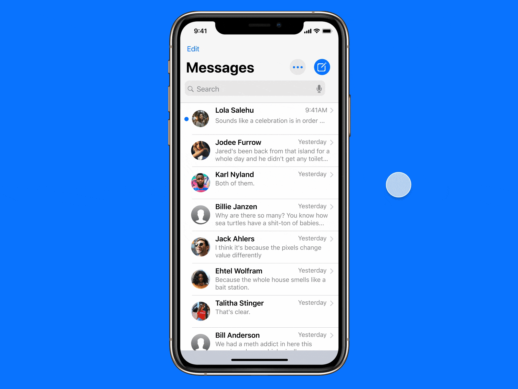
A Tool That Anticipates Your Needs
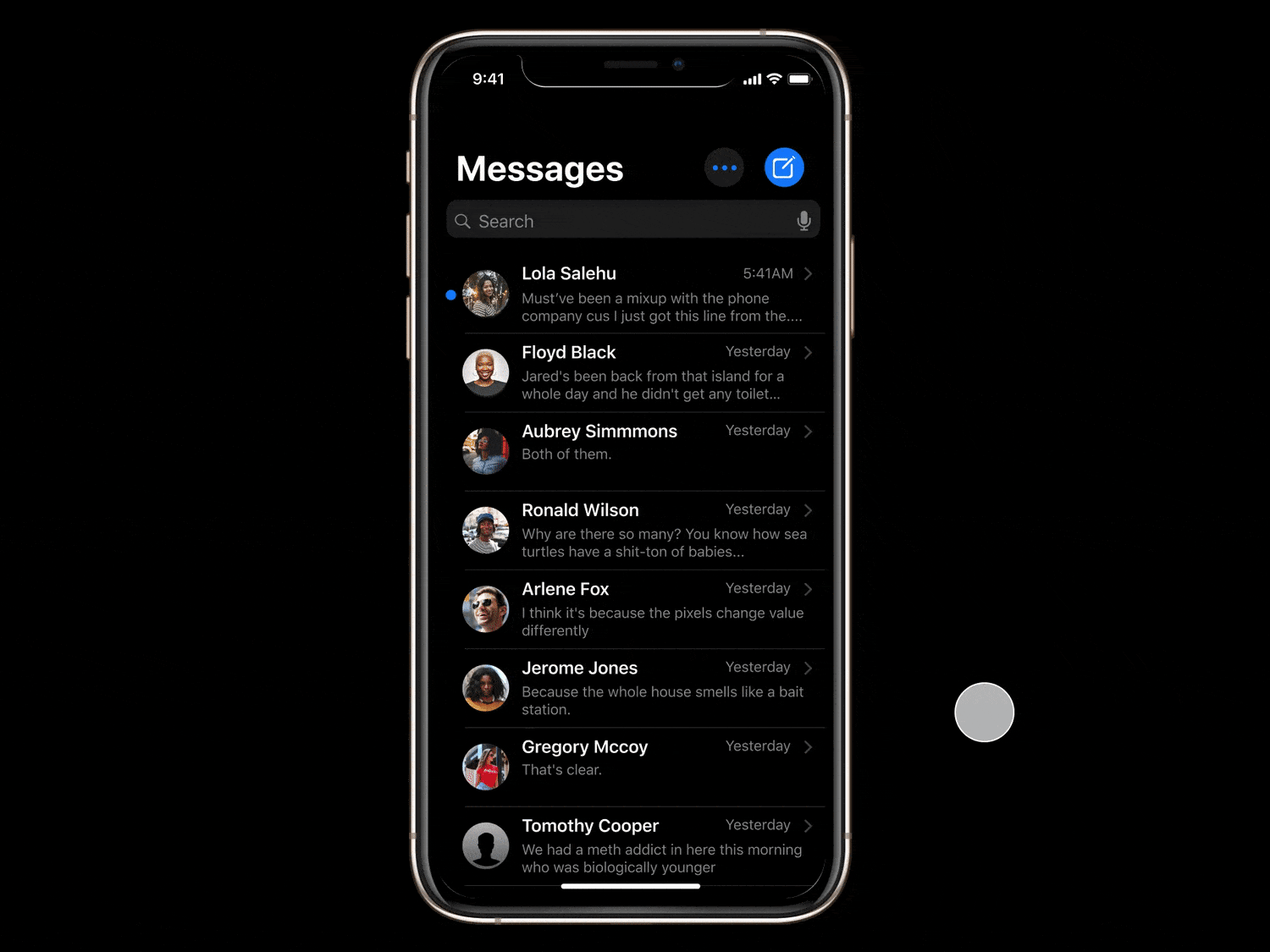
The new message screen, showing new and existing users key information they need upon opening the message.
From Complex to Simple
Share All You Want

I understand that a critical part of real-time communication is exchanging media. Now, users can share their pictures, videos, files, location, and contacts; all at the tap of a button.
Add uses familiar and consistent interactions, making complex tasks straightforward to perform.
From Tedious to Instant
A Search Away
Users can instantly reference previously shared information from their personal chat history. Now easy as pie.
Search features the voice input option, making lives easier through accessibility.
From Inefficient to Optimized
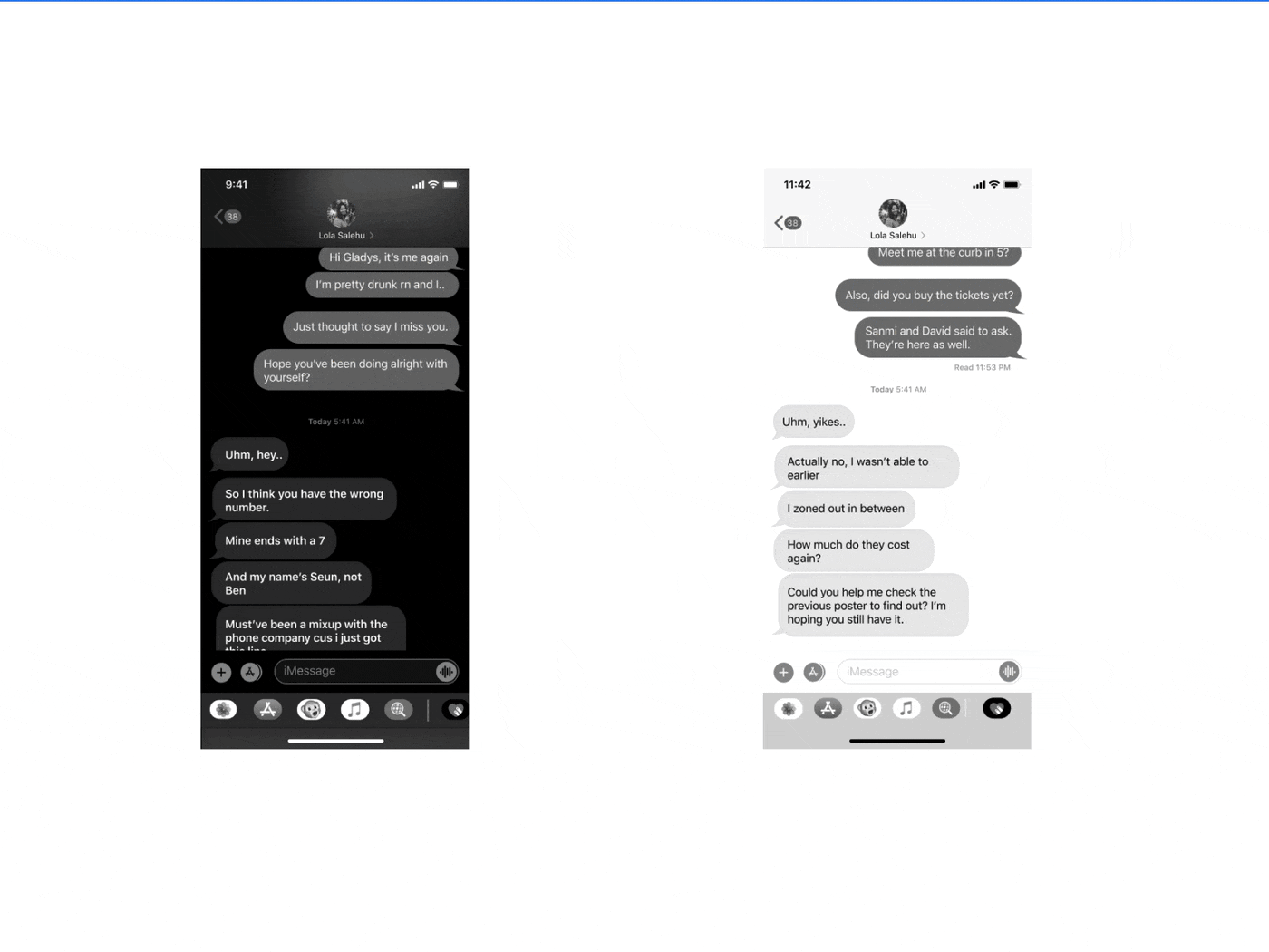
Smart Redirect
A key insight discovered during research was that the reaction feature — Tapback — was underutilized. It often left them confused whenever they got a notification from the sender but couldn’t pinpoint exactly what was being reacted to.
Smart Redirect was born so the user no longer gets lost in the conversation. Central to this feature were these key ideas:
- Provide direct access to the highlighted message.
- Micro-interactions to immediately draw the reader’s attention.
- An optional shortcut to return the reader to the initial point on the message thread.
From Constrained to Considerate
Delete for All
We all make mistakes, especially while communicating. Users can now simply erase miscommunications and get right back to it. Delete for All explores 3D Touch interactions, giving the user more control over their communication process.
Playback Slider
Users no longer have to worry about missing out on that bit of the voice message. A simple rewind, or fast forward can do the trick. Playback Slider uses direct manipulation to engage the user, reminding them that the control lies with them.
From Limited to Accessible
Quick Reply
Whether it’s a long chat or replying on the go, users can easily respond to messages with just a slide. Quick Reply optimizes the user’s accessibility by exploring simplified gestures for interaction.
Reflection
Redesigning this app and doing this case study reminded me that users are very integral to every design decision. It was amazing how little changes such as adding a search bar could create such a big usability impact.
Thanks for reading! Follow my medium profile to keep up-to-date on my incoming articles featuring UX nuggets, and links to provoking reads I’ve found helpful for my career. If you’d like to reach out, follow me on Twitter to continue the conversation. You can also check out more of my work on my portfolio.
Let me know if you have any questions or comments on my redesign for iMessage AND / OR If you’d like to have a chat about anything design related I’d love to hear from you!
Tools credit: Figma, Cloudinary, Overflow, Typeform and Miro (Awesome wingmen) 😌