Redesigning Intuit’s content design system
Co-authored by Vivek Saigal
Why redesign a site if things are going relatively well?
We first launched the beta version of Intuit’s content design system in December 2019. We combined 16 (!) style guides from various parts of Intuit — ProConnect, TurboTax, QuickBooks, product teams, customer success teams, marketing teams, the list goes on.
Establishing a One Intuit approach and having one place to store all of our content guidance has helped designers create more efficient, effective content. Content designers can scale themselves and feel more confident in their content decisions because the guidance is there. It’s been pretty awesome.
And our site has grown a lot — monthly traffic increased 327% last fiscal year. What was once an internal resource has bloomed into a content system referenced by Adobe, 18F, Nike, Northwestern Mutual, Zendesk, and other companies big and small. But based on internal surveys and feedback, we knew there were opportunities to make the site even better.
A good style guide is more than a fancy Word doc
One of the biggest opportunities was the content itself (surprise!). Our site has a lot of content. There was weird spacing (or lack thereof) between headers, pages were hard to read, and examples were formatted inconsistently. It was hard to find things.

Basically, the site looked like a glorified Word document.
Our goals: To make content more readable, scannable, findable — and beautiful. There’s no reason why a design system can’t be functional and nice to look at. This wasn’t about creating pretty things, necessarily, but about designing a system that serves both customer needs and business objectives (speed, clarity, consistency, recruitment).

We were a small but mighty team of three—a content designer (Sarah), a visual designer (Vivek), and our rockstar Wordpress developer (Kiran Nasim). We redesigned and rebuilt everything in 5 months.
Don’t ignore discovery
In a world where folks are expected to move fast (and faster and faster), it can be easy to ignore the discovery phase of a design project.
Don’t do it!

Discovery work ensures you’re on the right path and building the right thing. An audit of our own site, benchmarking, research, and competitive analysis revealed patterns and themes. It gave Vivek a runway so he wasn’t starting visual designs from scratch or operating on a hunch. Splitting the work gave him time to think and explore design trends like glassmorphism.
Digging into discovery also gave me an opportunity to exercise my UX skills. It helped both of us narrow in on what we needed to prioritize.
Discovery isn’t a design sprint. It takes some time — we were “discovering things” throughout the whole process. Lean into it and assume it’s your job, not somebody else’s. (Yes, even if you’re the content designer.)
A design system for the design system
As we started building components, we realized we needed to write down all of the thinking we were doing out loud on Zoom. We inadvertently created a design system for the design system in Figma, documenting the problem each component solved, the behavior, and any rules associated with it, both visual and content. This helped us stay consistent, which had been a huge issue with the site thus far.

People sometimes scoff at taking the time to write documentation. It’s not hard, especially if you do it with your design partners. Take the time to write down your process and rationale because it’ll save you time down the road. If someone has questions, you can point them to documentation.
It also kept us honest. What problem is this component solving? What are the use cases? What type of content belongs here? What doesn’t belong here? Documenting this on a component level helps future-proof the site. Anyone can take over and know what goes where.
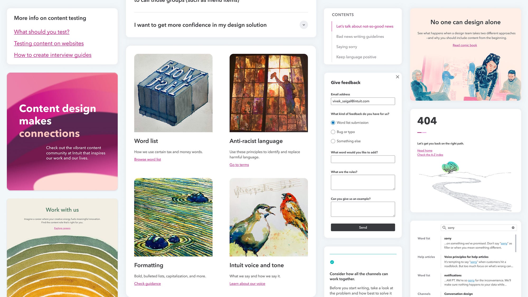
Intuit Content Design 2.0
I mentioned that our goals were to make content more readable, scannable, findable, and beautiful. Here’s some of what we did:
Readable
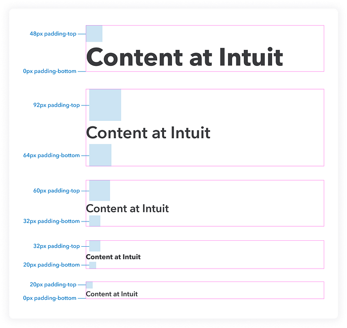
- Increased body text relieves eye strain and increases readability.
- Built-in padding in header components establishes clearer page hierarchy, ensures consistency, and saves time. (No more manually adding spacers to Wordpress pages.) Establishing a clearer hierarchy this way gives a page breathing room and shows what’s important.
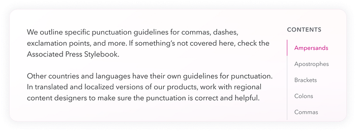
- Designed a responsive layout that increases the width for single and double columns, reduces scrolling, and visually highlights Dos/Don’ts and examples.
Scannable
- Introduced a right-rail table of contents to complex pages so people can see what’s on the page at a glance — without needing to scroll.
- Added copy links to each header so folks could quickly copy a link to a specific section and send to their partners.
Findable
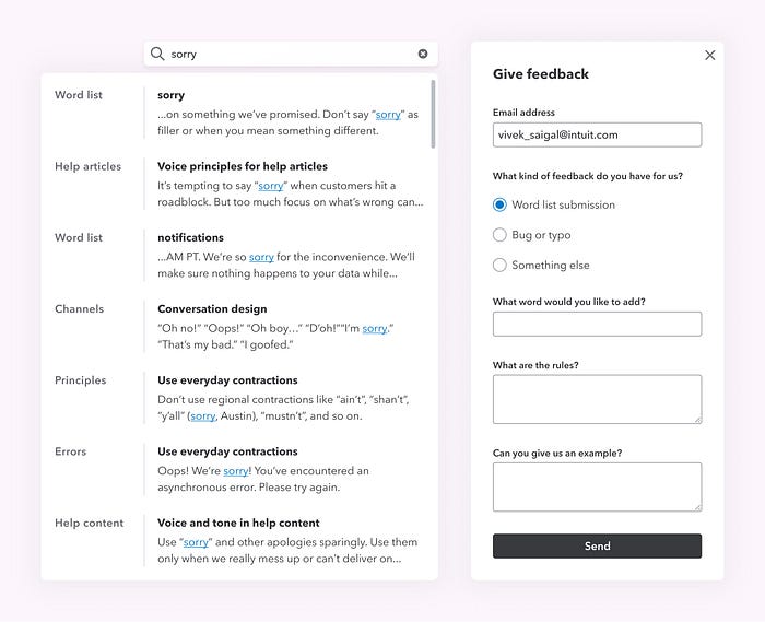
- Redesigned search so the search field is always exposed, and made it more contextual with two lines of preview text. We also categorized results by their parent page to add even more context.
- Not finding what you need? We added a form so anyone can submit feedback, anytime.
Beautiful
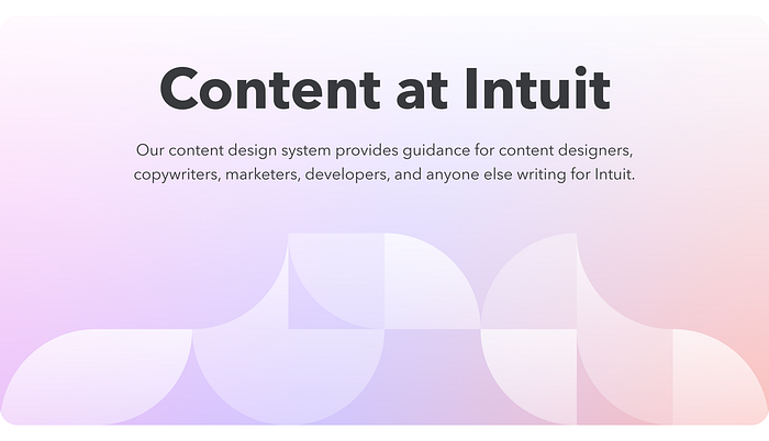
- Glassmorphism, a fairly new UI design trend, creates transparency and depth using multi-layered “translucent glass.” For us, it acts as a visual metaphor for our guiding principle of transparency. We share our content guidelines publicly to inform, educate, and encourage others to create good content for their customers, whoever (and wherever) they are.
- Illustrations created by the content design community that showcase our diverse artistic styles and perspectives.
- We looked at the “intangibles” that spark delight and joy in small places: the corner radius of our containers, the double drop-shadows to increase depth, and a color palette of gradients that promote tranquility and trust.
A flexible, One Intuit system
One of our design principles for contentdesign.intuit.com is tools over rules. We support content designers by empowering them with the information to make quick decisions and scale themselves. By componentizing our site, collaborating on discovery to move fast, and making stuff easier to find, read, and use, we’re helping Intuit designers be even more efficient and power prosperity around the world for our customers.
There may have only been three people *technically* working on this project, but moving so quickly wouldn’t have been possible without Tina O’Shea, Jennifer Schmich, and our content design community. Thank you.

