I couldn’t find my shoes online, so I redesigned Nike’s website — a UX case study

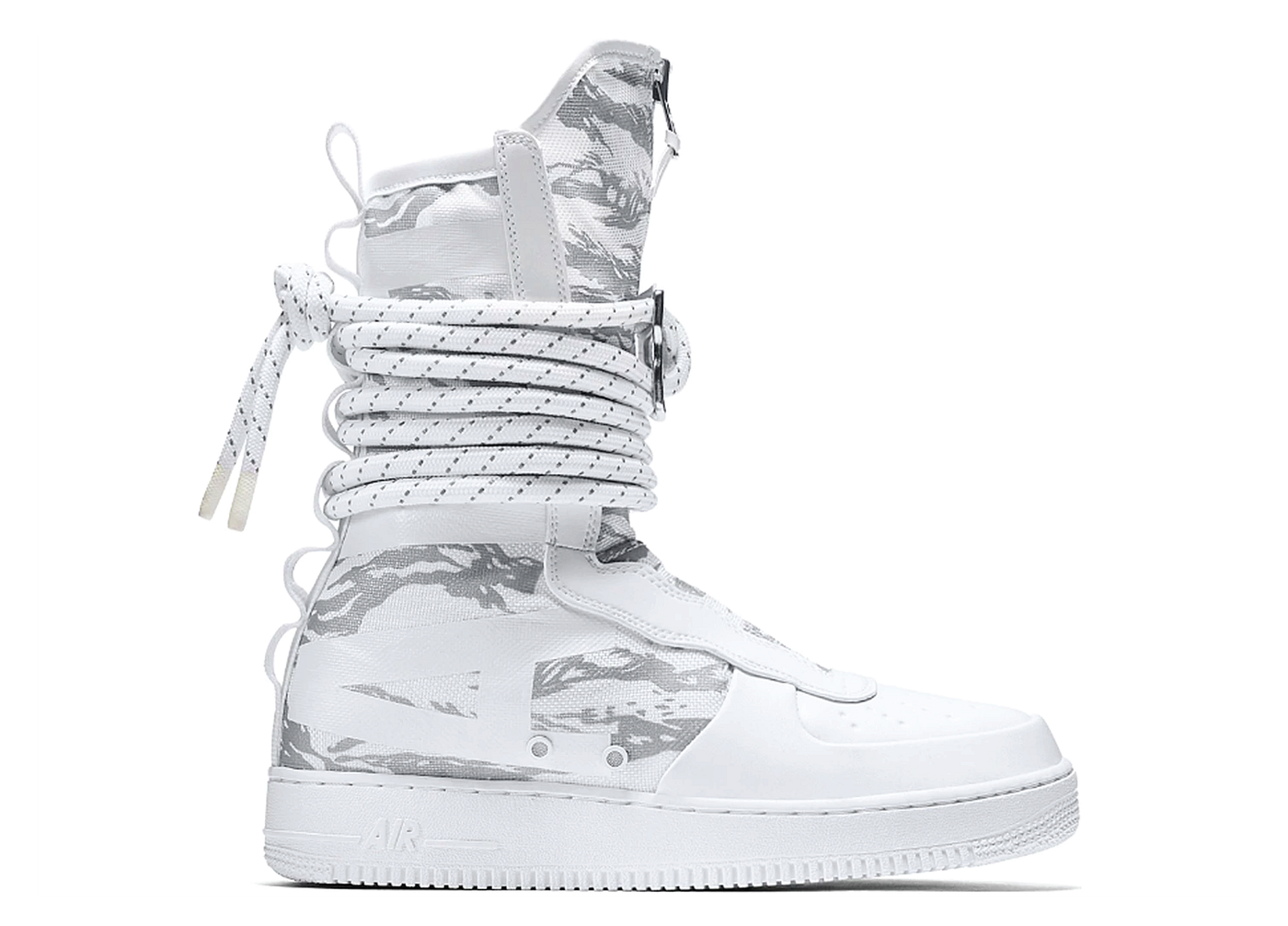
This past weekend I was visiting Nike’s website to order a gorgeous pair of White Air Force SF High Top Winter Camo shoes I had been saving up for.
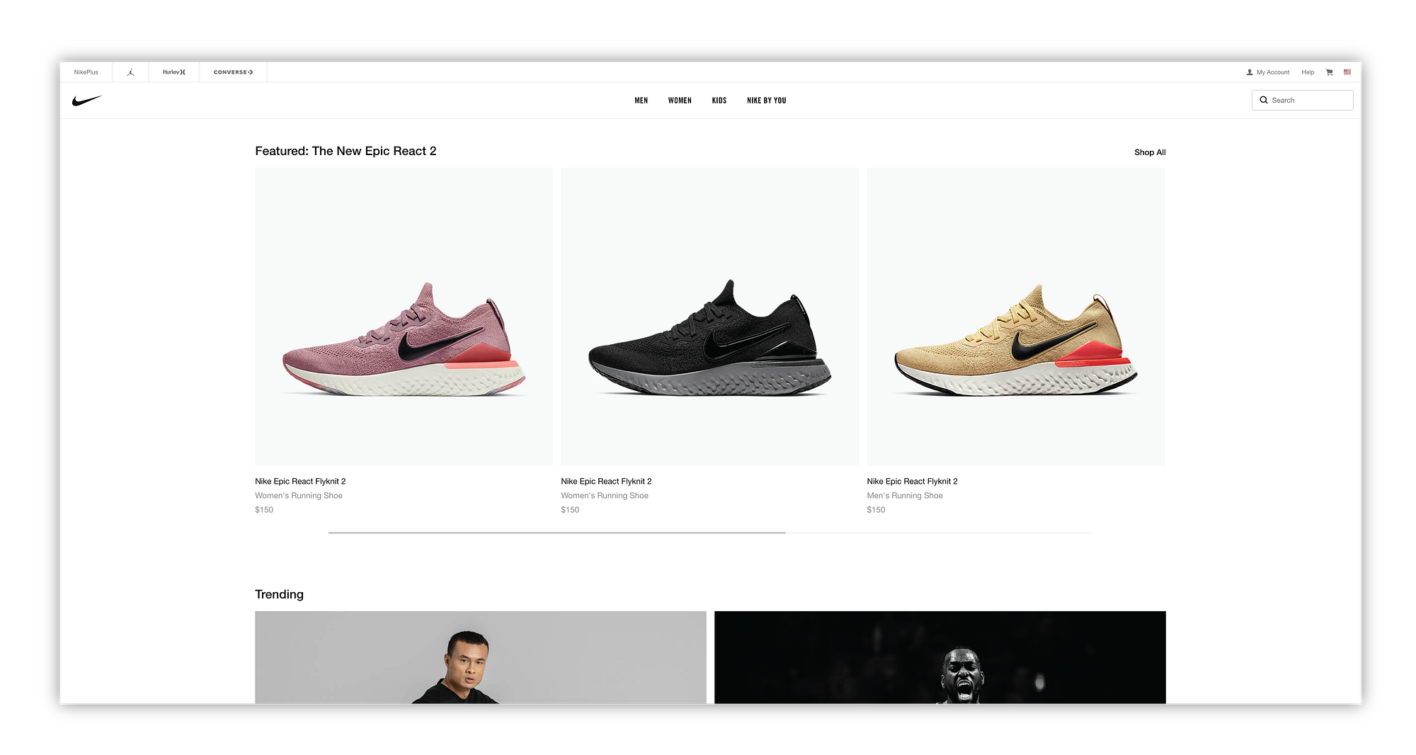
After ten minutes of scanning Nike’s website, I discovered the shoe I wanted was no longer in production. Ahhh oh no.
But I wasn’t totally distraught, I kept navigating through the site to see if anything else peaked my interest. While I was meandering the site I noticed the navigation was not ideal and I kept getting lost.
Rather than do nothing. I cleared the rest of my rainy Saturday schedule and began redesigning the Nike website.
Note from Designer: I am a classically trained healthcare UI designer, I haven’t really designed an e-commerce site. But I don’t have to worry about killing patients in e-commerce land, so why not, it’ll be fun!
So be critical, roast my design choices, and clap if you feel compelled lol!
I began with the navigation and overall architecture since that is where I was struggling the most. Nike has multiple brands (Hurley, Jordan, Converse) and corresponding sites so I started by reviewing each of the child sites.
Hurley Navigation
Hurley had a horizontal and vertical navigation. The horizontal navigation was superfluous and didn't really get me any closer to the products. The vertical navigation on the other-hand was the actual way I was getting to the product.

Converse Navigation
Converse had one horizontal navigation with five categories and sub categories. This navigation then switched to a vertical nav after selecting your category or sub category. I found this switch from horizontal to vertical rather jarring.

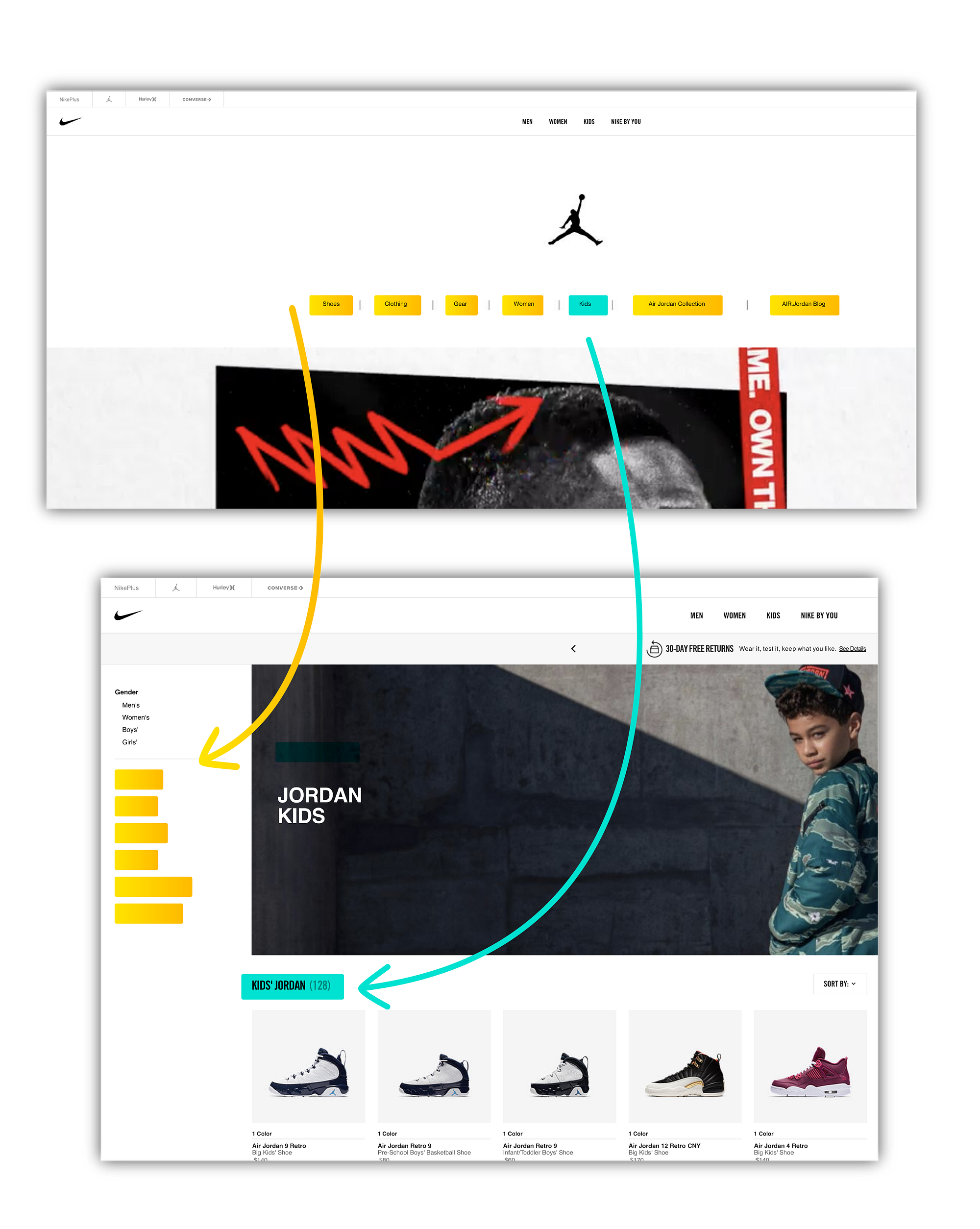
Jordan Navigation
The Jordan brand was similar to Converse but with only seven categories and no subcategories. The vertical nav was weird and switched to gender and neglected the previous pages categories (shoes, clothing gear, women, etc). I found this inconsistency odd, with the exception of the (Air Jordan Collection and the AIR Jordan Blog).
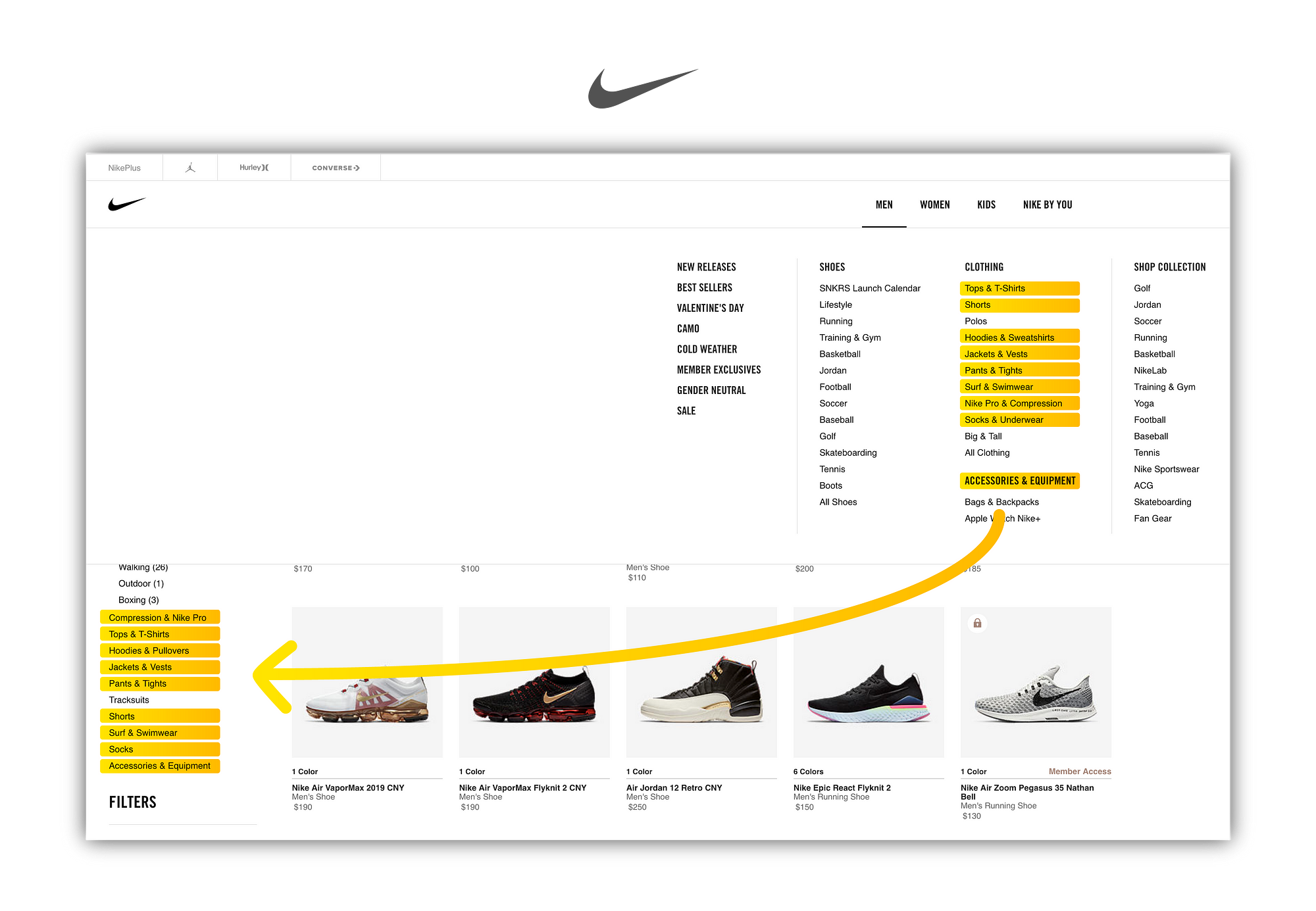
Nike Navigation
Nike was the parent navigation that remains the same through all the brands, this navigation would often times be redundant in the vertical navigations that appear once you drill down to the products.
By comparing the sites side by side I saw how the architectures vary by brand.

After viewing all of the sites together I took some notes on what I wanted to redesign or enhance.
- Enhance backward navigation through all brands.
- Create a consistent navigation between all brands.
- Call out the search feature for ad hoc inquiries.

Brand Toggle
I started by creating a toggle for the various brands. This would make the filtering for the sub categories more niche and not as lengthy. I added some affordance that I thought was missing from the original site as well in order to guide end users. (End User? Consumers? humans who visit this site, whatever).
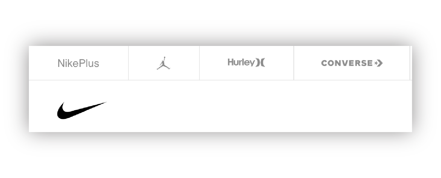

The default brand would be Nike since it has the most products, categories and most common workflow.

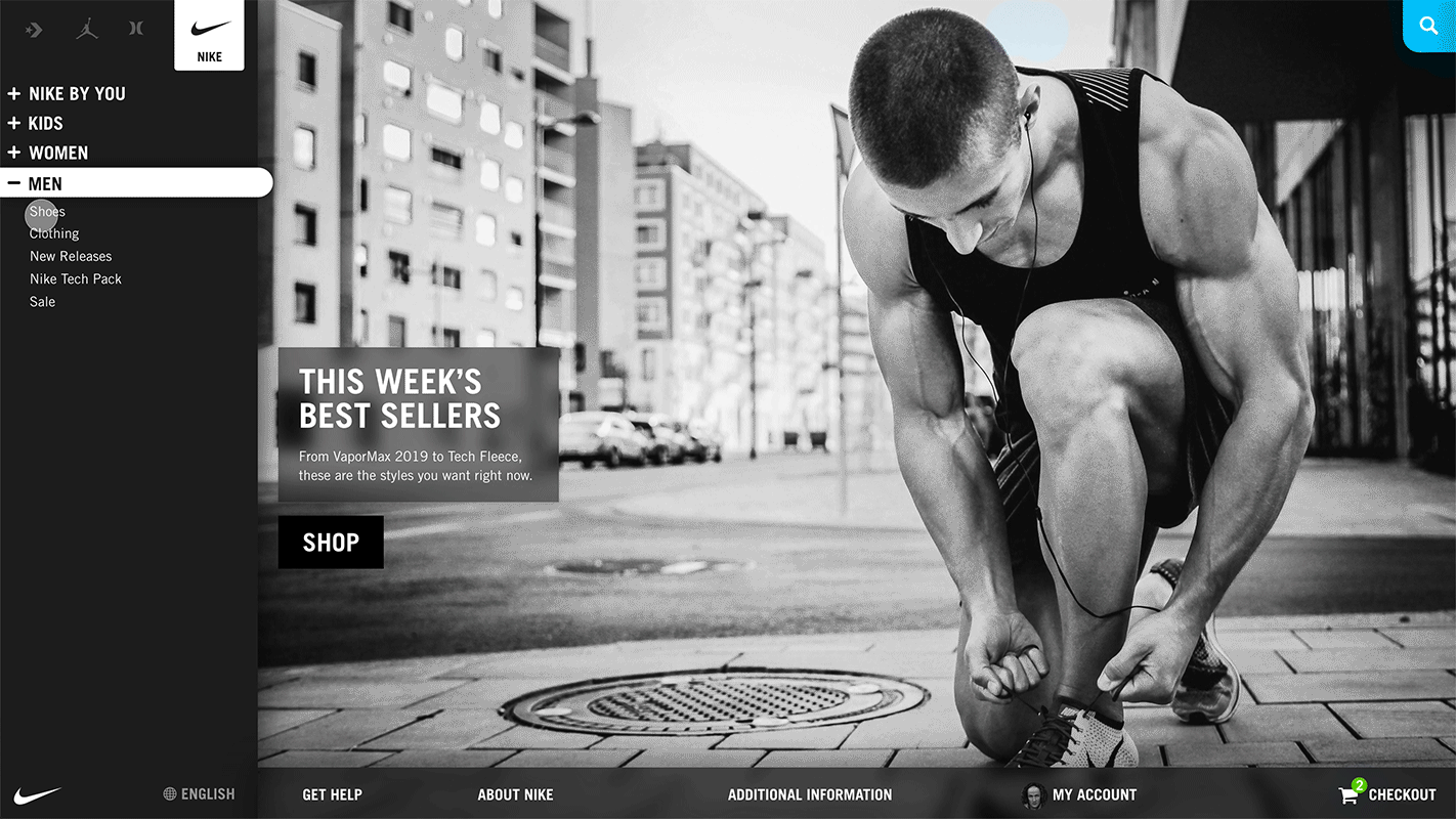
Main Navigation Hover
For the main navigation I kept the information in a hover state selection menu, but only included the information that wasn’t inside an existing category. This would remove some of the redundancies that were occurring while still only being a click or hover away.


I also thought it would be nice if the navigation remembered my preferences. Since I was logged in, I would be taken directly to the men’s section of each brand. Progressive disclosure is the name of the game with accordion menus and striking the right balance of too much and too little information is always tough, but I think I did it.

This hover information would vary based on category (Men, Women, Kids, Nike by You) but remain the same between brands.

Accordion Structure
I modified the accordion menu to each of the brands with four main parents (Men, Women, Kids and Nike by You). This makes navigating back much easier and is a more elegant solution than just frantically hitting the browser’s back arrow.
With my design you can move your way down the vertical navigation and get more and more specific results. Brand, Gender, Product, and Product Filter.


Bring Out That Search Feature
Some people don’t know what they want or they are like me and know exactly what they want. Like a size ‘11.5 White Air Force SF High Top Winter Camo’. So I wanted to highlight the search feature to meet both of these extremes.

Search would begin a new modality. With my layout the products could fill the screen from the floor to the rafters. Woop Woop! Or maybe nothing will appear like in my case, in which I could just close out of the modality and begin my life again.
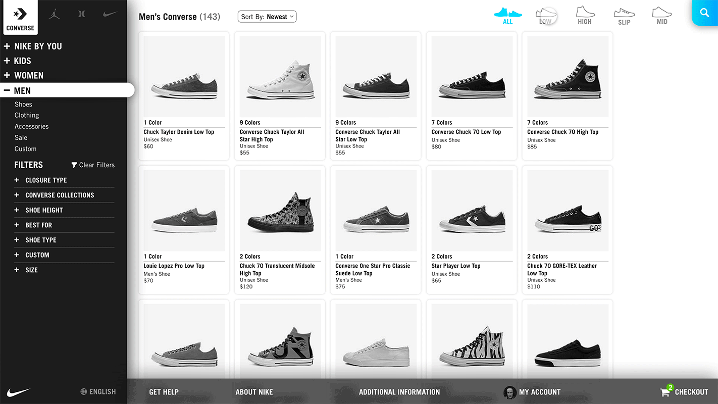
Filtering
I noticed that some products had secondary filters (style of shoe). I really liked this feature and wanted to keep it. So I threw the filters up in the top, so when the search feature is enabled the filters would disappear. This seemed like a meaningful way to show the relationship between filters and search.
Sticky Feet(er)
For the footer, I wanted the content more readily available, rather than scrolling to the bottom the page. So I stuck the footer to the bottom of the page and incorporated a pop-up checkout workflow that I thought was missing from my shopping experience.


Hover Preview
Since I had some time to kill, I reworked the preview hover as well. The previous hover would cover up the other products. I did not like this, so I created one that highlighted the product without overlapping the other products.


Microinteractions
Here are a few of the micro-interactions I created as well. I thought that a ‘clear filter’ button would be handy and it could fill up as the filters are added.

Add Some Pizazz
With a uniform architecture the art direction and branding will become more important to orient Nike’s consumers. So those designers better workkkk. I created this one in after effects I call it rainbow swirl.

Conclusion
Anyway, that was my weekend of redesigning the Nike website. Overall, it was pretty fun. Coming from a healthcare design background it was refreshing to design in the e-commerce space.
As always, I would appreciate feedback of any kind to help improve my design skills and thanks for reading this far! Now to get back to finding my shoes, I guess I’ll try Amazon or Ebay next.
Photography by: Alexander Redl & Paul Volkmer