Redesigning Suikakeibo: tips for approaching product design on side projects
 I love side projects. They’re often the first place I get to experiment with new ideas, flex different creative muscles, as well as tinker with new tools and technologies. They also provide another avenue for professional growth, while providing a sometimes much-needed break from other full-time projects.
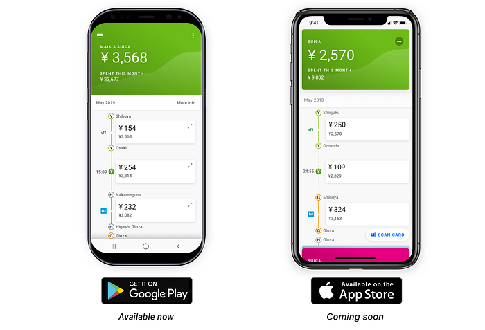
My most recent focus has been on a mobile app called Suikakeibo, a companion app for anyone who uses one of Japan’s many many IC Cards.
A Bit of Context
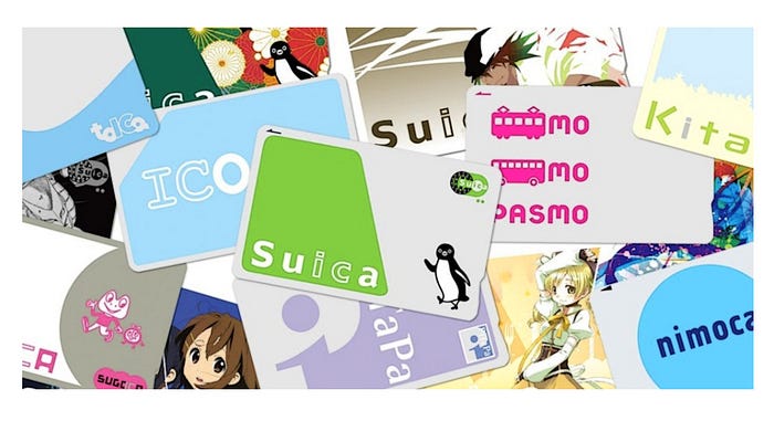
When anyone comes to Japan, one of the first things you’re told to get is an IC card (usually a Suica or Pasmo if you’re around Tokyo). What started life here as a mesh of different transit pass systems in 2001, evolved into a cashless payment alternative accepted (pretty much) everywhere. One card gives you a single, convenient way to pay for all your morning transit, mid-day snack, or 2AM post-sanjikai taxi needs.
The Problem
There is just one problem — these cards need to be topped up, and there is no real way to check the balance of your account online. Most terminals display your remaining balance when you use your card, but this is usually the last piece of information people rushing through the subway gates during morning rush hour pay attention to.

As a result, at some point almost everyone experiences the subway gates flashing red in protest, as the barriers slide shut, informing you that you’re in fact — out of funds.
Cue walk of shame to the reload station.
The Solution


This is where Suikakeibo comes in. Started by my friend Maik Buchmeyer, Suikakeibo is a mobile app that lets users quickly scan their card, check their balance, see recent trips, as well as manage all their IC card based expenses in one place.
Our Work

Our work on Suikakeibo continues in our respective downtimes. Rather than boring you with another case study talking about how we used design thinking to identify and address problems, or used tools like InVision to share assets, specs and feedback, I want to focus on something else.
Specifically, I’d like to discuss some of the things I learned while working on Suikakeibo as a side project.
The biggest difference between working on a project on the side vs full time comes down to one word — constraints. The process and principles are generally the same, but you have less time, less resources and (usually) less money. What you do have more of is freedom. Freedom to experiment, to fail and to learn.
Here are five things I noticed made me more effective as a designer through the course of this project. Hopefully they can help you be more successful in your own work.
1) Break work down to small chunks you think you can easily deliver — then break it down even further
Most of the time when I’ve had side projects fail, it was because we tried to do too much, and ran out of steam before we reached the finish line. This often happens because we’re used to estimating work based on how much time something would take with a normal work cadence. A piece of work you could normally get done in a sprint doesn’t “feel” like a lot of work, so it’s easy to say “Oh yeah — this is pretty manageable”.
But the same work you can deliver in 2 weeks at your day job might take you 2 months if you’re working on it during evenings and weekends. That’s a drastically different pace and timescale for the same amount of work, and it can make it feel like you’ve been chipping away at something for ages and not getting anywhere.
Losing motivation can be the death knell of any project, so break your work down to even smaller pieces and deliverables you can get out the door.
When I first joined the project, Maik and I talked about different ways we can help drive people to upgrade and better monetize the app. The full solution included:
- Restructuring the main menu and changing the CTA’s design
- Updating the “Upgrade” screen to better highlight the “Premium” package first
- Adjusting what type of ads we show through the rest of the app
But rather than doing this in one fell swoop, and waiting months till we can deliver everything, we chunked it down to the menu first.

Then the upgrade screen.

And we continued to adjust the types of ads displayed overtime, delivering each of the above changes on their own and tracking each design change’s performance in Firebase.
2) Needs vs Wants — Make sure you’re focusing on the right things
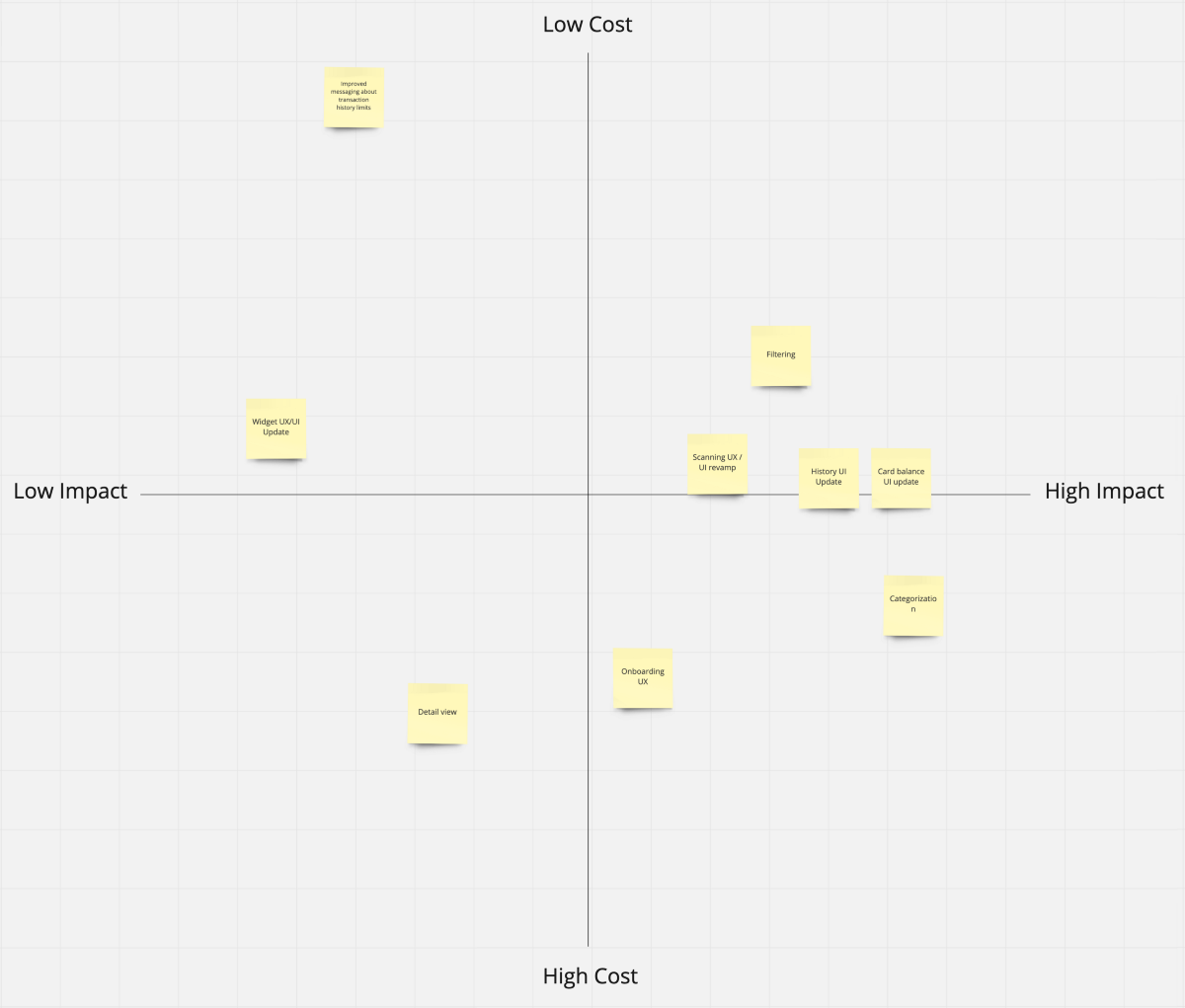
This ties in with the previous point. As you break work down into smaller chunks, you’ll have to decide what work comes first. Sometimes it’s as simple as “We need to do X before we can do Y so we’ll start here…” but other times, you’ll need to make a judgement call. You still want to make sure you’re delivering fully baked (if small / incremental) new experiences with each release.
This is where having clear Needs Statements, that address clearly defined user problems really comes into play. Again, this is standard product development best practice, but since you have even less resources to work with here, it becomes even more important.
“What value does this bring to our users? What can they accomplish with this change that they couldn’t do before?”
Holding me accountable on this front is something Maik did a great job of. Discussing every proposed change with this in mind helped us avoid too much scope creep, and made sure our delivery was focused on changes that always netted the biggest user impact.
For example, we had looked at a more thorough redesign of the transactions history page, that included
- A modified transaction tile design that removed the transaction ID and added in the operator logo for trips.
- Updated interaction design for adding notes and editing additional information about each transaction.
- A more complex scroll transition that would collapse the card into a condensed view to give the user more screen realestate.
- A lighter / brighter visual treatment for the page as a whole.

However, our primary use case centred around enabling users to scan and get an update on their current card balance as fast and as seamlessly as possible. That balance was the one thing users would be looking at the most, so our time was best spent improving the readability and aesthetic of that section before anything else.
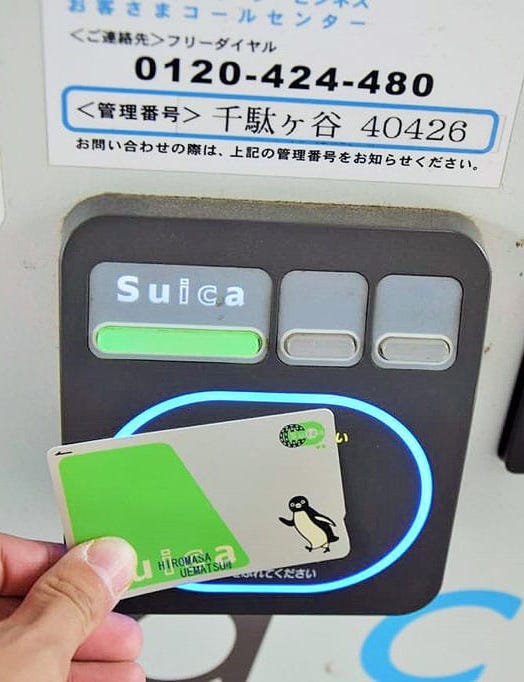
Once that was done, the next part of the experience that had the biggest impact on that user journey was the first time use experience — scanning a new card. So we focused on making the scan itself faster, as well as the guidance and UI more clear (taking some visual cues from physical card scanners, while reinforcing the new visual direction of the app).

3) Timebox and Commit
Funnily enough, working on Suikakeibo has helped me achieve a better work life balance. I sometimes have a problem shutting off, and that “10 more mins” to finish something can turn into two hours and a 9–5 can suddenly become a 9–7 or worse. As a result of these sometimes erratic work hours, I found that my focus on other pursuits would slip.
So I started blocking time off on my Calendar at the end of the day.

This has had the following effects.
- It helps me stay more consistent with my work and delivery on both projects.
- It helps me avoid those 10 hour days at my day job because it puts a definitive end to my work day that forces me to stop. I usually couple this with a location change to help “switch contexts” by either going to a cafe, library or coworking space.
- The more rigid timeboxing around my work in general has helped me manage and avoid burnout, which is something I struggled with in the past. (And is something that can easily creep up on you if you’re “doing work outside of work”).
4) Focus on Learning
Admittedly this one is a bit less objective. Maybe your main focus with your side projects is to supplement your income or to turn it into a fulltime gig down the line. Not everyone’s goal in undertaking a side project is the same, but I stand by this advice because it’s served me well through the years.
By focusing on learning first and foremost, you ensure that even if you fail and the project doesn’t go anywhere, you fail forward and come away more capable than when you went in. For me, if I’m not learning something new on a project, it’s almost not worth doing. One of the most fun things I got to experiment with here was more advanced prototyping and interaction design.

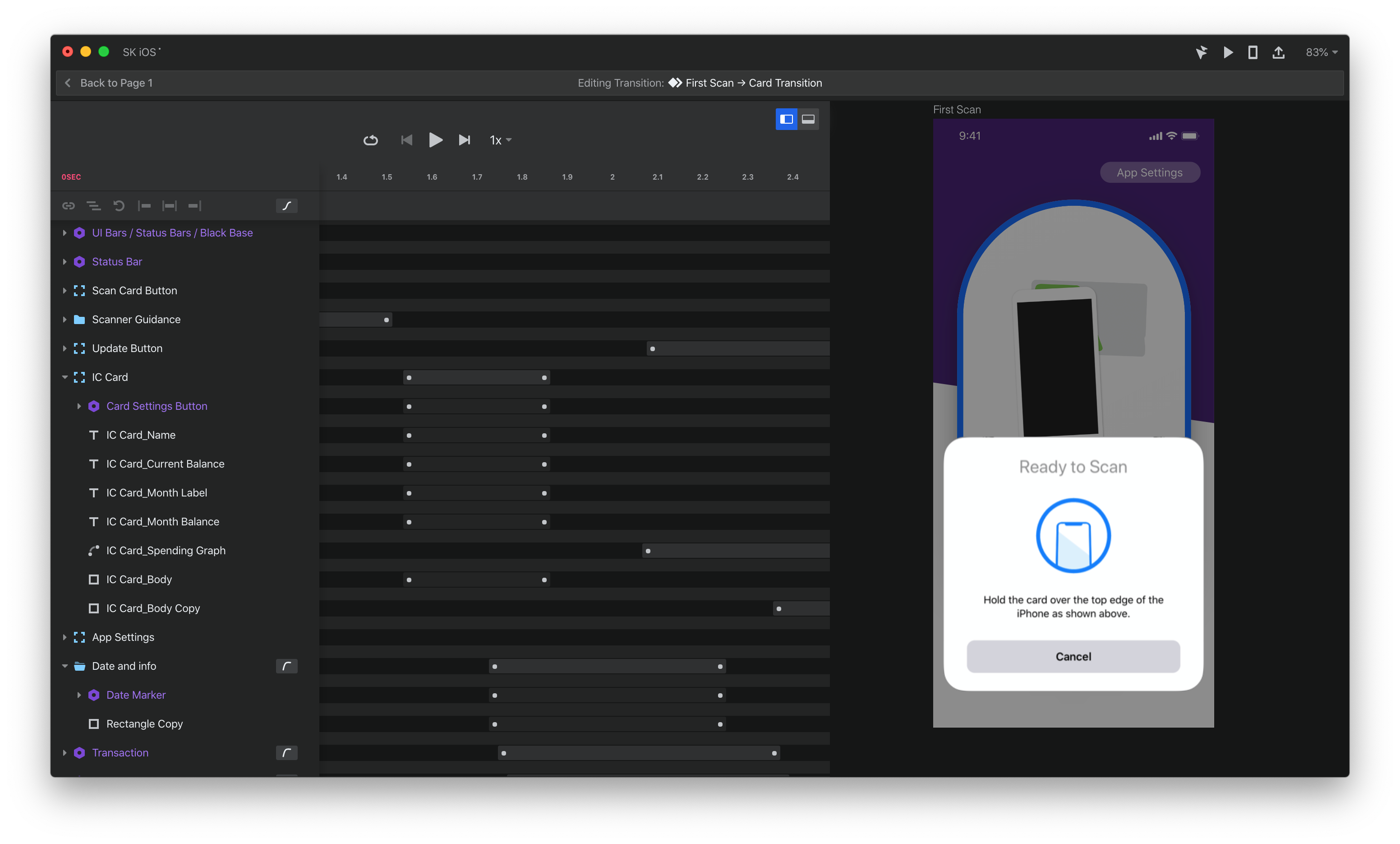
This could probably warrant its own writeup but after kicking the tires on a bunch of different software, I still came away most impressed with InVision Studio and Origami. Both offer great Sketch integration and are free to use.
InVision Studio will probably remain my default choice for prototypes that required basic to moderately advanced animations — it’s not perfect but the speed and intuitiveness of the timeline view for fine tuning timing is tough to beat. However, if you find yourself coming up against the limitations of Studio and want to build more complex, non-linear prototypes, Origami’s got you covered. It’s also the only prototyping tool that gives you the option to hook into things like your phone’s mic or accelerometer.
5) Remain Flexible and Put People First
Sometimes work at your day job suddenly ramps up, forcing you to go AWOL for a bit. Or a global pandemic breaks out upending part of your life, bringing into question whether you need to move back across the world in short order. You know… small stuff.
The point is, sometimes life happens, which will change your timelines. Or alternatively something in the market can change which may cause you to reprioritize your existing work.
On Suikakeibo, both of these happened. Luckily again, Maik’s been a champ and I think we’ve struck a good balance in both keeping each other motivated, but also understanding that things ebb and flow and sometimes our focus needs to be elsewhere.
But an example of a market shift happened earlier last year, when Apple finally gave developers proper access to the iPhone’s NFC reader. This meant that we now had a whole new platform we could tackle (but also a whole new set of both design and technical challenges to overcome). We originally planned to work on additional features for the app, but after some discussion we decided to pivot and tackle porting the app to iOS instead.
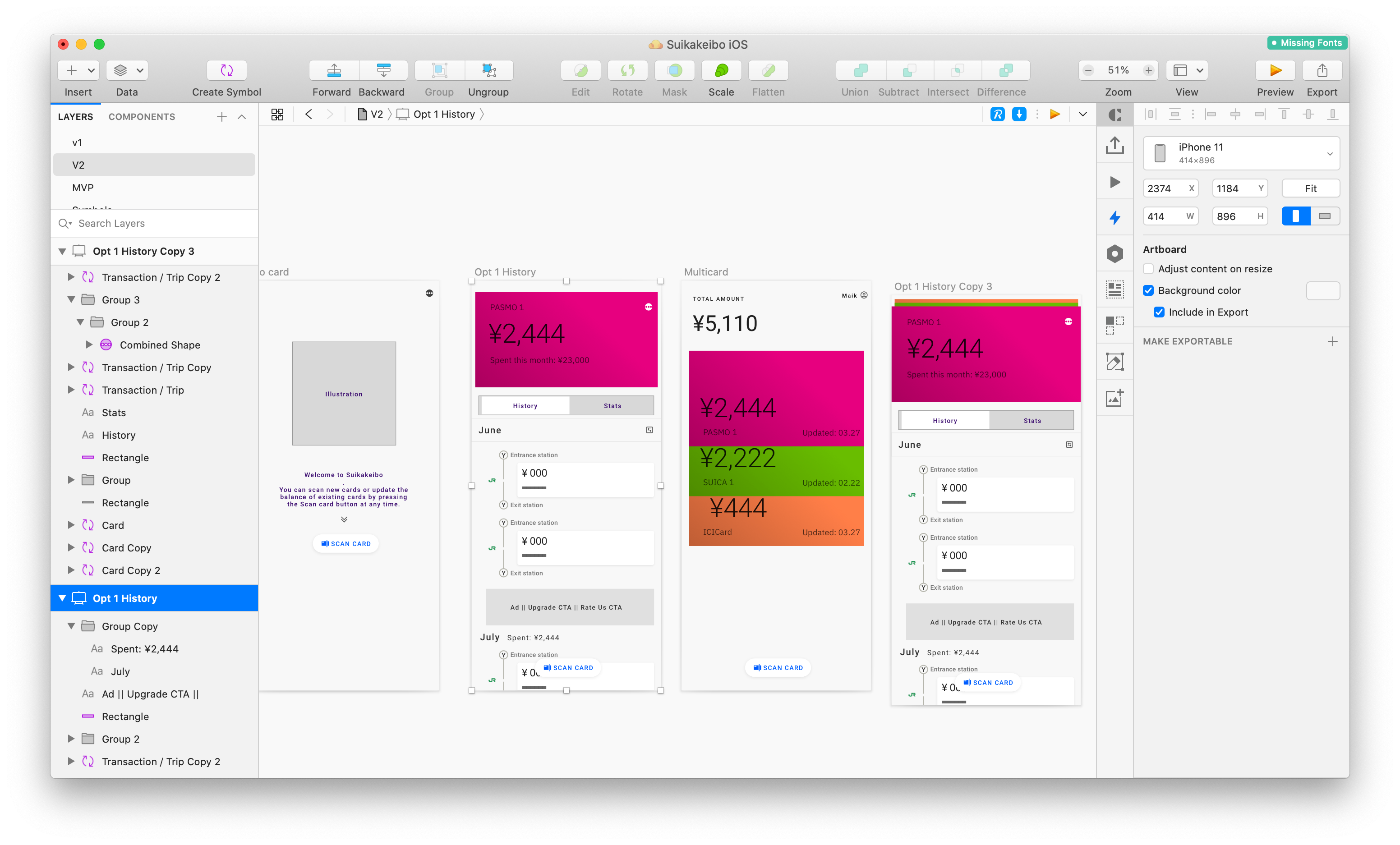


While there’s plenty of overlap, both iOS and Android have design patterns unique to each OS. Different levels of hardware and software restrictions, different paradigms on navigation, different ways to access settings and secondary actions were just some of the things we had to address as part of this effort.
Development on this is still underway, but as before, our goal here was to try and focus in on the core experience and make sure we nail that for our first release — then work on closing the feature gap between the Apple and Android versions of the app later on.
I’ll leave it at that for now, but I will most likely be posting a follow up to this in the coming months. The focus there will be more technical, with a look at OS native UX/UI patterns for both iOS and Android, and how we bridged design between the two.
I hope you’ve found this write up helpful! If you have any questions about the project, our process or anything I wrote above, please don’t hesitate to reach out, I’m always happy to chat :).

