Redesigning the checkout experience — a UX case study

In this article, I’ve collected highlights of checkout redesign process.
The customer is a Travel Management Company that has specialized in simplifying travel complexity for the humanitarian, faith and education sectors.
In simple words: there is website and desktop app, using which, trip organizers can book the whole range of services needed for the trip of a group of people.
For example, 4 students from Paris are going to visit a conference in Rome.
They need to book:
- Flight to Rome
- Hotel in Rome for 2 nights. 3 students will live in one room, the 4-th one in a separate room.
- Taxi from airport to the hotel
- Return flight to Paris.
Their mentor can book all the services on a website, pay with invoice and generate the pdf-file with a trip schedule and sent it to students mails.
There was done the research, made the analysis of statistic data, a design from sketches to the interactive prototype and usability testings.
I was working with a team of two business analysts and in a close cooperation with a development team.
The previous version of the checkout was a single page layout with an inconvenient interface to enter travelers data and pay for the trips.
So the main goal was to create clear and useful user experience.
1. Research
1.1 Stakeholders interview.
We had 3 remote Skype interviews, during which I’ve asked some questions and gathered stakeholders ideas.
After conducting stakeholders interviews I was able to identify additional goals for the checkout redesign:
- Integrate upsell and cross-sell functionality
- Make the checkout process more simple and intuitive
- Integrate additional services: choosing seats on a plane, adding of a baggage, travelers allocation in rooms
- Reconsider a number of features: canceling of a product, canceling entire trip, hold etc.
- Make approval process more clear.
- Provide information about the upcoming trip in a convenient way (dates, locations, flight stops, flight duration etc.)
- Make clear price breakdown
- A lot of minor improvements
1.2 Competitors research

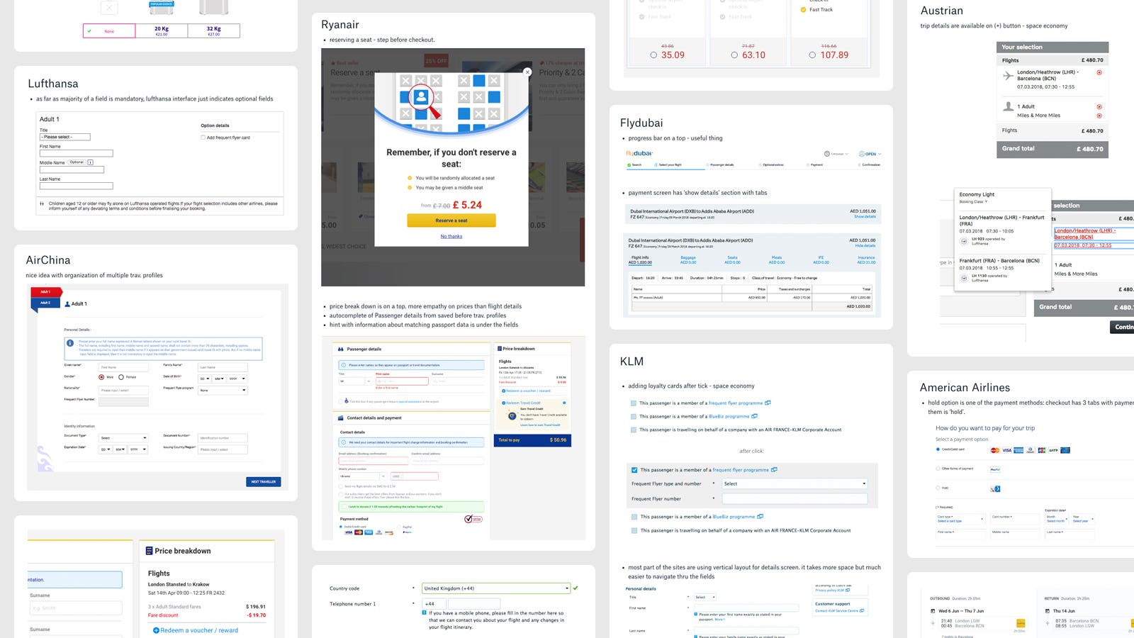
Research of the worlds largest airlines checkouts and of the competitors websites helped me to reach several conclusions:
- It’s a common practice to use step-by-step navigation with a progress bar, dividing the process into small iterations
- Majority of the form fields are mandatory (for security reasons) so it makes sense to mark only optional fields. Eventually, after deeper research, I’ve decided to mark both required and optional fields
- Price breakdown should be moved to a separate block with a fixed position on scroll.
Moreover, I’ve found some nice ideas about the layout of loyalty cards and payment blocks.
1.3 Team brainstorming
During meetings with a development team and BA’s, we defined that we have one serious technical limitation: the seat selection feature was already developed for another part of the website, so because of tight schedule we can just re-use the old one with light UI-changes.
Also, we agreed to move the main menu toolbar from the right side to the top. The new menu bar is going to be designed during checkout redesign, but later this change will be applied to all website pages.
The business analyst has compared single-page and multi-step approaches, after analyzing all the pros and cons agreed to use multi-step layout.
1.4 Let’s dig some statistics

What I’ve found in statistics data:
- The flights booking is a top priority
- In most cases, trip consists of 1 or 2 products, so there’s no need to work on cases with 3+ products checkouts
- Default payment method should be an invoice
- Booked trips cancelation is a secondary action
1.5 Users feedback
Users feedback was quite generic: hard to find some of the actions, UI doesn’t look fresh. I think we didn’t gate value information because users had worked with the website quite often, day by day and they become accustomed to the current flow, lost their critical thinking.
2. Analysis
During this phase, I have looked at the checkout process from the point of view of two types of customers and created user scenarios for them.
User one is a returning user, who wants to simplify checkout process, make it faster; second one — a new guy who got his first task to book return flight and sent booking for the approval.
Scenario for the user one:
- Proceed the checkout
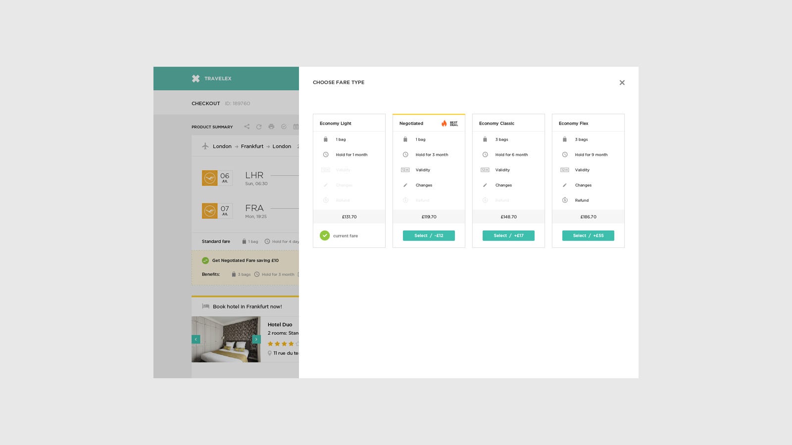
- Take a look at the different fare types for the chosen flight
- Change fare type from standard to negotiated
- Have a look at the suggested hotel, check other possible variants of staying, decline suggestion
- Proceed with traveler info
- Choose a seat in a plane
- Select invoice as a payment method
- Book a trip
- Share product summary with 2 persons.
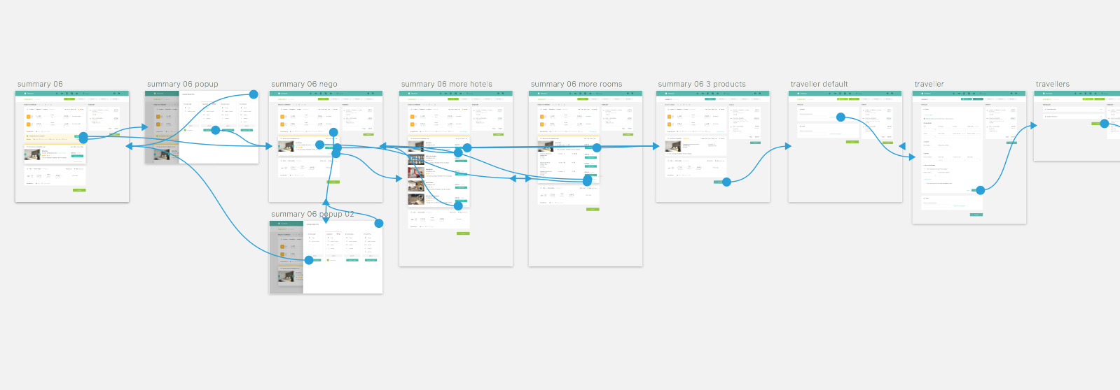
Furthermore, UX-map of checkout process was created and all the screens needed in a flow were defined (actually not all of them 😏)
3. Design
Frankly, I didn’t create grey wireframes. From the very beginning, I’ve tried to design in high fidelity, in order to establish a correct visual hierarchy and put relevant accents.
The main challenge was to create a smooth upsale experience.
Here are some of the issues we faced:
- Do we need to show all possible alternatives for the standard rate?
- Or we will suggest only one alternative to make user’s choice easier?
- Or we will suggest one rate more prominent, but other alternatives will be able to compare with?
- Will we suggest cross-selling hotel linked to the flight or as a separate item?
During this discussions, we were moving from the rough sketches (who have stolen my eyes and sense of beauty? 😆 )

…through the variety of approaches:

To the final version:

And here’s how the comparison screen looks:

To improve our cross-sell flow we agreed to present the product, that we suggested to buy, as a part of a product summary. By clicking ‘add to trip’ button the suggested product stays in its place and loses the highlight elements.

I assume that such way of presentation of the product will increase the conversion. Anyway, A/B testing will help us to understand whether I am right or not.
During the design process, we also defined the visual language, color scheme and typography. When the mockups were 70% ready it was time to create a clickable prototype and start user testings.
4. Prototyping
The next step was to link all the screens and present prototype to the development team and stakeholders.

As a result, I’ve got a new portion of fixes, suggestions and hypotheses. And it was a new cycle of sketching, brainstorming and prototyping.
For example, stakeholders wanted to make sure that the interface would work well on mobile resolutions.
Yes, it would:

5. Testing
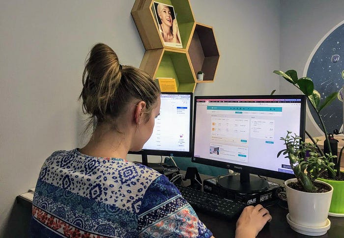
We have conducted usability testing sessions with real users of the product. During sessions, we have defined user experience pain points which were fixed in the next design iteration.
Hypotheses to test:
- Users want to view alternatives for suggested by the system hotel
- Travelers allocation as a separate step is not the best experience. It is hard for the users to discover travelers allocation feature because it is not mentioned in the navigation bar
- There’s a possible case when the user chose manual input of travelers information but then decided to go back to the database search. For now, we don’t have such option.
- After sending the trip to approval the system needs to show a success message to explain customer next steps.

Important to notice that all tested participants use the product very often and have a deep knowledge of booking process. And also they use competitors products.
Usability testing scenario:
Imagine that you are planning a trip for 2 students from London to Frankfurt. You’ve added two flights to the basket and proceeded the checkout.
- Products step.
What’s your current fare? What will happen by pressing ‘upgrade’? How can you compare other available fares? What the price for the first flight? Are you interested in a suggested hotel in Frankfurt? How will you add it to the trip? Would it be useful to have alternative suggestions or on hotel based on your previous searches is enough?
2. Travelers step.
How will you input traveler’s data if his profile already exists in a database? How will you do it manually? Do you remember cases when you needed to go back from manual input search?
3. Travelers allocation.
Do you understand what’s going on on this screen? Is this suitable place of the flow to allocate travelers? What is the best place for allocation?
4. Services.
How will you select seats on the flight? How will you add two extra bags to luggage? Can you hold a trip on this step?
5. Payment.
How will you choose Invoice as a payment method? How do you like a terms&conditions section on this page?
6. Booking
You need to send trip for approval for two people, how would you do this? Do you understand what will happen after pressing ‘send’?
7. Product summary
Can you cancel the trip on this step? Can you view detailed information about the second flight? How will you share product summary?
General questions
Which concerns did you have during completing tasks? Did you like look and feel of the checkout? What improvements can you suggest?
As a result of the usability testings, we have confirmed most of our hypothesis and have found a few new concerns. For example, feature ‘Hold a trip’ wasn’t obvious and we realized that the users need to be able to delete the item on every step of the flow.
According to the new information we got I’ve made one more design iteration. Results of it you can view in the following prototype
6. Next steps
The checkout is on the development stage at the moment.
My further steps are:
- Design review. To check how the design was implemented
- Micro interactions. To review the flow and find places where micro interactions will be suitable and helpful for the user experience.
- A/B tests. There are a few places in the flow where we can try to find the best solution by testing 2 variants on a huge amount of users (cross-sale functionality e. g.)
- Further improve our mobile experience
- Track how the users will interact with a product: clicks, navigation time, time to completion.
- Working with feedback from users: support tickets, bug reports, surveys.
Thanks for your time.

