Redesigning the Ola Cabs app — a UX case study
A new take on India’s most popular taxi app
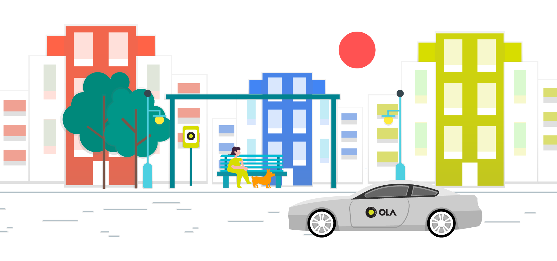
One of India’s most successful startups, Ola suffers from a common problem— clutter. An app used by millions on the daily provides so many options for customization that the user is often overwhelmed.
Going back to the roots , Ola solves a fundamental problem — that of servicing taxi rides with the help of our smartphones.
After talking to frequent users of the app spanning from different age groups (18–49), I inferred that users sometimes found booking cabs on Ola harder as compared to rival platforms — which I connected to some inconsistent flows. This combined with the constant call to actions (CTAs) and tiny text placement might’ve been the reason.
As Indians, most of us like to compare the various ride types at a glance, knowing the price difference between a Mini and a Prime ride on a less-busy day can lead to a much more comfortable ride.
For the more tech-savvy users, it was found that the app at many places, displayed the same type of information. A major example of this could be found in the ‘Know Your Ride’ section, which redirects the user to a ‘WebView’, whereas long-pressing the ride type also leads to a short description of the car specs and ‘Know More’ leads to the same ‘WebView’.
But quite possibly, the biggest issue almost everyone complained about was the display of singular prices at the confirm ride screen. As Indians, most of us like to compare the various ride types at a glance, knowing the price difference between a Mini and a Prime ride on a less-busy day can lead to a much more comfortable ride.
Identifying weaknesses
- Inconsistent user flows
- Too many options in Hamburger Menu
- Promos / CTAs (Call to action) densely populated across the experience
- Laggy animations
Task
While observing the current situation, I realized that all of these weaknesses could be solved by simplifying the user flow for some basic actions and then adding secondary CTAs & promos on top of it.
The main user flow should be:
- Confirming pickup location (with markers) / Choosing destination
- A choice between Riding Now / Booking for later
- Choosing the type of vehicle (alongside with prices)
- Confirming method of payment, applying coupons, choosing account profile
- Driver information while the ride is on its way
Design Decisions
I chose to design the user interface on the new Apple iPhone X as I thought it’d be a good experience to think of ways to incorporate the notch into the design. It made me learn a bit about the safe areas on this new device and how to effectively embrace the notch instead of ignoring it.
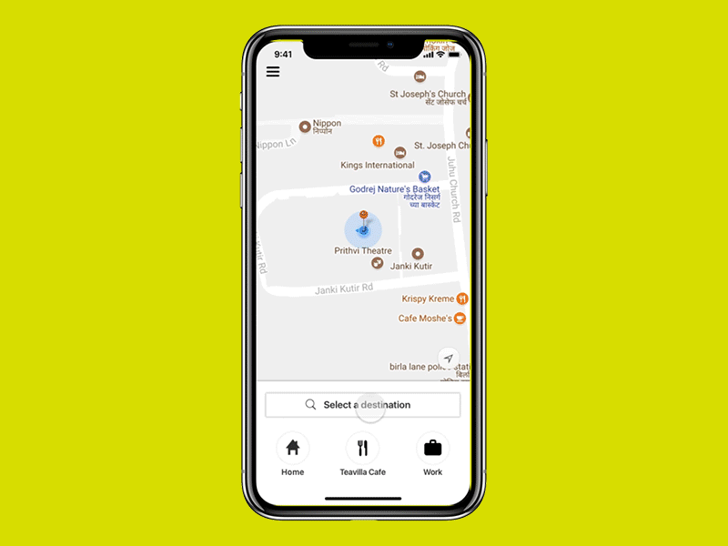
Home Screen
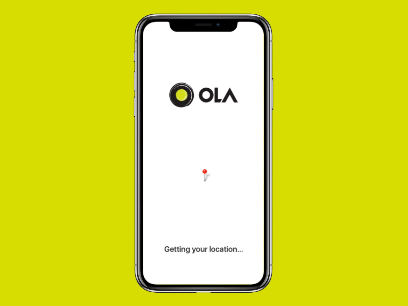
Being the first screen the user looks at while launching the app, I thought it was important to make sure they aren’t overwhelmed by the amount of content on the screen. This is why I chose to go for a bottom deck on top of a custom-themed map style, which focuses on areas and roads instead of building dimensions (as these aren’t important with respect to pickups).

The bottom deck follows our new user flow, thus placing the focus on a destination with a bunch of saved favorites/recent destinations showing up below the search bar. I opted for the bottom search bar instead of the top because of the increased accessibility due to the thumb placement while holding a phone [1].
Hamburger Menu
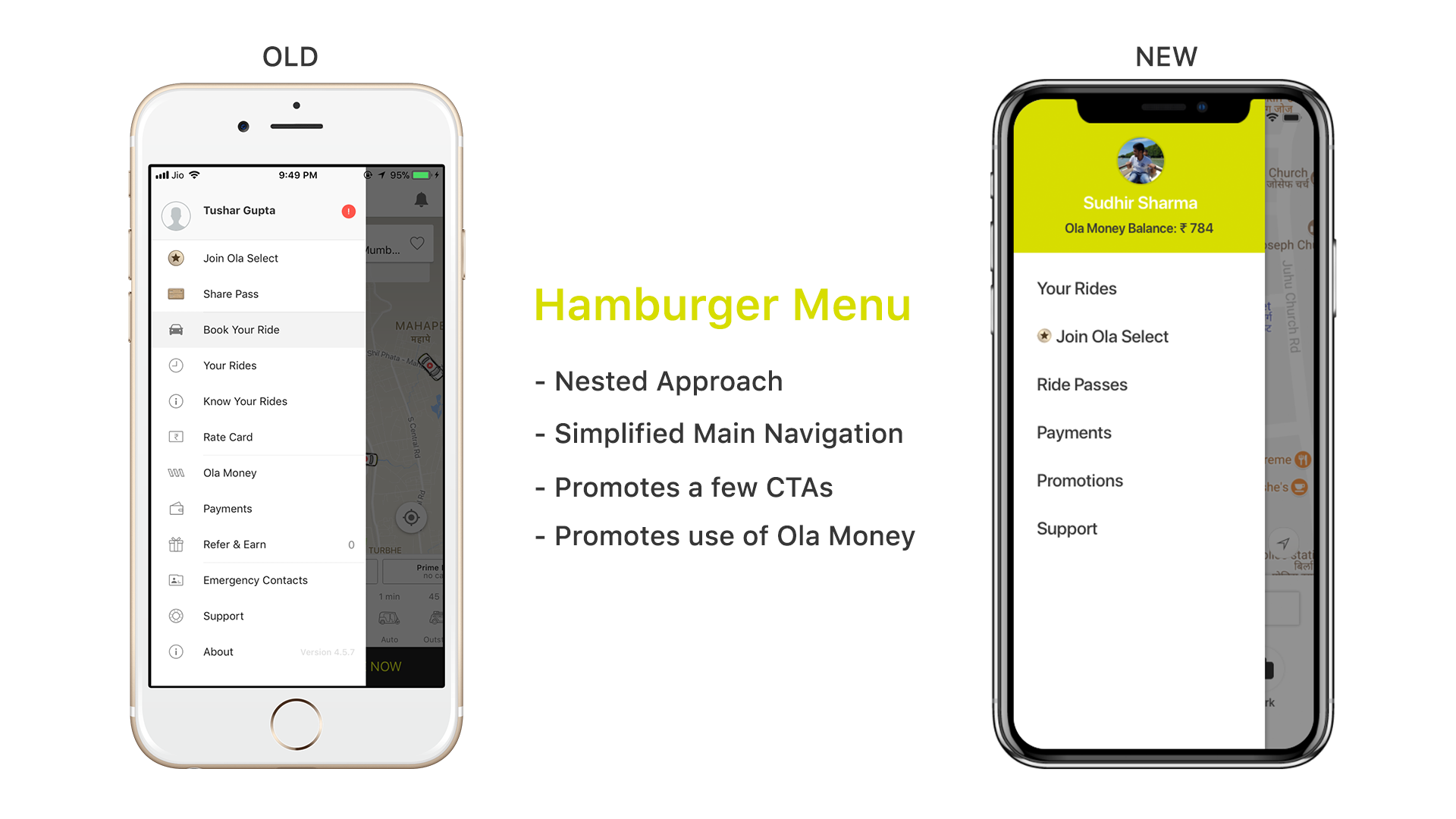
Presently, the menu consists of twelve options divided into four subsections. My take was to simplify this into six main options and using a nested approach to handle the remaining items. From a business proposition, the menu displays the user’s current Ola Money balance upfront, to promote the use of the company’s in-house digital wallet.
Whenever this menu is fired up, it overlays a light shade of black to ensure a consistent layered feel to the interface. The sliding menu takes about 85% of the screen real estate width wise.
Location Select
When the user taps the search bar on the home screen, it takes them to this screen where they can confirm their pickup and destination location. The results are locations are instantly updated after each character is entered in the textboxes.
In terms of micro interactions, this entire modal is slid up from the previous bottom search location card to ensure a smooth transition.

Ride Select
Being one of the most important parts of the flow, the Ride Select screen needs to convey a few solid points:
- Class of vehicle
- Estimated Time of Arrival
- Price
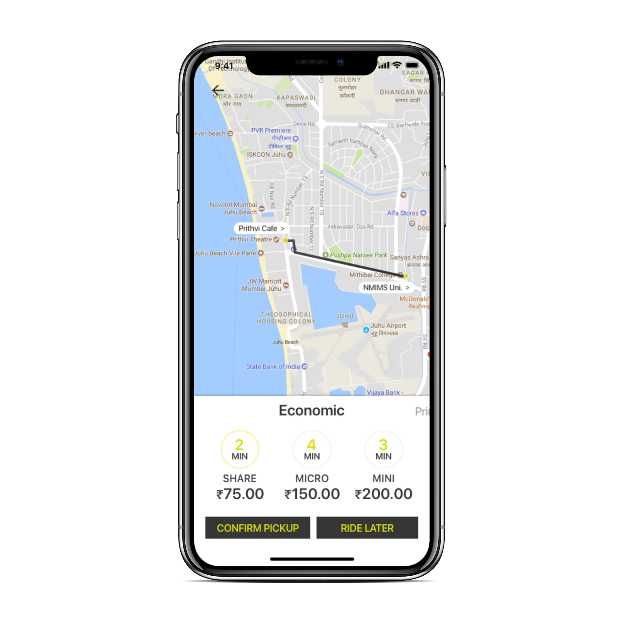
Keeping these points in mind, I segregated the Ola fleet of vehicles into a few categories such as Economic, Prime, and Luxury. This supplemented with the circles showing their respective ETAs with the yellow accent on the minutes. One can swipe right on the categories to see other options. The currently selected category has a slight outer glow to indicate a sense of toggling/selection.
Another essential step in the process flow, the app needs to make a few things crystal clear. While the app is searching for nearby drivers to accept the trip, it shows the user some critical information:
- Final total cost of their trip
- Card / Wallet being charged
- Coupons applied (if any)
- Personal / Business profile enable

For every user interface, it is essential to allow the user to undo their actions easily. Following this golden rule, it was important to ask the question: “How does one cancel the ride search process midway?”
Instead of introducing a new ‘Cancel’ button at these stages, it’s better to transform our Hamburger Menu icon into a Back Arrow Vector. This makes canceling a fluid and easy process, allowing the user to sometimes just check the prices and not actually proceed with booking a cab.
Ride Await
After most of the flow is complete, being one of the last steps — the user can share his ride details and contact the driver for pinpoint navigation and special instructions.
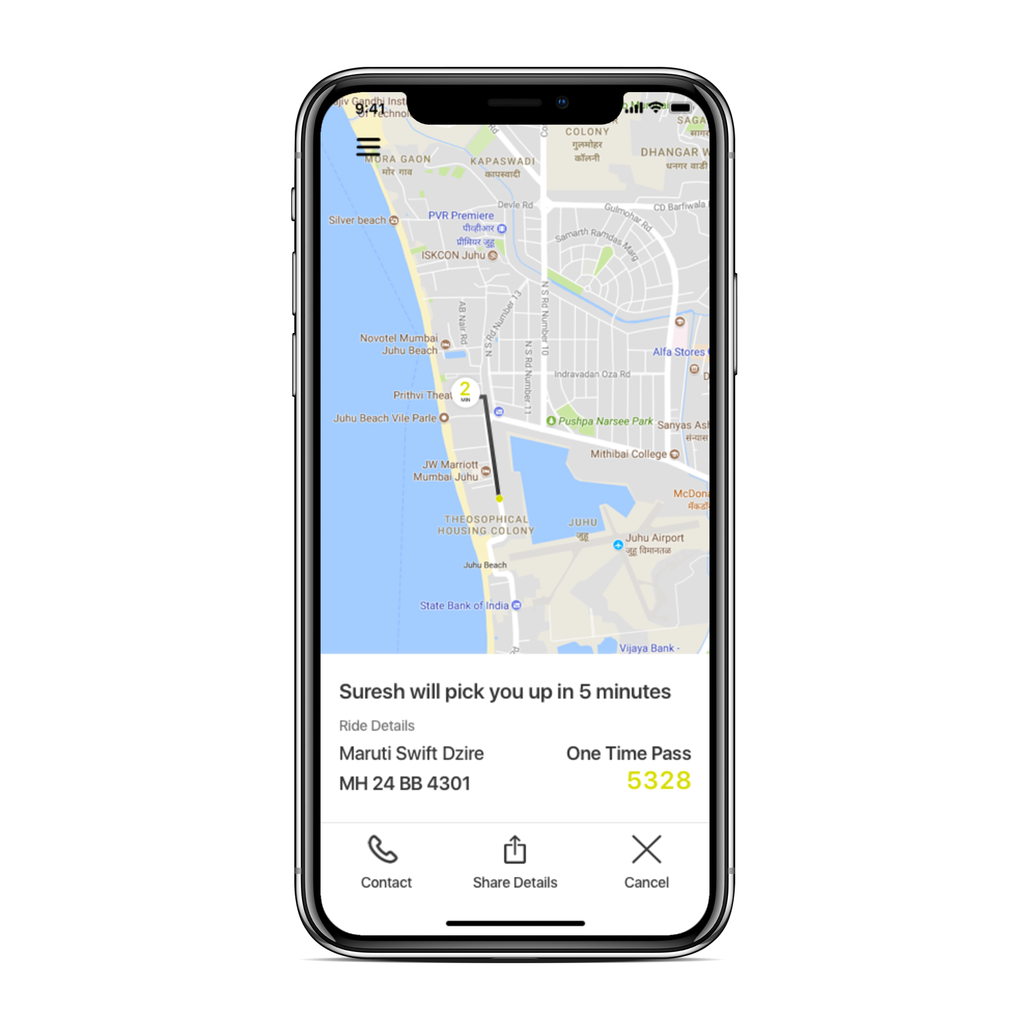
Going with a card containing all the essential information — Driver name, vehicle details, and of course the One Time Password. After following a standard set of line heights and spacing for the initial drafts, I realized that the OTP was one of the most important elements here and needed to stand out more. Hence I alternated the brand colors and font sizes to make it more prominent.
(Fun fact: I spent the last week watching some WWDC design keynotes, and in one of them — Mike Stern talked about using iOS specific icons, he even went as far as taking the example of the Share icon, and comparing the iOS standard to the general 3 circular nodes icon. Keeping this in mind, I went for the iOS specific icon!)

Results
Working Prototype
Thanks to Marvel, I was able to generate some great high fidelity mockups of the app screens. Take it for a spin here!
Disclaimer: This is a self-published project, and is no way associated to Ola professionally. I do not mean to in any way, discredit the work the amazing design & engineering teams at Ola put in everyday to continue being the undisputed market leader for online taxi bookings in India. This is my attempt at improving my design aptitude by analysing a popular app and taking the heuristic approach to try and improve them.
I’m currently looking for Product Design Internships for Summer 2018, and would love to be a part of your amazing design team. Check out more on my Behance, my detailed case study based portfolio, or just tweet me if you have any feedback on this project.
This case study was originally published on my portfolio.

