Redesigning the transport booking experience for Grab app
How do we work within a hyper-growth startup and design a rational but still meaningful transport experience that impacts millions of people? This is a design story from the largest transportation platform in Southeast Asia.
In August of 2016, I joined Grab, the biggest unicorn startup in Southeast Asia, offering ride-hailing transport services, food delivery, logistics and payment solutions. That began an amazing journey. I was the twentieth designer in design team and today the design team is even bigger. Before I joined Grab, I felt that the old Grab app could look much better, and I wondered if I could do a redesign project to make the user experience even smoother. However, it was not as easy as I thought.

Our challenges
A redesign is challenging for various reasons. Designing a product that is used by 1 in 6 Southeast Asians is scary. We have to cater to all 8 countries’ needs and think about scalability and various functionalities for different Grab services. Timelines are usually very tight, and also, after years of adding new products and features, Grab had become a big app😳. Hence there may be existing app legacy issues which is not very easy to resolve. At the same time, we need to find a balance between business viability, technical feasibility, and user desirability. It’s not just about revamping the visual style but providing a seamless experience for our customer. Besides, we needed to redesign the entire UX, visual and structure hierarchy to make it a better and more familiar experience to suit our users’ mental model, as well as create a better transportation experience and fulfill different regional and business needs.

So why did we do this?
There were many reasons that drove this project.
- Business: We wanted to reduce the drop-off rate of the home screen, and increase discoverability of service categories (e.g. transport, payment, food, delivery)
- Technology: The previous app design and architecture was difficult to scale due to the accumulation of UX and tech debt, especially as we had to scale across many tech families.
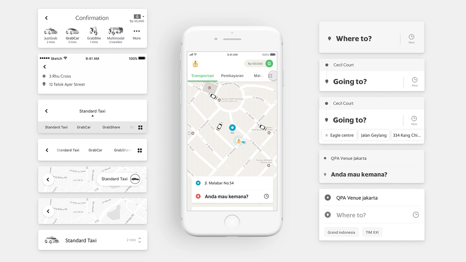
- User’s pain points: Many Southeast Asians use older smartphone models with small screen sizes — yet our design was not optimized for it. A lot of our users in Indonesia will see only a thin sliver of the map. Also, most booking fields are irrelevant to the average user. Plus POI predictions are often inaccurate. Our service type scalability is very poor.


So how do we get there? 😁

Product design workflow is not always as ideal as you may think, especially when you are in a fast growing startup. There’s no standard process. We have to go through exploration, ideation and design to implementation. Then we will have a more concrete and clear direction after many rounds of validation and iteration.
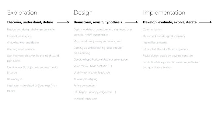
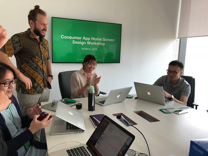
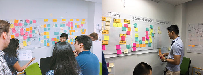
To work on the redesign project and make sure everybody is on the same page, we decided to host tons of design workshops and include UX designers, visual designers, researchers, product managers, engineers, and business owners to join this workshop. The objective of the workshop is to identify clear business goals, understand our user pain points, define our design principles, map out the user journey, consolidate different ideas, understand competitors’ advantages and define our measures of success. Also, our researchers shared our user insights and existing app data insights. We wanted to inject empathy into the process and brainstorm ideas from different angles (user/business/engineering feasibility).
3 core principles
After the workshop, we arrive at the same goal and reframe our challenges. We set up 3 core principles for what we wanted the redesign to achieve. These principles served as the foundation for the whole team and helped us focus on the most important things.
1. Design for discoverability: Show easily discoverable and relevant information to the user. Show the right message at the right time to the users in the relevant scenario.
2. Simple and accessible: Cater to 80% of user needs and fulfil their transportation behaviour mental model. Focusing on the core, as robust as possible.
3. Design for scalability: LEGOlization, fulfill payment, transport, different needs for business and tech families. Adapt, change and deploy to market quickly without requiring a massive redesign effort.
Define our hypothesis
We set up different types of assumptions to help us figure out what we want and which approach is the most suitable solution based on our engineering feasibility, business viability, existing constraints and our user pain points.
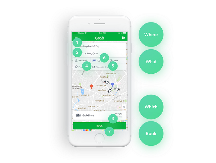
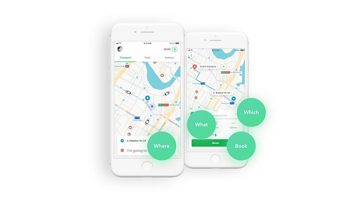
- In terms of product scalability: we assumed split to two pages could increase scalability in the future; also resolve smaller device issues.
- In term of discoverability: By revealing the service type entry points in the navigation, we assumed showing Grab services upfront on the home screen could increase Grab service conversion rate, discoverability and visibility. Encouraging users to explore more of Grab’s services.
- According to our data insights, previous Grab app didn’t follow users’ mental model. Users had to edit their POI on the top then change vehicle type on the bottom side then edit preference setting which is not very intuitive experience. To create more familiar transport experience, we assumed if we follow users’ mental model we could reduce friction for users and drop-off rate.
- In terms of product architecture, our old Grab data metrics shows choosing vehicle type upfront on the 1st step could not be as crucial as selecting pick-up and drop-off, so we display the vehicle type menu on the second screen and assumed users still know how to proceed even though vehicle menu and price are not close to each other.

- Most booking fields today are irrelevant to the average user. We assumed if we show the most frequently used preference options, such as reward and payment, can reduce the complexity of our configuration panel.

We have a lot of assumptions for new booking flow in terms of UX level, visual level, accessibility level, business level, just can’t articulate it one by one.
Iterative prototyping & ongoing user research
Designing empathetic experiences with product teams and doing research in different regions was critical for ensuring a more inclusive experience for our passengers. We want to take into account the diversity in Southeast Asia, including the differences between Singapore and Indonesia. No matter which countries you go to, there are some similarities but also some important differences. This is why we had so many rounds of user research to help us validate our assumptions and hypotheses in Jakarta/Singapore.
For first round research, we tested the existing Grab app experience with 8 participants in Singapore; some are regular users and some are non-regular users. Our goals were to understand passengers’ current experience, how they proceed when using Grab to book a car, and their mental model/perception of that experience. Another goal was to see if users are able to proceed with a new concept and design.
In Jakarta, we had 3 different rounds of user research sessions with the same research method, but different design approaches. We increased the number of respondents to make sure we tested with users from each segment. We wanted to test and validate our different assumptions and observe their transportation behaviour in the real world and in the lab. The first and second rounds of testing were conducted for passenger redesign flow with first-time onboard message and tooltips. Findings from previous research were all considered and incorporated in the design flow. Thus, round 3 of the test is aimed at revising pre-booking flow design.

I use Framer and Flinto to prototype a lot of interactions and assumptions. For example, how do we transition between POI and home (home to confirmation, poi to confirmation, confirmation to POI…etc). How do I edit point of interest? How do I select different vehicle type? How do I introduce our new experience? How do I change preference settings? How do I show/change trip sequence? After that, I combine all prototype fragments to one holistic prototype, then test it in Jakarta and Singapore. It shows a complete picture of what the redesign looks like.

By October of 2017, the core team and I started to present the entire transport experience, UX flow and MVP version to relevant teams and top management, getting their feedback. It was a complex process since we received so many valid concerns from different perspectives. These included branding colour disagreement, accessibility issues for the booking experience, holistic design system for all Grab products, increased visibility for core Grab service or scalability for potential future vehicle type. We had to tackle all of this feedback and initiate a lot of meetings and workshops across different teams. At the same time, the design side kept improving the design and consolidating all of our user insight and feedback.
To be honest, 80% of my daily life is communication, only 20% is related to design. 😂
After 50+ prototypes, countless UX flow, and design iterations, we had our MVP version for redesign. We redesigned the entire transport booking experience, released a new set of map elements to improve readability and accessibility, also created a holistic new design system for Grab app.
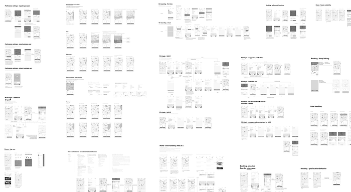
Here are some examples of our booking behaviour and user insight based on qualitative research and quantitative data analysis.


IA structure and component thinking
In terms of design principles for our structure, we had to rethink these three points:
- Scalable and stable design structure.
- Modularised components that can fulfill any scenario and service type.
- Consistent structure across different service types.

We analyzed the behaviours and mapped out the detailed actions from pre-booking to post trip. To make the journey better and provide consistent experience across all touch points, we try to provide different but systematic components and which can be reused across whole Grab tech families.

Interaction guideline and definition

In terms of Grab design system, it will be another article to describe it. Before we started Grab design system, we’ve been to a museum called “Asian Civilization Museum” in Singapore. To get inspiration and understand over 500 years of Southeast Asian art, culture, architecture, cloth pattern, Batik and heritage curated … etc. It was an interesting experience since we didn’t know how diversity in Southeast Asia before we went to that museum.
Regarding the interaction design exploration, I’ve also explored tons of different micro-interaction concepts at the early stages to demonstrate our ideas and concepts. It helps us persuade stakeholders if we can give them a concrete picture of our direction.
This motion is inspired by the movements and behaviour of Southeast Asia. Our experiences contain intuitive, judicious interactions that delight users’ transportation experience, increase engagement and reduce the anxiety of waiting. Furthermore, our motion should represent smooth interaction flow, clear visual hierarchy and delightful experience.


In addition, I also consolidated all UI components and defined interaction guidelines including motion curve, motion principles for transportation service, interaction spec templates and tons of interaction examples. Basically, it’s not just about building a document, but encouraging designers, engineers and product owners to have a basic standard to follow and speak the same language and terminology. (I will write another article to articulate the thought of the micro-interaction guideline and more detail about redesign.)

What’s next?
This is just a baby step in our redesign project. There is a lot more we can do with this project, and a lot more we need to improve as we continue tracking our data and learning more about user reactions to our new design. Our focus will be on improving the overall design system and providing different variations to see which approach is better.

Thanks to all the designers for making this happen and being so supportive for this project. ( Danis — design lead, Guan, Kuang Chih, Fengyi, Therese, Ingrid, Karlton, Gwen, Hillary, Voislav, Nina…etc )