Redesigning the responsive digital service ecosystem for a non-profit, ACRES.

Disclaimer:
This article is meant to be a descriptive account of my entire project walkthrough. So, it would be a rather lengthy read. I might write a shorter version sometime later, but this should serve as a good read for some of you who enjoys the UX process just like me!
Doing work for non-profit organizations have always been something on the back of my mind. Having the opportunity to collaborate with ACRES (Animal Concerns Research and Education Society) Singapore, was truly an amazing experience. The team we worked with, had one of the most determined, passionate and motivated individuals I have ever seen in my professional career. There were four of us with a diverse set of skills, and I was the lead UX for this project. We had the most enjoyable time of our life working on it. Before most of my project kick-offs, I would always make sure the team and I have internal alignments. We set our goals, what we hope to learn from one another, and at the same time, build new competencies amongst ourselves. In most of my past UX projects, my role has always been a strategic generalist since I have skills across the field, but a strong focus on ideation and strategic business to service design thinking.
Project Overview
The project scope is to redesign the website of ACRES. Keeping in mind the target audience and the purpose of the website. We must narrow down the key focus areas through research. The final delivery would include a responsive website prototype, content & UX strategy as well as a usability report on the overall performance of the existing site against the new one.
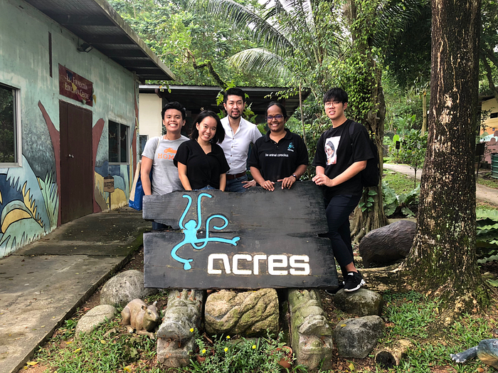
Team ACRES

Although I was the lead UX for this project, I could see every teammate working equally hard towards our goal. We did our best in the area we are good at. In the process of doing so, we were all contributing cross-functionally. I wanted the team to stay agile and be able to take on each other’s responsibilities. I have always felt the lack of strategic competency in a lot of UX projects. Hence, I instinctively took on the strategist role.
About ACRES
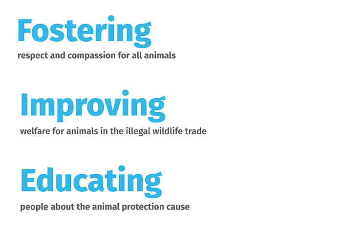
ACRES (Animal Concerns Research and Education Society), is a registered charity and Institution of Public Character (IPC), founded by Singaporeans in 2001. ACRES is an animal protection organization, driven by their concern for animals. They adopt research projects on the use of animals in various fields. Research findings are then used to educate the public to promote active community involvement in the animal protection movement, as well as strive towards synergistic partnerships with authorities and related parties.
Focus area of ACRES
We conducted our research on several areas, these include combing the web, social and also forums. We were able to map out the key focus areas of ACRES work.
Defining our research methodology
Now that we have a rough idea of ACRES, it is time to get our research methods in place. Gathering our thoughts and toolkits, we drafted out our research process in 3 key phases.

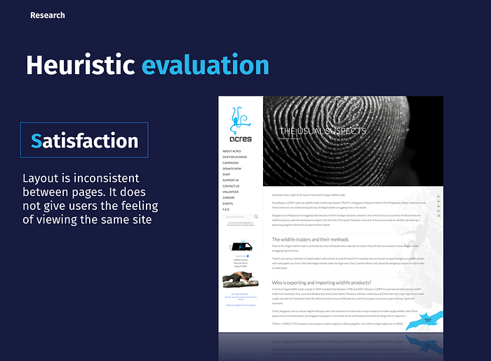
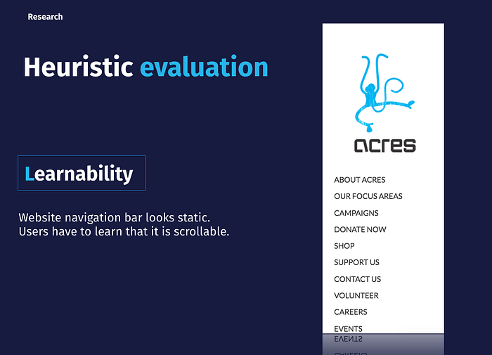
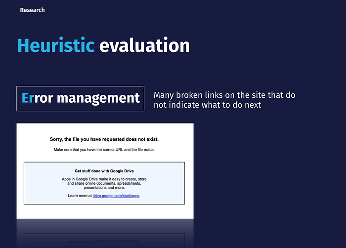
Heuristics evaluation
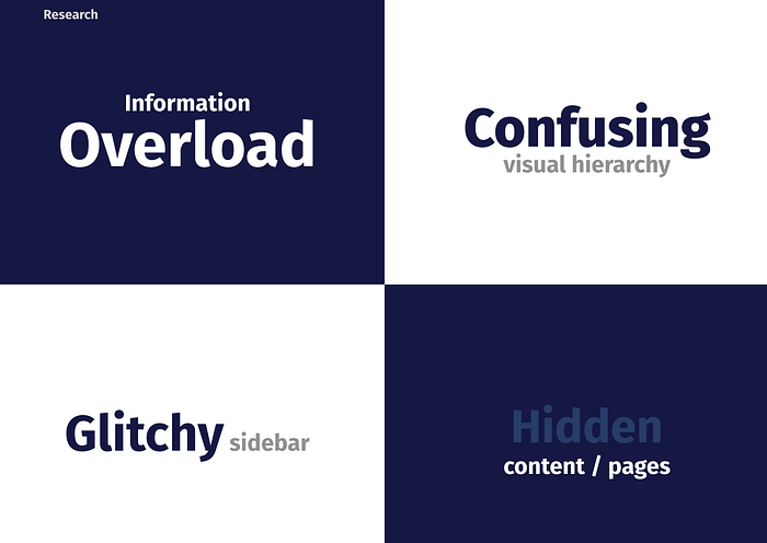
We went through ACRES’ website and did our heuristics evaluation based on the LEMERS approach. In order to get a better understanding of the whole experience, it is vital that we also capture the experience on mobile. Here are some of the key findings:

Content audit
We map out the current site’s content, to have a better understanding of the breakdown of the site. It was not as intensive as we thought. This is mainly because the site wasn’t as deep and also the content was mainly spread across the site’s pages. While doing the content audit, some of us were already working on the content strategy.

Client data validation through Co-creation

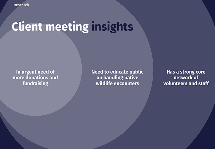
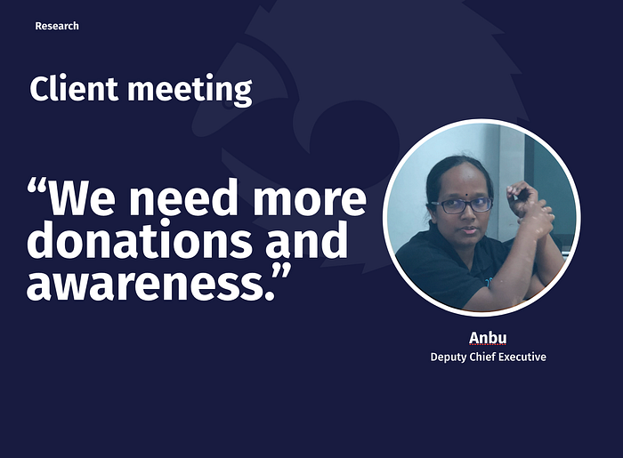
I always make it a top priority for all the data collected to stay as accurate as possible. To do this, a meeting with the client is always a must. I am extremely grateful to be able to set up meetings with ACRES client and have them give us so much of their time on this project. So we met up with Anbu, the deputy chief executive of ACRES and did an interview together with a walkthrough of some of our processes. In this co-creation exercise, we discussed several important aspects of the business. In a co-creation exercise, it is not just about trying to work towards a goal with your client, it is how good you facilitate it to elicit the right information required for your project. In my opinion, it was definitely a meaningful discussion both for my team and ACRES. Here are some key areas of our discussion:
- Business flow (includes: business flow, plans, KPIs, value propositions, vendor relationships etc.)
2. Current issues with the brand (includes: public perception, the role of the organization, fundings etc.)
3. Current issues and expectations for their online experience (includes: web, mobile, social etc.)
4. In-depth understanding of key major issues (includes: donations, volunteering, corporate partnerships etc.)
5. ACRES service delivery (includes: design of user journeys, touchpoints, back-stage processes etc.)
From the meeting itself, the team was able to validate the raw data collected. We did the first round of synthesis and was able to get something to proceed on. The next step was to get more data from the public.
In summary, our key take away was:
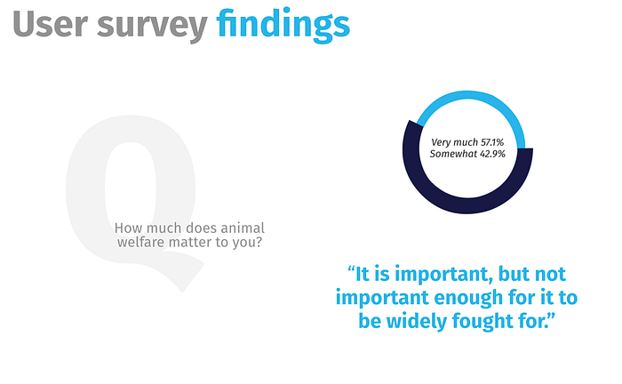
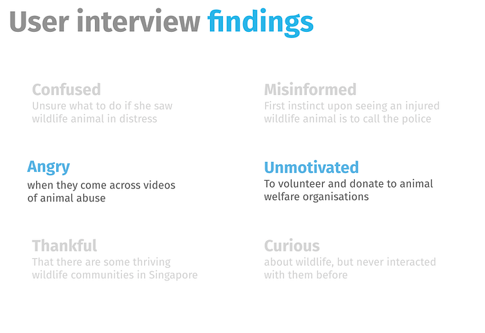
Quantitative and Qualitative data
In order for us to work on a higher level of accuracy, we did several rounds of interviews as well as collect both qualitative and quantitative data. There were really a lot of data compiled, but to cut to the chase, below is a snapshot of some of the important findings:
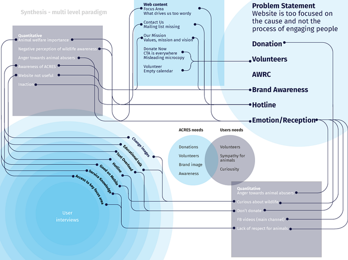
Data synthesis through a multi-level paradigm
The response I got from my teammates when I introduced this process to them — “This was so intense!”. :) Have you ever watched detective movies where he would gather all the evidence and have them tacked to a huge board? He would use threads and linked up all possible trails? I had the team worked this out with me after they compiled their data respectively. Through this approach, we break away from the norm of sequential data synthesis. At one glance, I gave them a bird’s eye view of what we have collected so far, and the team was able to understand the complexity of the problem we are solving here. We managed to pull possible similarities and synthesize all possible routes of experiences. Following this, we identify where the key problem areas were. Then, we would map these problems with the business needs and the user wants. This process, albeit a long and intense one, was able to help the team move forward, and eventually reach a point of conclusion.
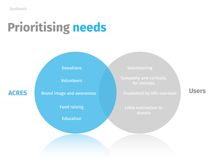
Prioritizing our needs
This helps to map both the organization’s needs against the user’s needs
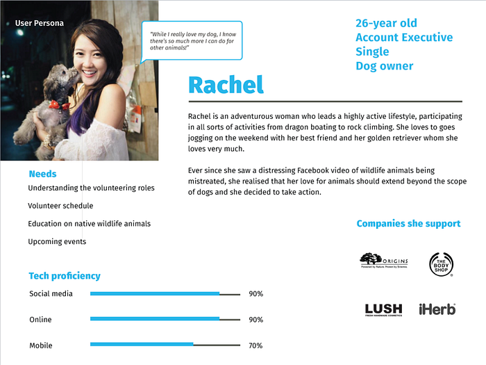
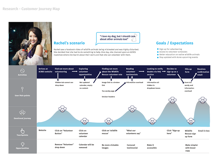
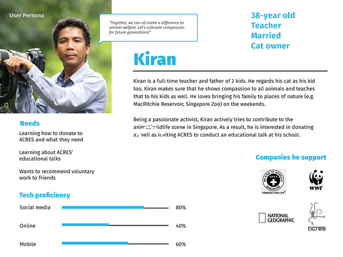
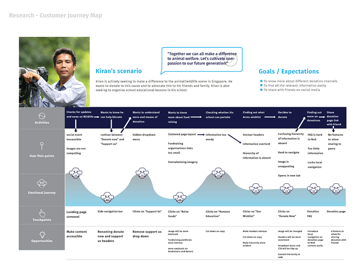
User Persona and Customer Journey mapping
From here, we came out with the user personas for both Rachel and Kiran. The two personas were designed to illustrate two key issues we want to tackle: donations and volunteers. Both are indirectly a problem due to the general lack of awareness and poor content optimization within the site itself.
Features prioritization
Using the features prioritization matrix, we tally all the different problems to tackle. And to further filter them, the MOSCOW approach was used to enable us to break down even more in-depth the issues to resolve.


Strategy
I’m a strong believer that strategy should always start during the discovery process. There are several areas to look into before the commencement of the project. As a team, we do stand-ups almost every day and we try to keep each other aware of our progress.
Our work process

The new I.A

Content strategy
We needed to make sure all 4 core areas of content strategy is crafted. I worked with Brenda on getting the content properly audited and how it should be placed and broken down into.

We decided to have the faqs in one page instead of bits all over the site. We moved donations and volunteers up to the first page to give more attention to the page itself.
Two-sided markets
What if real value is made possible through two distinct users in the service or product experience? ACRES’ value proposition not only helps the public, but they are also responsible for the wildlife animals. Because of this unique situation, it affects the UX strategy. In order to really understand ACRES, we could first look at the organization by digging deep into understanding its entire service model. I’m not exactly using a business model here, because it is essentially still a non-profit organization. However, the canvas is still effective for us and can be adapted to understand the organization from both the beneficiary and user perspective.
Using the business model canvas twice
The business model canvas was one of the few tools that I have chosen to understand the business. Due to the nature of ACRES being a non-profit organization, we must understand the business from both the beneficiary perspective as well as the users. Below are two canvas derived from both sides:


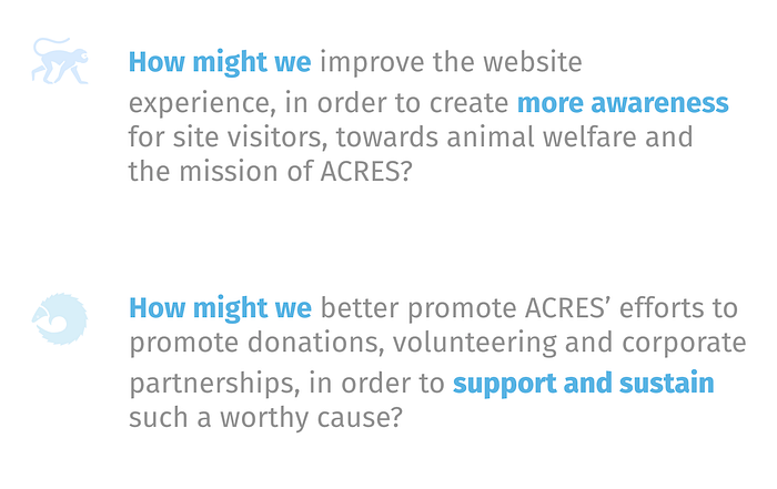
How might we …
We discovered two issues after mapping out both canvas. While ACRES have got really good value proposition as well as provide other services and corporate partnerships, this information is not immediately accessible or optimized to the site users. The three main things we need to help ACRES achieve was:
- Increase Donations
2. Increase Volunteers
3. Increase public awareness
Digital service journey
In order to understand the flow and connection in the journey, we mapped out the digital eco-system. This was essential for us to plan the service design journey. It allowed us to see the entire process from end to end. Since the main problem lies in awareness, there is a need to build the solution around helping users to understand ACRES a lot better. To do this, we must look outside of just the UX of ACRES’ current digital experience.

Service design blueprint
Using the service design blueprint, we could map out the entire journey of the user. We were able to work collaboratively with Anbu to understand ACRES’ back-end processes and using this first-hand information, built this blueprint. In order to make the service blueprint even more comprehensive, mental experiences of the users we tested were added into it.

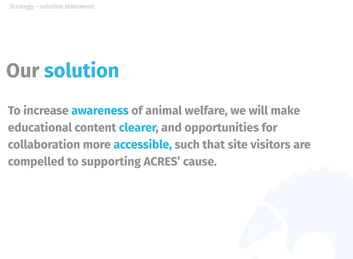
Redesign Strategy
The redesign strategy focuses on improving the UX experience, the digital service experience, towards service design. These 3 levels of experience are derived from the digital eco-system. As a UX designer, there are times we have to look further past just designing screens while as a service designer, there are times when one must look into the digital aspect of the user experience. The end result is the digital service design happening between both UX and Service. this redesign strategy addresses all 3 levels of experience, giving the user an integrated experience across the entire product journey.

By addressing current content strategy both on the web and mobile, we help ACRES realize existing possibilities of a better user experience. We could push this further by addressing the digital service delivery and improve what they could have done better. Lastly, if we tap further into service design, there are even more potential in terms of improving the service delivery of ACRES. People get more engaged with the ACRES brand, not limiting to just digital touch points but through the entire brand. They walk alongside the brand like an advocate!

Value innovation
Using the four actions framework, I’m looking at improving the value for both ACRES and users.

Behavioral economics
In order to improve the sign-up rates and to push overall engagement across all content touch points, the approach used in the copy taps on several cognitive biases. We set trigger points across our entire service journey. Below is an example of the volunteer digital service delivery.

Using behavioral economics on the copy
We wanted to experiment with the effects of how human’s cognitive biases can affect them, especially in areas where we could trigger better donation and volunteer rates.


Given more time, we would have made a lot more tests to verify the results of our work here. We wanted to see the impact of behavioral science on people’s decisions.
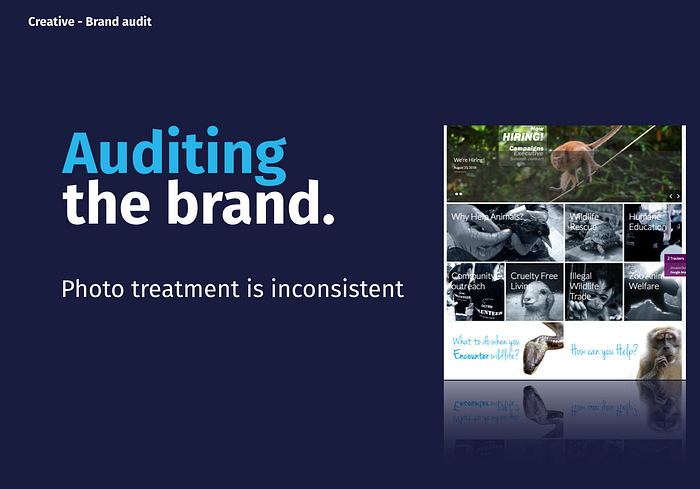
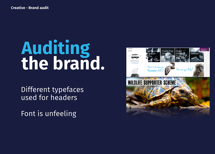
Brand audit
The team and I conducted a brand audit across all the touchpoints and highlighted several important areas to work on.
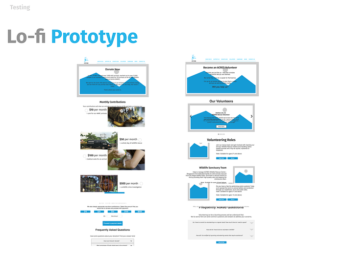
Lo-fi Prototype (1st iteration)
We proceed with the lo-fi prototype and did one round of user testing. It helped us understand what the current prototype is not addressing. This was version 1 of the prototype.
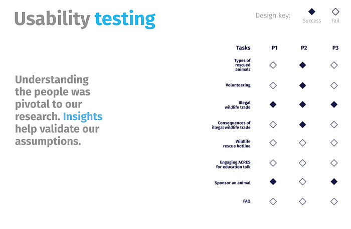
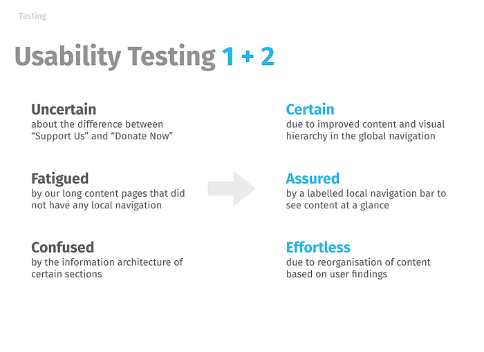
2nd round of user testing vs 1st round
Our second round of testing was significantly more successful than the first one. We timed the speed of how fast the users finished each task and realize a huge drop in getting the task done. The overall sentiments of the users were also very good. Many rated the new experience to be much better than the last one.


Improvements made
We were overall very happy with the improvements made during this short 10 days sprint. The donation process and volunteer process were now made much much easier. We made several key improvements to the overall experience.
- Better donation experience online


2. Emotional visuals were placed on their google sheet

3. Using cognitive triggers to help us craft a more engaging UX across the board.
4. Improved navigation menu.
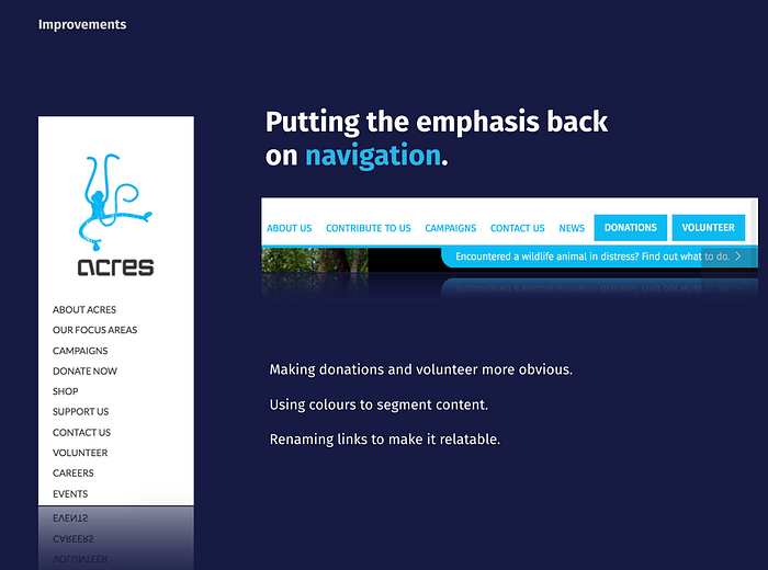
These were some of the improvements we made. There were so much work done, and we were elated to see how much we have covered in such a short period! :)
Hi-fi prototype


In summary, I think we had a long time working on this project and there were many things we want to improve on. There were also a few things we wanted to add to our future plans.

I wished we had more time to do more user testings on the results and impact of human behavioral science. There were many things I felt we could dive deeper and build for ACRES to achieve better service delivery for their users.
I’m glad you made it this far! Clap if you like it! Thank you for your support! Feel free to drop your comments and thoughts!


