Redesigning the Zoom experience
 With the COVID-19 pandemic hitting countries across the world, a lot of people have now switched to video meetings. Be it for your official meetings, webinars, entertainment sessions — video meetings are the new normal. We saw these video meeting applications becoming popular during the crisis, especially Zoom. It has become one of the most popular apps on Google Play and Apple App Store in the world. Needless to say, the Zoom app saw tremendous growth in its stock.
I had my first experience with Zoom in 2016 when I had to attend a meeting with one of the clients for a design brief. My second experience with Zoom was a few days back. And to my surprise, the app has largely remained the same.
In my opinion, there are a LOT of problems with the current experience. Because of the crisis, the elderly have also started interacting with their friends and family on such apps. One of my uncles also had to go through the Zoom experience and his experience was also very bad.
I decided to improve the current experience of the Zoom app. I have also tried to list down all the issues I see in the world-famous app and how I have tried to address these issues.
Let us get started.
Imagine you are invited to a Zoom meeting. You get an email from the host with the invite link. The meeting is scheduled for two days later. The D day arrives, you click on the link. A new browser window opens up. The browser prompts you to download the Zoom app. If you already have the app installed, it opens up the Zoom app and you see a screen as shown below.

Okay. Let us try to understand this screen. I see this obstructing popup which basically asks me to test the audio and it basically shows me only one option to join the meeting with computer audio. Every time I join a Zoom meeting — this popup hinders my screen. Okay, so I do a very tiny checkbox to basically hide this popup for the future.
If I talk about my uncle who is in his 50s, he would expect the meeting to start right away. I mean, for him, he should just click the meeting link and boom the meeting should start. But he faces this popup and as a layman, he has no clue what’s happening. Let us go ahead. I click on Join with Computer Audio.
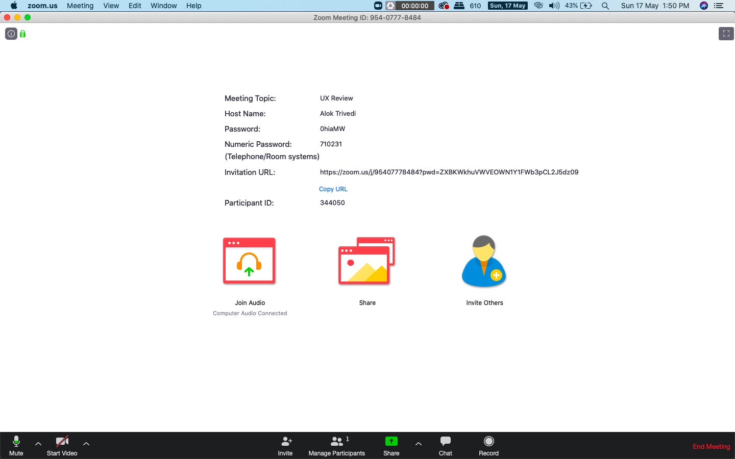
So now I have this screen.
The popup’s gone and I see too much text, three big icons and a black toolbar. Let us drill down this screen.
- The text information basically has a meeting name, hostname, meeting password, meeting URL, and participant ID. All this information is not that of use to me.
- The big icons are Join Audio, Share, and Invite Others.
- Join Audio — I think I performed this action in the first popup as well. I have literally opted for computer audio a few seconds ago. Why would I need to perform this action again? Repetitive action. This could have been added in a subtle way rather than a big icon.
- Share– Okay. Share screen? Share the meeting link?
- Invite Others– I can use the meeting link mentioned in the text information and invite anyway. But okay, this can be a useful feature.
Overall, this whole screen can be made much simpler.
Let us see the toolbar now.

Okay, so I have these options:
- Mute and Video (then a dropdown for toggling between various audio or video inputs I might have) — required feature but again I don’t personally like this dropdown arrow beside it.
- Invite — can be placed somewhere else
- Manage Participants–can be shifted to a menu item instead
- Share
- Chat
- Record- can also be moved to a menu item
- End meeting — very less prominent. It should be a CTA. I have found people complaining about finding how to end a meeting.
Once people start joining the meeting, I see the screen with video tiles. Also, if I open up the chat to chat with someone, this is how the screen looks like right now.

The sidebar is one panel that again is a lot confusing to find and send a message. People have found it really confusing to chat during a call.
Redesigning the experience

The new screen has the following limited information:
- Meeting name and the host
- Who are in the call currently? I have tried to show the users who are in the call with their display avatars.
- The video panel where you can see how you are looking. Adjust your hair and all.
- Microphone and Camera: I have also shown the ON in green and OFF in red color for better visual identification for the users.
- Join Call: the primary CTA on this screen in BIG BLUE Zoom branding color.
I have removed the non-essential text information. Also, I have shifted the Copy Meeting Link in later screens.


Once you are in the call, and the first one — you see the above screen. I have added the required options in the dock bar in the bottom. The dock also has an improved End Call button with RED color. Red is a standard color for disconnecting the call. I think it would be easier for the masses now to identify how to disconnect the call.
The dock also contains easy options to mute or turn off your video. And share screen. Rest options, I have removed from this screen. I have also added the Invite Others on the top to invite your friends or family into the meeting.


Once people join the call, you will see a Toggle Chat button because now you can chat with other people. Toggle Chat would open up the sidebar the same way as before.


Opening up the chat screen would toggle the main meeting video to tilt slightly to the left. The dock bar would also shift accordingly. In the chat screen also, I have added colorful avatars to easily identify the person who is sending the message.
I hope you liked the redesigning of the experience. Please mention your questions and feedbacks in the comments down below. I really hope the Zoom app incorporates some of the features in their app.