Redesigning the bulk goods scales at Whole Foods — a UX case study

This is the first post in a series where I turn design issues I see in the real world into UX case studies.
On a recent trip to Whole Foods, I wanted to grab some trail mix from the bulk goods section. Just as I finished getting my trail mix and just as I was about to write the price look-up (PLU) code for it, I saw a scale for bulk goods. I thought this scale might also be able to print out a barcode sticker for my trail mix, so I went to give it a try.
Unfortunately, the experience using this scale couldn’t have gone worse.
Experience breakdown
- I put the bag of trail mix on the scale. The scale showed that the trail mix weighed 0.51 pounds but couldn’t calculate the price per pound or the total price. This made sense since the scale didn’t have the PLU code for the trail mix. I looked for a way to input the code, but couldn’t find anything. So I was left to tap everywhere on the screen until something gave — and that was the “Add Tare Weight” “button” on the bottom right.
- I was then prompted with a bunch of random container sizes to choose from, which didn’t seem applicable to me at all. Not to mention, the word “tare” was throwing me off. I tried to press “no container” but the screen was unresponsive. I pressed “clear/start over” but ran into the same outcome.


So let’s back up. This was obviously a confusing experience, but I still like to give the benefit of the doubt to whoever designed this. I believe that there are always reasons for how things were designed, no matter how confusing they might initially appear to be. I would’ve loved to have spoken to the original designer/manufacturer for this device, but since this is a personal design exercise, I didn’t have that luxury.
So I’ll assume what the goals of this scale:
- The scale should be able to calculate the total price of the item based on the PLU code and the weight of the item so that the end-user — a Whole Foods shopper — knows exactly how much their trail mix obsession is costing them.
- The scale also takes into consideration the weight of the container that the shopper is using, so that the shopper doesn’t get overcharged. This is what the second screen is attempting to convey.
- Because I saw a receipt printer attached to the scale (not shown in the above photos), I’m assuming that a barcode sticker would be printed out so that shopper could affix it to their trail mix container.
I know that the user is going to be a shopper who probably would want to get this done quickly. The scale likely exists to save shoppers the trouble of writing down the PLU code and securing it with a twist-tie — or, in other cases, forgetting to do any of this, which is something to consider in this redesign. These issues likely slow down the checkout line (which is something that I’ve admittedly done).
The problem I’m solving for here, then, is:
“How do I create an accurate and easy-to-follow scale solution for Whole Foods shoppers that prints out barcode stickers?”
Success for the outcome of this solution would be quicker checkout times when bulk goods are being purchased.
So let’s get down to business.
Exploration

After some sketching, I came up with these initial wireframes, which incorporated the main objectives of weighing the item, identifying the item, identifying the container, calculating a final total and printing out a barcode sticker.
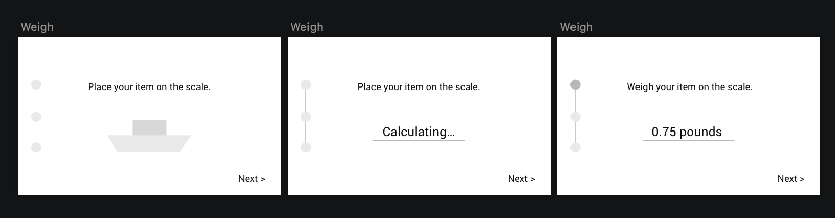
In the process of breaking down the weighing flow I realized that a shopper’s first instinct is to set their item on the scale. That’s exactly what I did in the first place! And that’s frankly why the scales are designed the way they are, with the weight calculations on the first screen.
So I redid my wireframes to reflect this behavior.

Now came the fun part… designing the item identification experience.
First there was the option of having the user input the PLU code for their item. This is something that’s already in practice in bulk food sections, so it wouldn’t require shoppers to change their behavior.

Before settling on the PLU input method, I wanted to explore an option that would allow shoppers to search for their item.

However, I didn’t think that this was any more efficient than the PLU mechanism, so I went ahead with the PLU code flow. One thing that I’d want to suggest — at least when the technology is affordable enough — is to add an AI camera to this scale so that no user input is needed. The scale can simply use cognitive vision to identify which item(s) the shopper picked.
With the different flows sorted out, the revised flow looked like this:

Now that a good chunk of the interactions have been solved (for now), it’s time to work on creating visual clarity and delight.
Refinement
Since Whole Foods already has a very sturdy and beautiful set of brand guidelines, I decided to use them when bringing this flow to life.
While Circular and Corda make a great pairing, unfortunately for me, these typefaces come with a hefty price tag. I didn’t foresee these screens using Corda, so I decided to swap Circular with Airbnb’s Cereal font. These typefaces are obviously different, but at least both are geometric and convey similar feelings of lightness, freshness and modernity.

I played with a number of treatments for the starting page and ended up liking the middle option on the top row the best. Many applications of the logo playfully cut off one side of the circle, so I thought that treatment would give this screen more personality and, at the same time, draw the shopper’s eyes towards the scale (below the screen).
I knew the calculating page would be pretty empty, serving mostly as a transitional page. But I also knew that it had a lot of potential for some fun.
For an activity loading indicator, I wanted to do something along the lines of “morphing vegetables”, in a similar style to the talented Yup Nguyen.

What I ended up coming up with may not be as brilliant as something Yup might’ve created, but I think it does the job for now. I’m trying to show a pizza morph into a watermelon morph back into a pizza.

As I continued going through my screens however, I realized more and more that having the logo at the bottom was becoming a nuisance. For example, I needed to fit a number pad on the PLU input screen, but with that logo — there’s no way anything is fitting! Not to mention, the progress bar at the top needed some work.

The version with the logo in the top right wasn’t too bad… I’ll use that one going forward.

With these changes, the number pad was able to fit… though I must admit, it looks like it’s floating. Also the number pad seemed to be taking up more space then it should be. It needed to be tweaked more.

Adding some visible padding around the number pad made it seem less like it’s floating, so that’s an improvement at least. From there, the rest of the screens fell into place.

With all of the components put together, they look something like this:
Again, if I had the budget/bandwidth to go to a Whole Foods and get this tested, that would be my next step here. But for now, this is my redesign for the bulk goods scale.
Success, if this were to be hypothetically shipped, would be measured by 1) tracking the average time it takes a shopper to complete this flow against a benchmark time and 2) anecdotal feedback from cashiers about whether or not this makes checking out more efficient.
I’m always looking to improve upon what I’ve designed, so any thoughts and feedback is greatly appreciated!

