UX Collective

We believe designers are thinkers as much as they are makers. https://linktr.ee/uxc

Follow publication

Reducing cognitive overload: designing for human cognition
Marcos Rezende
UX Collective
Published in
8 min readJun 6, 2024

--

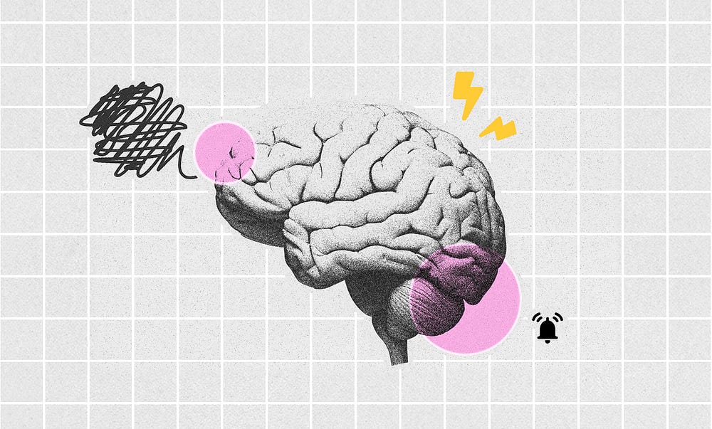
An illustration of a human brain with various graphic elements representing cognitive overload. On the left side, there is a black scribble with a pink circle around it, symbolizing confusion and stress. On the top right of the brain, there are yellow lightning icons, representing a sense of overload. At the bottom right, there is a pink circle and an alarm icon, symbolizing alertness and stress.
Illustration by Marcos Rezende

Imagine dropping someone from the 1900s into our world. The daily grind looks different, but are our brains keeping up? That’s the core challenge of modern cognitive design: how to present this information explosion without frying people’s minds.

To navigate this information overload, we’ll delve into concepts like cognitive load, mental interaction cost, mental models, and calm technology. By understanding these fundamentals, we can create intuitive experiences that simplify the user experience and make interactions with technology more efficient, even in a chaotic information environment.

The spectrum of human cognition

A black-and-white image of a crowded street, representing cognitive overload. Various people are walking in different directions, with some faces highlighted in purple circles, symbolizing the difficulty of focusing on many simultaneous stimuli.
Image: Mauro Mora (Unsplash) — Edition by Marcos Rezende

Understanding human cognition requires a holistic approach, including perception, attention, memory, language, reasoning, emotions, and consciousness. These elements form the foundation of effective and intuitive design.

From stimulus to perception

Perception begins with a stimulus in a sensory organ, converted by the senses into neural activity processed by the brain. This initial activation, called sensation, leads to the creation of a mental image of the original stimulus.
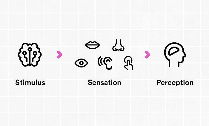
Diagram illustrating the relationship between stimulus, sensation, and perception using simple icons. A brain icon represents the stimulus, which leads to an eye icon symbolizing sensation, and finally to a head outline with a brain inside representing perception. Pink arrows connect the icons to show the progression from stimulus to perception.
From stimulus to perception — by Marcos Rezende

For example, when people see a red light while driving, their eyes spot the red light (stimulus), their visual system processes it and sends signals to their brain (sensation), and then their brain figures out that the red light means they need to stop (perception). By understanding this process, user experience designers can create interfaces that fit how people naturally see and understand things, making them easier to use.

Bottom-up and Top-down processing
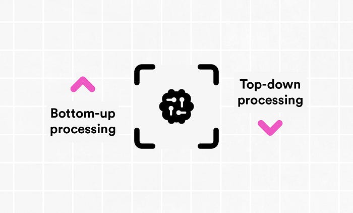
Simple diagram contrasting bottom-up and top-down information processing models in the brain. Bottom-up processing is represented by an upward-pointing magenta arrow, while top-down processing is shown with downward-pointing magenta arrows surrounding a black icon depicting a brain.
Bottom-up and Top-down processing — by Marcos Rezende

Create an account to read the full story.

The author made this story available to Medium members only.
If you’re new to Medium, create a new account to read this story on us.

Or, continue in mobile web

Already have an account? Sign in

--

--

Responses (11)

Write a response