Building an MVP design system in 3 months
This case study aims to chronicle the creation of our working design system at Linqia. I’ll share insight into the questions we asked, our process for getting started, the tools we used to create and implement the system, and also how we document, maintain, and share the system with our team.
Important questions
Should we build a design system?
It’s not news that design systems have become increasingly popular over the last decade, but should everyone build a design system? Probably not, so the most important question you should ask yourself and your team before you start is just that. ‘Should we build a design system?’
What are the possible benefits of building this system? What could go wrong? How many resources will it take to maintain this system? And, what problems are we trying to solve by building this system?
Why are we building a design system?
There are costs and benefits to creating a design system, so our next question was ‘why are we building a design system?’
We came up with the following goals in which we would measure the success of our design system by. The design system should:
- Increase engineering velocity
- Create consistency throughout the product
- Establish a shared language across our organization
How should we go about building a design system?
Next, we needed a plan. I started my search by looking towards the best-in-class systems to draw inspiration from and try to interpret their approach.
I went to events and listened to other designers talk about the systems they’ve created. I picked up a copy of The System’s Bible by John Gall. Gall’s Law states that all complex systems that work evolved from simpler systems that worked.
A complex system that works is invariably found to have evolved from a simple system that worked. The inverse proposition also appears to be true: a complex system designed from scratch never works and cannot be made to work. You have to start over, beginning with a simple system.
Along the way, I realized that no design system is one-size-fits-all. A design system should be thought of the same way you approach any product. At Linqia, we’re a small startup team with limited resources, and it was important that we create something that would be easy to create, maintain, and access. To accomplish those goals, our system needn’t be huge or full stack, it needed to work for us.
I referenced Brad Frost’s popular Atomic Design Methodology, and looked into how other teams have implemented that methodology into their own systems. The Atomic Design Methodology proved to be a valuable tool for bringing logic and structure to the UI design, and was a helpful concept to help align our team and get buy-in across the organization.

We continue to use the Atomic Design Methodology as a tool to discuss our foundations and components today. When it comes to documenting our components, our team felt it was more helpful to break them out as functional components as opposed to sticking religiously to the atomic terminology. Still, our components are broken down into:
- Basic styling elements like type, icons, color, etc. (atoms)
- Components (molecules)
- A collection of components or a combination of components (organisms)
- Those are laid out on the page (we kind of skip over templates because we build the component to take in real data)
Finally, it was time to get to work and conduct an audit of our existing product, start rebuilding, and get documenting.
Conducting an audit
First thing first, I conducted an audit of the existing product. I broke this up into two phases: visual design and user experience.
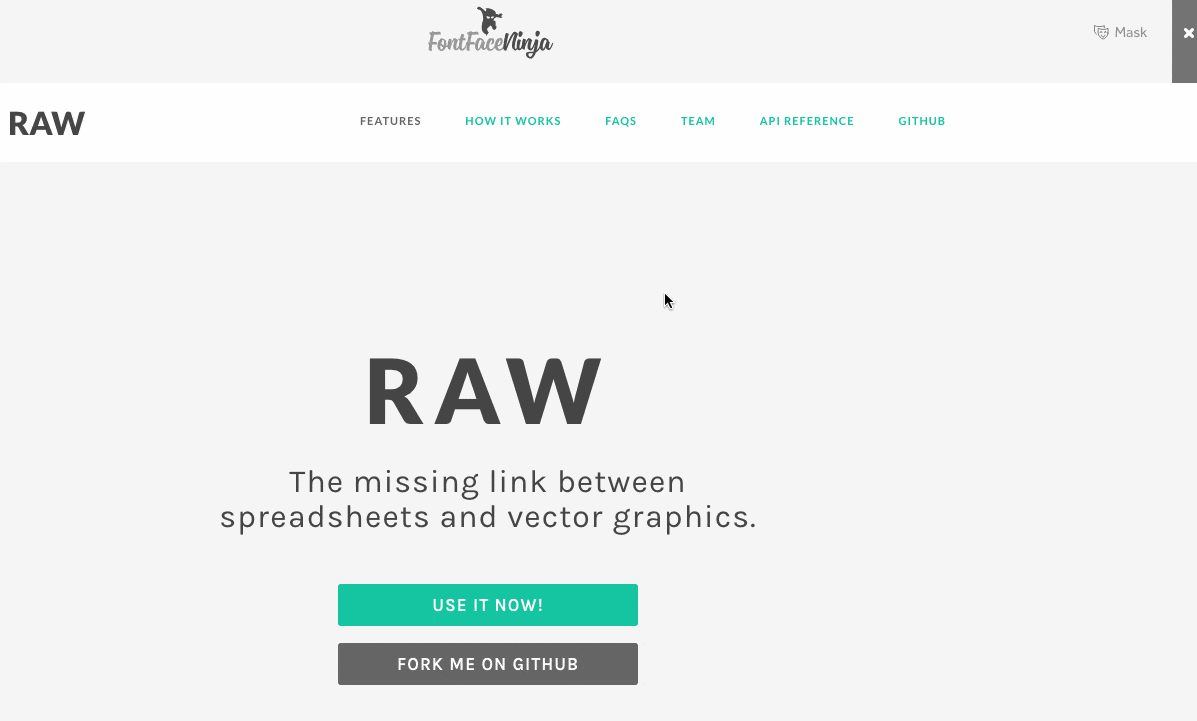
I used a plugin called FontFace Ninja to audit the typography, I enjoy doing this manually because I like to explore the relationship that type has to the context in which it lives.
Another useful tool, called CSS Stats, will pull a bunch of raw CSS data from your site and return a visual representation of colors, font sizes, font families, as well as a list of the most commonly used properties & declarations (plus more).
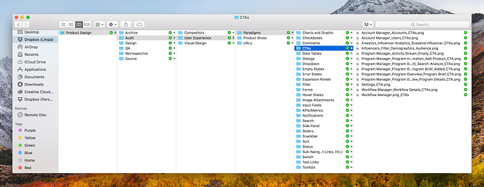
Next, I created a library of screenshots and organized them into their own folder. If anyone on our team is wondering what it would take to replace all the buttons in the product, they can easily access this folder and see the what and where of it’s context in the product. It also offers us a quick glance into the debt that had been accumulated and what it would take to reduce it by implementing new reusable components.
To no surprise, we discovered many different colors in hue and a whopping 41-color palette. There were 24 different font styles, consisting of 3 different fonts and various weights and sizes. There were permutations of the same buttons, completely one-off randomly-styled buttons, various styles of input fields, and so on and so forth.
Process
Our cross-functional team consists of 6 contributors: 2 product managers, 3 front-end engineers, and myself. Here’s a high level description of what our process looks like today.
Product roadmap
Our product roadmap encompasses the company’s overarching strategic goals, under which we prioritize new features or updates to existing features. Those features will have deadlines assigned to them. We’re tackling this redesign and systemization through the lens of this roadmap.
Design process
Research is conducted and new features are conceptualized, iterated upon, and designed. We break out components in terms of their functionality, so a text input and a number input will have their own individual component. When new designs are ready, we break out any new components and create supporting documentation.
Reducing components to a single function, like a button or a drop down increases flexibility, making them more reusable. The more reusable your components are, the less you need to maintain, and the easier scale becomes.
—Invision’s Design Systems Handbook
Recurring meetings (process and alignment)
Every Friday, we meet to discuss the health of our design system, assign tasks for any updates required, and look at new components we need to build. Together we collaborate on the final structure and naming convention of the component. This is important as it allows the team to discuss the differences of terminology between design and development and democratizes our shared vocabulary.
Foundations
Brand values
Authentic, Trustworthy, Impactful, Approachable, Inspiring, Leader
Choosing a typeface
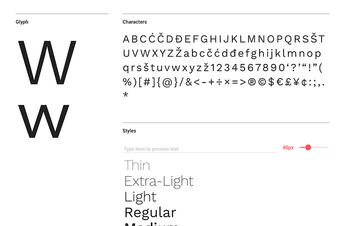
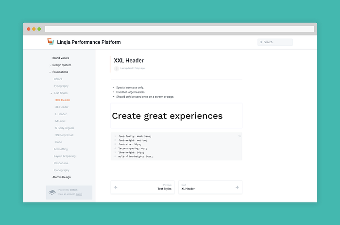
In addition to the 24 different font styles found during the audit, there were 3 different fonts in use: Roboto, Segoe, and Arial. The primary typeface, Roboto, didn’t feel like a match for our brand and we decided to look for a new typeface to add a touch of warmth and personality to the product.
As a startup, our one constraint in selecting a typeface was that it should be open source, so I turned to Google for my search. After experimenting on a few different combinations, I landed on Work Sans as our new typeface.
The Work Sans family is simplified and optimized for on-screen text usage which provides users with an easy and legible reading experience. This was important as we have a lot of long copy within the product in the form of creative briefs. The product also allows users to generate and copy code in the application, for which we utilize a monospace font — Source Code Pro.
Building a color palette
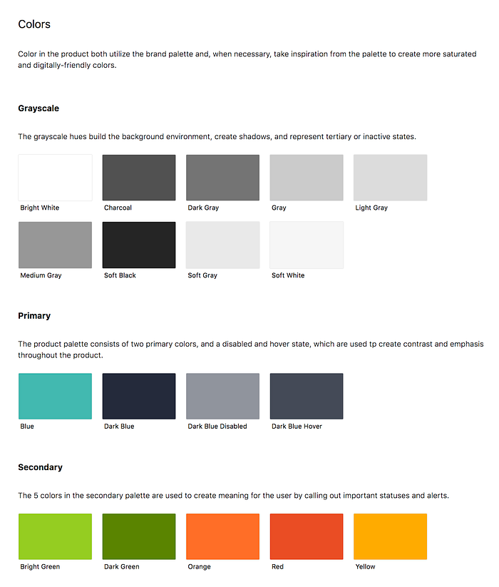
The digital color palette takes inspiration from our brand palette, using those to come up with colors that are more saturated and look better on digital screens. We also came up with 9 colors to use as our greyscale palette.
Our final palette utilizes two primary colors which are used to create contrast and emphasis throughout the product. Our secondary palette consists of 5 colors which are used to create meaning for the user by calling out important statuses and alerts. The greyscale hues build the background environment, create shadows, and represent any tertiary or inactive states.
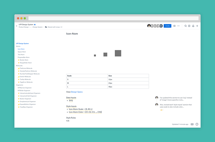
Iconography guidelines
Icons are created and provided in vector format (SVG) which works best for scalability and responsive design. Our iconography always uses 1px borders and can be different colors based on their context and size. We have 3 icon sizes, and use boundaries to allow flexibility when making visual adjustments (visual weight).
Spacing guidelines
When it comes to spacing, we use multiples of 8 to define dimensions, padding, and margin of both block and inline elements.
As our design foundations continue to develop, we’ll likely include guidelines for shadows, motion, and sound as well.
Documentation
Finding the right fit
Documentation has the important goal of being the shared record of truth that anyone on the team can access. We needed the platform to be accessible, easy to use, and free.
Dropbox Paper was free, accessible, and the auto-generated table of contents allows us an index to quickly jump to. We used emojis to symbolize when something was new or had been updated, and used commenting to collaborate and ask questions. The speed and velocity was great! Until the document started to grow. At that point, it started to feel cluttered, unorganized, and too informal. It stopped feeling like the right tool for a design system. (And to be fair, it was never intended to live up to this purpose. I just am too stubborn to not use Dropbox Paper for everything.)
We tried Gitbook and it seemed perfect for us. It was free, accessible, organized, easy to use, and felt more formal.
Then, Invision released Design System Manager to the public, and I switched over the same day. It took me less than 4 hours to move all our components and documentation over to DSM. Ultimately, using DSM as our tool became the best option as it meant we no longer needed a new tool.
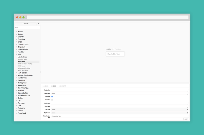
Storybook
In addition, our engineering team uses Storybook to develop and deploy our components into our different dev environments. Storybook and DSM contain quick links so that anyone on the team can switch between the documentation and components, and the code. We also link out to Invision Inspect so that engineering can quickly view the design specs. (Feature request: It’d be rad if components would allow inspect directly on DSM, or at least link out!)
This is how we’re documenting our design system today, it’s a simple and straightforward approach that is working for us right now, and over time we will continue to build upon it.
Measuring success
The biggest indicators of success have been encapsulated in those ‘ah-hah!’ moments our team experiences when we’re looking at new designs and putting our system to the test. There were also some quick wins that we were able to accomplish through creating this system:
- Documentation—it took a few tries to nail down our design system documentation in a way that was useful for engineering, accessible by everyone, and was easy to maintain.
- Flexibility and velocity—the first components we built took a lot of engineering effort, but as we continue to use the system and build with it, it’s noticeably increased our efficiency and velocity.
- Consistency and standards — we’re slowly overhauling the system with every new and updated feature we work on. Our goal is to complete the entire redesign over the course of the year.
- Redesigning the copy — the way the product uses terminology and groups information didn’t match how our users talk in the real world. I’ve began documenting this as well so that we can create the same consistency in our formatting foundations.
Looking at the system critically, and other things I’ve learned along the way
Creating a design system not only helps your team create more consistent interface, it builds a bridge between design and development.
Here are some takeaways from our team over the past 3 months:
- Managing the system in different applications is a lot of work and it’s important to have set time aside to maintain this system of work, otherwise your design system will become outdated and useless.
- I don’t yet consider this a full stack design system, more like an MVP of a design system. We still have a ton of grounds to cover in terms of laying a strong foundation before we can scale this design system.
- Our design system is an internal tool, and we must ensure it’s a great user experience for our team if we want it to be adopted and successful.
This is the story of a living and evolving product that’ll continue to serve Linqia’s other products in the future. Have a story of your own? I would love to hear about it in the comments.

