Member-only story
Replace your complex bar chart with a dot plot to make it better understood
The alternative to bar charts that works well with complex data

Bar charts are used for nearly every situation, which means sometimes you’re struck by monstrosities like this:
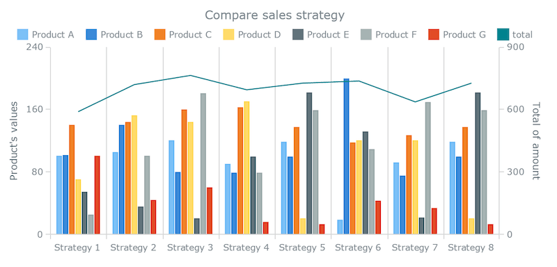
Working with data visualizations often means working with bar charts, which can get boring after a while. Work with multi-variable bar charts, and you’ll wish for something easier on the eyes.
Luckily, there’s an alternative to bar charts that accomplishes both of those things. Many people prefer it to bar charts, especially when your data becomes more complex: the Cleveland dot plot.
Understanding dot plots
The dot plot came about as a result of a few different forces at work. The first of which was a concern over the accuracy of visual cues. In the early 1980s, William Cleveland and Robert Mcgill published a piece that talked about the accuracy of certain visual cues.
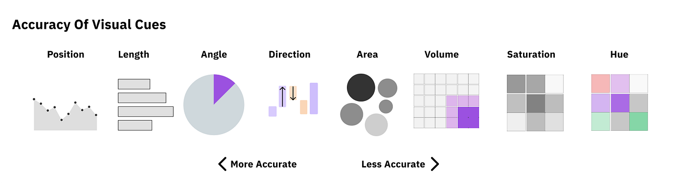
Cleveland noted that people are a little better at judging position accurately than they are at measuring length. The other influencing factor at the time was Edward Tufte and his famous “data-ink ratio.”

In simple terms, the less ink used for things other than the data, the better. These two ideas, accuracy and less clutter/ink, contributed to what is known as the dot plot.

The dot plot replaces the bars of the bar chart with dots, and it has 3 main advantages:
- Reducing clutter
- Being able to have a non-zero…