Member-only story
Responsive grids and how to actually use them
You looked around, you saw all the arguments on why to use a grid, how to set one up, and you’re totally on board with all of that, but nobody told you how to use one. Same.
Technically this article can be applied to grids in print but for our purposes, I’m specifically talking about web responsive grids for desktop, tablet, and mobile. Before we get into the nitty-gritty, let’s get our terminology right.

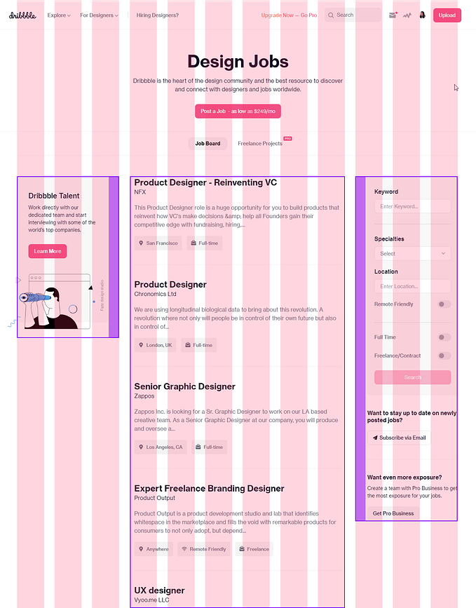
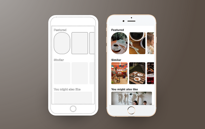
Field Elements are your blocks of design, whether that be text, image, or a combination of both. Background colors don’t really count as field elements unless they are a container for your text/image. I’ve seen the name field element be interchangeable with units, elements, parent containers — they’re all the same.
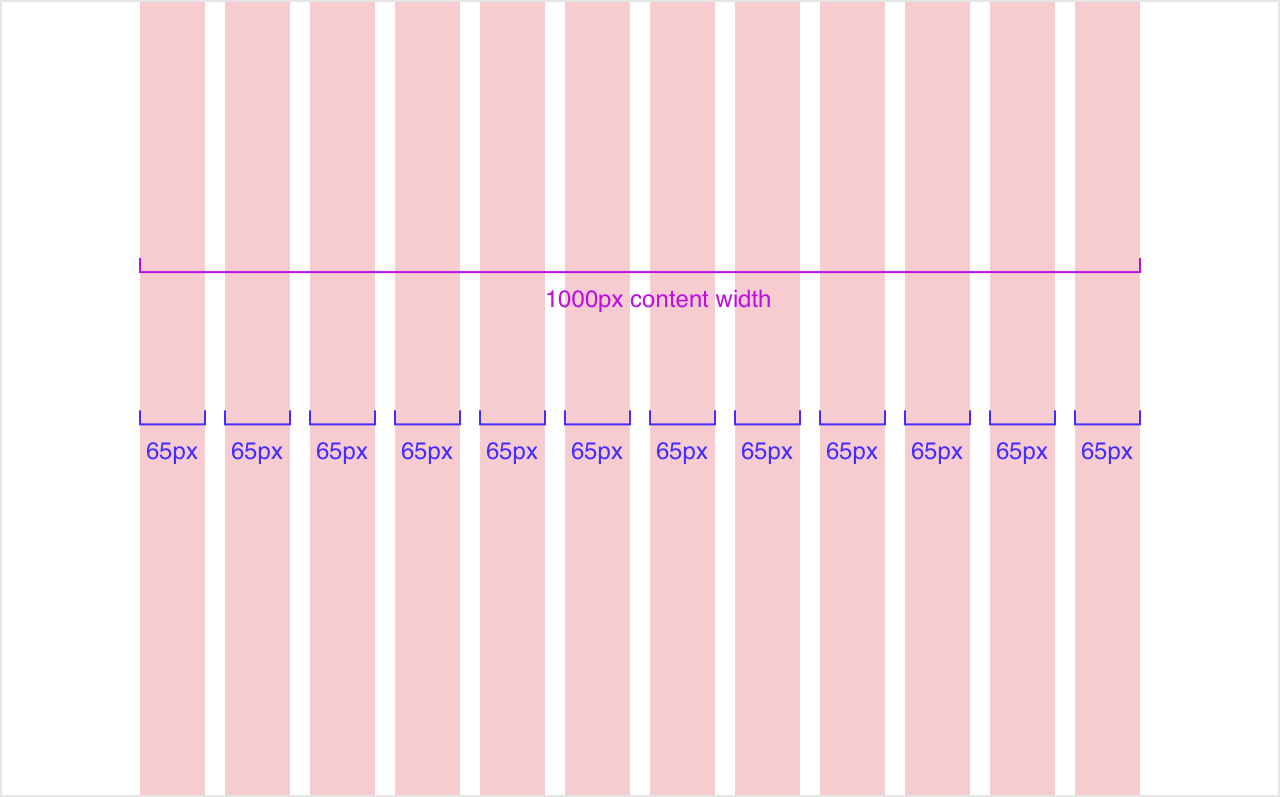
Columns are the thick colored blocks that make up the content width of your design. Field elements are to sit on a certain number of columns. Traditionally in a design system, the column width doesn’t change but the number of columns change from 12 on desktop, to 8 on tablet, and to 4 on mobile. You can literally use anything you want, but most grids have 60–80px column widths. Choosing a column width that works for you is the most important since it’s the main determinant of your content width.
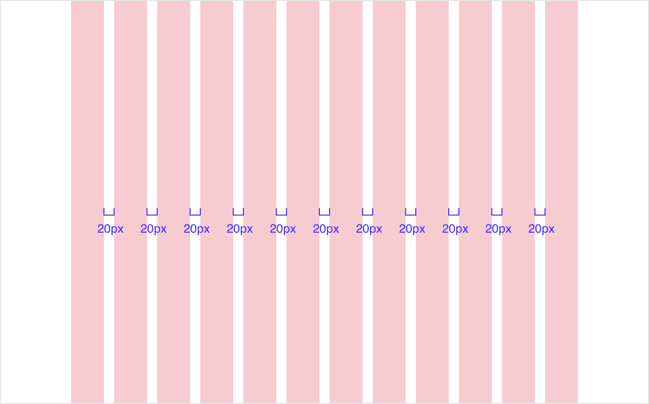
Gutters are the space between the columns. 20px is a common gutter size, and this spacing will be really important when you have a masonry design or a grid of card elements, a simple example being a photo gallery. Some systems increase the gutter width as you increase in device width, but it’s also okay to keep it fixed.
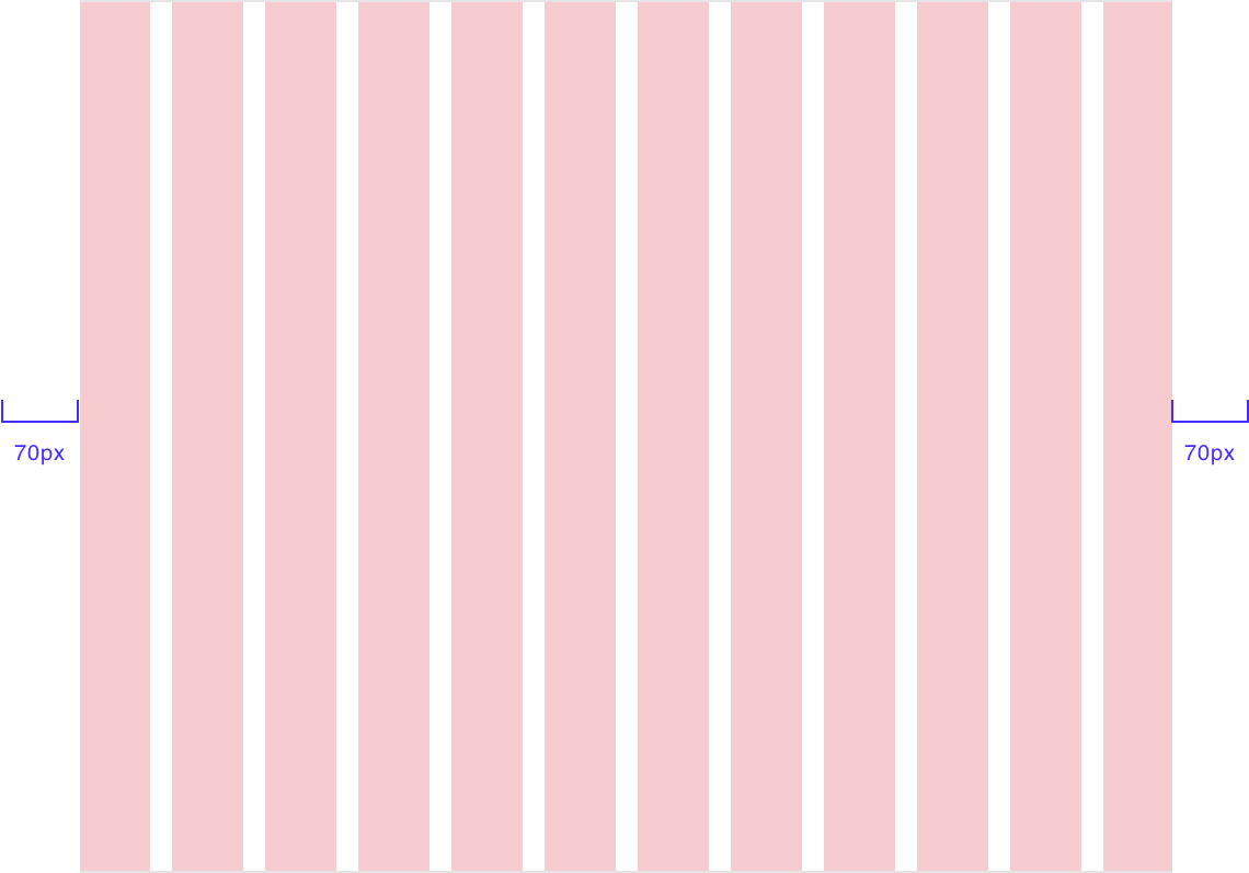
Side margins also known as outside gutters are the amount of white space outside of your content width. For a more accommodating design, the side margins increase as you go up in device width. Side margins on mobile are…


