Member-only story
Responsive text: building readable text across screen sizes
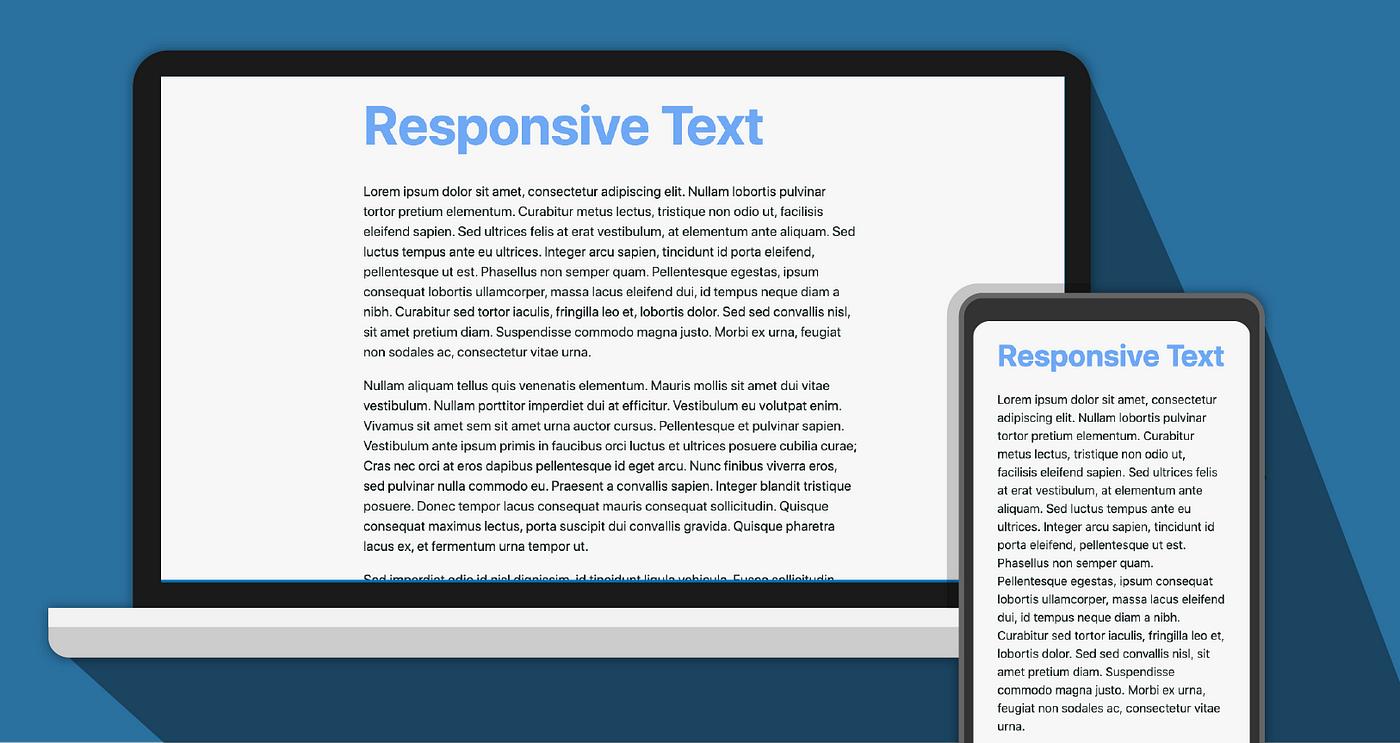
Many of you may already know about responsive web design. Cited from Wikipedia, responsive web design (RWD) is an approach to web design that makes web pages render well on a variety of devices and windows or screen sizes. The responsive text itself is an approach to make texts on a web page that can be read well on a variety of devices and screen sizes. It does not only mean changing size on a different screen. It covers good readability and cohesion between text and elements that surround it. The first web page itself is a full-text page.

It is undeniable that text is one of the main components of the web, even until today. Bearing that in mind, there are some things that may help you to provide good responsive text.
Choosing Font
There are thousands of fish in the sea. And so are fonts for the web.
You can browse and download many appealing fonts on the internet. This freedom also comes with some drawbacks. Using custom font on your website means adding the extra job of HTTP request of getting the font. While loading the font, the browser may show Flash of Unstyled Text (FOUT) and Flash of Invisible Text (FOIT).

