Member-only story
Responsive Web Design
A guide to responsive typography
Creating an efficient typography design system to adopt responsive web design.

 Today due to the constant technological advancements there is an ever-increasing need of designers to provide the best possible digital experience for the users leveraging the innovative technologies. Over the years, I have worked on a variety of website design projects. The need for Responsive Web Design is at an all-time high since the users tend to use a variety of devices with different screen sizes to access the internet. This makes it very important for the website to be viewable on these devices with multi-screen sizes.
Responsive web design is a methodology to create websites that scales and adapts depending up the size of the screen and capabilities of the device on which the website is being viewed. For example. content and images scale to best fit the screen, navigation pattern changes according to the capabilities of the device. Therefore it is crucial for typography to adopt the responsive nature of the design to make the content legible and appealing on all devices.
Where content defines the intent and meaning of the copy the typography defines the emotions, presents the voice of the brand, and also helps to express the message effectively to the users.
The most common way of implementing responsive web design are :
- Adaptive layout using breakpoints
- Fluid Layout using relative measurement based on the dimensions of the screen.
Both the methodology have some pros and cons, considering the typography fluid layout creates problems due to the constant rendering of the scaled content relative to the dimensions of the screen, it creates inconsistent copy due to the different aspect ratios of the devices we use today. Whereas Adaptive layout gives more control over typography using different breakpoints to achieve legible copy over all the devices.
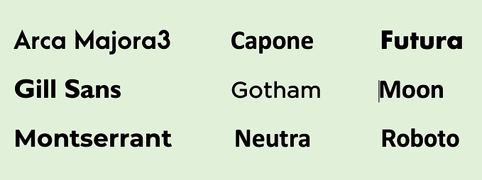
Step 1 — Choosing the right typeface
Choosing the right pair of typefaces for your design can be stressful due to the wide range of available web fonts. Finding the right pair of typefaces is one of…


