Reticle-design for augmented reality software

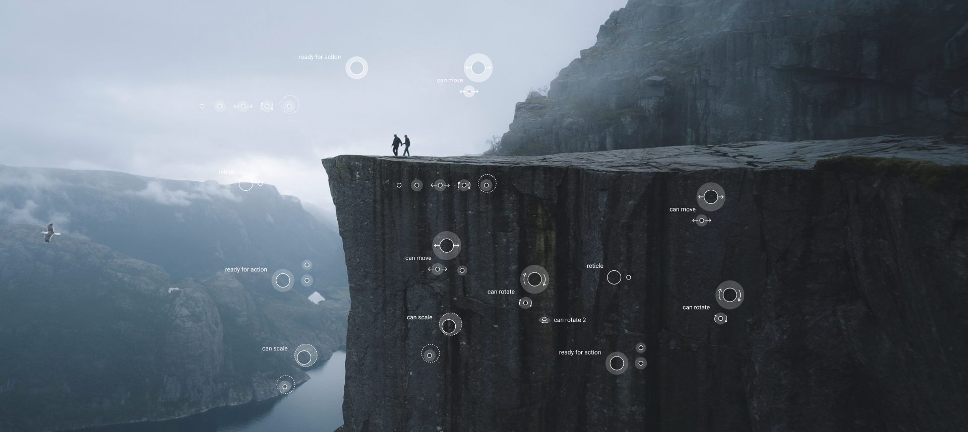
 There are so far very few ready-made solutions or established rules for augmented reality design. I decided to share with you my experience in developing one successful interface solution for AR. Using wiARframe software for creating scenes and augmented reality objects (AR), I noticed that there is no important interface element — the sight. I used the software to test some interface elements and interact with them in AR and very often did not understand: whether I point the center of the screen at the object and it just slows down, or should, for example, slightly to the right. All problems that arise with pointing and focusing on the object could easily solve the sight.
Armed with arguments and knocked on the developer. Jeremiah Lazarus Alexander proved to be a very friendly Singaporean and an advanced programmer; we quickly found a common language. I asked him not to worry: soon we would make the best scope for his application. Jeremiah drew my attention several times that he would not be able to pay for my work, but if I could make it royalty free, he would be very happy to integrate the scope into his application
That’s what we agreed on. I don’t know why Jeremiah was even talking about royalty, for me, as for any designer, the solution to this problem is a mini-visa. Of course, I went straight to work.
The task: to make a scope for the augmented reality application.
Problem: there are some Google recommendations on sights for VR, materials on AR practically do not exist.
For analysis of existing decisions I have connected the student whom I teach design: both to me will help, and swings at the same time in UX-cases in AR.
First approach
We found some difficulties, a couple of features and a lot of stupid ideas:
- The sight has many states, as many as 7: basic, ready to interact, rotation of the object, its movement, scaling, short (1 second) and long (3 seconds) focus.
- The sight-ring looks great, a wonderful idea, it can be filled with a fill if necessary.
- The big scope-ring will be well visible on objects, no need to flicker.
- It is necessary to enter additional elements, arrows and bypasses, which unambiguously tell the user what to do with the object.
- No, a large scope will not look good, you should try a smaller one.
- The problem of the sight contrast on different backgrounds will be solved by its transparency.
- Or maybe we should add color coding of the sight’s states and make the life of the user brighter?
- How to solve the problem of interface congestion when pointing at many objects from a distance — for example, when entering a room where there are dozens of objects?
The first approach proved to be very fruitful: we developed many design options and interaction of the sight with objects.

Second approach
I consulted with Jeremiah, we tested different states of the sights on video — for the developer, of course, everything was “fantastic”, “Aves” and “mapping”. By the way, since we have about 6 hours time difference with Jeremiah, we rarely managed to communicate more often than once a day. Usually I would wake up, get an answer from him, write mine, and the next morning everything would repeat itself. Very productive :)
But the more I looked at the sights, the more overloaded they seemed to me, I understood that I had to go in the direction of simplification.
I tried to simplify everything, but I only managed to spoil the design and add elements from the last century to the sights.
Obviously, the second approach proved to be unsuccessful :)

I tried to check all variants of design and animation of sights at least on video, because it is unrealistic to estimate interaction of a sight with objects and transitions between different states of a sight on a static picture.
Discussed new options with Jeremiah, at the same time asked if we can somehow track the shape and contours of real objects (with objects from AR would not be a problem), because in the brain of the designer appears even the most delusional thoughts, on the video they are well visible :)
By the way, I recommend Sketch to VR plugin, it allows you to check all your ideas and hypotheses of interface solutions very quickly.
The third approach, the most important
After many searches for solutions for the sight states, I suggested Jeremiah to reduce their number to three: “basic”, “ready for interaction” and “long focus”.
Users of augmented reality applications in 100% of cases use smartphones, are already accustomed to multi-touch screens — zoom, rotate or move objects on the screen for most are already familiar skill. Unless, of course, as a device you have a smartphone, not glasses with touch controllers.
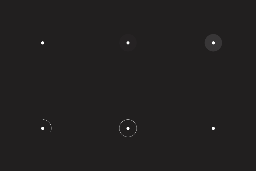
- Worked out and accepted as a basic version of the new design of the basic state — the sight turns into a point. Always contrasting, always visible.
- Semi-transparent ring around the sight remains — as a marker of the state of readiness for interaction.
- A very important state — focusing for three seconds — is implemented as a progress bar on a circle, it tells the user that any interaction is about to occur.
- The focus state to unload the interface suggested that it should be enabled when approaching an object one meter or closer.
- Tested with Sketch to VR plug-in different sizes of sights and elements, determined optimal: point — 8 px, ring — 24 px.


As a result, there were three states of the sights instead of seven, sizes and animation of the sights were tested on real users — everything is great. Jeremiah, of course, gave out a portion of his “avesome” and “amazing” and went to implement this development in the application.
Let’s collect more complete feedback after the final implementation in the application and make improvements if necessary.
This project allowed me to draw two conclusions:
- On design AR still very little work, a lot to create yourself.
- It is important not to be afraid to set tasks and solve them, so there are beautiful cases.
Now, having completed the design of the sight, I set myself the next task — to redesign the interface of the application wiARframe. I hope it will be no less fascinating.
Software — wiARframe
For the moccap phone thanks to monsterbox
For the photo thanks to Valdemaras.D

