Revisiting the UX Double Diamond — a UX case study
After a week of conducting a design studio with fellow UX thinkers for an app feature integration, I discovered something we could have done better. Only upon reflection had I figured out why I found myself uncomfortable with the decisions we were making in the studio, despite how thorough or consistent our findings were from our user research rounds.
As the empathetic UX designers that we believed ourselves to be, we were thinking for the user at times where we should have been testing on the user. Of course, you can’t introduce a user into your studio design process, but you can iterate with multiple prototypes for usability testing.

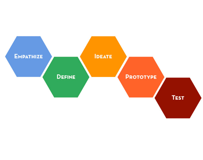
The double diamond shown here is standard for UX design. The focus of this article is to revisit how the ideation/development phase interacts with the implementation phase.
Before I elaborate on the problem or my solution, let me frame the setting in more detail.
Project Overview
Bear with me as I frame the process that led to the problematic design studios.
Our Task
My team of four UX designers (including me) were asked to design a new feature for the Blue Apron mobile application (in practice). Our client’s overall goal was to increase customer engagement on the app, but we were given no metrics as to what that meant. Their proposed solution that we were asked to investigate was a feature that would allow users to upload their own recipes and vote on others’ submissions. The app would feature the recipes with the most votes.
In order to determine whether this proposed feature would actually increase engagement on the app, we had to find out what Blue Apron users need that they aren’t getting, and/or what they want — and what that opportunity space looked like for our client.
The Research
We followed standard protocol of user research and analysis — we conducted more than 40 screener surveys and 7 interviews, documented two iterations of affinity mapping, created hypothetical and actual empathy maps, and developed a primary persona.

Our results were direct; Blue Apron users and other meal kit users (Hello Fresh, Purple Carrot) wanted quick and easy meals.
- 6 of the 7 users we interviewed said that what they look for in meal kit services is convenience and short cooking times.
- Several of our interviewees had left Blue Apron for Hello Fresh, a competitor that users said had easier recipes.
- 5 of the 7 were quoted claiming, “I’m not a chef” (in as many different ways as that can be said).
- All who mentioned searching for recipes online complained about the time it took to find one
- 4 mentioned their dislike of “crowded grocery stores”
- All who mentioned ingredients said they value them fresh


Overall, the results were consistent with what one would expect of current or past meal kit service users; convenience was the primary attraction. Some of their needs were being met by Blue Apron’s existing service, but not all. There was a hole in the service.
We had discovered something significant; there are users who value fresh ingredients and cheap, healthy home cooking — but, they don’t have time to cook and are not interested in complicating the process of feeding themselves.
Perfect! An opportunity space for our client.
Brad: The Persona
The way to address the problem of user engagement wasn’t to add a social feature, it was to give space for a persona that the current Blue Apron brand was not catering to on their app. We had to introduce a second persona, and in turn design a feature that would cater to them.
Brad, a 29-year old city-dwelling professional, has the following behaviors:
- Seeks recipes that are simple and easy, and often improvises to save time
- Likes to cook with fresh ingredients and values his health
- Is frustrated with prep times that are required when making dinner, after a long day at work
- Dislikes making trips to his crowded grocery store
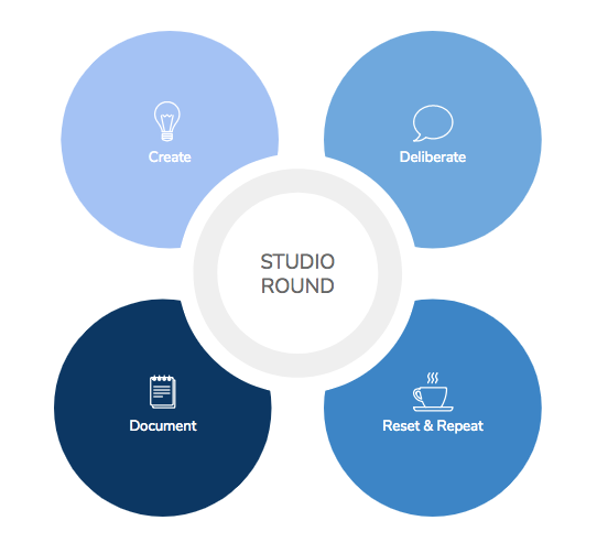
So, we conducted our first design studio with the following user task in mind: Find simple and easy recipes on the Blue Apron app to create your weekly meal kit.
The Problem
In the Blue Apron design studio, my teammates and I were eliminating design ideas when narrowing down what our first paper prototype would function and look like. I am careful not to say what our prototype would include because I’m not talking about narrowing down features. I’m talking about designing for a single user task in different ways. In other words, we were deciding what the best design would be to give the user the quick and easy recipes they wanted. I felt uncomfortable with that fact that my teammates were making these decisions so freely. I wanted more structure in the decision process.
Before I go on, let me elaborate on the process my team was following; the double-diamond.
The Double-Diamond
Let’s review the double-diamond process in short: first, a UX team must find out how to design the right thing. Research and synthesis are meant to frame the problem.
Then, we create a problem statement with insights and a “how might we…?” statement to open up the possibilities for a solution.
Then we move onto the part where we design the thing right.
As protocol currently has it, the design studio process lies in the second half of the double diamond; it is part of the process of designing the thing right. It is closely followed by usability testing to make sure users can actually accomplish the task we have given them, or in other words, can actually interact with the feature we are introducing to them.
So what’s the problem?
Something is missing between the two diamonds. How can the design studio only be part of designing the thing right? Don’t the multitude and variety of design ideas that come up in studio deserve to move into user testing, before being eliminated by the designers themselves?
Let me take a moment to clarify that I do understand the principles of design studio, and I do understand that the basis of designs is the synthesis that has culminated from the research phase. And I understand that the problem statement is what frames the design process.
But I am arguing one specific thing; that the design studio process should allow for more outcomes than one. Why narrow down so many ideas to just one based on the consensus of however many designers. What about the user?
Again, the solution for this is not feature prioritization like Moscow Mapping or quadrants dividing ideas between must haves and should haves and could haves, etc. because I am not talking about deciding between multiple features. I am talking about designing a single feature in different ways.
Shouldn’t the user be introduced before over 20 different ideas are narrowed into a single prototype? If we are only producing an extremely low-fidelity paper prototype then the argument that time and effort are too limited to produce several prototypes is thwarted.
Efficiency
I am proposing that a UX team creates more than a single prototype as a result of a design round in order not to suffocate the studio session. In fact, the time spent discussing different ideas and critiquing them would be minimized by the introduction of user testing for multiple prototypes.
The time it takes to narrow down ideas into a single prototype would be traded for the time it takes to test multiple ones.
Furthermore, the results of usability tests on multiple prototypes is much more informationally saturated than tests on a single prototype. In fact, the iteration that would come after testing various first-round low-fi prototypes would be much more efficiently improved than one that comes after the results of test on a single prototype.
The iterations that would come after testing a single initial prototype wouldn’t have as much creativity as an initial design studio. Creating prototypes from the initial studio round allows multiple best ideas a chance to make it to the user. In the instance with my Blue Apron team, we had to fall back on some of our initial design ideas when the prototype we had created hadn’t been as successful as we had hoped. Wouldn’t that effort have been saved if we had tested those other viable, applicable, user-oriented, empathetic designs in the same initial round, with different prototypes?
Possibilities
As I mentioned before, the user has to be introduced earlier in the design decision phase. Decisions that narrow down the pool of design ideas from a studio round should be informed by more than just research.
Let me take a moment to go back a bit to the research phase: when you are interviewing a user base, you can’t directly ask a user what they need or what they would like in a product. As a user experience designer, that is your job. You have to find out what their behaviors are and from there determine what kind of product they need. They can’t tell you what they would want because they are prospecting, and they don’t know what the possibilities are.
That’s why it’s a UX designer’s job to show them those possibilities — and to test those possibilities on them.
And that is my argument. Test more than one possibility.
I’m suggesting that different product designs (meant to achieve the same task or introduce the same feature) should be tested on different groups of users, in a controlled way (i.e., making sure the groups are comparable in demographic and fit to the target user). For clarity’s sake, I’m not suggesting that a UX team should test multiple product designs (meant for the same task) on the same user; that way users are not choosing between one or another design; they are just telling you about their experience with the one product you’ve shown them. Then you can compare the results from tests of the two or three — or more — prototypes that came out of the one design studio.
Only then can you narrow down into a single prototype.
At least, only then can I as a designer feel comfortable testing a single prototype.

Resolution
Don’t worry, there is still a happy ending, other than the lesson I’ve learned. By revisiting our initial design studio, we were able to introduce ideas to our second prototype that we had discarded before testing.
This allowed us to focus even more on defining user engagement and meeting user needs with business needs. We went on to test a prototype that created a Blue Apron “Express” mode that users could turn on to see recipe options with short cooking times and low levels of difficulty.
This time, with the lessons learned, not only were we testing the app’s functionality and usability with users — we were also testing how it would change their experience with Blue Apron’s brand. We didn’t suffocate our ideas for the second iteration.
In retrospect, discomfort led me to discovery. And I can move forward into new studios for new products knowing that when a design decision isn’t certain and concrete, it is time to test the possibilities on target users.

