Creating rhythm with typography
How type comes together in visual design.
When users land on a web page or mobile application they scan content, seek valuable information, and eventually accomplish tasks. When the text is legible and readable, the user is guided along a path to perform an action or receive feedback. A good understanding of typography in design improves visual communication and the user’s experience.
Typography is the art of arranging letters and text in a way that makes copy legible, clear, and visually appealing to the reader. Typography involves font style, appearance, and structure, which aims to elicit certain emotions and convey specific messages.

Why is Typography important?
Text represents more than 90% of all information on the web, therefore it is vital to consider how users will feel when they view information. There are various reasons why typography is important in user interface design, they include:
- Guides users, optimize readability, accessibility and ensure an excellent user experience.
- Communicates clear information to users.
- Establishes a strong emotional engagement.
- Influences decision making.
- Good typography expresses the visual hierarchy.
- Holds attention longer and makes a user interface visually stimulating and memorable.
- Provides a balance to your design.
- Help set the tone for the product and establish a brand presence.
- Builds recognition for the brand’s personality.
How does rhythm work in typography?

Imagine listening to your favourite band, how harmonious the tunes are and how everything flows smoothly. Now imagine listening to poorly tuned music or beat. How did you feel?
When you listen to music there is a pattern, which influences how you feel and establishes order. This pattern is known as the rhythm. Rhythm involves repetitive strong patterns of sound, words, or musical notes, and it applies to typography because order and consistency are more pleasurable to humans than chaos or noise.
Letters come together to form a structure and types are organized with rhythm. When humans read, they quickly scan chunks of content and pick out only a few letterforms. The brain recognizes and pays attention to repeating shapes and patterns which help it extrapolate information into something it can comprehend.
When we listen to music there are intentional breaks integrated throughout that separates sound from silence. The same effect applies to typography when combining letters, words, and empty spaces to solidify type rhythm. Unexpected spacing breaks the rhythm and flow of reading.
Understanding how rhythm works in typography will allow text to be read quickly and easily.
There are two ways we can establish type rhythm:
- Horizontal visual rhythm
- Vertical visual rhythm

Horizontal visual rhythm
Kerning

Kerning, also known as letter spacing, focuses on the space between individual characters. Although characters have various widths, it is important to proportionally distance them to make them look natural.
Tracking
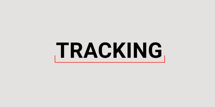
Tracking is the spacing between all the characters of a text. Properly selected tracking can make the copy feel pleasant to the eye. There are two common occasions when overriding the default tracking can have a positive effect on design:
- Headings and title. These tend to be larger than the body of the text. Hence the spaces that come from tracking may look larger. In this case, we can make it look better by decreasing the tracking on the blocks of text. This will reduce the visual weight and look more in line with the body of the text.
- Short uppercase text. Reading small all caps text can be difficult, therefore increasing the tracking can break each text apart and make it clearer.
Therefore, the larger the text, the smaller the tracking, and the smaller the text, the larger the tracking. This improves readability and clarity.
Text alignment
Alignment refers to how text is placed on the screen. There are four types of text alignment:
- Left alignment. This refers to text aligned along the left margin, creating a straight line on the left side and ragged edges on the right side.
- Right alignment. This refers to text aligned along the right margin, creating a straight line on the right side and ragged edges on the left side. The ragged edges on the left make text difficult to read because a user will need to adjust the eye when they begin reading the next line down. Right alignment works in some languages such as Arabic but should be avoided unless
- Center alignment. This is often used for title blocks, headlines or table data representation. Center alignment is difficult to read for a body of text because of its ragged left and right edges, making it difficult for readers to trace from one line to the next. It is mostly used when we’re trying to grab the attention of readers or when visual appearance is vital.
- Justified alignment. A justified text increases the space between words to fill the entire line so that it is aligned with both the left and right edges. Overly stretched lines become loose and compact lines of text become tight. We want to avoid loose or tight lines of text because a change in the rhythm while reading can become jarring and make it difficult to read.

Capitalization
There are four types of capitalization you would see in typography.

- Uppercase. All letters in every word are capitalised. In body copy, uppercase is used for extreme emphasis. Using all caps for body text leads to cognitive load, slowing reading comprehension leading to a bad user experience. All caps should be used sparingly and reserved for title blocks, brief headlines or single words and when you want to grab a users attention.
- Sentence case. In sentence case, only the first word has a capital letter.
- Title case. The first letter of each word is capitalised, except for certain small words, such as articles and short prepositions.
- Camel case. Initial capital is used for the first letter of a word, forming the second element of a closed compound, e.g. PayPal, iPhone, MasterCard, eBay. Commonly used in programming languages to make combined multiword with no space legible and quickly scannable.
Vertical visual rhythm
Leading

Leading, also known as line height, is spacing between two lines of text. Leading improves how legible blocks of texts. Loose leading can make users lose track and take them long to locate the next line, decreasing reading speed. Tight leading can distract users because of surrounding text from other adjacent lines. Well-designed leading helps eye travel from one text line to another and improves reading speed.
Line length

Line length is the distance between the left and right edges of a text block. The line length should promote comfortable reading, legibility and professionalism. When a line of text is too short, the sentence structures are disrupted which requires the user to quickly change lines too often. When a text is too long, the user gets tired leading to a bad user experience.
Hanging punctuation
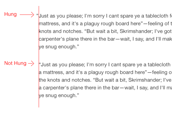
Hanging punctuation refers to the practice of extending certain punctuation marks into the margin of a flush edge of text, to give the appearance of a more uniform vertical alignment. We should always hang punctuation marks outside the body of text because this ensures that our paragraph margin aligns smoothly and vertical rhythm remains uninterrupted.
Text orientation
Text orientation refers to how text characters are set in a line that can be sideways or upright. Text orientation can be used as accent design which means that it shouldn’t be something users have to read. They shouldn’t be used to display important information and should be kept short and legible.
Learning the basics of typography will help you understand how typography elements come together to create copy that is optimized for accessibility, hierarchy, and readability, bring the user interface to life, and improve user experience. We shouldn’t substitute form over function but make sure typefaces convey information in a way that pulls the user’s attention, works in harmony with other visual elements on a page, and clearly communicates its purpose.
I added some additional resources that can help you delve deeper.
10 Principles for Typography in UI Design
A Reference Guide For Typography In Mobile Web Design
Can you easily read and comprehend textual information on the page?