Screenlife App — a UI/UX case study
A showcase of the iterative design process

There are a lot of products that allow you to record your actions in the web browsers. Some of them are recent startups like Loom, others have been on the market for many years, like Vidyard.
Screenlife is a web recorder too, but it stands out from the competition because it saves its recordings as interactive video files. It means that when the user is watching the Screenlife video, all the links, buttons and other elements from the recorded pages are clickable and active.
Screenlife can be used to record tutorials, create product tours or to tell interactive stories. For example, in this Screenlife recording lifestyle blogger, Carlos Deloye Harris Jr. shares his shopping tips while creating a spring outfit on the Urban Outfitters. Every element in the video is interactive, so you can buy items that Carlos adds to his cart directly from the player screen.
Currently, the project is in early beta — some bugs may still occur.

Task Overview & The Challenge
Before we started, the Screenlife platform had already consisted of the chrome extension and the website.
The Chrome extension was created as a tool that allows users to record themselves and their actions in the browser.
The website goal was to create a sense of community around the Screenlife by giving users the opportunity to discover, comment or share interesting content.
At that time product owners weren’t happy with the mobile Screenlife experience and hired our company to design and develop the Android and iOS applications. I was responsible for the UI/UX design and was the only designer on the project.
The main challenges that we faced at the beginning of the app development process were:
- We needed to keep the core features as simple as possible, yet create a well-built mobile adaptation of the comprehensive recording platform.
- We were required to move fast, nevertheless develop a user-friendly product.
Below there is a look-back on how we tried to overcome those difficulties and what we learned in the process.
Research
The first step was to analyze the main competitors and get acquainted with the existing Screenlife products. I reviewed several similar apps, talked to the stakeholders and made a list of both implemented and planned UX flows.

On the research stage, I also wanted to learn about Screenlife users and share those learnings with our teammates. To achieve this, I created several provisional user personas that were based on the stakeholder interviews and the online research.
For the personas to be profoundly beneficial to our design process, we needed to base them on the qualitative data from the user interviews. Unfortunately, we didn’t have access to our target audience and weren’t able to organize the interviews with them.


Ideation
Once we gained a clearer picture of our users, we began adapting web user flows to the mobile environment and started generating design solutions in the form of paper prototypes.
By doing low-fi prototypes, we were able to go through a lot of design ideas and quickly find the right ones. Moreover, prototypes allowed developers to begin coding the most fundamental app interactions and discover technical limitations of which we couldn’t have known before.
During the ideation stage, every meeting with the developers included a discussion of the proposed user flows and design ideas. There were a lot of ongoing efforts to make sure that we were all on the same page.


High-Fidelity Mockups and Animations
When it was time to turn our paper prototypes into digital mockups, the first thing that we started working on was the onboarding experience.
To educate our first-time users about the complex technology, we decided to show them several typical Screenlife recordings on the onboarding screens.
Initially, designs for those screens were heavily animated. But our PM concluded that we needed to postpone the implementation of those animations until the later versions of the app.
This decision turned out to be a right call: during usability tests, the onboarding appeared to be a significant pain point for the participants.

Then, I started creating digital mockups for other flows of the Screenlife iOS and Android apps. My tool of choice was the Sketch.
Because of the time constraints that we had, I preferred using native OS components to creating custom ones. This choice significantly eased the development process for our team — implementation of the custom components can often lead to the occurrence of some unexpected bugs.

Invision Prototypes & First Usability Tests
Being the only UI/UX designer on the project, I understood that a large number of my design decisions was probably based on my false assumptions about the user’s behavior in our app.
To find those assumptions, I created and user tested Android & iOS Invision prototypes.


During these tests, we discovered several usability issues and formed solutions for them.
Usability issue 1
Participants didn’t understand what content we were suggesting them on the search screen — all links looked alike.
Solution: Add a content indicator icon near each element of the list. These icons would help users figure out whether the item is a link to a video, to a playlist or an author.

Usability issue 2
There was no creation option on the “My playlists” screen, so when the participants were trying to create a new playlist from there, they couldn’t do it.
Solution: Add a “Create” button on the “My playlists” screen.

Usability issue 3
When participants were leaving the player screen, they expected that the player would become minimized and that later they would be able to resume the video playback. The same player behavior can be seen in the most popular video apps like Youtube or Vimeo. Users were surprised when our player didn’t behave that way.
Solution: Design the minimized player state and create a new navigational stack logic.

Conducting usability tests early in the process helped us find and fix some of the most apparent usability pain points at the lowest cost possible. The further the stage of the product development was, the higher the price of fixing those issues would be.
Design Reviews
The app developers were implementing more than 60 Screenlife mockups in a row, so it was easy for them to overlook small design nuances like increased letter-spacing, light gray backgrounds or custom margins.
I thought that those discrepancies shouldn’t be left unnoticed, so the next step was to review the implementation of my designs in the Android and iOS apps.
I provided several documents explaining what could be improved and where the execution didn’t align with the initial design.

Remote Usability Tests
When the product was more or less ready to be publicly tested, we decided to conduct several more usability studies.
The first one was the remote unmoderated usability test via Erlibird.
Before we started testing, we had formed a list of tasks for the participants. Those tasks reflected important user flows in the app, both for the business and for the users.
During the test, a small part of the feedback that we received was very subjective and was based on the personal preferences of the participants. But, for the most, the comments were useful and showed us where we had troublesome areas in our app.
For example, several users pointed out that the filtration in our app can be improved.

Some participants complained about the navigation on the player screen. Others told us that they weren’t happy with the requirement to rotate the phone on the player screen.

Some users hated our app and some felt in love with it right away.

When we finished the last remote testing session, we were left with an understanding that we needed to continue our testing efforts to receive even more insightful feedback.
Onsite Usability Tests
We made a decision to conduct a series of additional tests, now moderated and onsite. During those tests, we would listen and watch our participants use our app.
Earlier, we had formed several hypotheses that we wanted to test. Those hypotheses were based on the feedback from the Erlibird tests and on our own experience of using the app.
Hypotheses that we came up with:
- Users didn’t understand the Screenlife technology and how it can be used.
- Users had troubles filtering videos.
- Users weren’t able to figure out how the player worked and how to like or comment the videos.
- Video thumbnails didn’t provide substantial information to decide whether the video would be interesting to watch.
Half of the participants that we recruited for the tests were unfamiliar with the Screenlife technology. Also, we deliberately hired participants with a varying level of technical skills: three participants were at the beginner level and four participants were at the intermediate level.
Results of the tests were astonishingly insightful — we found 24 usability issues that we needed to fix. Here are some of them:
Usability issue (2 of 24)
All users chose “Don’t allow” option in the notification permission dialog.
Solution: The native permission dialog can be shown only once, so I think that before showing it we should display our custom dialog that would ask the users whether they would like to give us permission.


Usability issue (4 of 24)
At first, all participants thought that it was required to sign in or register to use our app. They couldn’t see a cancel icon on top of the “Sign in” screen that would allow them to skip the authorization process.
Solution: First-time users don’t want to spend their time registering, they want to explore the app first. If the majority of users think that the authorization is mandatory, we would have high app deletion rates. I suggest that we make the “Skip” button much more prominent.

Usability issue (7 of 24)
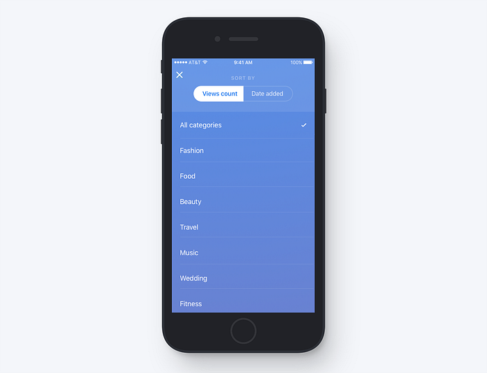
It was hard for the participants to discover filtering options. Moreover, after selecting a filter all users waited for some confirmation message or “Apply” button to appear. Applying changes by tapping the “Cancel” icon was unnatural for our participants.
Solution: We need to improve our filtering experience: make it more discoverable and user-friendly. After tapping on the category, users should be able to understand that the category filter was applied.
Usability issue (24 of 24):
On the “Add info” screen, 6 of 7 participants tried to add a new hashtag by tapping on the number sign symbol on the phone keyboard. In the current version of our mobile app, we prevent users from typing any non-alphabetical symbols in the “Hashtags” field.
The participants didn’t understand why they couldn’t type the number sign symbol and thought that it was a bug.
Solution: Add a number sign symbol placeholder to the “Hashtags” field so that the users would understand that they don’t need to manually type this symbol to add a new hashtag.

If interested, check the full list of our findings and solutions from this usability study.
Key Learnings from the Tests
Generally, it was easy for the participants to use our app. The flows of the search and account creation were pretty straightforward and were completed almost entirely without any difficulties.
The player was one of the most critical problems. It was glitchy and didn’t provide a smooth experience for the participants.
Screenlife app wasn’t compelling enough. We need to show our users more of exciting, personalized content and create a far more informative main screen thumbnails.
Onboarding flow was a massive pain point for our users. It was ineffective in helping our users to understand the Screenlife technology. Moreover, it was visually irritating to them because of the fast playbacks of the background videos.
“Why everything is moving so fast? What’s going on here? Is he trying to sell me something?”
— Usability test participant about our onboarding experience.
New Design Iteration
It was time to revisit our initial designs and solve some of the issues we had found during the usability testing stages. Based on what we’ve learned so far, we started redesigning several screens and flows.
Firstly, we improved the main screen experience. As we found out earlier, users needed more information to decide if they wanted to watch a recording, so we thought that adding the time of creation indicator and the number of likes and views to the video list items would partially solve this problem.

Secondly, we redesigned filtration and sorting flows. We added tabs to the main screen (popular, following and new) to make sorting experience much more apparent.

Finally, we added the “Follow” feature. “Follow” feature was already on our product roadmap for a long time. The usability issue associated with the lack of unique and personalized content on the users home feeds showed us that we should give this feature a high priority and implement it during the second design iteration.

What’s Next?
We are planning to conduct new usability studies to make sure that the solutions from the latest design iteration solve some of the usability problems we found during the tests. After that, we’ll need to concentrate on redesigning our onboarding experience and completely rethink how we can show our app value for our first-time users.
What we’ve learned so far:
- The access to the end users is vital to the product success. We based our personas on assumptions, which led us to the creation of the app for users that didn’t exist or existed only in the form of stakeholders expectations.
- It was better for us to use the Jobs-to-be-Done methodology rather than personas. Personas explain who people are and what people do, but they never fully say why people do something. JTBD, on the other hand, looks at situations, motivations and helps better understand the reasons behind user decisions.
- We shouldn’t have waited so long to test our design assumptions. We could’ve started testing them right from the point when we created our first paper prototypes.
Despite all the difficulties, I think that the learnings from the Screenlife design process would significantly influence the way we will approach similar projects in the future.
Screenlife is currently in invite-only beta but is steadily moving towards the launch date.
Special Thanks: Sergey Filonenko, Yana Yarmoshenko, Tetiana Uspalenko.
Thank you for reading! If you enjoyed this case study or have any feedback, contact me on Behance or LinkedIn.