Seeing What You Hear: the Art of Album Art
How an absurd moment led to the artwork for War Is On Its Way
 In 2015 I gave a crash course in record sleeve design to musicians in the SXSW artist lounge. Cheekily named, “I Shot the Serif,” the talk covered the basics of typography, image, metaphor and meaning with musicians in mind. I had seen a rise in DIY artwork coinciding with the rise of DIY recording. Some of it was cool but a lot of it was just… bad. This was a shame because great music was getting packaged in ugly wrappers. So I drummed up this lesson with Mike Renaud, who was the art director at Pitchfork at the time, to help artists get better at matching the visuals of their recordings with their music.
I empathize with everyone that goes on this audiovisual journey. It is hard to design for yourself, even if you’re a professional designer like me. Beyond the basics, you’re reaching for something deep, just like when you’re writing music. It is difficult to be objective about the quality of your work because you are so close to it. It’s the same reason that it’s often better to have someone else mix your self-recorded album. Fresh ears and a fresh perspective will hear the songs differently and bring out their best.
When I started recording War Is On Its Way I didn’t imagine any specific visuals but I did have a feeling. The lyrics of the songs brought to mind the circumstance of ill-fated lovers. I called this feeling romance—not the Rom Com kind. It was the mysterious, pained Shakespearean kind where love meets tragedy.

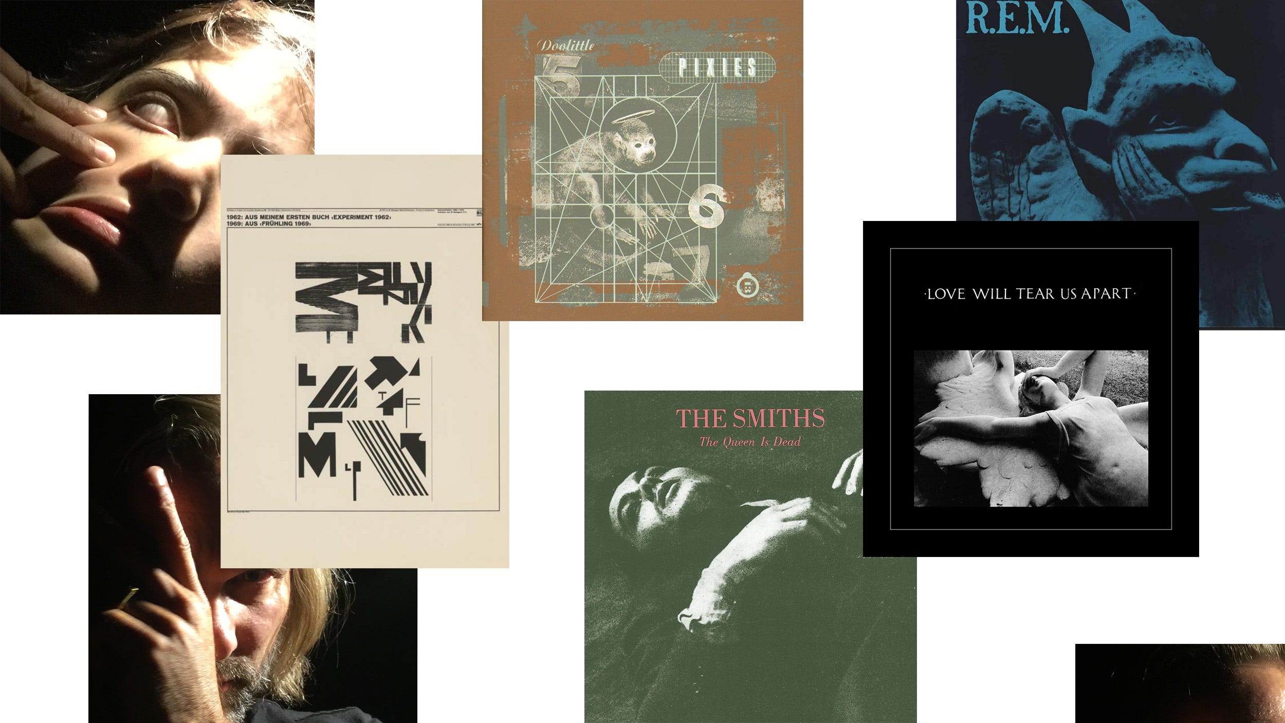
As my songwriting progressed the feeling began to conjure visual associations. My mind was wandering through the annals of classic album sleeves from R.E.M, Joy Division and the Smiths. I was thinking about 4AD covers from the 80’s and 90’s because Vaughn Oliver, the long time art director for the record label, had just passed away. I had recently come across some type experiment posters by Wolfgang Weingart from early 1970’s that I admired. And then I recalled some photos that my daughter and I had taken the previous summer.
There was something about the absurdity of these photos that matched the emotions I was trying to capture for the record: my daughter rolling her eyes back into her head, me smashing my nose against my face. They were the product of two bored people goofing off after dinner with an iPhone and no intention beyond the moment. Little did we know those were the money shots!
I have found that good ideas often reveal themselves over time, usually the result of many different experiences coming together. I rely on this in my creative process and so I’m often seeking answers more than I’m trying to create them. It’s less problem solving and more problem reacting, or as Brian Eno has said, “gardening, not architecture.” I mentally mapped the photos into the visuals I had been pondering and suddenly knew what to do.

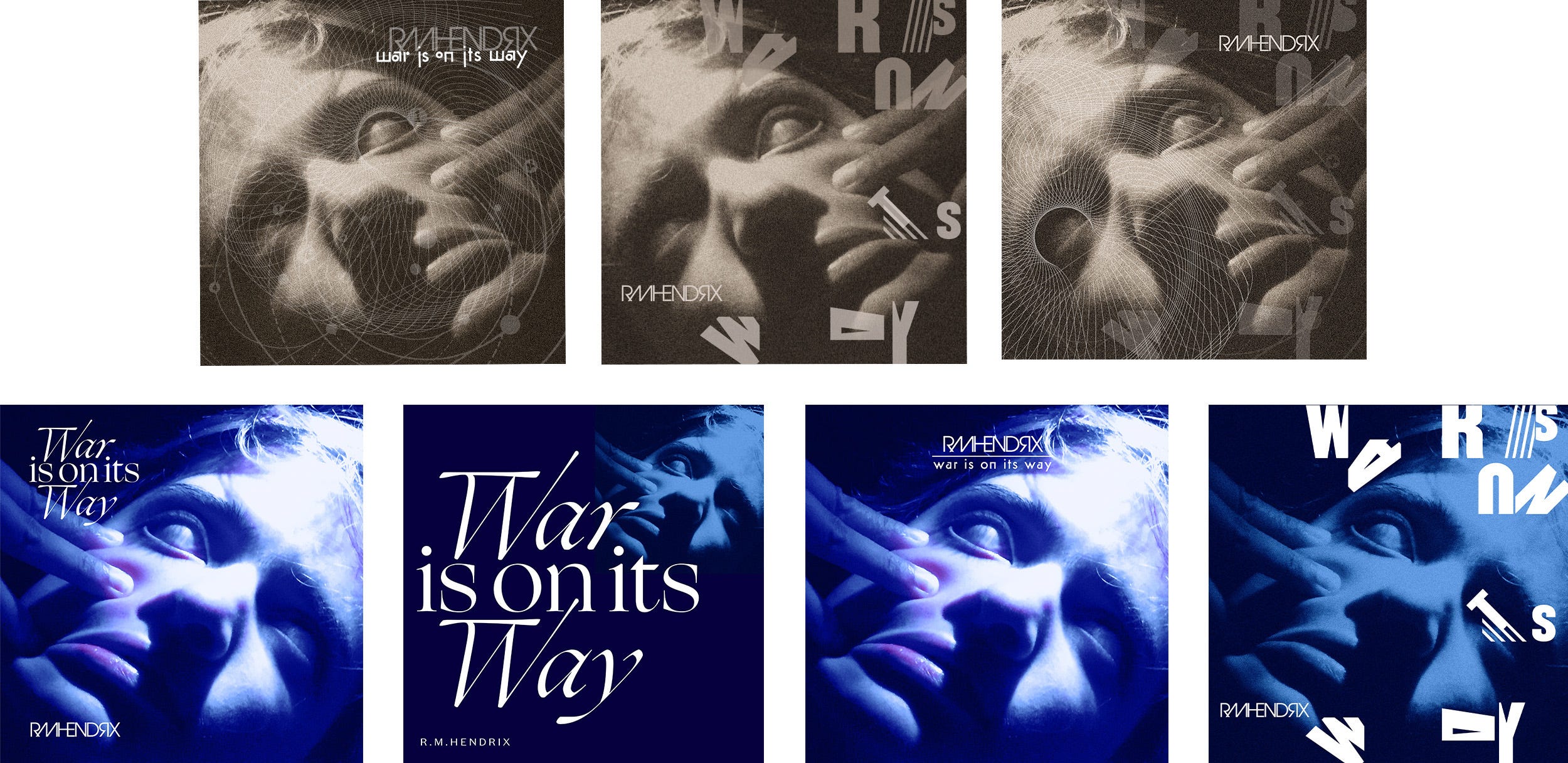
The first pass was literally a composite of all those things in my head. They weren’t random things, but things I had filed away in the mysterious dossier of my mind. I zeroed in on the photo, exploring different visual treatments to make the image appear less like a photo of a person and more like a Greek sculpture. Introducing different color washes created the opportunity to play with light. The feeling I had was coming to life.
Typography was a mystery to me at this point. I tried several approaches, each exploring a facet of this so-called romantic notion. I really liked the script, but it also felt nostalgic, as if it could have been on a 70’s era classical record—“Soothing Sounds of the Flute!” Futura Classic had some unexpected geometric elements that I liked but it felt too rigid and mechanical. The cropped wood type experiments inspired by the Weingart posters were promising. The controlled chaos of the separated letters appealed to me, but its graphic boldness detracted from the photograph.
I also explored overlaying textures, a tribute to Vaughn Oliver. I liked the complexity they brought to the cover, but the line art also was creating gauzy layers that didn’t represent the immediacy of the music.
It was now February, four months into the writing and recording sessions. I knew I had something for the artwork, but wasn’t sure what. So I sat it aside and focused on the music, wrapping up the songs and getting them mixed by the end of March. Finally, In June, nearly 8 months after this record began, I returned to the art.

There was no confusion about the record now. It had its own aura and all I needed to do was dial into it. I took one more pass, thinking this time more about the lighting and meaning of the colors than about communicating through typography. I realized that since the majority of listeners would see this artwork on a screen, rather than printed on a jacket, its emotional legibility was its highest priority. Typography wasn’t necessary because every streaming platform labeled the image with artist and title anyway. I could just eliminate type as a design element.
The final design for War Is On Its Way is a box within a box, made by changing the scale and orientation of the same photograph three times. It creates the impression of looking into another world, or of a trapped figure gazing out at us. Illuminating it in a blue glow emphasized the melancholy and despair of the image. I was seeing what I was hearing, a psychological portrait of the songs. I had also arrived at a visual system that I could translate to art for each of the singles from the record.


Happy with this I returned to typography again. I needed something for the packaging and promotion and I wasn’t ready to give up on Futura yet, especially after arriving at such a strong geometric layout. I had made a title lock-up in a customized version of Futura. It felt relevant now and I wanted a complimentary font alongside it for the song titles. After searching for a couple of weeks I came upon Ruben, a font from Vocal Type, based upon a hand-drawn banner from a Vietnam War protest in 1970 called the National Chicano Moratorium. I liked its tall and narrow proportions, it’s block lettering and it’s unique bullet point-like cutout in the B’s and R’s. Its backstory also resonated with the ideas behind the record—a war protest and civil rights march. Everything fell into place.


I don’t have an exact count but I think I’ve designed about a dozen album covers for myself. Sometimes it comes easily and sometimes it’s long and drawn out like this one. There are days I’m discouraged and ask myself why I’m doing it! I have plenty of friends I could hand it off to confidently. But I can’t let go. And so I trust my process, embracing iteration and failure, embracing absurdity, and knowing that it will result in something I’m proud of in the end, no matter how long it takes.

Now when you look at my portrait, I hope you see the playfulness in the menace. When you look at the album, I hope you see the humor in the despair. When you listen to the album I hope you hear the joy in the sorrow. If you don’t then I’ll have to take my own crash course!


