Member-only story
Why the Starbucks app is design perfection
For over five years, my coffee has always been at the tips of my fingers. Thanks to the Starbucks Mobile App, I can order my favorite drink with a couple taps on my screen. Then, it’s ready for me in minutes. I enter the store, grab my drink, and ignore all human life in the process.

In terms of mobile ordering, Starbucks has established itself as a trendsetter. For a while, the Starbucks app was the most used mobile payment app until ApplePay took it over in 2019. Over 30 million people were ordering coffee through the Starbucks app, and that number continues to grow. Clearly, they’ve put a lot of effort into this process.
The Starbucks app isn’t just a success in terms of numbers. From a usability standpoint, it showcases a lot of best practices for on-the-go ordering. Over the past couple of years, I have been using my smartphone to order food more than ever before. Any time I feel frustrated I think to myself and say “Starbucks does it better.” Their app has become my gold standard when it comes to restaurant UX.
Using the Starbucks app, I’ve been able to identify seven areas where the app excels. These aren’t the only things that are Starbucks does well, but they’re the ones I find most important and define my experience on the app. Other apps take notice, and when brands want their customers to order on a smartphone, these are the features you’ll find.
1. Your Points: Front and Center
If you’re using the app, there are probably two main reasons. Firstly, you don’t want to wait in line. Secondly, you want free coffee.
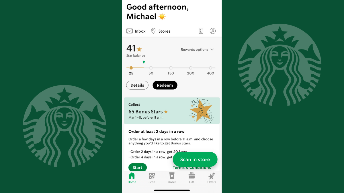
When you launch the app, your “star balance” is going to be front and center on your dashboard. This lets you know if you have rewards at your disposal and how you can get bonus stars.
This is a mutually beneficial feature. Customers know promotions and can work toward getting their next free drink. For…

