Sexist design: How gendered packaging reinforces gender stereotypes and toxic masculinity
How many times have you paid attention to the copy and design of the toiletries you use every day?
I was on holiday with my partner. We were staying at a beautiful Airbnb facing a canal in Venice. The flat had everything we could wish for; a great view, a comfy bed, a stocked-up pantry, as well as a variety of toiletries. It was when I took a shower that I paid attention to the body washes on the shelf for the first time in years. I hadn’t done it since I was a child, when smartphones were not around and packaging was the only form of toilet entertainment.
I saw this shower gel ‘for men’ specifically catered to ‘busy men who need to resist stressful situations’. This made me fly off the handle. I rage-walked back into the bedroom and started ranting at my partner:
“A shower gel for busy men?! Who the f*ck wrote this?”
As a writer myself, it’s fair to say that piece of copy was a load of bollocks.
Content
- The “power” of copy
- Digging into product descriptions “for men”
- A look into toiletries not marketed to men
- Does Womanhood equal motherhood? - Comparing the design
- Did you know? Black plastic is bad for you and the environment - Comparing the ingredients
- Comparing prices
- Other toiletries — from deodorants to incontinence pads
- Deodorants and colognes
- Razors and shaving products
- Incontinence Pads
The “power” of copy
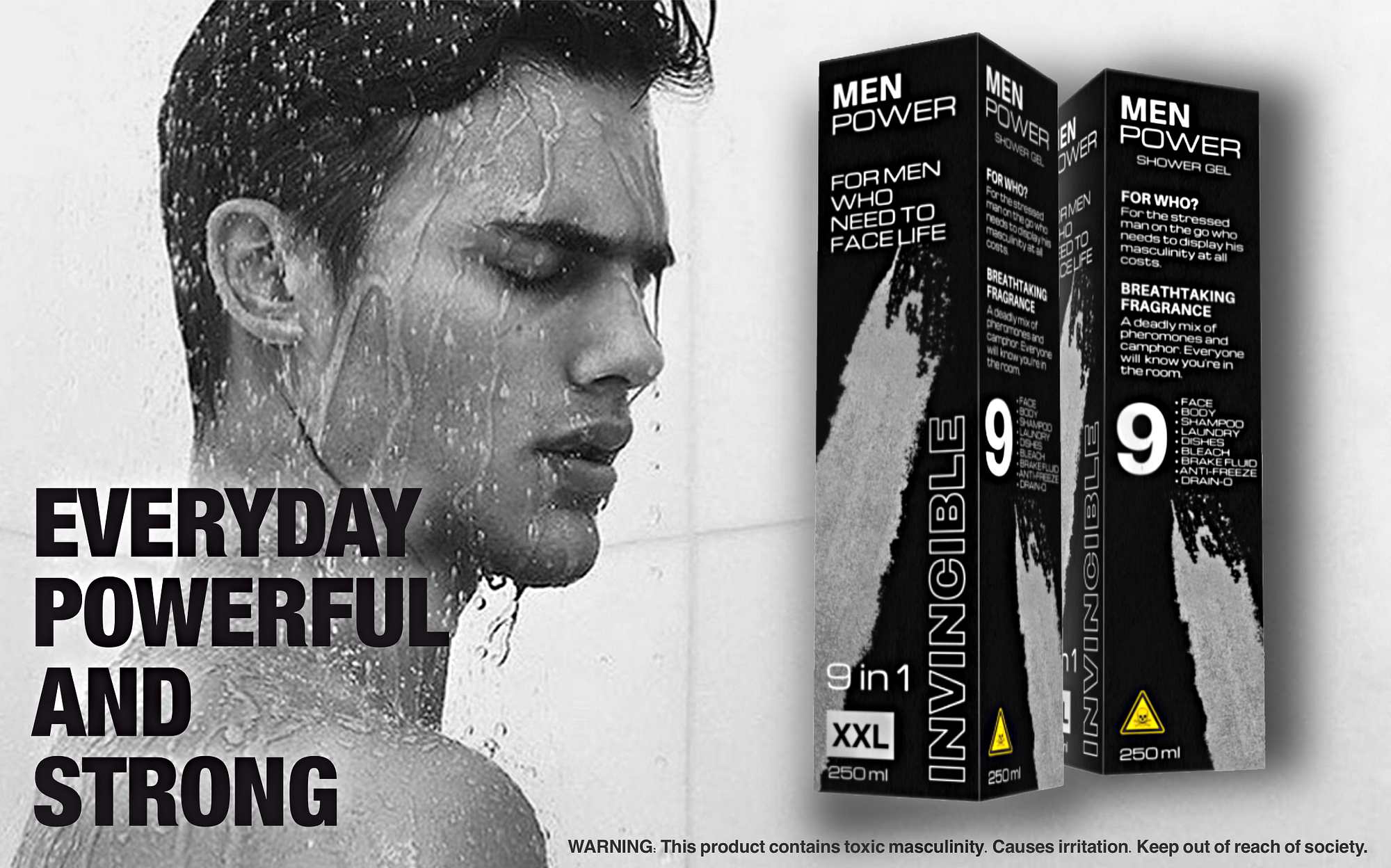
After giving the packaging a more thorough look, I noticed a series of buzzwords and numbers — yes, numbers — placed all over the bottle in different sizes, but consistently in uppercase letters. Perhaps words like “STRONG”, “POWERFUL”, “INVINCIBLE” ARE MORE MASCULINE IF SHOUTED IN YOUR FACE?
Another hilarious piece of copy was the random “XL” on a 300 ml bottle, which was no larger than any other shower gel bottle ‘for her’. So was that supposed to be some sort of allusion to men’s desired size of their genitalia? An ego booster perhaps? One more mystery was the huge number on the front of the packaging; not any number, but a big number, like “100”, “5 in 1”, or even “-4°C”.
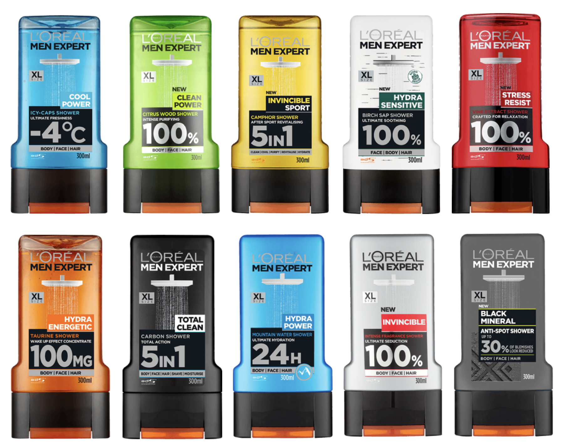
So I started my research from this exact line of shower gels; MEN EXPERT by L’Oréal. You can see that the word “power” appears on 3 out of 10 product names and “XL” is on all packages. Apart from these, there are several words — adjectives and adverbs in particular — that tap into a rather traditional and patriarchal interpretation of masculinity related to performance, authority and dominance, such as “invincible”, “ultimate”, “intense”, “stress”, “resist”, “energetic”, “total”.
The product descriptions on the back reinforce this idea even more. These shower gels are designed for ‘the man on the go’, ‘the stressed man’, and the busy man with a ‘busy lifestyle’ who needs a ‘shot of energy’ because ‘coffee is not enough to keep him awake’. The Invincible shower gel was ‘ideated for total seduction’ and is for the man who wants to ‘boost his seduction power’; the tag line even says: “the power of its intense fragrance is designed to boost your sex appeal. Become invincible”.

I extended my research to find other body washes designed for men, searching in some of the biggest supermarkets in Copenhagen — where I live. I found other brands producing body washes specifically for men; Adidas, Axe, Dove, Nivea and Palmolive. I am sure there are many more on the market, but these are the most commonly found in supermarkets.
By looking at more products and brands, a pattern emerges; the use of capitalised text, big numbers (“3 in 1", “12h”, “95%”), and words that hint at power, performance, and strength, such as “pure game”, “endurance”, “energy”, “active”, “energising”, “stimulating”. Axe, similarly to L’Oréal, features the “XL” on a 400 ml bottle. One of the shower gels by Axe is even called Apollo, like the deity in classical Greek and Roman mythology. However, I doubt it’s a reference to a classical deity, but rather to the spaceflight that landed humans on the Moon.
References to sports cars, spaceships, and, more in general, anything that travels fast and that is traditionally driven by men is another recurrent pattern I noticed in men’s razor packaging. But I’ll talk about this later.


Digging into product descriptions “for men”
I discovered that toiletries in Scandinavia usually don’t have product descriptions similar to the one I found in the Airbnb in Venice. In fact, the same shower gel is also sold in Denmark, but it only describes the ingredients, rather than who it’s for. In a way, it’s a pleasant surprise. Perhaps the Scandinavian market is a bit more advanced in terms of branding? O maybe there is simply not enough space on the bottle — since the same copy is repeated in Danish/Norwegian, Swedish, and Finnish.
I did some more digging and found that product descriptions in the back of the packaging are more common in the Italian, British and American markets. Not being able to travel to these countries, I visited a bunch of online shops to learn more.


You can see that all shower gels show the five functions of the product. But the shower gel marketed in Scandinavia only has two descriptive paragraphs; ‘What does it do?’ (Hvad gør den?) and ‘Fragrance’ (Duft). In addition to these paragraphs, the ones marketed in Italy and UK display an extra top paragraph titled ‘For who?’ (‘Per chi?’ on the Italian one) and a bottom one titled ‘How to use?’ (‘Come si usa?’ in Italian). And it’s in this ‘For who?’ section that the idea of masculinity as something performative emerges the most.
Finding the back of the bottles online has been quite the challenge. Most of the time, only the front of the product is shown. But product details found online provide great material to look at too. The example below is a deodorant, and it’s part of the same Stress Resist line I stumbled upon in Venice. The description focuses on ‘men with busy lives who have to endure and resist stressful situations’. How many times have you read similar copy on women’s products? How many times have you seen the busy-ness and stress of women being addressed on toiletries?


A look into toiletries not marketed to men
Why did I write ‘not marketed to men’ instead of ‘marketed to women’? The answer is simple; women’s toiletries usually don’t have any copy explicitly saying ‘for her’ or ‘for women’. It is usually implied or hinted at. The only exception seems to apply to perfumes.


What immediately caught my eye is that fully capitalised text is almost completely gone, there are no buzzwords and numbers competing to stand out on a small label, and there are very few adjective-noun or adverb-adjective combinations (think of ‘active clean’, ‘extra fresh’, or ‘clean power’ in men’s products we’ve seen before). The copy focuses on the desired effect of the product, and the vocabulary evokes life, nature, beauty, and relaxation; you find words like “nourishing”, “refreshing”, “reviving”, “restoring”, “hydrating”, “revitalising”, “glowing”, “relax”, “wellness”, “flower”, “nature”. Why are these words not used on men’s products? Does the male skin disintegrate at the merest hint of ‘femininity’?
Does Womanhood equal motherhood?
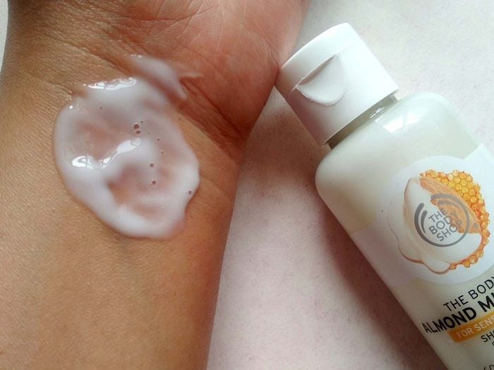
Some of the terms used seem to have a maternal connotation — think of “nourishing”, “care”, and “soft”. This type of copy suggests that womanhood equates to motherhood. If you believe this is a long stretch, think for a moment about the textures of body washes designed for men and women; why is it that the majority of men’s body washes are gels, whereas women’s ones usually have a milky texture? Could that be because milk is associated with mothers and therefore women? Isn’t that stereotypical and outdated, though? Or maybe because society thinks women should bathe in milk like Queen Cleopatra used to do? Or could it be because something milky in texture in the hands of a manly man can only be one thing — sperm — and that’s not acceptable? Why would men find that repulsive, though?
Such representations conveyed through words, textures, and materials conceal and subtly reinforce power differences present in our society. Masculinity is associated with performance and femininity with discretion — how many times have you seen “discreet”, “invisible”, or “secret” on women’s toiletries? This distinction also reinforces gender as binary, which is totally uniclusive.
Comparing the design
As you probably know already, there is a huge difference between the packaging design of men’s and women’s toiletries. Men’s packaging is often black, silver, blue, and red/orange in colour, squarer in shape, with rough textures that resemble car tyres. Because men need to have grip, and therefore control, even when they take a shower.


On the other hand, women’s packaging usually comes in white, pastel colours, or pink — we’re still at the point where blue is for boys and pink is for girls, really?? — . The shapes are much rounder and the textures much smoother, almost slippery. This can be seen in all types of toiletries, from shower creams to deodorants and moisturisers.
It seems that the beauty industry still hasn’t caught up with the times we live in. Not all boys wear blue, smash up toy monster trucks and dream of becoming football stars. And not all girls wear pink, play with dolls and fantasise about becoming Disney princesses. And yet the products — toys included — we find on the shelves are still being marketed according to old clichés that promote stereotypes and a toxic view of masculinity. Women can be powerful and active, and men can be fabulous and soft. Or they can be all those things at the same time.
Did you know? Black plastic is bad for you and the environment
As seen and said before, a lot of the plastic packaging ‘for men’ are made of black plastic. I didn’t think much of it until I stumbled upon a TikTok saying that black plastic is not recyclable. I researched a bit more and found that black plastic is problematic for a number of reasons. One is that it’s not detectable by conventional plastic-sorting facilities, which use near infrared radiation — a light beam that bounces off the plastics to identify and sort them. Due to the low sensitivity of black pigments to near infrared radiation, dark plastic is often not recycled (Andrew Turner).
On top of this, there are few uses for recycled black plastic because of its lack of colour versatility. So there are few reasons why black plastic recycling technologies would be developed.

In addition, Turner, in his paper, highlights that ‘the demand for black plastics in consumer products is partly met by sourcing material from the plastic housings of end-of-life waste electronic and electrical equipment (WEEE). Inefficiently sorted WEEE plastic has the potential to introduce restricted and hazardous substances into the recyclate, including […] heavy metals Cd, Cr, Hg and Pb’.

He also adds that ‘a complex quasi-circular economy for WEEE plastic results in significant and widespread contamination of black consumer goods ranging from thermos cups and cutlery to tool handles and grips, and from toys and games to spectacle frames and jewellery. The environmental impacts and human exposure arising from WEEE plastic recycling and contamination of consumer goods include those associated with marine pollution too’.
So next time you buy something made of black plastic, remember that you’re not only contributing to marine pollution, but potentially to your own poisoning too — since the toxins contained in that black plastic might end up in a variety of other products you eat and drink from every day.

Comparing the ingredients
I looked into and compared the ingredients of 20+ body washes, using the ingredient checker by Skinsort, to see if any significant differences emerge between men’s and women’s body washes.
I was expecting to find more hydrating ingredients and delicate scents in women’s products, and more exfoliating ingredients and stronger fragrances in men’s products.
But let’s dive into the findings. The number of ingredients in men’s and women’s body washes is not significantly different; the number of ingredients is around 24, varying from a minimum of 18 to a maximum of 28. Men’s shower gels tend to have a higher concentration of fragrances, since perfumes usually appear higher up on the list of ingredients — ingredients are listed from the most to the least present in the product; perfumes are usually the 5th-7th ingredient in men’s products whilst they tend to be 9th or lower in women’s products. This explains why men’s body washes seem to smell much stronger. Men’s shower gels usually contain more aggressive and exfoliating ingredients, as predicted, such as Salicylic Acid. Another interesting finding is that men’s body washes usually contain more colouring agents and in higher concentrations compared to women’s shower creams.

In the ingredient analysis, Skinsort highlights ‘notable ingredients’ and ‘ingredients of concern’, which may cause irritation or worsen already existing skin conditions such as acne or rosacea. The only notable ingredient contained in many of the products is AHA (Alpha Hydroxy Acid), water-soluble acids made from sugary fruits, like citric acid. As for the ‘ingredients of concern’, men’s products tend to have slightly more ingredients that can cause irritation. Some of the body washes I looked into contain sulphates, alcohol, and/or oils, whilst some others don’t. The difference is not based on whether it’s a men’s or women’s product, but rather on the brand. Nivea appears to be the less skin-friendly brand; the products analysed contain sulphates, alcohol, oils, and are also not fungal acne safe.
As for the fragrances, women’s shower creams tend to have sweeter and more flowery fragrances, such as honey, vanilla, almond, lavender, apricot, and a variety of flowers. Men’s shower gels tend to have more pungent or woody fragrances, such as sandalwood, citrus, mint/menthol, and camphor.

To sum it up, men’s and women’s products aren’t significantly different. Men’s ones simply tend to be more exfoliating and stronger in scent. The fact that woody scents, which evoke images of wilderness, are associated with masculinity makes me think men are seen as a sort of Tarzan or homme sauvage. I wouldn’t be surprised if someone started marketing men’s toiletries containing pheromones — perfumes already exist.
Comparing prices
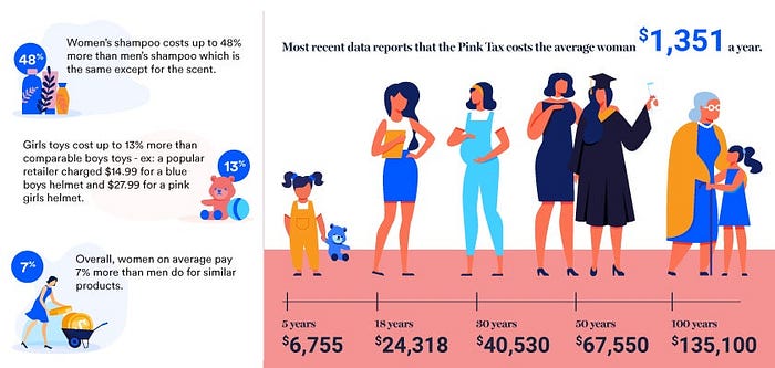
Making a complete analysis of the price of men’s and women’s toiletries would probably make another article. What is worth mentioning, though, is that there is a lot of information online showing that discriminatory pricing on products and services based on gender do exist. This is called Pink Tax, which is not a proper ‘tax’, but rather a whole system of different pricing based on gender, which doesn’t only affect adult women. The New York City Department of Consumer Affairs study found that ‘girl toys’ cost on average 2 percent to 13% more than ‘boy toys’, which are often the same other than their colour (Bankrate). Bankrate wrote an interesting article on the Pink Tax.
Other toiletries— from deodorants to incontinence pads
Deodorants and colognes
The pattern repeats, the colours and fonts used are the same as the products seen before and the copy is similar — “best”, “absolute” and “pure”. However, this time we also see the use of new terms — “inspired by respect” (for what?), “instinct” (present in two different products), and even “bad”. We also find a reference to James Bond, a character whose sexism is today infamous.


Razors and shaving products
Two things that stand out if you take a quick glance are the colours and shapes; the packagings of men’s razors are predominantly blue and square, whereas women’s ones come in a series of pastel colours in the shades of peach, violet, and light blue, and the shapes are much more fluid.
The general feeling you get standing in front of the men’s section is that you’re about to buy some space shuttle replacement piece. On the other hand, when you stand by the women’s section, you’re under the impression you’re about to buy what you need before flying to Hawaii or frosting some cake. Plain backgrounds with a focus on shiny blades vs splashes of milk, fruit, and flowers. Why?
The copy reinforces this feeling. The text on men’s packaging borrows terms from the space and engineering vocabulary — “pro”, “glide”, “shield”, “fusion”, “Mach”, “guard”. Almost as if shaving was like completing a heroic mission. Well, you’d be surprised to know how many women do their stache too, with the only difference that the advertising industry doesn’t depict them as heroes.
The copy on women’s packaging is all about having smooth skin and experiencing a comfortable glide. The name of one of the brands is the same as the Roman Goddess of Beauty and Love, to remind women once again that their ultimate goal is to look beautiful. Of course. There’s no heroism or mission to complete here, just s-m-o-o-t-h. The Tropical confuses me a little, I don’t really get what it’s supposed to evoke? Most women don’t f*ck off to a tropical island every time they shave. Plus I can guarantee you that Northern European beaches look far from tropical.


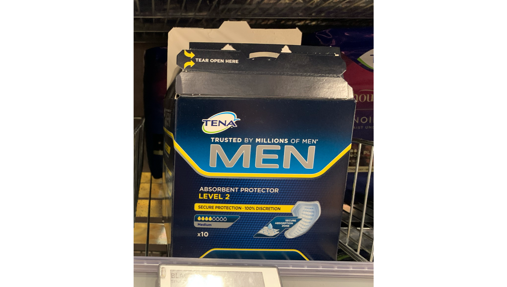
Incontinence Pads
This is probably my best and unanticipated find. I found that men’s and women’s incontinence pads not only differ in their design and copy, but they communicate very different messages.
The message that passes is that incontinence pads help men maintain control — aka retain their masculinity — over odour in social situations, whilst they protect women against odour, helping them keep an attractive, pleasing femininity in spite of the product. You can see that male potency and female discretion are reinforced through the use of specific fonts, capitalisation vs cursive, black/blue vs purple/pink.


Also, the photos on the two packages suggest completely different imagery; what stands out in the male packaging is the size of the model’s groin, which is not only ‘accommodated’, but even ‘enhanced’. The curved line following the model’s silhouette in the female packaging hints that it’s all about looking attractive and flawless.
The most ironic thing — with which I’d like to close this long commentary — is that the other male incontinence pack available on the shelf was open; someone had stolen one of the pads. Showing up at the checkout with a box of male incontinence pads was probably not ‘masculine’ enough.