Redesigning an e-commerce app for Shopee — UX case study
Shopee is the leading e-commerce platform in Southeast Asia and Taiwan. It is a platform tailored for the region, providing customers with an easy, secure and fast online shopping experience through strong payment and logistical support.
Why Shopee
I’ve known of Shopee but never had a chance to use the platform until the day I was looking for a new camera lid to replace the old one that I lost, and that was when I had experience using Shopee.
My first impression of Shopee was negative. There were so many things on Homepage. I had difficuties at using throughout the whole order process.
After finding it’s difficulties, I decided to challenge myself to do an UX/UI improvement to the app for better user experience.
Research
I begin my research by starting to look at a few competitors or similar platforms, analysing UI, UX, User flow and key features.

My Design Process
Stanford d.school Design Thinking process.

Phase 1 : Empathize
User Interviews
I had ten user interviews who have experienced with Shopee. Here are some of the insights.
Questions I asked :
- What does your typical day look like?
- How many hours do you use internet per day?
- If you could rate the likeliness for our product on the scale of ten, how much would you give?
- Why do you purchase online?
- Can you tell me about last time you used our product?
- How you do like our products?
- What could be the reason to stop using our products?
These are typical questions that I asked, which I went deeper in some questions depends on each user’s situation.

“Too many details on Homepage, lots of categories and buttons which I don’t use half of them.“
“I use Shopee to buy things that are affordable which is why I never tab on Shopee Mall page.“
“It should be better if they only show items that I’m interested. I’m a man and the women stuffs keep showing which I’m no interested of buying them. This is pretty annoying“
Phase 2 : Define
Pain Points
- Users have difficulty receiving information — Meaning users can’t manage to see things that they’re interested. They also find item list has many details which they would rather focus on the picture.
- UI could be improved and made more user centered rather than “sales centered”
There are also other pain points such as :
- Too many notifications. 95% of them are all about news and promotions. It’s really easy to miss the message from the seller when they respond.
- Inaccurate order status. Users would rather check their packages status with logistic companies which are more accurate.
Personas

Phase 3: Ideate
What If?
- We believe that if we have filtered search feature
then users will take less time finding what they need.
We will know it’s true when we see users spend less time using the product. - We believe that if we redesign the app to be more user-centered
then users will have better experience using our product
We will know it’s true when we see the increase of frequency use returning users.
Phase 4: Prototype
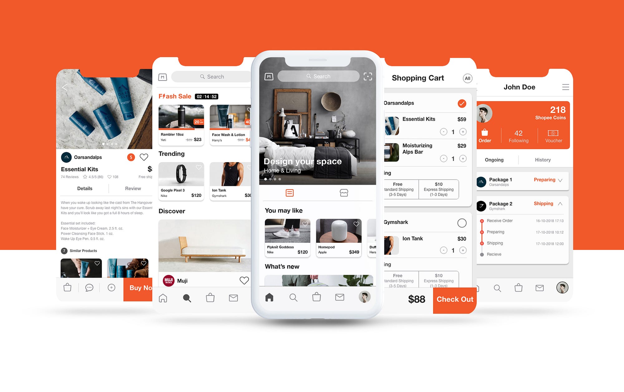
Homepage
I’ve made many changes on the current homepage. The bottom navigation has has been redesigned. I also trying to avoid too much information in this page as the purpose of it changes from companies’ sales and promotions to become more about user’s interested space.
Navigation — I’ve designed a new Tab Bar, replace “Feed, Mall and Notifications” buttons with “Explore, Cart and Inbox” buttons instead so users can quickly have the access to their important stuffs.
Shopee Mall mode —The “Mall” botton is moved to the top left since users rarely tap on it. Now it works as a mode which can be turn on and off. This allow users to choose whether they want the algorithm to show items from all sellers or just only official brands.


Scan button — I’ve also added a scan button near the search bar so the users have another way to easily search items by scanning or taking photos.
Feed and Follow section —There are two sections in homepage as I mention earlier as the page is supposed to act like an user’s space — meaning things will be shown differently in each users.
“Feed” is the section where users can manage to see items from their interested categories. By filtering this, users must tap and hold the icon until the category screen shows up.
The second one is “Follow”, as I pull out the “Follow button in the bottom navigation bar from the previous version. Now it becomes a part of home page. “Follow” let users check any updated selling posts from their favourite sellers and brands.
Explore page
This is a page where the all the sales, trending and discovered items are in. There is not really a change much in the steps of exploring besides the UI improvement that I’ve designed it to be more cleaner to improve the usability.
Flash sale — According to the research, Flash sale is one of the most clickable thing for users. In the previous version, it was placed in the middle of Home page where users have to scroll down to see. I decided to put at the first top in this explore page so users can easily see the deals.
Favourite and Wishlist— Now users can easily favourite and make a wishlist on items they scroll pass by.


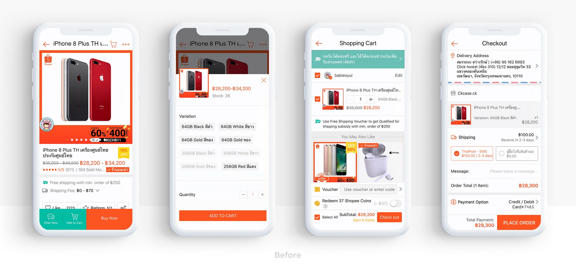
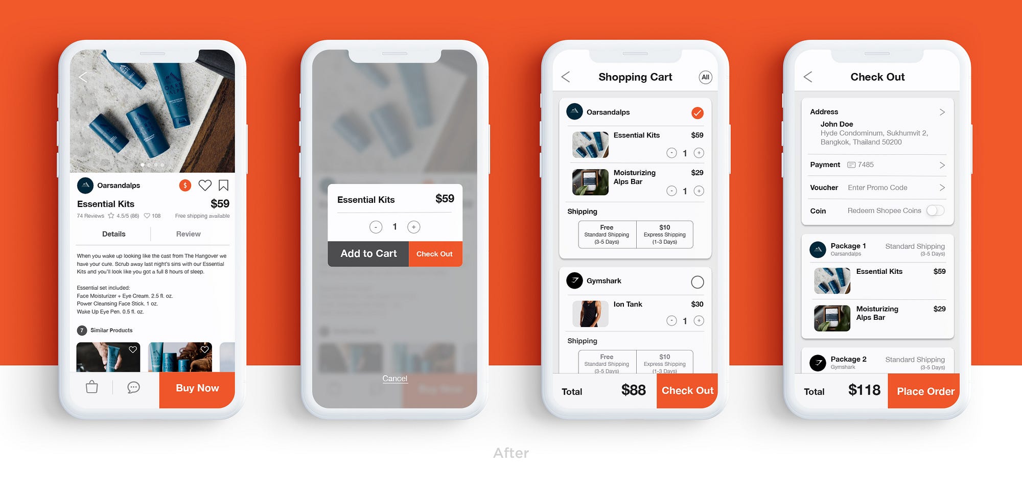
Shopping Process pages
The steps of shopping process is slightly different.
Shopping cart & Checkout — Users can choose the shipping method for each sellers from shipping page and be able to redeem promo code and Shopee coins later during the check out page.
Inbox page
In the previous version, the notifications come from two ways — chats and news updates which are showed separately, I decide two combine them together in this Inbox page, and divide with a sub tab instead.


Seller Profile page
I’ve designed it to be more cleaner to improve the usability. Put the chat icon on the top so user can have start a chat with seller right from this page.


Profile page
There’s a big change in Profile page. Due to the research, I’ve come up with top four things that users interact the most which are Shopee coins, Order tracking, Following and Voucher. And put the rest information in the hamburger icon on the top right.
Shopee coin — According to the research, Shopee coin is user’s favourite. I decide to put it on the top so it’s easier for use to see their reward points.
Order— This section is where user can track their ongoing orders and looked to their purchased history. There’s a drop down arrow icon in each package where user can check the order status without having to go to another page. If there’s any order updates, the notification will pop this page separately from the inbox.


Conclusion
Due to time constraints and the small amount of data from research . I didn’t have a chance to conduct the test and validate the solution.
Thank you for reading! Here’s still my second case study as an UX practitioner (See the first: GrabFood). Sure there are still lots of thing for me to learn, and I really would love to hear feedback from you guys.

