Sign Me Up! — Designing successful sign-up pages
Even though privacy concerns have been brought to the world’s notice after the infamous Facebook-Cambridge Analytica data scandal, users continue to provide their information on various websites without a second thought.
We’re willingly providing information to untrusted sources for comfort, experience and ease.
The reason why users continue handing out their data wherever needed is they now understand very well how machine learning works. They understand that the system is only as intelligent as the amount of data it receives to learn from. For the system to evolve and become more intelligent, as well as provide relevant suggestions; it needs to evaluate data about the user and alter its algorithm.
That being said, businesses often face a lot of trouble with making users sign up with their systems.
Why is it that when on one hand users are giving out their information like free candy, on the other hand they are so reluctant to sign up?
It is the fear of being flooded with promotional messages and emails. So many of us went through the ‘Farmville’ era on Facebook. During a brief period of time, the only notifications that would pop up on all our Facebook accounts were Farmville requests from our friends. Users are now scared to sign up with any website that even remotely looks like it might spam their inboxes with newsletters and promotional content.

So what can we as designers do to help applications convert their users?
1. Placement in the flow
How many users truly sign up with an application is also influenced by where during the user journey the sign-up be placed.
If we ask a user to sign up at the very beginning, before they’ve even had a preview of what the application does or how it looks, there is a very good chance that they’d leave immediately. We need to remember that there are alternatives to almost everything in the market right now. If the user is being forced to commit to something before they are confident about it, they will abandon it and go find that alternative within seconds.

Most e-commerce applications get this just right. They ask the users to sign up with them just before they can place their order.
By this point, the user is completely invested in their journey since they’ve taken the time and effort to hunt down what they’d like to purchase and added it into their carts. There is very little chance that they’d turn back at that point.
Even before we start to think about the design and the content of the sign-up, it is essential to place it at the correct portion of the user’s journey to ensure more complete journeys.
2. Ask for only that is needed
When asking the user to sign up, ALWAYS ask for the bare minimum. Users look at signing up as a mindless activity. All that needs to be done is enter information they have keyed in several other times and continue with their task at hand. If the user is forced to enter additional information for a process that is supposed to be extremely straight forward, it is bound to raise some red flags.

Sign-ups are most successful when they request users to enter information that is absolutely mandatory to onboard them.
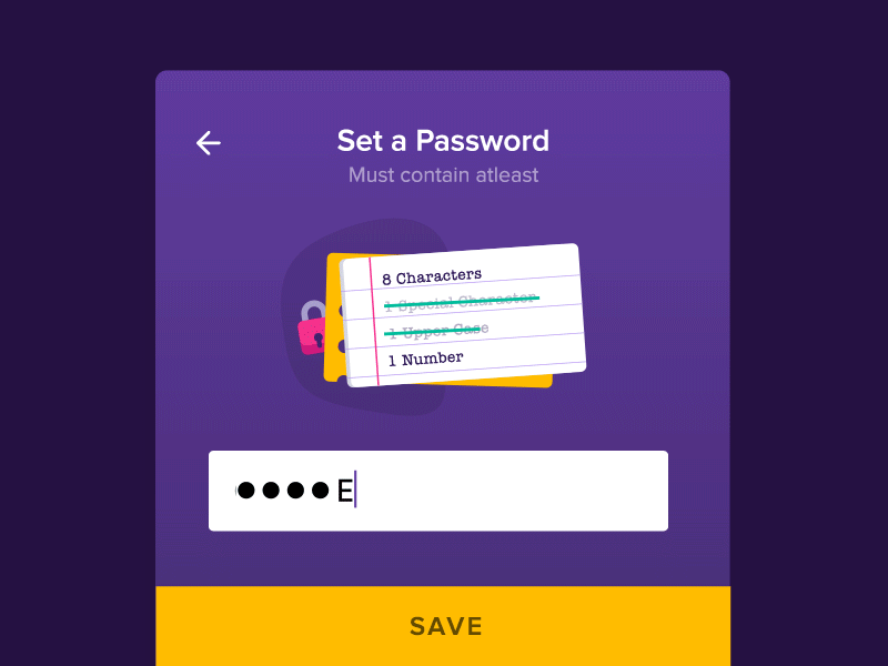
Same is the case with the password field. There are many applications that over-complicate the process of creating a new password for their log-ins. Ask yourself, is it really necessary for the password to have one uppercase, one lowercase, one special character, one GameOfThrones character and the name of your firstborn as a part of the new password that is being created?
There are many, many people that still use one single password for most of their log-ins. We should aim at creating a smoother experience for this set of users.
Even if the password needs to be complex for security reasons, make sure that the user know what is expected out of the password. If the conditions for a successful password are displayed upfront, the user will set up their new string accordingly. Lowering the chances of failure will thus ensure better experience.
3. Let them know
Let the users know what they’re getting into. If an application eventually charges the user for its services, they need to let them know about the costing in advance. If signing up simply means being able to acquire access for a week, let them know about it in advance. If there are Terms and Conditions have they must definitely go through, let them know about them in advance. Bottom line, if there is anything that your user should know, let them know about it.
Anything apart from this would be equivalent to deceiving the user. Not giving the user a heads up will most likely leave them feeling cheated. Since trust between is system and the user is already a tough feat to achieve, we should make sure that we cover all bases at the time of the sign-up.
4. Social Sign-up
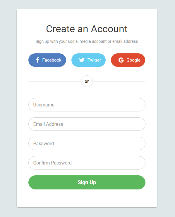
Always, always, ALWAYS give the user the option to sign up using their social media account (Facebook, Google, Twitter, LinkedIn, Google+). There is a much better chance of the user going through with the sign up process if it involves them getting done with it by just clicking a single button. There are so many websites and applications that bring up social sign-up options upfront while hiding the standard email sign up behind a click.
Whether we like it or not, our social media accounts have become a huge, huge part of our lives. There are people who literally earn their living my simply being present on Instagram. So when allowing applications to use a pieces of their lives to receive access, users could get cautious.
To attain their trust, assuring the users that never will you ever use their social media accounts to post anything is of utmost importance. Adding that one statement helps the user trust the system a little better and puts them in a more comfortable spot to proceed from.
A major advantage of a social media sign up is skipping the verification step. It seems like SO much effort to open up one’s email, click on the verification button, go back to the application they were using and repeat the same process again.
Sign up pages can sometimes define the relationship that gets established between the user and the system. It is of utmost importance for us as designers to get it perfectly right at the very first time.
The next time you design a sign up page, think long and hard about where you want to place it, what fields you want to include in the form, and lastly, the kind of experience you want to leave them with!


