Member-only story
SpaceX: Simple, beautiful interfaces are the future
The recent Launch America event was a big win for reducing complexity.

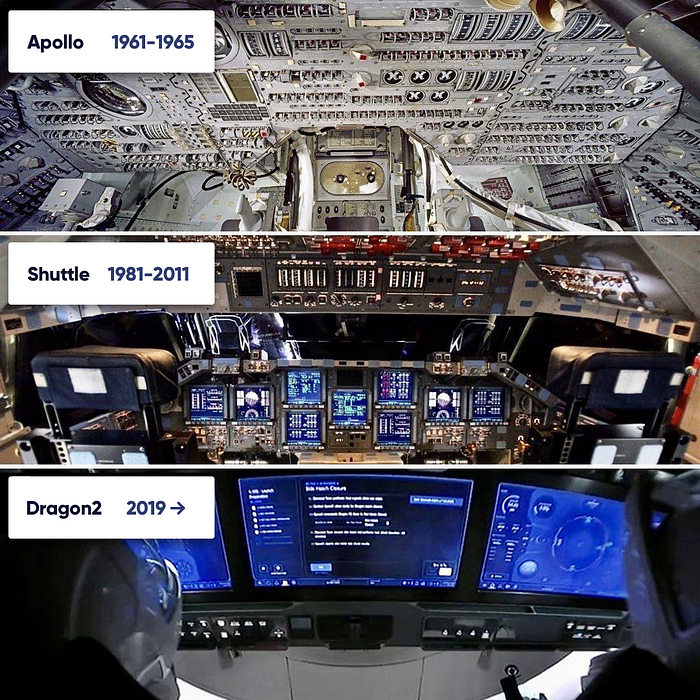
A photo has been floating around the internet showing how the interior of the new Dragon spacecraft differs from the Space Shuttle. The difference is staggering, but not entirely suprprising. After all the Shuttle started operating in 1981, while Dragon 2, is barely a year in operation.
On-screen user interfaces evolution
Macintosh — 1984
But let’s go back in time a little bit, to the first Macintosh. Of course, the Xerox Parc inspirations need a mention here, even when it’s unclear how much Apple “borrowed” from Xerox. Still, after very simple, text-based interfaces having a “virtual” desktop was a revelation and a revolution at the same time.

Before the GUI people were able to do a lot of the same things — there were word processors, spreadsheets and other office tools. They were simply a bit harder to use and required very good keyboard shortcut knowledge.
All hardware UI
So instead of a visible interface, the interface was all hardware.
The Macintosh transitioned the interface to a mix of hardware and software, through skeuomorphic paradigms (desktop metaphor, and later the trash-bin).
The next revolution
I’m going to skip the click-wheel, as it was a single-use device thing, and while I love my iPods (and still use them to this day) the interface wasn’t a game-changer of the same proportions as the bitmap screen and mouse combo.

Steve Jobs realised the next step by showing the popular phones of 2007. They had lots of buttons and a visually cluttered, hardware interface. He also said what I think was the most important takeaway from the whole UI part of the keynote.


