Simple, reusable design system in Figma
Find out how to create a simple design system with a library of style and components that will help you jump-start all your projects.

 Putting together a design system may seem like an unnecessary hassle. It’s often easier to jump straight into designing things without having to worry about styles, components, or libraries. Some might even argue that when it comes to smaller projects, creating a design system takes nearly as much time as designing the entire project, so why bother?
While it’s true creating a design system is an additional step in the design process, what’s also true is that, regardless of the size of the project, the first version of your project rarely gets accepted by the client. Depending on the size of the project as well as the severity of the changes, introducing them could take a lot of time.
So whether you’re designing huge platforms or small e-commerce websites, design systems could save you a lot of time in the long run. Instead of going through each and every view making sure that you’ve applied the new colors or fonts, you could just take a look at your styles and components, introduce all the necessary changes in a few clicks and automatically populate them to the entire project.
Not only does this save you time, but it also allows for more coherent design practices as you limit yourself to only using predefined styles and components.
Figma gives you the tools to create a simple, easily reusable design system. There are a few ways you could approach this, and I’m going to try and cover all of them. I’d also like to take you through the list of things you’ll need to build your very own basic design system, which you can then modify and grow to best suit your project’s needs.
Technically you could use one of the available ready-made design systems for Figma, but I’d argue this is not a very good idea unless you’re trying to create something in a hurry. I believe it’s always best to put in the time to build your project from the ground up. This will allow you to better understand how each component is created and solve any issues that may arise while working with the design system.
Sometimes it can be hard to create a design system without seeing the bigger picture. It’s a good idea to base your design system around an already finished project.
The first and most important thing is creating a proper grid for your design system. Depending on what kind of framework you’ll be working with, you could be using different types of grids. The one I personally use most often is the Bootstrap grid. I like to set up my grid to not only help me space around objects horizontally but also vertically. I’m not going to go into why you should be using a grid, as that’s a subject for another article.

You should turn thus created grid into a style. Now if you haven’t done that already, it’s also a good idea to go into the Figma hamburger menu > Preferences > Nudge Amount and set the values to 1 and 8. This way your keyboard arrow keys in combination with the shift key will allow you to move the objects around while sticking to the grid you’ve just created.

The next step is to create a bunch of font styles that we’re going to be using in our project. It’s important to remember to cover all the basics such as several styles for headlines, paragraph texts, hints, captions, and such. Do as many as the kind of projects you’re involved with may necessitate. You might think to yourself: “Hey, why not have the same style for buttons and menus since they use the same font?” Well, you might find yourself in a bit of a pickle if it turns out that you only need to change the font size for your menu elements at a later stage of your project.
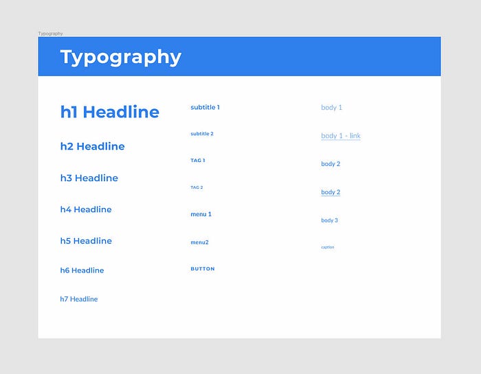
I like to keep all my font styles displayed in a frame, so I know whether they play well together or not. This kind of setup will be necessary if you decide to duplicate your design system instead of using it as a library for your project, but I’ll get back to that later. Generally this amount of styles should be enough for any kind of average-sized website with a decent amount of text in it.
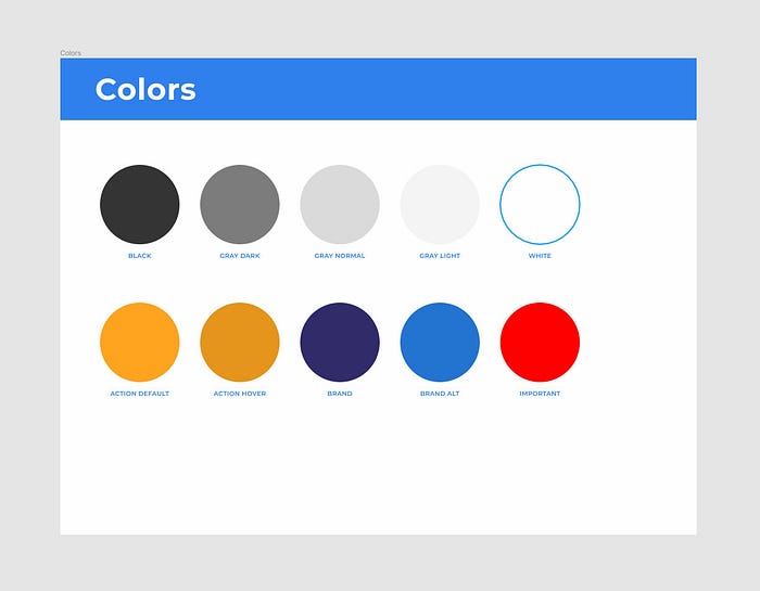
When it comes to colors I usually define styles for the brand colors, the action color, and some grays. You might want to define styles for important, warning, success, error messages, and such as well. Dealing with a strictly defined palette makes not only the design process but also the hand-off much easier.
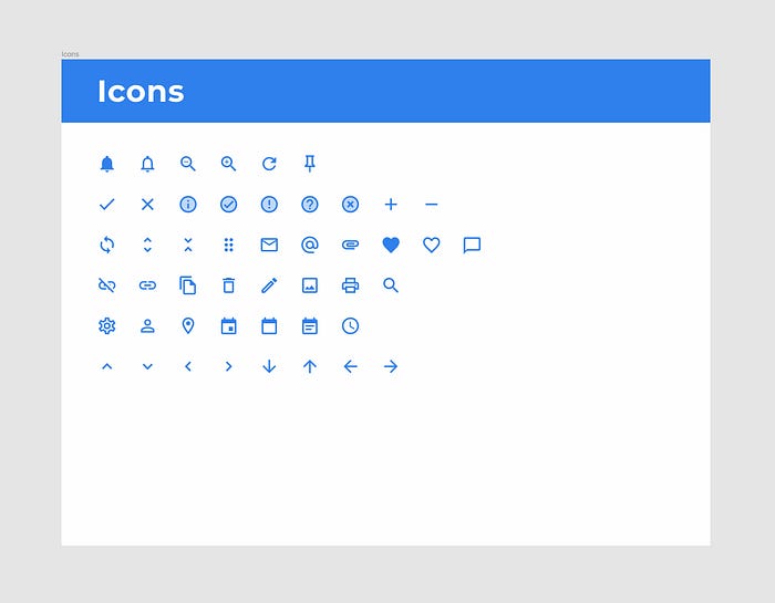
A basic set of often-used icons is also a good idea. I’ve used Google’s Material icons for this example. Even if you‘re tasked with designing your own set you can use these as placeholders in early mockups that are easy to replace at a later time.
Even though there’s a variety of plugins that can automatically generate content for you such as avatars or images, I prefer to create a predefined set of images or avatars as styles, to retain coherence in case I decide to use them as placeholders.
It’s not very intuitive, but Figma lets you set up images as color styles that you can later use like any normal color style — to fill a given object using a predefined set of characteristics. What’s even more interesting is that objects can have a lot of fill layers within themselves that interact with each other (this also applies to strokes, effects and so on) and so a group of fill layers all within a single object could be defined as an easily modifiable style. Fill layers can also be moved to front or back and copied between objects. This is an awesome feature that not a lot of people know about.
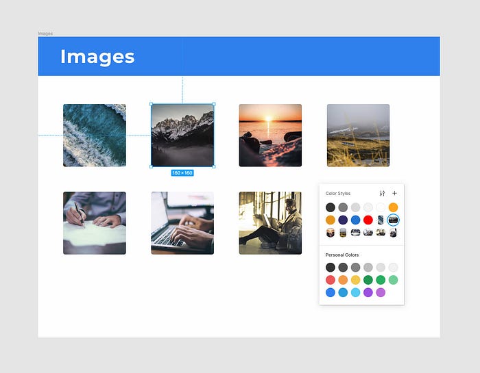
You can of course achieve similar effects by setting up images as components, but you can’t use components as fills.
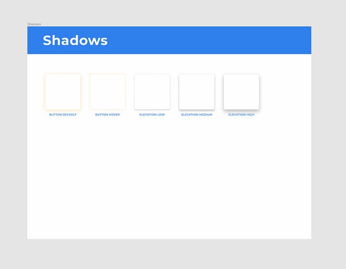
The last step is to create some shadows for your project. For a small design system I wouldn’t bother with an entire complex elevation system, just a couple of different shadow styles should be enough.
Once you have all the styles set up this way it’s time to start putting together some components.
Before Auto Layout there was a whole different approach to creating buttons. You’d start with defining shape components that would then serve as button backgrounds through using appropriate constraints. You’d use these shapes across all your components so that if you decided to change your corner-radius, this change would affect all your buttons, images, input fields, and so on. While this technique still has its merits and can still be used in some situations, it won’t work with Figma’s Auto Layout feature.
Auto Layout is an amazing feature, but in the case of buttons it’s not always the best solution. Sometimes you need to size your buttons according to a grid. Some of the projects I’ve worked on necessitated both, standard and Auto Layout buttons. Some of them could do without Auto Layout at all. Not one could do without the standard, non-Auto Layout buttons. When creating a small design system such as this one I’d stick with non-Auto Layout buttons.
At this point you actually start using your styles. You can use your Button font style, put it in a frame, fill it with the Action Default style, slap the Button Default effect on it and you’ve got yourself a button. Do this a couple more times to create appropriate styles for different styles.

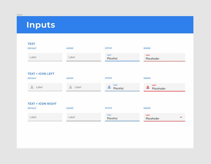
In the case of a simple design system like this one I’d finish up with a set of inputs in different states. Again, you should base their design on the styles you’ve already created.
At this point you’ve got all the basic ingredients to start working on a new design. Where you go from here should depend on what kind of projects you do most often and what other patterns could be turned into reusable components that often appear in your projects. Often work with e-commerce websites? It’d probably be a good idea to create some product card components, maybe a checkout form.
Now there are two ways you can go about reusing your design system for new projects. As with most things in life, each has its pros and cons. Go with whatever is best for your design practices and the type of projects you deal with.
You can do it the way it was intended by Figma. Use the design system you’ve created as a library. This way you get access to the entire design system right away, but any heavy modifications of the components are out of the question obviously. You can only modify the colors and hide their elements. Other than that you’re stuck with what’s in the design system. The same thing goes for all styles. You can add new ones, but can’t modify the originals. It’d actually be a better idea to split the design systems into separate libraries and so you could, for example, use a button library, a gray color library, an elevation library, etc.
The second approach and the way I do it is to simply duplicate the entire design system. This way there’s nothing stopping you from modifying all your components. The bad thing about duplicating design systems is the fact that it makes you lose all your styles. You basically need to go through all your fonts, colors, fills, and whatever else you might’ve set up and turn them into styles once again. This isn’t so bad however as it only takes a few minutes and still makes you save a lot of time in the long run.
Technically a design system is a much more complex structure than what we’ve created so far. But while a complete design system is supposed to include all reusable characteristics and patterns of a design, our basic design system’s goal is to help you kick start your designs.

