Using smart layout in Sketch
Creating simple and complex symbols using Sketch’s latest feature.
On September 17, 2019, Sketch 58 was released and included a major efficiency boost for designers working with symbols.
From the Sketch Release Notes:
With Smart Layout, we’re making Symbols more powerful and supercharging your workflow when it comes to using them in your designs. With it, you can set a direction for Symbols to resize when you change their overrides, while keeping the spacing between different layers in that Symbol consistent. Better still, you can set different Smart Layout settings for Nested Symbols and even groups within Symbols. It’s incredibly powerful and we can’t wait to see how it’ll improve your workflow.
I wanted to take this new feature for a test drive to find ways that my workflow could be improved with Smart Layout.
Starting Simple
To get a hang of how Smart Layout works, I started with a simple button with the following layers:
Button:
- Text Layer
- Background Layer
To represent different button states, we’ll just rely on Sketch’s text styles and layer styles.
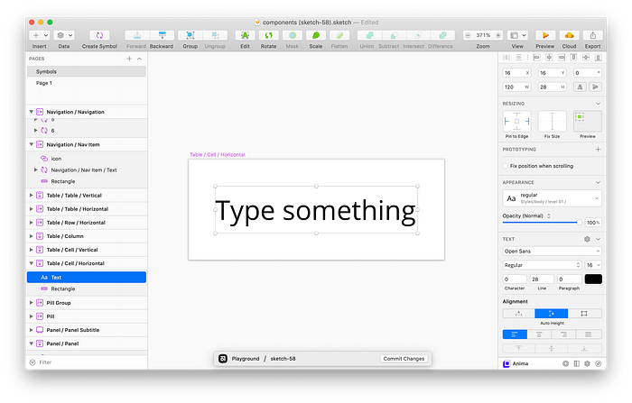
When creating this simple button symbol, I set the text alignment to auto width and gave it a margin of 16px all around to allow the text layer to grow along with the content within the text override. By setting the overall symbol’s layout to horizontal and left to right, whenever the text changed, the symbol container would resize to fit the text. Super cool!

Next, I wanted to take a look at a more complex type of button. Can a single button symbol accommodate buttons with icons? Let’s look at two specific examples:
Icon Button:
- Modifiable icon to the left of the text layer
Button Dropdown:
- Modifiable icon to the right of the text layer
This was surprisingly easy to achieve with Smart Layout! By adding left-icon and right-icon layers, the button resized depending on what was set in the symbol override.

With these settings, I can set either the left-icon or the right-icon layer to None in the symbol overrides, and because of the Horizontal layout, the button will resize accordingly. Here it is in action:


Kicking it up a notch
I use cards (panels?) and modals (dialogs?) fairly regularly and have multiple different symbols to be able to use them efficiently in my day-to-day. Could Smart Layout create a more versatile component that could accomplish all of my use cases?
Breaking down the potential layers for this versatile card/panel/modal/dialog component, we have the following layers:
Card/Panel/Modal/Dialog:
- Title
- Subtitle
- Image/Media
- Body
- Pill Group
- Button Group
In order to rely on the same collapsing technique when adding icons to buttons, I learned that every part of my component needed to be a symbol to take full advantage of overrides. Here’s what my panel layers looked like:
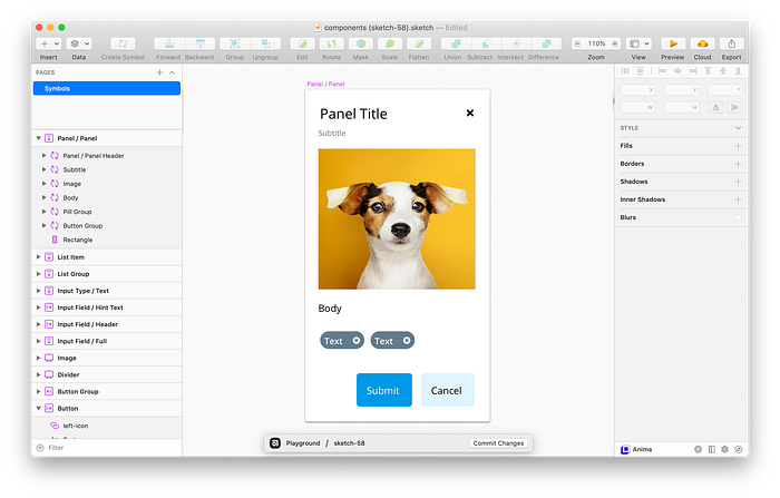
As shown above, this Smart Layout is composed of several other symbols with their own resizing rules and layouts.

With a little finagling and some foresight, you can create some fairly flexible components using smart layouts!
Takeaways
- In order to make truly complex smart layouts, you need to be pretty comfortable with both nesting and resizing in symbols. Smart layouts feel like a layer on top of group resizing, and combining the two together can create some pretty versatile symbols.
- When using overrides to collapse elements in a symbol using Smart Layout, working with spacing is a bit tricky. In order to make sure that proper is maintained throughout the component, spacing had to live within each nested symbol within it. This is a bit different to how I’m used to working in Sketch, but seems like it could be useful within Inspect mode when sharing spacing specs between design and engineering. In the above example, the Panel Title symbol has a bottom spacing of 8px, which could correspond to code as
h1 { margin-bottom: 8px }.
Let’s take it *one* step further
I probably spend the most amount of time creating and maintaining tables in my Sketch projects, and they’re often so variable that it’s typically more work to maintain a symbol than to just work in groups. Even for simple tables, making sure columns and rows stay aligned as the content changes takes a lot of time. Can Smart Layout help here?
Again, let’s break down what we’ll need for a table:
- Table Cell
- Table Row or Column (depending on layout)
- Composed Table
Smart Layout only allows for either a horizontal layout or a vertical layout, so I’ll make two tables — a horizontal table that resizes horizontally based on the content, and a vertical table that resizes vertically based on cell content.
Vertical Table
First, let’s break down the cell for a vertical table:
Vertical Table Cell Layers:
- Text Layer
- Background Layer
Our text layer should fit the width of the cell, and any overflow should wrap to the next line. This way, as the text changes in the symbol override, the cell height will grow accordingly. Our background layer will again make use of layer styles, which will come in handy for specifying a header cell later on.
Next, let’s use this cell in a column symbol. This symbol will resize vertically, meaning that if we remove a cell, the entire column will resize to adjust. We’ll stretch each cell to fill the column when we adjust the width. We’ll also use text and layer styles to make a header cell. I like to rename repeating symbols so they’re easier to find in the override panel later. RenameIt totally helps me out here!
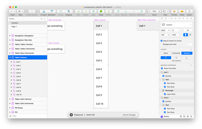
Finally, we’ll compose our columns into a larger table. Having 10 columns gives us the flexibility of being able to remove unneeded items depending on the use case.
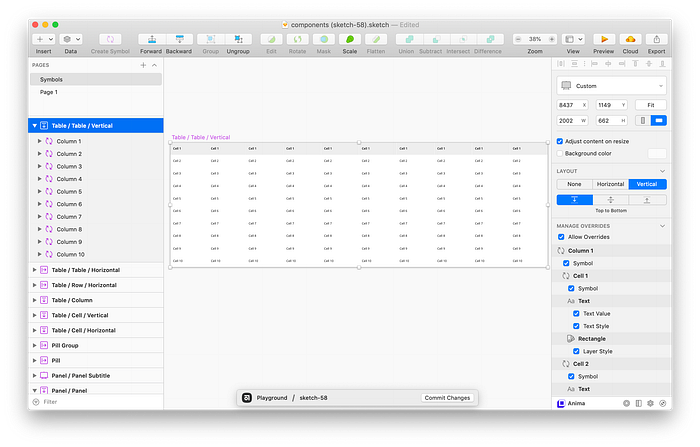
Following a similar pattern, I created a table that stretches wider as longer content is added. Here’s both, side by side:

Things I’m still looking forward to
After playing with Smart Layout, I’m super excited to for all the applications for my day-to-day. That being said, there are a few things I’m keeping my fingers crossed for in a future release:
Better Performance
All of these nested symbols reallllyyy slowed down my machine. Creating that table symbol took way longer, even just when changing the text in a cell through the override panel. Fingers crossed in the future all these nested symbols required by smart layout get a bit more performant!
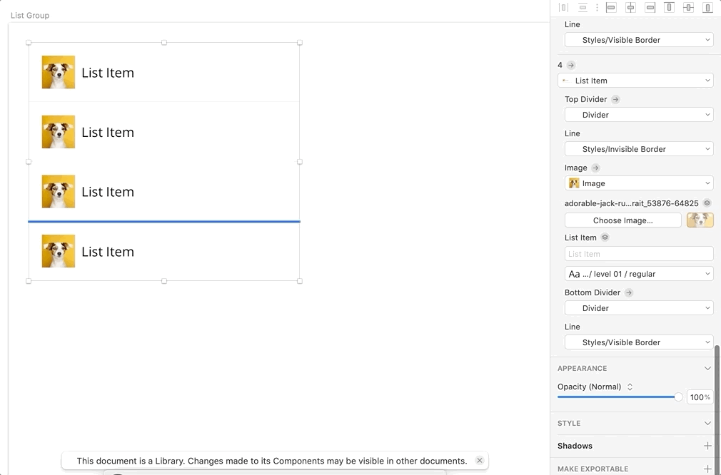
Adding repeating items vs. just removing them
In certain cases, it’d be cool if we could add elements through the symbol override panel. In a List Group symbol I created, it’d be nice to be able to add list items on the fly that adhere to the same smart layout rules, the same way that I can remove list items.
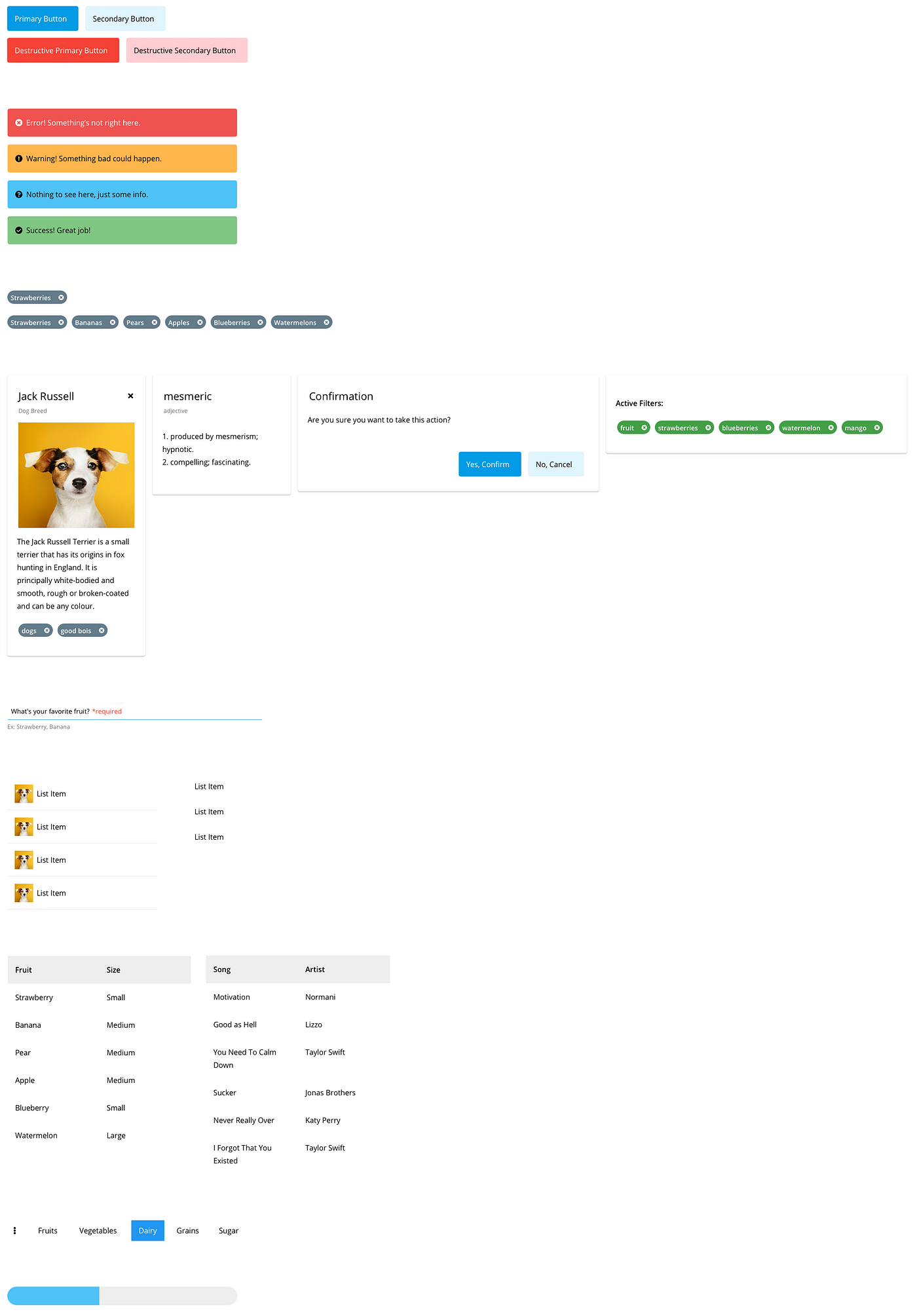
Here’s a few more items I was able to create from a handful of symbols using Smart Layout:
Have you used Smart Layout in Sketch yet? Let me know what you’ve been able to create, and if you have any tips or tricks to share!

