Member-only story
Sketching tips for UX designers who think they can’t sketch
“I can’t sketch.”
That’s what a lot of UX Designers start out saying to their instructors. If you are facilitating a Design Sprint, you could be hearing that from a Marketing Director or someone in the Finance department. Most people would at least get a little lump in the throat if someone told them that they were going to be spending the next five minutes sketching.
On the other hand, you have people who love to sketch. Whether they come from an artistic or creative background or not, some people are just natural doodlers. But this category contains its own challenges.
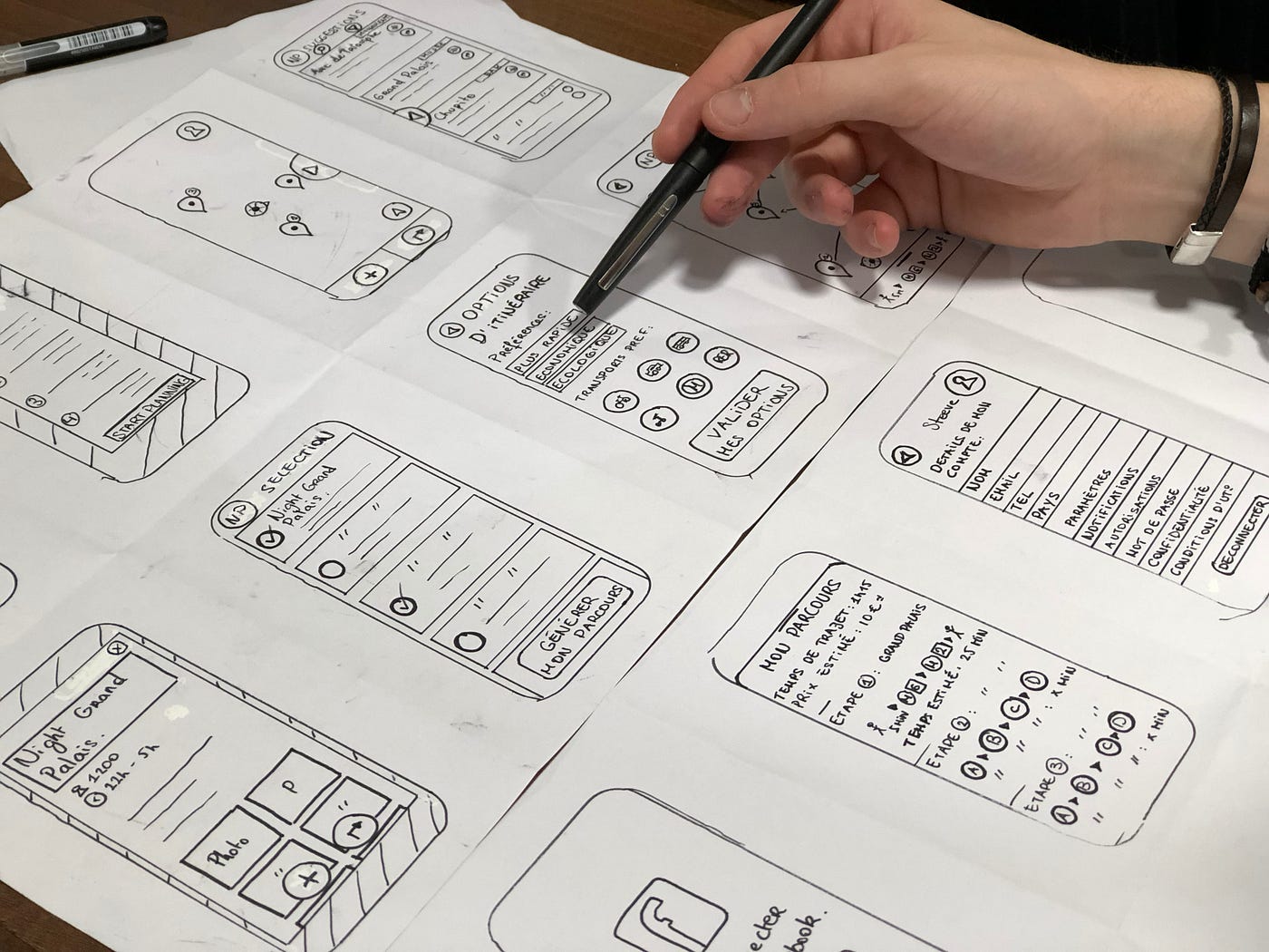
For people who like to sketch, the problem tends to be they use too much detail. Their heart palpitates at the thought of “only” having five minutes to complete their sketches. They might only get a few screens deep into their 6–8–5’s (aka, “Crazy Eights”).

Sketching for UX is Meant to be Rough
The reason, first and foremost, for sketching in UX design is to get ideas down quickly that communicate rough structure and placement. They are not a finished product by any stretch of the imagination. They are strictly tools for communication and creativity.
I saw many of my colleagues get bogged down by their desire for detail and ended up hating the sketching portion of the process. I myself have a pretty strong love/hate relationship with UX Sketching. But there are a couple things you can do to avoid this pitfall:
Use BIG markers
You can short-circuit your tendency to put in too much detail by using markers that are purposely too big for the medium. Don’t be afraid to use a big, chunky marker on a little sheet of paper, or sticky note. Not only does it help you stick to the big details, but it is more visible from a distance when your team is reviewing work.
Alternatively…
Use Smaller, Cheaper Paper
It’s the same principle as before but in reverse. Whatever writing instrument you’re using…