Sketchnoting for UX designers: WebExpo Conference captured by sketchnotes

Some days ago I attended the WebExpo Conference in Prague, and listened to 16 talks (8 talks/day). And I didn’t only listen to them, I created a sketchnote during each talk!
At the end of the first talk the guy sitting next to me asked if he can take a photo of me sketching :) So here is a documentation of the process by Roman Veselý (btw. if you want to read a conference summary from a developer’s perspective, check out his article):

Benefits of Sketchnoting
This is the definition of sketchnotes by Mike Rhode:
“Sketchnotes are rich visual notes created from a mix of handwriting, drawings, hand-drawn typography, shapes, and visual elements like arrows, boxes & lines.”
Sketchnoting or visual note taking is great, since…
- it helps you zoom out, focus on the bigger picture
- it supports distilling the most important concepts
- it combines seeing, hearing, thinking and sketching, meaning that your brain and your hands need to cooperate; as a result, you’ll be able to recall the things you’ve experienced more efficiently (improves memorability)
- it forces you to concentrate on the main ideas, overarching thoughts, so you won’t get lost in the little details
- it makes you organize the knowledge you’re capturing
“The reason I believe sketchnoting and UX Design are such happy bedfellows is because they require similar skills: listening, processing, and sketching.”
(Matthew Magain — Why Sketchnoting Makes You A Better UX Designer)
And if you sketchnote at conferences, there is an additional benefit: your sketchnote (and the fact that you’re creating sketchnotes) is a great conversation starter, so it’s a networking tool, too.
Starting points for beginners
- Read Mike Rhode’s epic book: The Sketchnote Handbook
- This article by Matthew Magain sums up the basics:
Inspiration: Great Sketchnoter UX Designers
Here is a list of some great sketchnoter designers to follow:
Chris Spalton (in this article Chris talks about all the reasons for sketching in UX — spoiler: sketchnoting just one of these ;) )
Eva-Lotta Lamm (I highly recommend reading her article on how to practice sketching: Thoughts about (sketching) practice)
Makayla Lewis (check out her awesome article: The Power of Sketchnoting in UX Design)
Some other sketchnoter designers to follow: Kate Rutter (here), Francis Rowland, Boon Yew Chew (here), Michele Ide-Smith (here), Veronica Erb (here), Matthew Magain (here), Christina Wodtke (here), Ben Crothers (here)
And finally here are two really inspirational resources:
- In this article Candice Mazzoleni shows how she practiced sketchnoting by watching UX talks, I can’t recommend this way of practicing enough! It’s like a tutorial level for live sketchnoting at conferences, meetings: you’ll be able to watch the video again or pause it if you need more time. (Btw. you can watch the talks of the WebExpo ‘18 conference here.)
- The other one is this story: the Agile Australia conference (AgileAus18) invited 11 students to live sketchnote the conference talks, and for many of them it was their first time they tried out sketchnoting! Take a look at their sketchnotes here, their results are really motivating.
Join my 100-day long UX sketching challenge
Live sketchnoting is not easy, but having a UX-related visual library helps tremendously! And it’s not only about repeating the same 20 visual anchors (e.g. a lightbulb or a pencil) over and over again: if you have a good foundation, you’ll be able to combine the elements of your visual library in a meaningful and interesting way!
So if you want to build a visual library, my 100-day long UX sketching challenge might be a great fit for you!
This is how it works: I send out 3 objects or concepts related to UX each day for 100 days, and the task is to create a sketch for them. I also provide my own solutions for the previous day’s exercise. As a result of completing the challenge, you’re going to end up with 300 UX-related visuals drawn by yourself! And it only takes about 5 minutes a day.
You can read more about it in this article: UX sketching challenge: 100 days of visual library building.
About WebExpo ‘18
WebExpo is an annual conference for designers, developers and everyone working on digital products and services.
I experienced the conference from a designer’s perspective, since I attended talks related to design, but there were more than 50 talks and several workshops, so it was truly a huge event. Thanks for inviting me Gonzalo Fernández, it was a great journey!
And finally here are my WebExpo sketchnotes, I hope that this little “case study” for live sketchnoting at a design conference will be inspirational for you!
WebExpo ’18 Captured by 16 Sketchnotes
The 1st Day

Impactful Storytelling for Innovators and Disruptors by Susan Lindner (read more about the talk here)
Key Takeaway for me: you can use fear and you can terrify people enough to change their behavior, but it only causes a short term change. To influence behavior in the long run, you need to apply a different message: the listener (customer) should be the hero of the story!

Measuring the Value of Design by Douglas Powell (read more about the talk here)
Key Takeaway for me: You can show the value of your design work by collecting and analyzing data, and creating a story by using numbers and facts, so that you can present a more concrete, quantified impact to the business leaders.

Microcopy — Your Users Will Fall in Love by Kinneret Yifrah (read more about the talk here)
Key Takeaway for me: Every word on a UI should be intentional, and every word should contribute to the user experience in some way.

Lead with Design by Diamond Ho (thanks for signing the sketch ;) ) (read more about the talk here)
Key Takeaway for me: Designing for 200 000 000 users means that you most probably design at the largest possible scale, and in this case the smallest fine-tuning, e.g. even a really simple “upvoting / downvoting comments” function needs to be carefully tested and introduced.

VR and AR are not Flashy Toys anymore — How to Use New Technologies and Deliver Good Results (Based on Use-cases) by Bartłomiej Rozbicki (read more about the talk here)
Key Takeaway for me: Including human touch, e.g. interaction with another human is an essential part of designing for VR, since people want to deal with people.

Design Systems at Scale by Rich Fulcher (read more about the talk here)
Key Takeaway for me: The most eye-opening part was about providing counterexamples (e.g. for documentation purposes). It is easy to assume that “glerb” (an artificial word for the purposes of this example) is a pen, since there were 3 pictures in a row about 3 different pens, and all of them stated that “it’s glerb”. But then the 4th picture changed this assumption, since it also showed a pen, but it was tilted a bit, and it turned out that a tilted pen “is not a glerb”.

Enterprise UX: Harder, Better by Bela Berankova & Honza Valder (read more about the talk here)
Key Takeaway for me: I loved the visual metaphor for breaking down silos: the fruits represent the isolated departments, so you should create slices of them, and make healthy fruit salads. :)

Faster, Stronger: How does User Research Fit in an Agile World by Tereza Kosnarová Venerová & @Robert Fujdiar (read more about the talk here)
Key Takeaway for me: I like the idea of creating a dedicated Slack channel for the developers where they can check out the customer feedback coming from the customer support team, and also the reviews from the app store.
The 2nd Day

Peoples & Algorithms: Building AI-Driven Features that Don’t Cause Harm by Val Head (read more about the talk here)
Key Takeaway for me: Bias in our assumptions might cause a lot of harm, and might result in algorithmic cruelty! For example a birthday reminder of a dead daughter — and the user is not able to opt-out!

How to Design the Future by Dan Saffer (read more about the talk here)
Key Takeaway for me: I really liked the systematic framework created by Dan and his team at Twitter: you look at the general future first, then narrow down the list of the trends, then create stories (there is also a story sheet template!), based on stories you define the organization’s opportunities, then you and the business leaders can make a more informed decision concerning the next steps.

How to Build an Evil-free Social Network: Olympic Case Study by Ondřej Machart (read more about the talk here)
Key Takeaway for me: This was one of my favorite talks, it beautifully summarized what’s wrong with creating addicts instead of gaining users, and what the possible ways of removing the “evil” side of these addictive products are.
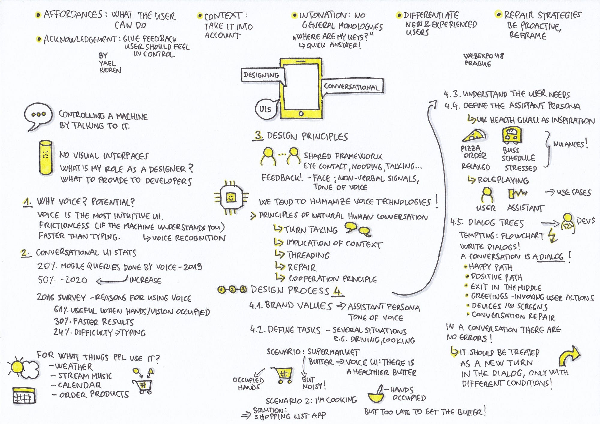
Designing Converstaional UIs by Yael Keren (read more about the talk here)
Key Takeaway for me: Since we tend to humanize voice technologies, we should design conversational UIs in a way that these incorporate the principles, characteristics of a natural human conversation. One of these is that in a human conversation there is no such thing as error, so an error should be treated as a new turn in the dialog (with different conditions).

How to Design a Design Workshop by BoB Marvan (read more about the talk here)
Key Takeaway for me: While everything can go wrong in the process of organizing and facilitating a design workshop, there are many-many little guidelines you can follow in order to minimize the risk of frustrating scenarios. I especially liked this one: you should always ask a photo of the room in which you’ll facilitate the workshop.
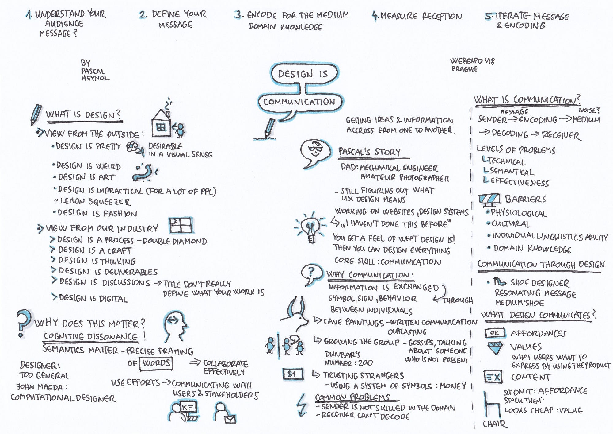
Design is Communication by Pascal Heynol (Becker) (read more about the talk here)
Key Takeaway for me: What I loved about this talk is that Pascal admitted that he is still figuring out what UX design means. After having so many different types of projects, he realized that once you get a feel of what design is, then you can design everything, and the core skill here is communication (that is about getting ideas and information across from one to another).

The Future of AI is Emotionally Intelligent by Pamela Pavliscak (read more about the talk here)
Key Takeaway for me: Technology’ll move from just being intelligent to emotionally intelligent. And emotions are 1. very complicated, 2. constantly changing. For example we’ll have feelings about other people’s feelings, and these feelings might actually be completely new or mixed.

Constant Curiosity: How Brands Earn Trust by Asking Firecracker Questions by Jon Burkhart (read more about the talk here)
Key Takeaway for me: The ultimate content strategy is listening. In order to make memorable content, we should create content that POPS, there are 4 elements: Provocation, Originality, Play and Surprise. As UX designers, we should think of ways of putting joy into our UX copy / UX design.

