Sleek Beautiful Design Provides Bad User Experience
Sleek, minimalistic, and futuristic, three words that come to mind when I think of the brand Apple. Apple has won the hearts (and wallets) of their consumers over the years. Just last year, they were named the most valuable public company ever. In February 2018, Apple reportedly sold 77.3 million iPhones, 13.2 million iPads, and 5.1 million Macs during the first quarter of 2018. With the introduction to the Macintosh in 1984 to today, Apple truly leads the world in innovation with their products such as the iPhone, iPad, Mac, Apple Watch, and Apple TV.
I myself am currently typing on my Mac Book Pro with my iPhone next to me. I wouldn’t consider myself an Apple fanatic but I would say I am very loyal to the brand. They not only have a sleek and innovative brand image but from my experience they offer and deliver great customer service and they create products that really do offer great user experience…all of their products except their chargers.
For a company that makes such innovative products, why can’t they make a charger that will actually last?

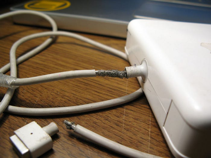
Their phone charges are a disgrace to their brands name. Although they match the white, sleek “Apple” look, they fray and break easily if you don’t just plug your phone in and walk away. Any normal usage of your phone while it is charging will wear and tear the chord. From a quick skim of the reviews online, I know I’m not the only one who has gone through multiple chords as a result of them not being made to withstand use.
“These cables are terrible. These break just as easy as the cheap flea market ones. I’m always praising Apples products to all my friends. These cables are an embarrassment.” Written by Bonnae C from Chicago // Apr 24, 2018
“Looks good, but Poor build quality, stopped charging in 7 weeks. With good and safe use in one location No option but to try luck at store repair or purchase again, will try third party this time.” Written by Amit C from Cupertino // August 16, 2018
When purchasing a phone charger (or receiving it with an iPhone) we expect it to be made to be functional and adaptable to our everyday use. However, these chords seem to be made delicately. I’m not using a charger because it’s sleek and pretty, I’m using a charger to charge my phone. With every pull or tug, the chord becomes weaker and weaker. Wear-and-tear is the reality for many products but considering the price and quality of the Apple brand, you’d expect their chords to be built to last longer than their counterparts — which does not seem to be the case.

I read that one of the reasons the chargers and cables break easily is because Apple uses a thin rubber protective covering instead of PVC or other materials that manufacturers of competing brands use. Their do not use strain relief what-so-ever in their chord design, so if you pull them to the side they will immediately be strained. Without the stress relief ridges, the chords endure more stress than other chords would from the same movements.
I’ve had too many frayed iPhone chords to count and I have generally found that the off brand, cheaper chords last longer and are less frustrating to deal with. The “beautiful” UI, in fact offers poor user experience long term. I expect a product (especially a product from Apple) to last.

“I honestly think apple knows these cables are horrible, NOBODY should have to keep wasting money on something that’s gonna break a few months later with that being said apple should replace all cables without paying for these despite if your warranty has expired.” Written by April D from Brooklyn // July 30, 2018
The MacBook charger also has the same issues. Although it may look sleek and innovative like every other Apple product on the market, it is not made to function as it should. The newest charger also no longer has an LED located at the head of the connector to let you know when the computer is fully charged. They also now only sell USB-C cables separately — which doesn’t really affect the overall performance of the product, it’s just annoying when something was sold together previously so you expect to have the same type of experience.
All in all, Apple charges break a few major user experience rules making their “pretty design” bad UX. For starters, it breaks some of Neilson’s 10 Usability Heuristics for User Interface Design. Apple charges do not provide visibility of system status as there is no feedback that the phone is charged or charging from the actual adaptor or chord. In order to tell if the phone is fully charged, the user must click on their phone.
Additionally, his rule of flexibility and efficiency of use is also broken because the chargers do not allow the user to tailor the phone chord’s functions to their frequent actions. For example, if I wanted to use my phone while it is plugged in, I’d be using the product how it is not intended to be used but how it best serves me. The product should have been built to meet my needs of using the chords like a normal human would and not just plugging them in to look pretty.
Lastly, although the chords are fairly consistent looking to other brand’s chords, the consistency of the quality of a user’s experience goes down each time they use it. I’ve had frayed chords that would have to be angled a certain way to have them work properly ruining my experience and making me frustrated.
So despite looking “on brand,” over time, the user experience definitely dwindles for Apple Chords.
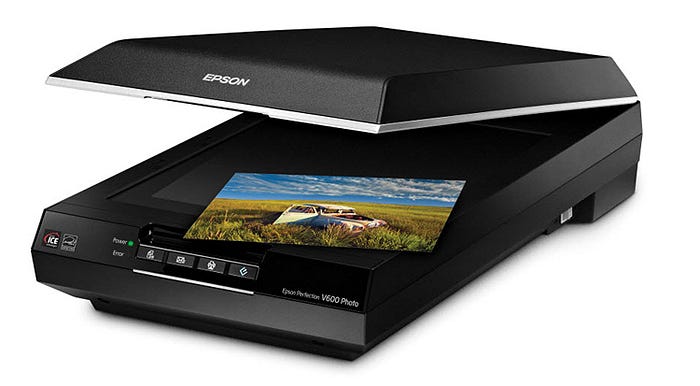
Another analog product that is an even better example of pretty but bad UX is Epson scanners (and probably majority of scanners/printers out there). I own an Epson Perfection V600 Photo scanner which is used to scan photos, film, slides, and everyday documents. The product itself works incredibly well. With 6400 x 9600 dpi resolution, and DIGITAL ICE® technology, it ensures precision scanning.
In comparison to older models, it’s also a relatively good size. It can fit on a desk and is sleek unlike a clunky printer. The model is also equipped with some eco friendly features (which is a big plus for me). These include that is designed to be recycled, energy star qualified, mercury-free LED light source, and the use of the LED light source allows the scanner to consume less energy than a fluorescent lamp.

Despite these great features, there are a handful of things that really make me hate the overall user experience. First off, the error button on the front. It breaks the third rule of Ben Shneiderman’s The Eight Golden Rules of Interface Design because it doe not offer any feedback. It turns red to let me know there is an error but there is nothing on the actual scanner that helps me or the user figure out what is going on. The interface of the scanning software, if open, will prompt you with a message that there is an issue connecting to the scanner. I’ve used printers before that will show a picture on a screen to indicate where the error is. Even if there was a picture or something to help the user understand what the error is on the open desktop application, that would at least provide some user feedback. This also breaks rule 9 (Help users recognize, diagnose, and recover from errors) and 10 (Help and documentation) of the 10 Usability Heuristics for User Interface Design. There is a users manual available online but at 146 pages, I can honestly say I have not read it. I also think for the most part good UX should allow me or the consumer to understand how to use the product without having to read copious amounts of information beforehand.
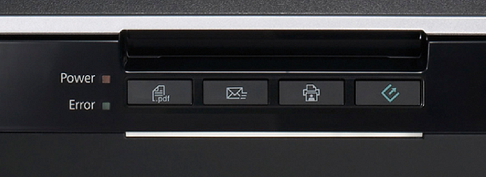
Additionally, it also does not meet rule number 3 of the Nielson Norman Group’s 10 Usability Heuristics for User Interface Design, user control and freedom. “Users often choose system functions by mistake and will need a clearly marked “emergency exit” to leave the unwanted state without having to go through an extended dialogue,” notes the Neilson Group. The Epson V600 and many other scanners surprisingly do not have a cancel button on their scanner at all. What if I click the scan button and then decide I actually wanted to email a pdf version of it to myself (emailing is one of the icon options)? Then I have to wait until the initializing scan is done and actually scanning is completed which wastes the user’s time.
The Epson V600 also breaks the 4th rule of of the Nielson Norman Group’s 10 Usability Heuristics for User Interface Design, consistency and standards. As the Neilson Norman Group mentioned, users should not have to wonder about situations, actions, or usage. One thing that annoys me about this sleek design, is that the power button is on the back side instead of with all of the other buttons. Maybe it was designed this way on purpose so users don’t actually shut it off during scanning? But for me, I have my scanner sandwiched up against the wall and the other stuff on my desk. For consistency in design the power button should be with the other buttons. Also, most printers and scanners out there, generally keep their power buttons on the front of the printer for ease of access and consistency.

Last but not least, they have a “copy button” with their other buttons. The icon looks like a printer is scanning something and making a physical print of the object. However, this scanner has no printing capabilities so it is confusing to me that they would include an icon that looks like that. Also, I’m not quite sure what the application or reasoning behind choosing to “copy” something to one’s computer vs. “scanning” to the computer would be used. I guess if the user just wanted an extremely basic copy then maybe, but it seems like a wasted space of a button that could have been used as a cancel button or power button on the front.
All in all, I still love this product and think the actual interface of the desktop application works pretty well. It does it’s job but there are some major user experience things that could be easily addressed to improve the product and user’s experience.
Sources:
Image Sources:
https://www.makeuseof.com/tag/frayed-phone-lightning-cable-fix/


