Member-only story
Small bites, big results: how analyzing info in chunks can change everything
#31 Small multiples

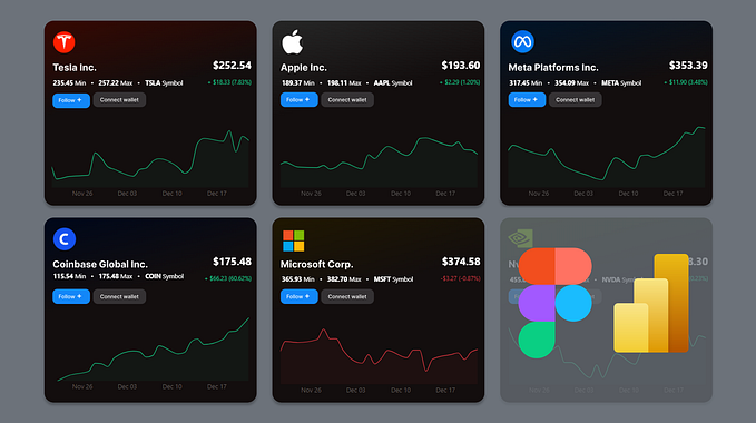
In a nutshell, small multiples are a set consisting of the same chart. The charts share the same scale and are split by one or more dimensions. The biggest advantage is that they are economical — once you understand the design, you can quickly scan them for patterns (see Visual Display of Quantitative Information, Edward Tufte). Also, they simplify information by breaking it down into smaller, easier-to-digest chunks. Therefore small multiples should be a go-to chart if we want to present different dimensions.
The chart I picked for this week is an excellent example of how they can simplify the analysis. The original graph created by Eurostat shows the employment rate among men and women. This information-dense chart includes breakdowns by gender, education, having offspring, and type of employment. Everything is jumbled up and presented in a way that discourages analysis.

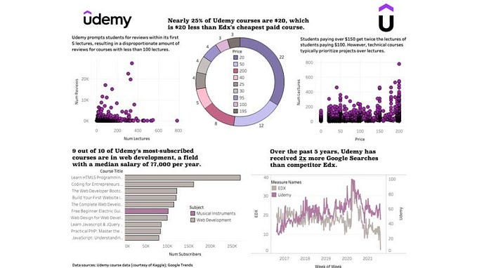
Good data visualization solutions
Elements that work in this chart