Small but mighty microcopy
While surfing the web, have you ever stumbled upon an onboarding or error message that made you smile? I love finding these snippets of text that have personality, it reminds me that there are real people on the other side of the website. When I found out that this type of copy was called microcopy, I had to dig deeper and find out more. In this blog post, we will look into what microcopy is, why it’s important, and how you can use it.

And what is it?
You might not have heard the term microcopy, but you have guaranteed seen it. Microcopy is an umbrella term for different type of text on a website or application that help to guide or instruct the user. It can take many forms, such as button labels, form placeholders, error messages, confirmation messages, loading messages, and progress messages. The term is relatively new, and practitioners and organizations operate with slightly different definitions and scope. For example, Nielsen Norman Group uses the term “microcontent” and excludes menu items, field labels, and error messages. Regardless of the scope, they agree upon the role of microcopy. It should speak directly to the thoughts and concerns in people’s heads at the right time. This makes microcopy extremely contextual, and as it has to anticipate the user’s concerns in the interface and give the reassurance.
How microcopy came about
The term microcopy was coined in 2009 by a usability professional, Joshua Porter. In his blog post, Writing Microcopy, he talks about a check out system that he had created.

He realized that the customers were having issues with entering the correct bill address information. But by adding clear instructions for the users next to the billing address field: “Be sure to enter the billing address associated with your credit card”, the problem went away. He realized that this smallest copy could have a mighty impact.
In Joshua Porter’s words:
“Don’t be deceived by the size of microcopy.
It can make or break an interface.”
Why should I care?
Good microcopy makes money. It cost less to incorporate a string of text than hiring more support or designing a new interface. With Joshua Porter’s example, he could have left things as it was, leaving support to deal with complaints and frustrated users who did not complete the purchase. But this would be bad for business. By incorporating microcopy in the right place, he increased usability.
Microcopy is a way for the brand to create a positive experience for the user and also engage them. Professor Clifford Nass of Stanford University research the interaction between humans and computers which he writes about in the book The Man Who Lied to His Laptop. He found that people respond to digital interfaces as if they were humans. We will empathize, be polite, and if it does not behave expectedly, we will argue, be offended, or get angry. We create an emotional bond with the interface. Microcopy establishes a dialog with your users that is full of character and enhance that bond. If the user trusts that the communication is genuine, the more likely they are to follow messages, work together with the interface, and return another day.
There is a lot of business and brand competing for the same user group. Microcopy can enhance the brand and make it stand out from the crowd. Slack is an excellent example of that. It is just a chat program, but it has today more than 10 million daily active users. When they launched in 2013, a chat program was not exactly a new idea. According to the firm that designed the app, Slack got its success because it does three things differently from other enterprise apps. It looks, feels, and sounds different. It is full of delightful microcopy that is playful. It transforms a tedious task, like waiting for a page to load, to something funnier, and it feels like you are playing rather than working.

Interesting… How can I start using it?
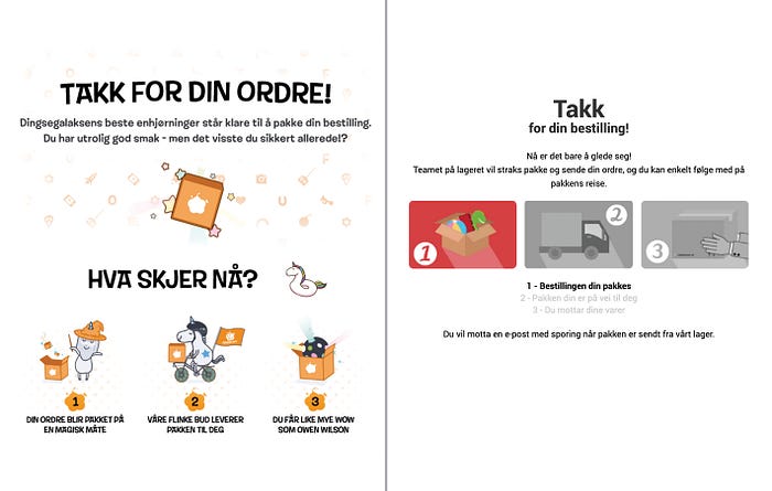
First, you have to determine what kind of tone of voice the brand has. If you should describe the brand as a person, how would it be? Does it have a clear vision and mission and set of values? It is essential to map out this before you start writing microcopy because you want the tone of voice to align with the brand. Is it conservative or more humorous, established or cutting edge? In some interfaces like Slack, it is appropriate that it makes you laugh. However, you don’t want that from your doctor’s office, you would instead feel like you are in capable, caring hands. Kinneret Yifrah describes how you can map the brand’s personality in her book Microcopy: The Complete Guide. Look at the images below. Both show a confirmation email after purchase. One has a more humorous approach and the other more serious, even though both sell toys.

Then, you have to consider your target audience. If it is a more specific group, then you can use references that are easily recognized by that group. If the target group is young, then you can use slang that will be incomprehensible to an elderly audience. One rule of thumb is that the wider the target audience, the more diverse and general the language should be.
You need to communicate with your users. Explain what they need to do, how they can find the information you need them to put in, complicated terms, and why they have to do particular tasks. And don’t forget to have empathy for your users. By meeting them where they are mental, you can get them to the next step. Acknowledge their concerns and tell them why you are asking them for sensitive information, what you will do with it, and protect it. Then assure them that if they do this, they will get the outcome they want.
Microcopy is sometimes a bandage.
Microcopy should not be used to fix a defective system or design. If you have to write microcopy than you should first think about what can be improved in the system to avoid them.
To site Bill Beard from Smashing magazine:
The best experiences have minimal copy because they’re intuitive.
Fixing interface usability is often more expensive and time-consuming than adding instructions and explanations to the users, as we have mentioned earlier. But the interface might still remain confusing and frustrating, even for the experienced user. And it might be cheaper to alter the interface in the long run, as you might be losing customers.
Good microcopy can improve your interface, but it should be a thoughtful process from the start. Just as important as good design and ease of use. So next time you are redesigning or creating a website or application, don’t forget about microcopy.
Further reading:
Microcopy: Discover How Tiny Bits of Text Make Tasty Apps and Websites
5 Ways To Prevent Bad Microcopy


