Some proposed color heuristics

Most digital designers are familiar with Jakob Nielsen's ten heuristics for user interface design. They’re a perfect list, because they provide guidance for both novice and expert; you can take the advice at a high level, but dig deeply, too. Others have adapted them into slightly different or condensed versions, all of which are useful.
Still, there’s an area of design that affects everything we do, but which lacks strong guidance. We have best practices for some areas of it — the psychology of color, the accessibility of color, the uses of color in data visualization — but we don’t have universal guidelines.
I’ve spent many years developing, applying, and refining color usage best practices, and training others in the same; I’ve studied the different ways color is used to carry information, how to make color accessible, how to make it usable, and more. I conducted formal color perception testing in college, and have implemented, measured, and tested color use in multiple industries: healthcare, business intelligence, technology, education. Now I’ve synthesized that work into what I hope is a useful format for designers: a list of eight color heuristics.
Some of these echo Nielsen’s heuristics, which makes sense, because the goal is highly usable color experience. Some overlap a bit, but better minds than mine have heuristics which do the same. Nevertheless, it’s a start.
Cognitive load reduction or maintenance
Colors should not confuse or distract. Color should draw attention where it needs to be and where appropriate, share honest, accurate information.
Much of color’s power lies in engaging preattentive processing. Preattentive processing is the sensory awareness we experience before we consciously pay attention to it. Before we turn the sensation into linguistic knowledge we can share or deliberately respond to, in other words.
A bright color draws the eye, so we color our calls to action brightly. A dashboard shares important success metrics, so we make the charts vivid.
The problem is that too many colors can confuse and distract. Testing as far back as the nineties has demonstrated that “even after extended and consistent practice…the presence of an irrelevant item with a unique color interferes with parallel search for a unique form, and vice versa” (Theeuwes, 1992).
Using colors judiciously, where they are relevant but not where they aren’t, solves this problem. It can actually reduce cognitive load by bringing the user’s attention where it needs to be, quickly. Using the right kind of color to show good or bad status is enough of a convention that many users begin to make a judgment the moment they see red or green in a chart; so use these colors carefully, where they mean something. Don’t make a user make a judgment call and then have to reinterpret the chart correctly. Make it simple, and make it better with color.
Colorblind accessibility
Colors should work for the colorblind. This is particularly important for data visualization. You can test your accessibility with this wonderful color blindness simulator from Colblindor.com.
Status colors — colors which show judgment, such as good, fair, or bad — are particularly frustrating because the two most common types of color, deuteranopia and protanopia, are green-blindness and red-blindness. You can learn more about making them accessible in this article I wrote a while back.
Contrast accessibility
In some contexts, color should have excellent contrast. This is typically restricted to typography, but it matters deeply in data visualization as well. Once again there’s a great online tool, WebAIM’s Color Contrast Checker. Your chart colors may not be read like text, but good contrast will make them easier to parse.
A key audience being undermined by poor contrast are older users, who are an ever-increasing audience. Think about it; all the young people who drove the creation of the World Wide Web are middle-aged now. The stereotype of the tech-ignorant oldster is just that — a stereotype. Many older users have been brought to the online world via usable smart phones and tablets. Don Norman wrote about this recently in Fast Company. It’s a great read, extending well beyond digital design.
Matches brand, system aesthetics
Color should integrate well with brand and system aesthetics. If new colors must be added to a palette for data visualization, for example, they should suit the feel of the brand and site.
I can’t argue for minimalist color all the time, because sometimes dramatic, exuberant colors are appropriate to the site’s purpose; but I can argue for Einstein’s version of Occam’s Razor: “Everything should be as simple as possible, but no simpler.” Do what you need to do, then stop.
Matches user’s visual language
Colors should match the culture, age, and any other aspects of your user’s frame of reference. Many times this is as simple as creating usable, accessible, brand-appropriate color choices. Sometimes it’s a bit more challenging:
- Cultures may have specific preferences for color. If you are working on a site that provides region-specific UI notes, talk with developers about incorporating culture-friendly colors that appear based on the user’s location. Make sure you test with appropriate audiences.
- Different ages have different color preferences. For example, very young audiences like bright, primary colors and strong contrast.
These don’t exhaust the possibilities, they’re just examples. If you’re exploring regional color, Xerox created an International Color Guide, which is a great springboard into your research.
Consistency
Colors should be consistent. Use the same color for links, the same color for highlights, the same colors to carry good/fair/bad meanings, etc.
Information has a backup
If your color carries information, the data should have a backup mode of expression (text, or an icon with an on click, on hover, or alt text value). You might have a blind user, or a user with a rare type of colorblindness. Expect that. Make sure that your text values work on screen readers!
Shows what it means
Color should have an accurate, honest meaning. For example, using status colors to express simple categories can be misleading; don’t do that. Here’s one of my favorite examples of misleading color usage: a chart from Politifact, reviewing the honesty track record of two candidates in 2016.
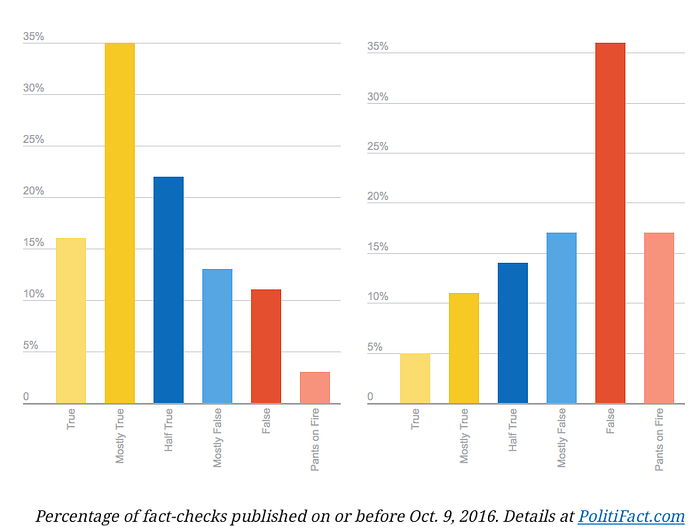
Much more than color is wrong with the above:
- The scale is different. The two tallest columns are the same height, but the one on the right is 36%, while the one on the left is 35%.
- The center of the true/false range — “Half True” — is not in the center of the columns. Instead, it’s paired with “Mostly False” in the center-appearing blue tones. This is because of the extreme “Pants on Fire” column, which has no equivalent on the true side. One can imagine an “Earth is round” extreme true value to balance this, or merging “Pants on Fire” with “False,” since it is.
- The totals are 100%; these are percentages of a total. The chart style does not emphasize that.
On the color side of things, here are the challenges:
- There are two status colors prominently shown (red and yellow), together with a non-status color (blue). Since the chart is judging, a traffic light choice of green/yellow/red would be more appropriate. But it’s worse than that, because the yellow is on the “true” extreme, making the tall column on the left-hand candidate appear, at first glance, almost as bad as the tallest column for the right-hand candidate.
- The colors should show degrees of difference, but instead use different tones without meaning.
Here’s my revised version. Both charts are accurate, but which one tells an honest story?

Conclusion
I hope these heuristics are useful. Thanks are due: Several areas are the better for discussions with usability researcher and friend Jennifer Ehrlich. UX design co-instructor Meredith Patrick and several classes of UX students also helped me refine my color usability techniques.
I’ll be expanding on these and related color lessons in the near future, so stay tuned!
References
Coblis — Color Blindness Simulator. https://www.color-blindness.com/coblis-color-blindness-simulator/
Nielsen, J. (1994). 10 Usability Heuristics for User Interface Design. NN/g Nielsen Norman Group, https://www.nngroup.com/articles/ten-usability-heuristics/
Theeuwes, J (1992). Perceptual selectivity for color and form, Perception & Psychophysics, November 1992, Volume 51, Issue 6, pp 599–606|https://link.springer.com/article/10.3758/BF03211656#citeas
WebAIM, Color Contrast Checker. https://webaim.org/resources/contrastchecker/
Xerox, International Color Guide. http://www.office.xerox.com/business-resources/colorconnection_book4_all.pdf

