Member-only story
Sparkles aren’t good UX✨
Even if they’re aesthetically pleasing, you can’t substitute important information with sparkles.

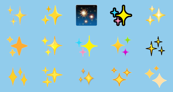
I will be the first person to tell you how much I love the sparkle emoji. ✨ I use them constantly, and in most personal projects, I throw them onto my designs like glitter. They give things a little more ✨glitz✨, a little more ✨glam✨, and the four-pointed star cluster is very much in vogue at the moment. Its meaning is almost always positive, so why shouldn’t UX designers use sparkles in their designs?
Origins of the sparkle icon

The four-pointed sparkle motif can be traced to the (becoming popular once more) 1950’s aesthetic. The atomic era slapped stars and boomerang blobs on wallpaper, advertisements, and vinyl diner booths. It’s a design that communicates something beautiful and new, and the stars’ proliferation during this decade perhaps reflects the optimism for new leaps forward in technology at the time. Just look at The Jetsons: this futuristic cartoon family was animated in the early ’60s but was set in the far-off future of 2062. In the cartoon, wherein science fiction borders on outright magic, sparkles stand in for the technical workings of robots and computers.
Sparkles came into the 21st century, perhaps by way of Japan. In anime and manga, sparkles are used as emphasis — to show that someone is excited, something if beautiful or lovely, or that someone is happy to have a refreshing glass of milk. Emojis (from the English word “emotion” and the Japanese “ji 字” meaning “character”) also come by way of Japan, and Japanese phone carriers were the first to use these pictograms, including the sparkle emoji, which was described with terms like “sparkling new.”


