Sprout Events — a UX/UI case study

A “gig economy” is a free market system which allows freelancers to select temporary jobs and projects, while employers can select skilled individuals from a larger pool for short term hire.
Our client, Cindy Tran, wanted to take advantage of this upcoming concept and create a mobile platform to bring (at the moment), event organizers and staff together, with the eventual goal of becoming a one-stop shop for both parties to find each other.

This project was planned and executed by my team of four. The UX leads for this project were Travis Tong and myself. The UI leads were Grace Ng and Fatimah Yasin.
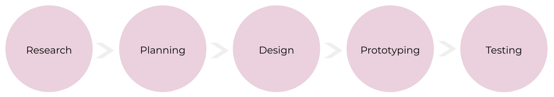
We followed the UX design process. We had 3 weeks to research, design and execute a high-fidelity mock-up of a mobile application for our client.
Research and Discovery
Domain Research
To set the foundation for our research, my team researched numerous local and international temp-work companies to see what features were common across the board, and how Sprout Events could stand out differently. We also looked up common temp-work platforms such as Facebook and Craigslist, as well as temp-work agencies such as Brightspark and BBW International.
We then performed a comparative competitive analysis of just the mobile applications that were available to download.

What we discovered was that the market was already very saturated with similar applications trying to take advantage of this gig economy concept. This helped us list out the features that were necessary for our mobile application to have.
At the same time, we learned that most of these applications lacked in 4 areas. They didn’t provide volunteer opportunities, only temporary paid work. They didn’t provide training, or facilitate permanent hiring. Lastly, they didn’t allow event organizers with the ability to create a list of favourite employees.
User Research

Surveys
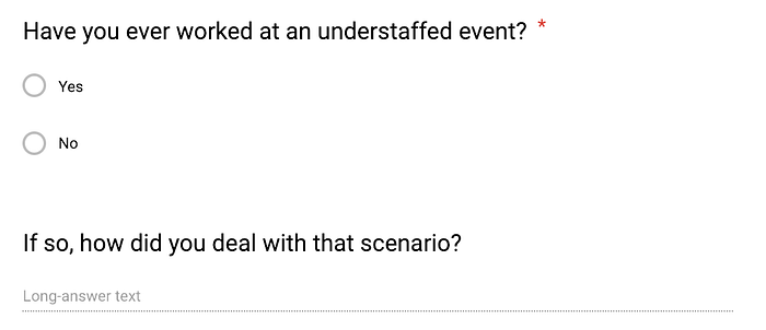
We began with formulating survey questions. The objective of our survey was to understand how a staff member found a job, and how an event organizer found their staff. We also wanted to learn about each party’s motivations, pain points, and ways for what might help resolve those frustrations.
Our survey was a challenge to craft, as we had to ask different questions depending on whether the respondent had only worked before, planned an event, or had done both. Using Google Form’s “form logic”, we were able to create a questionnaire that catered to both without creating 2 separate forms to deploy.
We posted our survey on Facebook and Slack.
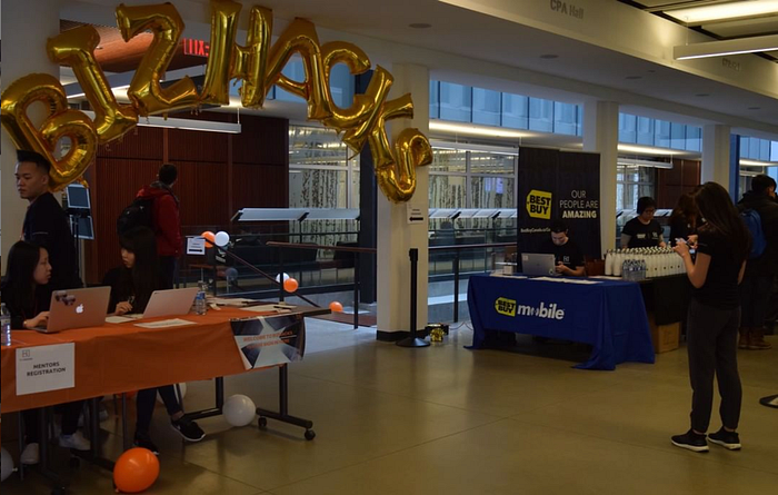
While we waited for survey responses, I conducted one contextual inquiry at UBC’s BizHacks event, and we also conducted 4 in-depth interviews.
Contextual Inquiry
Contextual inquiries put the UX researcher in the field to observe the behaviour of the target users in real time.
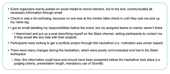
I volunteered as a mentor to assist in any technical and design development of the hackathon projects that students were developing. During the preparation of the hackathon, I experienced how the event organizers recruited mentors and participants. At the event, I observed how the event’s schedule was maintained, how information was distributed, and how the other mentors were checked in. This was what I found out:
Interviews
Cindy’s aim was to target a wide demographic of people, from students, to stay-at-home moms, to empower all those looking to jumpstart their career. Since we were getting a lot of responses from students through our survey, we decided to interview a stay-at-home mom to learn her perspective.
So together, Travis and I conducted 4 in-depth interviews with 2 event organizers, 1 security guard, and 1 stay-at-home mom.
Affinity diagram
After gathering all this data from multiple sources, we used an affinity diagram to make sense of all of it. An affinity diagram is used by UX researchers to categorize information into meaningful sections to help analyze data better.


Results
From the event organizer point of view:

90% of those who have planned events do so because they support the cause it’s for. But the top reason for organizing an event is because it’s fun and rewarding to see their event come to life and see their work come together.
The event organizers mostly communicated through email, and personally vetted each of their staff workers, regardless of whether they received a job application or a referral from another event organizer. This is very time consuming for them, so they try to plan out their staff 1–2 months before the event takes place.
Event organizers would like more responsible staff, which includes, but isn’t limited to checking in on time, knowing their roles beforehand, and communicating better about cancellations.
From the staff worker point of view:
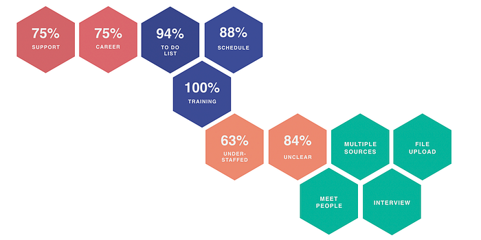
We found that the majority of event workers had two key factors helped influence their decision in working for the event. First, the staff want to work at events that they are passionate about. Second, they want to work at events that may have a positive effect in advancing their careers.
In general, we found that the most respondents wanted a clear outline of their day, additional training, and having the their shift fit around their schedule. However, the majority of respondents noted that they have worked at unstaffed events before and their duties were not necessarily clear — leading to frustration.
The Opportunity
An interesting finding from our survey was that 65.6% (21/32) of our respondents had volunteered at events. This meant that a platform that helped staff workers find paid events AND volunteering roles would be a unique niche to to fill.
Our results helped us craft three user personas for this project.

Planning
Storyboard
We created multiple storyboards to illustrate different aspects of our personas’ journeys.
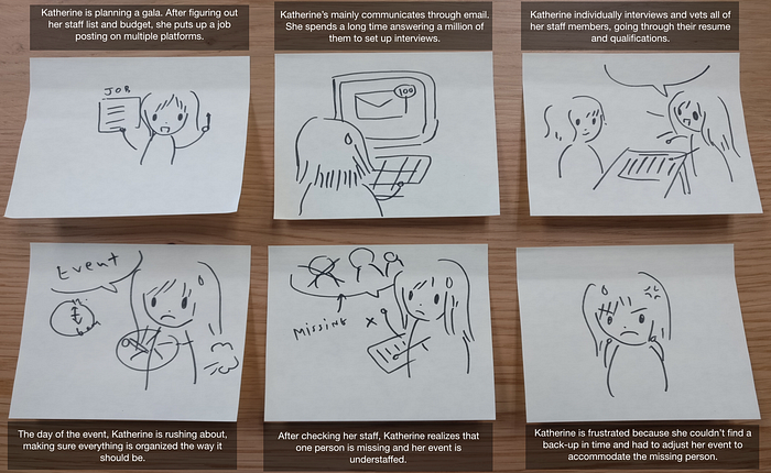
This first one illustrates Katherine’s frustrations.
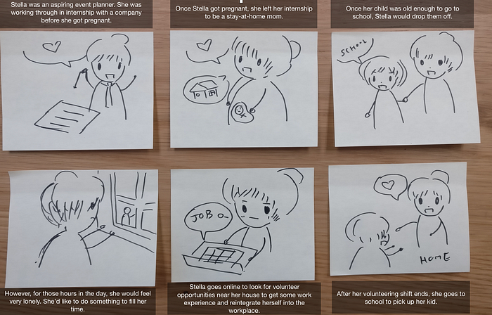
The second storyboard shows Stella’s interest in jump starting her career again.
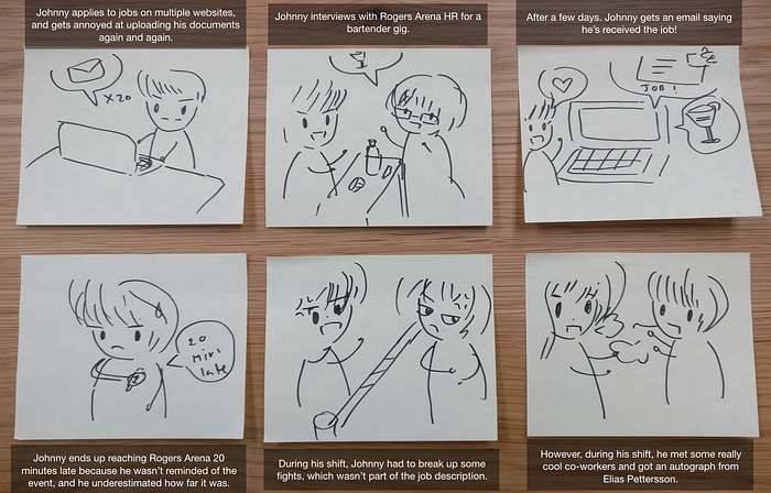
The third one shows Johnny’s experience working as a bartender.
We realized that while the motivations of Stella and Johnny are different, the features that they would require and would like to have were the same. So even though we explored the scenarios that Katherine, Stella and Johnny would find themselves in, we focused on Katherine and Johnny’s customer journey and user flows.
Customer journey map
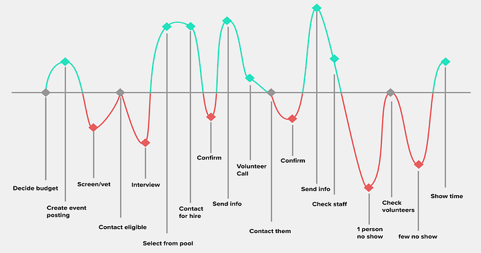
Organizing an event as a whole is already pretty stressful, but even just managing staff has its own pain points, as we can see with Katherine’s journey map.
From Johnny’s journey map, we can see his own frustrations highlighted below.

User flow
We also created a user flow that mapped out what steps were required to register for the mobile application. Here’s one example of the user flow from the event organizer’s perspective:

Feature prioritization
Putting all our research together, we were able to create a list of features that we felt was necessary for the minimum viable product (MVP). We also organized the remaining features in bucket of “nice to have” and “do not need”.

Design and Testing
The design objective was to use the UX research we’d done to create a usable, understandable and efficient prototype. The user flow map helped us figure out the on-boarding flow, which was a springboard for us to develop the concept for the rest of the application.
I worked on figuring out the event organizer flow, while Travis worked on prototyping the on-boarding flow, as well as the staff worker flow. Using the feedback gathered from the paper prototyping, we then created the mid-fidelity prototype using Sketch and InVision.
Organizer flow
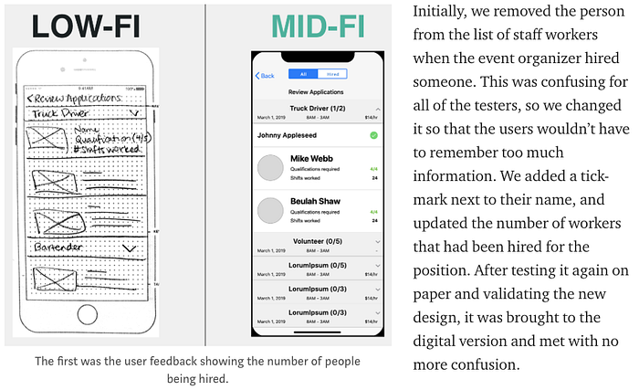
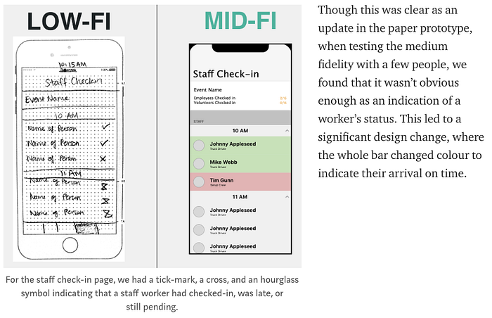
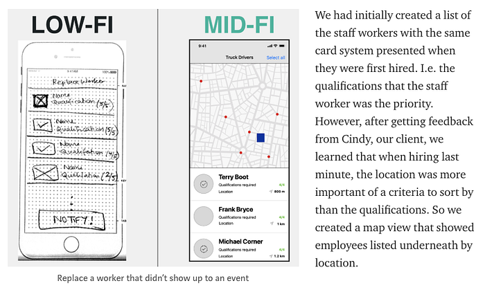
Testing revealed that the flow of the app was simple and easy to use. However, there were 3 screens that changed significantly from our testing of the paper prototype, which are reflected in the medium-fidelity version.
Staff Flow


During our testing, we received feedback that the ability to quickly search for desired events was something that people wanted and that people really appreciated the clear divide between paid and volunteer work. However the flag highlighting the amount of money made was unnecessary, especially since volunteer events wouldn’t have a similar flag to highlight. For consistency, we removed that flag.
Upon tapping into an event, we wanted to make sure that applying for events was a super approachable process for anybody and the responsibilities and required qualifications were clearly laid out — a priority that we found during our research phase. The card system drawn out in the paper prototype was changed to a list view of sorts, making it easier to read the data.
Lastly, in order to keep both the organizer and the worker accountable, we decided to make rating a mandatory process after finishing their shift in order to collect their payment.
This decision undoubtedly was met with some controversy but we came to realize that without forcing the user to go through this step, there was a high chance that the planner would not have been rated.
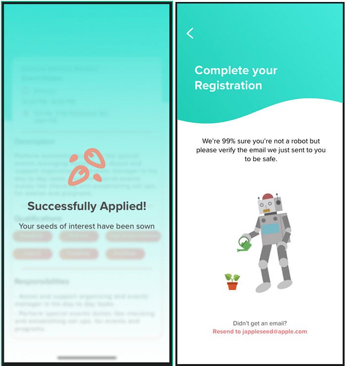
Delightful Design
While searching for a job isn’t the most exciting of tasks, we decided to incorporate a little bit of humour to keep the staff workers engaged with the application.
UI Design
“Celebrate your passion and discover new possibilities”
The final design phase for this project was completed by the UI team, Grace and Fatimah. They not only skinned the medium fidelity application that Travis and I developed, but they also rebranded the company.


Finally, here are the high-fidelity versions of the screens discussed above.


If you click through the register flow, you’ll experience the staff worker flow. If you click through the login flow, you’ll experience the event organizer flow.
Future considerations
With such a tight timeline, we weren’t able to include all of the features we set out to include. While we were able to integrate the volunteer aspect which all of the competitors were missing, we also had to account for the other features that were a must-have, and save the features that would’ve made the application unique for a later date.
Below is a proposed timeline of the order in which the other features would be implemented.

Conclusion
Overall, the team worked very well together to create an app catered to the gig economy, while at the same time, bringing something unique to the table. The final product exceeded Cindy’s expectations, and fulfilled the business goals, user goals, and project goals.
If you liked my case study, please clap and leave a comment! All feedback is welcome 🌱