State of mobile app design 2019
2019 is almost half-way over so it’s time for a comprehensive look at the current state of mobile app design — from UX patterns and visual elements to fundamental changes caused by AR and other uses of the camera.
UX patterns
First, let’s explore patterns that are emerging and that define a state-of-the-art mobile experience.
Tab Bars
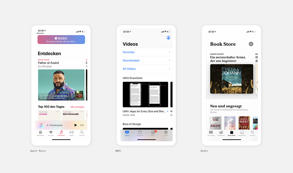
While nothing new, Tab Bars are increasingly popular and that’s for good reasons. Primarily because they are easy to reach with your thumb while holding your phone (which keeps growing year by year), but also because they are always visible, allowing for easy navigation and clear guidance.

Another reason for their popularity is due to their adoption in Apple’s iOS Human Interface Guidelines as well as Google’s Material Design (called Bottom Navigation).
Visually, the icons are getting bolder and simpler than they used to be. This can also be attributed to the latest versions of iOS where Apple introduced this new style along with other changes such as bold headlines in the header.

However, there is still no consent if you should use additional text labels or use the icons standalone. I’d still recommend text labels because an icon alone can be confusing or misleading and there are so many stories of misinterpretation that you definitely shouldn’t rely on them alone.
Focus on the lower third
It’s not only the bar tar, but there is also a bigger trend to focus more on the bottom of the screen and to keep important interactions like navigation (see Tab Bar) or buttons in the lower third of the screen. Again, this is primarily out of ‘reachability’ reasons.
And with full-width buttons that are sticky to the bottom of the screen, you keep the primary action always in view, thus making it a clever way to keep the user focused on his goal.

Just make sure you place the label in a way that it doesn’t overlap with the app switcher bar in iPhone X and above.
Layered Content
Based on action sheets, bottom sheets have increased in popularity recently. The idea is pretty simple: keep the user in the original context e.g. browsing the latest sneakers, and overlay additional information only when the user wants to. The information is there the whole time, just a finger-tip away.

Bottom sheets are not only great for additional information but can also guide a user through a checkout process.
Make sure to reduce the amount of information per step, for example by using default payment settings or shipping address instead of showing the long forms. This got perfected by Amazon.

Lastly, there are backdrops. Like bottom sheets, they form a second layer on top of the first one but tend to be bigger, contain more information and usually feature a small handlebar to pull down or up. They are a great way to really make sure the user focuses on the task at hand but still has some context.

Visual trends
Fewer shadows, more whitespace
When announcing the second iteration of Material Design -often called Material Theme- Google acknowledged the over-use of and reliance on shadows and reduced them by a fair amount. They also began using a lot more whitespace to help with visual hierarchy and structure.
You can see the same in iOS, white Apple strong usage of reduced headers, consisting of nothing more than a headline and a lot of whitespace. What was first introduced with the revamped Apple Music App is now front and center in nearly all of Apple’s apps.

This cleaner approach, also popular in web design, got quickly adopted by many popular apps. The newly announced Facebook redesign is the maximum of minimalism.
Colorful and round
What else? Ah yes, everything is round now.
Color is still a thing in app design, but its usage has changed. Gone are the background-colors for headers, say hello to colorful bubbles and buttons.
I just hope we‘re peak gradients. #gradientsarethenewblack

When you’re using gradients, give them at least some meaning as Apple does with Apple Pay, where the gradient of the Apple Card changes depending on the where you spent your money on.
Join the dark side
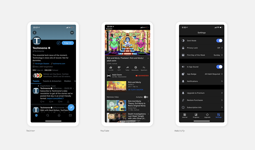
Dark Mode is coming, not only on Android but also very possible to Apple’s iOS. So you should probably start to think about how your app will fit in when everything else is ‘inverted’. On MacOS, some of my favorite apps like Sketch and Abstract (and now even Chrome) finally started to adopt dark mode, but with a lot of effort and by making use of the MacOS GUI. I’m not saying you should definitely design a dark mode for your app but at least think about it. And with Material Design offering a dark mode now, there is at least something to build upon.

Animations
Again, nothing new but animations can enhance the user experience quite a lot by adding joy of use and ideally help the user better understand certain things. From slick micro-interactions to subtle background animations and transitions — with new tools like Airbnb’s Lottie it is getting easier to implement animations.
And as stated on material.io:
Motion focuses attention and maintains continuity, through subtle feedback and coherent transitions. As elements appear on screen, they transform and reorganize the environment, with interactions generating new transformations.

New to animations? Check out the InVision Handbook that focuses on Animation.
The merger of mobile web and app design
With more and more powerful mobile web browsers and frameworks like Progressive Web App (PWA), the gap between mobile web and native applications is shrinking. By blurring the line, it’s making it harder for the average user to distinguish between web and native. Which is a good thing, because why should there be different UX patterns between these two ‘platforms’?
Although many PWAs are still ‘light‘ versions of apps, e.g. Twitter Light or Messenger Light, aimed at users in developing countries where mobile data is not given, it’s not only there that you benefit from fast load times, easy to maintain code and independence from app stores. A great example is lyft’s PWA.
Google adds new features to PWAs at an impressive pace, with push notifications, offline data storage, integrated payment solutions and more now available. Recently, they even announced PWAs for desktop. Apple is slowly but steadily enabling PWAs features with Safari updates on iOS, paving the way for real cross-platform development. And with a potential anti-monopoly lawsuit against the App Store, they might increase their efforts and speed up the process.
So, if you’re thinking of building an app, I think there can be a strong argument for going with a PWA instead of native.
The camera becomes the app
Snap, the company behind Snapchat describes itself as a camera company, not a social network. That‘s weird to think about at first, but it shows the importance of the camera for Snapchat. You open the app and you see the camera screen — and in many cases yourself.
Let’s take a look at how cameras are changing mobile apps.
The rise of video
YouTube and Netflix changed the perception of how and where users are watching videos. Both of them are now reporting more usage on mobile than on desktop or TV and enabled other apps like Snapchat, TikTok, and Instagram to put videos front and center of their user experience.
With auto-play on Twitter and Facebook and even product videos instead of photos in e-commerce, videos are everywhere to be found in mobile apps.
The power of the camera
In the fin-tech wold, it has become the standard to use video ident to set up a new bank account. What could only be done face-to-face in e.g. the post office (at least in Germany), is now possible from your living room in a matter of minutes.
Talking of banking: Apps like Deliveroo and Apple Pay started using the camera to scan your credit card, removing the painstaking process of manually entering in every character.

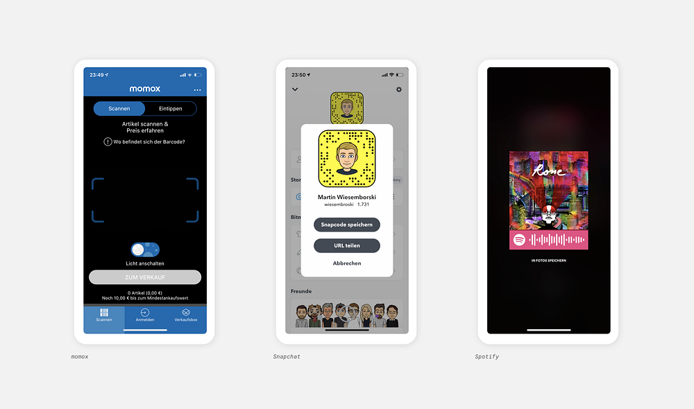
Making use of the camera to provide assistance to the user is nothing new. Apps like Amazon and momox allowed you to find products by scanning their bar code for some time now. Snapchat Codes make it easy to share your contact with others and was even adopted by Spotify to quickly share songs (although I’m not sure how successful of a feature it has become).

However, with advances in image detection, more sensors, and on-device machine learning, it is now possible to use the camera in creative and very useful ways (and yes, also for fun Snapchat filter turning you into a baby version of yourself). Google Lens is getting more and more powerful and allows you to identify most objects just by pointing at them. Similarly, Pinterest is working intensely on ways to find exactly the sneaker you took a picture of.
Last year, Google showed us the future of navigation with the introduction of augmented reality in Google Maps. I always thought it was only me who is unable to find the right direction, but it turns out I’m not alone, which makes me very happy. One year later, Google is finally launching the feature on Pixel devices and the technology behind it is truly impressive. No wonder they encountered many roadblocks along the way (pun intended).
Which leads us to Augmented Reality. Just last week, Nike introduced a new version of its app. The goal is to find you exactly the right shoe size you need, not too small not too big. Something a person in the shop would usually do for you, but in the age of online shopping, they are nowhere to be found.
Meanwhile, Apple and Google are hard at work to ship updates to their AR frameworks and you can expect new announcements very soon at Apple’s developer conference WWDC on June 3–7. Both of these frameworks (ARKit and ARCore) allow developers to make use of the power of augmented reality and built-in tools for measurement, tracking and more.
IKEA landed a big hit last year with a new app that lets you virtually put the new sofa in your living room and I think we will see many more clever use cases coming in the next months and years.
Conclusion
Trends come and pass by, but beneath colorful bubbles and large headlines more fundamental things are changing. A system-wide Dark Mode might have a bigger impact than currently anticipated. New and improved frameworks for AR, machine-learning and cross-platform applications open up new possibilities to create great experiences.
What did I miss? What do you think should definitely be on this list?
Let me know!

