StepSetGo Apple Watch app — a UX Case Study
Breakdown of my process of designing the entire experience of the StepSetGo app for the Apple Watch.
Now before we get started, I’d like to do a super small plug to one of my highly requested courses!
It’s Free! The Mega Product Design Course for Beginners!
If you’re looking to drastically upskill and change your career trajectory for the better, make sure to check out my Mega Product Design Course for beginners on my YouTube Channel.
I’ve had the good fortune of working with some of the biggest companies and startups and have learned a lot through that. And I share all the knowledge with you all for free on my YouTube Channel.
I cover everything from the core foundations of Product Design, UX Design and so much more. Get to see and learn what it takes to be a skillful product designer which can get you any opportunity you want.

Anyway, let’s get into the case study!
Why?
So this was a personal project that I wanted to add to my portfolio. There are a lot of projects and case studies on mobile apps and websites. But hardly a few projects on Apple Watch Apps. And being a person who does things differently and better than others, I decided to take this up.
I took upon the challenge of learning everything about the Apple Watch. How they work and what makes a good Watch app.
Why was it a challenge?
Good question 😅. I don’t own an iPhone and so I obviously won't own an Apple Watch. I had to sit with my friend who owned an Apple Watch and use it to understand how it all worked. And later if I ever had a question I either had to Google it or write it down. So that I could get the answer myself when I met him the next time. I also watched all the WWDC videos on the Apple Watch and read the Human Interface Guidelines quite a few times. I’ll share all the links at the end of the article.
So today, I am about to share my learnings and process so that it will help you make excellent apps for the Apple Watch.
I also made a full-fledged presentation on Behance. Definitely check that out as well ✌️
So let’s get started 😎.
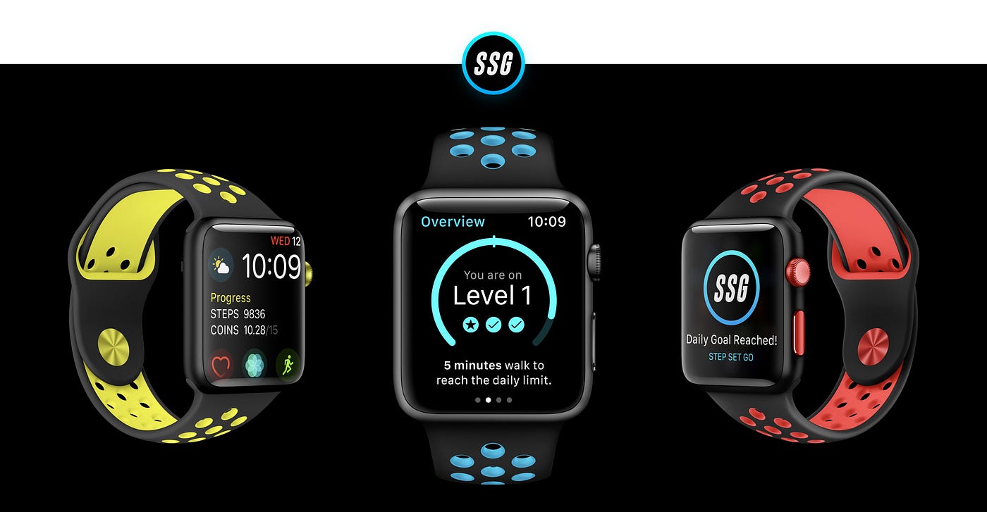
What is StepSetGo?
It’s an app that counts the number of steps you take and converts those steps into coins. With these coins, you can redeem rewards such as movie tickets, coupons, gadgets, fitness products, and even a real bike. I’m not kidding 🤣.
It’s available for both Android and iOS. Give it a shot if you want!
Honestly, the mobile app looks insanely good! The UI/UX of the app is fantastic. Great job by whoever worked on the design.

Before we get into the specifics, let’s understand how this app actually works with an example.
The app has a total of 5 levels. Each level has a daily limit on the coins that you can earn per day. So if you are on level 1, irrespective of the number of steps you walk you can earn only 5 coins per day. If you are on level 3, you can earn a max of 15 coins per day.
So how do you move up a level?
When you reach the daily limit 3 days in a row, you advance to the next level. So if you are on level 3 and you walk enough to reach 15 coins 3 days in a row, then you are upgraded to Level 4.
But what happens if you don’t reach the daily goal?
Each level has a safe zone. If you do not reach the safe zone 3 days in a row, then you will get downgraded to the previous level. So if you do not reach the daily limit, but you reach the safe zone, you will be on the same level. Nothing to worry.
This is the biggest concern for the user. So when designing a watch app you need to consider the biggest pain points and concerns ofthe user. Then design accordingly.
So without any further ado, lets dive in!
App Icon
When designing your app icon for the Apple Watch, there is only one thing that you need to keep in mind.
Make sure that it stands out from the other apps and is quickly recognizable. This can be done through text, color, logo or even an icon.
I tried a few variations with the logo and decided to go with the original logo because it worked the best.
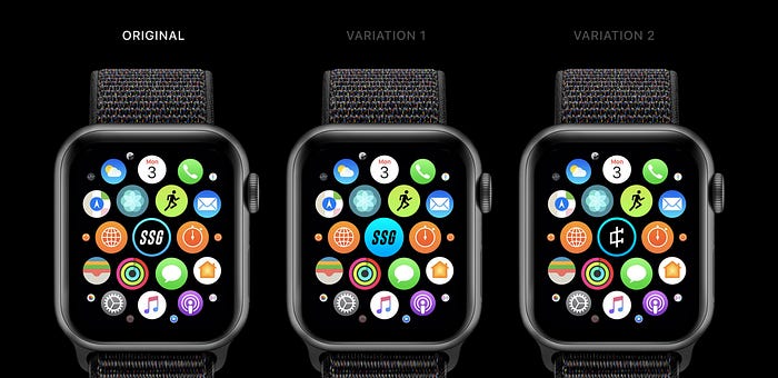
For the 2nd variation of the logo, I used the coin icon as the logo. Since the whole concept is about walking to earn coins, I felt that it would make sense to have the coin as the logo. However, I felt that it looked more like a cryptocurrency logo.
Among all the 3, I felt that the first one stood out better and so decided to go with that.
Picking features
When deciding on what features to include in the Watch app, there are a few things that need to be kept in mind.
- Display timely and essential content that gives value to the user.
- Allowing the user to quickly perform interactions with the watch.
This is the approach I took to pick the features.
I made a list of all the features that the mobile app provides. Then I checked if each feature satisfies the above 2 pointers. If it did, I decided to include it in the watch app.
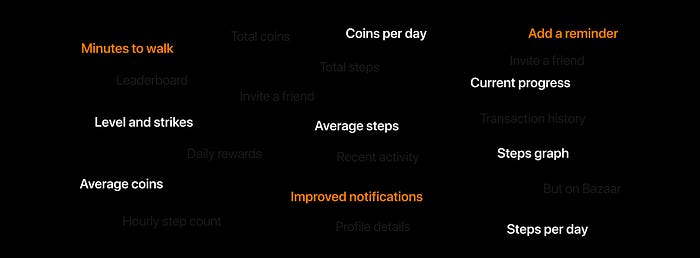
The features in white are the ones that I decided to integrate into the watch app. The features in orange are new features that I introduced to enhance the experience of the watch app.
Time to take a look at the overall app experience.
Core App Experience
Apps on the Apple Watch can have either hierarchal navigation or a page-based based navigation.
Based on the information architecture of your app, you will have to pick one of the 2 types of navigation.
I decided to go with page-based navigation. Why?
It’s because even though all the content is related to each other, they do not fall under one another. There is no need to drill down one level below. The content on each page can be understood independently.
Let’s understand the content on each page.
Page 2 — Overview
Why is the overview page not the first page?
Good question!
When the user opens that app, he will land on the second page (overview page) and not the first page. Setting a reminder is one of the most important actions that can be taken on the app. And that needs to be just one swipe away.
So why not keep the reminder on the 2nd page and the overview on the 1st page?
If I did, then to look at the daily stats, I would have to swipe 3 times to see the stats, which is quite a lot of swipes.
As I mentioned earlier, the interactions need to be quick and swiping takes a bit of effort and time. Even though it's very minimal, it is still important because we are dealing with time in terms of a few seconds.
99% of the times, the user would either look at the stats by swiping right or set a reminder by swiping left. This makes it faster to navigate within the app.
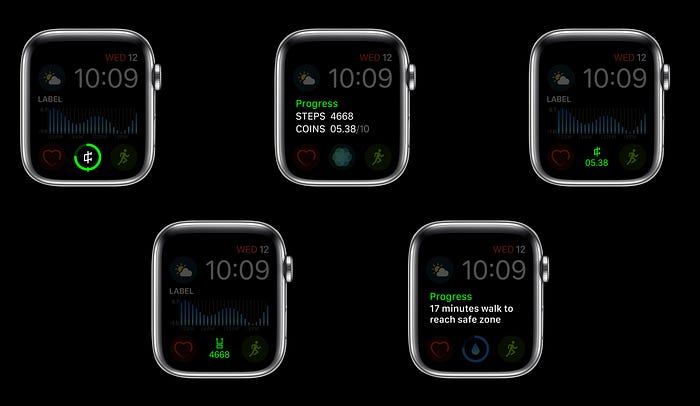
Anyway, the content on this page is laid out in such a way that can be quickly understood with a glance.
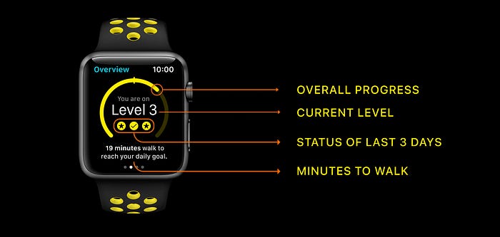
- The overall progress of the day. Where the user currently stands and whether the user reached the safe zone or not. The user can generate a mental image in his mind and remember that he has to take a walk before the day ends.
- The current level of the user.
- Status of reaching the safe zone or the daily limit of the immediately previous 3 days of the user. This is quite important because there may be a case where the user has missed reaching the safe zone last 2 days. He might have forgotten all about it. By showing it to the user, it reminds him that he has to reach the safe zone to prevent getting downgraded.
- The minutes to walk to reach the safe zone or the daily goal depending on the progress so far. This is a new feature that I introduced into the app.
Rather than showing the steps or coins earned, it makes more sense to show the minutes to walk, to reach the goal. It makes no sense to show the steps a user takes or the coins he has earned as they are hard to keep track. Even showing the distance makes no sense.
So rather than those units, it makes sense to show the minutes needed to walk as it is easy to track the minutes walked. The app will calculate the minutes based on the walking speed of the user.
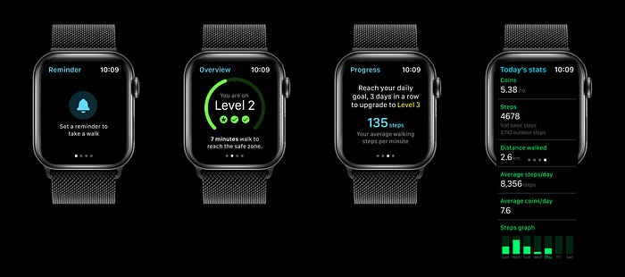
Page 1 —Reminder
Setting up a reminder is a new feature that I introduced into the Watch app.
By swiping to the left, the user can quickly set a reminder to walk in just 2 simple steps. However, the reminder can be set only for that particular day.
This is how the process looks like.
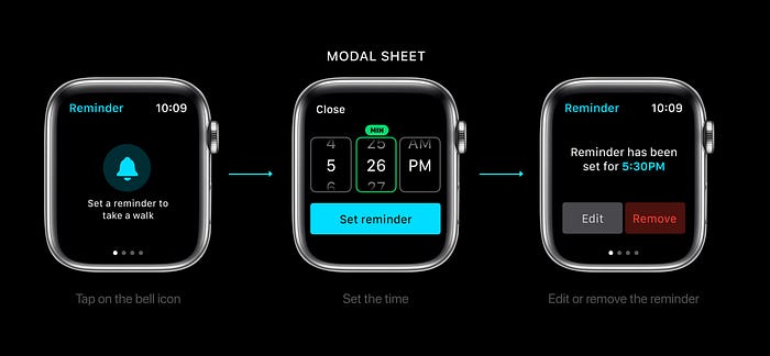
Step 1: Tap one the bell icon.
Step 2: Use the digital crown or swipe with your finger to set the time.
Step 3: Umm… There is no step 3 😝
Once the reminder has been set, you have an option to edit it or remove it on the same first page.
Page 3 — Progress
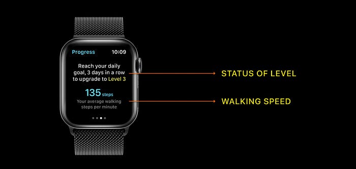
The Progress page is very simple. It provides information about the status of the level and the average walking steps.
But why are you showing the level status again? Didn’t you already show it in the Overview page?
Good question again! So there are chances that a user might overlook that information on the overview page. But there is no way a user would overlook it if it's presented in big text. Hence, the reason to show it again.
Page 4— Today’s stats
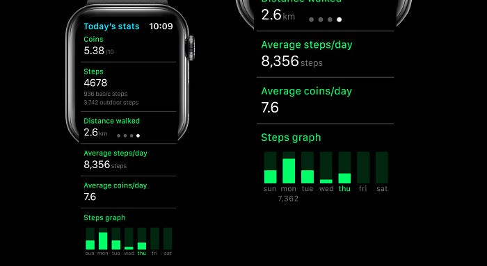
The stats page is pretty straight forward. Nothing much to it. Only one quick thing to note is that, by tapping on the graph, the user can see the actual number of steps walked.
Enhanced Notifications
Notifications on Apple Watch play a very significant role. Providing essential and timely notifications are very crucial.
The current mobile app provides notifications only in 3 situations.
- Safe zone reached.
- Daily limit reached.
- Downgraded.
Now, these notifications are obviously required but there needs to be more and they need to be better.
So I added 3 more notifications to the list.
- A notification informing the user that they missed reaching the safe zone the previous day/previous 2 days. This will alert them about their status. And they will make sure that they hit the safe zone/daily goal no matter what.
- A notification informing the user that he has reached the daily limit 2 days in a row. This will let him know that he needs to reach the daily limit once more to advance to the next level. Such notification will definitely motivate the user.
- A notification that is a result of the reminder set by the user himself.
Here are 2 notifications to illustrate how I enhanced the notifications.
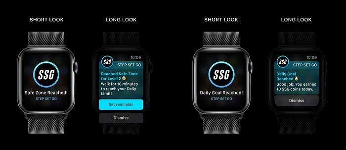
The one the right is pretty straight forward.
But the one on the left provides valuable information. It mentions how many more minutes the user has to walk to reach the daily limit. It also encourages the user to set a reminder with a colorful call-to-action, so that he does not forget to take a walk.
Make sure that you are designing actionable notifications. By doing this the user can perform actions which will help him achieve his goal.
Complications
Complications are like widgets that display information on the Watch face. The user does not have to enter the app to get this data.
Here are a few types of complications.
As you can see, each complication provides different types of information. The user can pick any of the different types of complications based on his requirement.
There is one last thing before we wrap up. Enjoy a simple and fun animation that I made about how the Watch app would really function.
Resources
- What’s new in WatchOS 5
- Designing Notifications
- Designing for Apple Watch Series 4
- Creating Independent Watch App
- Designing Web Content for Watch OS
- Human Interface Guidelines for Apple Watch.
- Complete Presentation on Behance.
- Mockups used in the article. Mockup 1, Mockup 2, Mockup 3.
And… That’s a wrap!
So that’s pretty much it. I’m super sorry for making this very long 🙏🏼. I wanted to share everything that I could. Hopefully, you found this article very helpful and insightful.
🔥 2 Free months of Skillshare Premium!
If you want to learn to build a fully functional website from scratch without using a single line of code in Webflow, make sure to check out my Mega Webflow Course for Beginners! You can find the course on Skillshare
Register with my link and get 2 free months of Skillshare Premium and watch it for free.

Did you know?
You can give up to 50 Claps for this article? Just hold the clap button for a few seconds and bam! Try it out 😋
My other articles on medium
Reach out to me on social media
Twitter, Instagram, LinkedIn, Dribbble, Behance and YouTube.

