Member-only story
Stop using style tiles when presenting design work
This alternative leads to a clearer direction.
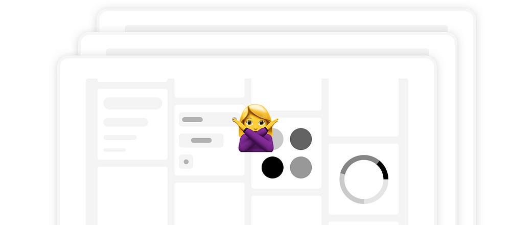
Designers often get the visual ball rolling on a new project with a few ‘style tiles’ to help a client pick a visual direction. They look like headless UI kits with color swatches, typography samples, and graphs out of context. The problem with the format is they compare surface-level details, not the experience of the product. When you show surface-level details, you will receive surface-level comments. “I don’t like the red” or “mix these two together” is usually the subjective feedback. This puts the designer in a bit of a pickle without a clear direction on how to make decisions. Here’s the remedy:
Run a Brand Experience Workshop
If you’d like to know more about this type of workshop, you can read more here in long-form.
Synthesize Words
After the workshop, you’re left with a ton of great descriptors. Organize them into buckets. You’re looking for 4–5 key attributes that best describe the brand in the form of adjectives. You’re looking for positive words that support those key attributes. And don’t throw away those negative words, they are just as important in defining something. Like measuring anti-matter by measuring the matter around it… Think about the many different factors like competitive landscape, other sub-brands, parent brand, brand story, target demographic, research insights, etc. The product is always more defined when these attributes create some tension with each other. When they push and pull at each other is where an interesting brand experience can lie. Why? Because humans have tension within themselves—this is personality.
Get familiar with these words, they should drive everything about the product, even the architecture should be subject to influence from these words.


